
在地图中使用stat_countour()时遇到的问题(ggplot2 )。r)
我有一个在欧亚大陆的位置(纬度+经度)的数据框架,我想使用第三个变量来创建一个等高线图。数据帧(datgeo)如下所示:
lat       long      date_BP
56.28000  25.13000  7429.833
40.31992  29.45311  8048.077
50.41027  14.07460  4200.000
50.12175  14.45695  4484.600
58.74000  -2.91600  4913.444
44.53000  22.05000  8200.333
50.09000  74.44000  3707.125
34.75146  72.40194  2834.625
...
我使用ggplot2生成欧亚大陆的地图。我尝试使用date_BP作为z轴来创建等高线图。
library (ggplot2)
library(rnaturalearth)
library(rnaturalearthdata)
library(ggspatial)
world <- ne_countries(scale = "medium", returnclass = "sf")
ggplot(data = world) +
  geom_sf() +
  geom_point(data = datgeo, aes(x = long, y = lat)) +
  stat_contour(geom="polygon",data=datgeo, aes(x=long,y=lat,z=date_BP,fill=..level..)) +
  scale_fill_gradient(low="blue",high="red")+
  coord_sf(xlim = c(-12.3, 110), ylim = c(70, 30), expand = FALSE)
然而,脚本根本没有工作,我无法得到等高线图。这是上面的脚本生成的映射:
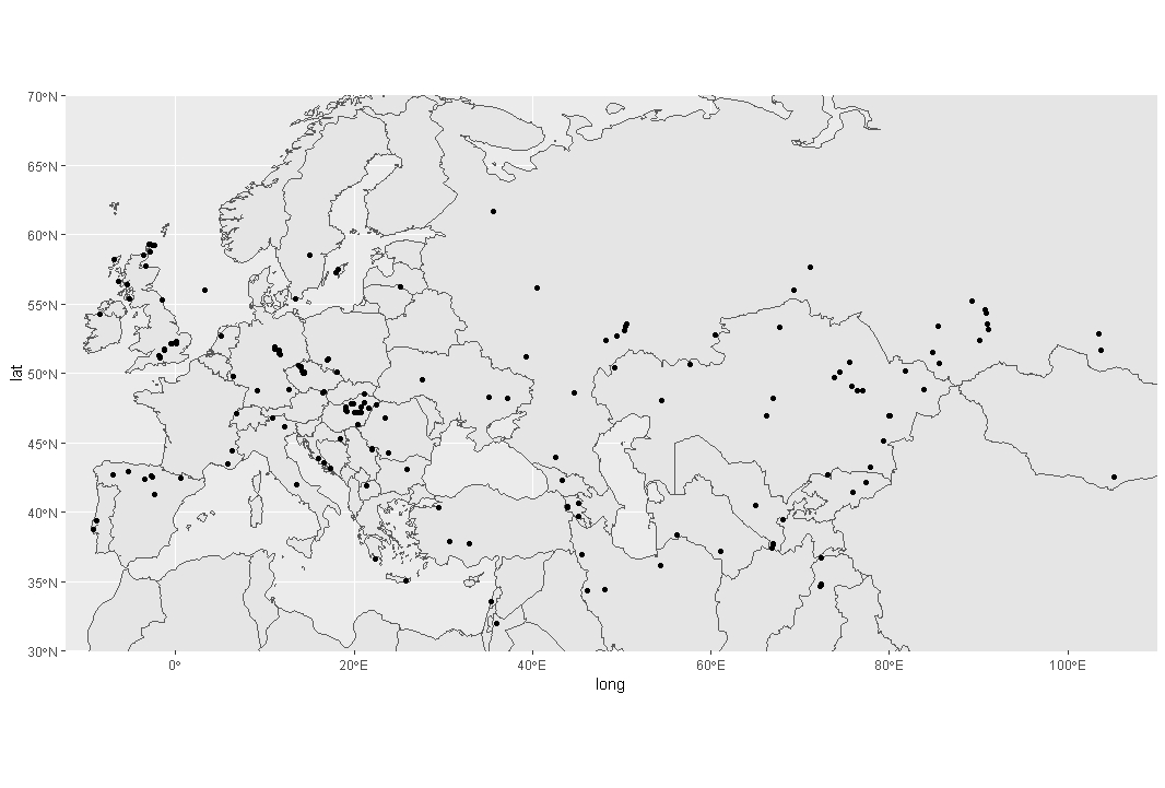
为什么这个脚本不代表任何等高线(等高线)?
回答 2
Stack Overflow用户
发布于 2020-03-05 07:26:56
我认为您的问题是stat_contour不能工作,因为它需要一个完整的网格。我发现这篇博客的文章解释了如何处理这个问题:https://www.r-statistics.com/2016/07/using-2d-contour-plots-within-ggplot2-to-visualize-relationships-between-three-variables/
我使用这个博客的答案构建了以下的答案,适合您的问题和您提供的最小示例。
首先,您需要基于受限数据集"datgeo“创建一个预测模型。
data_geo_loess <- loess(date_BP ~lat+long, data = datgeo)然后,您可以使用lat长值创建一个值网格:
lat_grid <- seq(min(datgeo$lat),max(datgeo$lat),0.1)
long_grid <- seq(min(datgeo$long), max(datgeo$long),0.1)
data_grid <- expand.grid(lat = lat_grid, long = long_grid)现在,您可以使用loess模型根据您生成的lat和long的所有值来计算date_BP的理论值,我们将重新构造date_BP,以获得适合ggplot2的数据。
geo_fit <- predict(data_geo_loess, newdata = data_grid)

library(reshape2)
geo_fit <- melt(geo_fit, id.vars = c("lat","long"), measure.vars = "date_BP")

library(stringr)
geo_fit$lat <- as.numeric(str_sub(geo_fit$lat, str_locate(geo_fit$lat, "=")[1,1] + 1))
geo_fit$long <- as.numeric(str_sub(geo_fit$long, str_locate(geo_fit$long, "=")[1,1] + 1))

> head(geo_fit)
       lat   long    value
1 34.75146 -2.916 24170.02
2 34.85146 -2.916 24290.79
3 34.95146 -2.916 24381.19
4 35.05146 -2.916 24442.12
5 35.15146 -2.916 24474.53
6 35.25146 -2.916 24479.34
最后,您可以通过以下操作获得您的情节:
library(sf)
library(sp)
library(maps)
library(rnaturalearth)

ggplot(data = world) +
  geom_sf() +
  coord_sf(xlim = c(-12.3, 110), ylim = c(70, 30), expand = FALSE) +
  stat_contour(geom="polygon",
               inherit.aes = FALSE,
               data=geo_fit, alpha = 0.5, fill = NA,
               aes(x=long,y=lat,z=value, color=..level..)) +
  geom_point(data = datgeo, aes(x = long, y = lat)) +
  scale_color_gradient(low="blue",high="red")
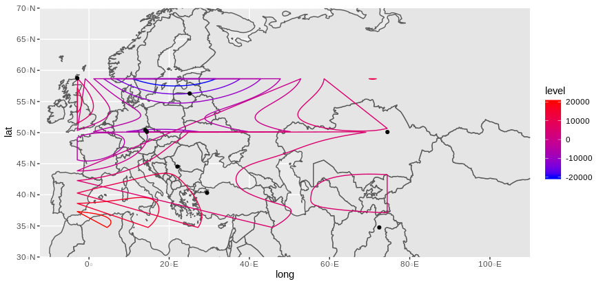
看上去像你期待的那样吗?
注意:loess模型会返回一些警告(至少在我的例子中是这样),因为观测量太少,无法建立可靠的模型。所以,你必须用你的真实和更完整的数据来看,如果它是有效的。
注意:另一种解决方案是使用stat_density_2d,但不能使用三维值。
可复制示例
structure(list(lat = c(56.28, 40.31992, 50.41027, 50.12175, 58.74,
44.53, 50.09, 34.75146), long = c(25.13, 29.45311, 14.0746, 14.45695,
-2.916, 22.05, 74.44, 72.40194), date_BP = c(7429.833, 8048.077,
4200, 4484.6, 4913.444, 8200.333, 3707.125, 2834.625)), row.names = c(NA,
-8L), class = c("data.table", "data.frame"), .internal.selfref = <pointer: (nil)>)Stack Overflow用户
发布于 2020-03-05 11:04:31
我想感谢dc37的帮助!
我使用了stat_density2d,但是我得到了一些奇怪的结果。
这是第一种方法:
world <- map_data("world")
plot <- ggplot()
plot <- ggplot(data=datgeo, aes(long,lat,fill=date_BP)) +
  stat_density2d(aes(fill=..level..,alpha=..level..),geom='polygon',
                 colour='black') +
  scale_fill_continuous(low="green",high="red") + guides(alpha="none")
plot <- plot + geom_map(dat=world, map = world, aes(map_id=region),
                        fill="NA", color="black", inherit.aes = F)
plot <- plot + theme(panel.grid=element_blank(),
                     panel.border=element_blank())
plot <- plot + coord_sf(xlim = c(-12.3, 110), ylim = c(70, 30), expand = FALSE)
windows()
plot
我得到的地块是:
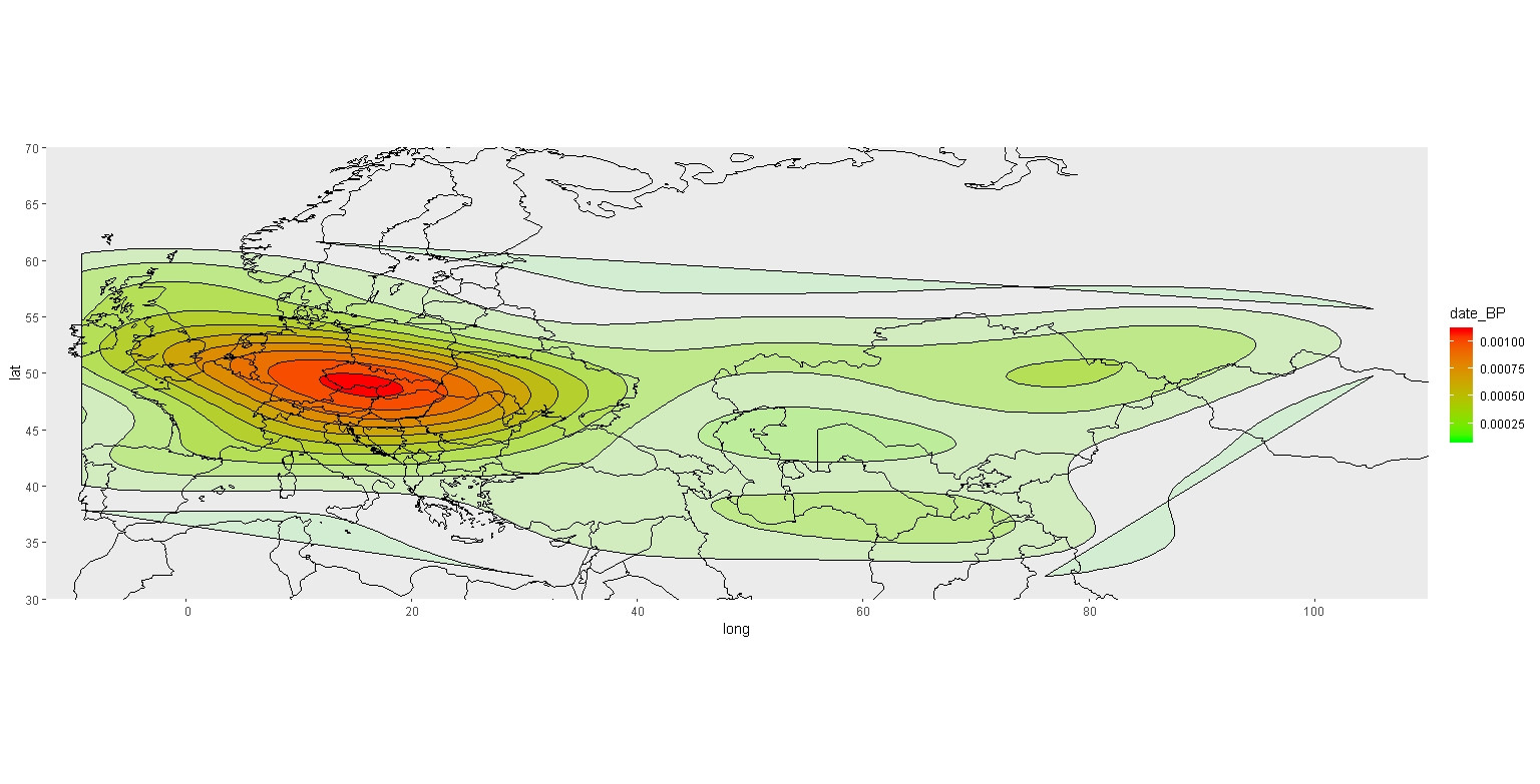
我不明白这个传说的规模,因为我的数据最大值是45020,最小值是736。我不知道怎么改变这个。
现在,如果我想添加geom_point(),事情会变得很奇怪:
world <- map_data("world")
plot <- ggplot()
plot <- ggplot(data=datgeo, aes(long,lat,fill=date_BP)) +
  stat_density2d(aes(fill=..level..,alpha=..level..),geom='polygon',
                 colour='black') +
  scale_fill_continuous(low="green",high="red") + guides(alpha="none")
plot <- plot + geom_map(dat=world, map = world, aes(map_id=region),
                        fill="NA", color="black", inherit.aes = F)
plot <- plot + theme(panel.grid=element_blank(),
                     panel.border=element_blank())
plot <- plot + coord_sf(xlim = c(-12.3, 110), ylim = c(70, 30), expand = FALSE)
plot <- plot + geom_point(data = datgeo, aes(x = long, y = lat))
windows()
plot
我得到了这张地图
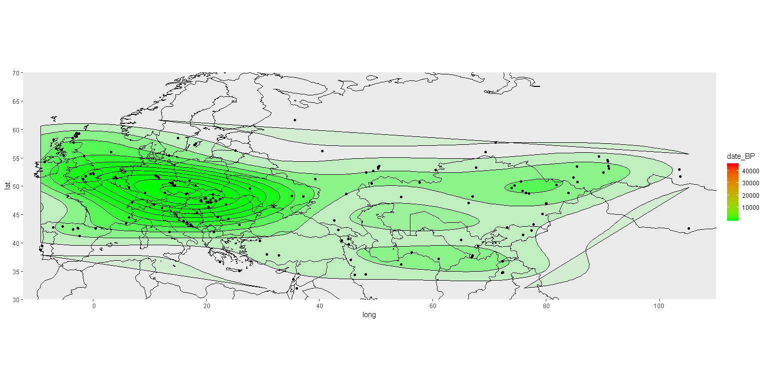
你可以看到,现在我有了点,等压线的颜色发生了变化,图例的比例也是正确的。我不明白为什么地图会这样变化,只是为了增加点。
你知道发生了什么事吗?哪一张是正确的地图?
https://stackoverflow.com/questions/60529319
复制相似问题
腾讯云开发者

Copyright © 2013 - 2026 Tencent Cloud. All Rights Reserved. 腾讯云 版权所有
深圳市腾讯计算机系统有限公司 ICP备案/许可证号:粤B2-20090059 ![]() 粤公网安备44030502008569号
粤公网安备44030502008569号
腾讯云计算(北京)有限责任公司 京ICP证150476号 | 京ICP备11018762号