
在R中创建“经济学家”风格的情节?
在R中创建“经济学家”风格的情节?
提问于 2020-04-12 09:55:21
这个问题有两个部分,一个是一般性的,另一个是具体的情况:
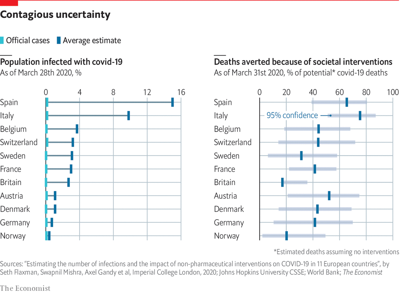
- 在R中是否有一个主题或模板来制作类似于“经济学人”杂志上的图表的情节?其他上下文中的示例包括:用于python的从python创建“经济学人”风格的图表和用于Stata的
set scheme economist。 - 具体来说,如何使用语法(例如,在
ggplot2中)来生成类似于下面示例的组条图、带有粗体线条的彩色标记(左面板)或矩形置信区间(右面板)?
回答 1
Stack Overflow用户
回答已采纳
发布于 2020-04-12 09:58:30
是的,您在ggthemes (ggplot2的扩展)中有theme_economist和theme_economist_white。
对于条形图,您需要使用geom_bar和coord_flip (这里)。
ggthemes (这里)中的示例
library("ggplot2")
library("ggthemes")
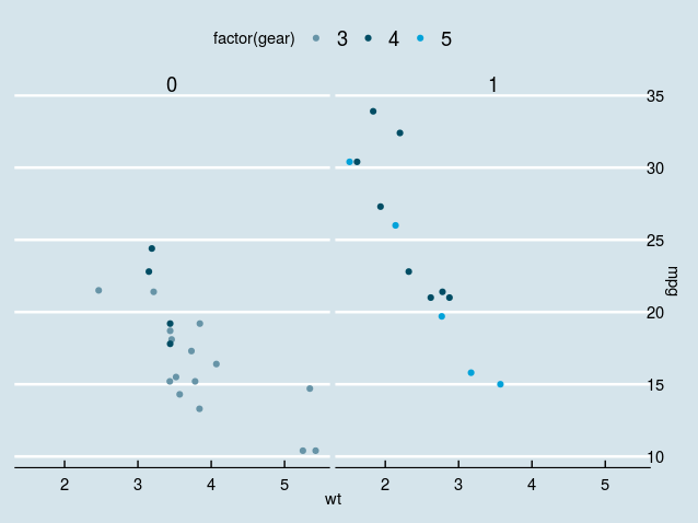
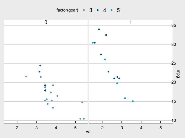
p <- ggplot(mtcars) +
geom_point(aes(x = wt, y = mpg, colour = factor(gear))) +
facet_wrap(~am) +
# Economist puts x-axis labels on the right-hand side
scale_y_continuous(position = "right")
## Standard
p + theme_economist() +
scale_colour_economist()
## White
p + theme_economist_white() +
  scale_colour_economist()
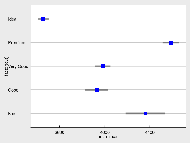
如何再现给出的情节
由于我无法在我的计算机中安装SciencesPo包,所以我建议您使用ggplot + ggthemes方法。
一个很好的起点可能是以下方法。我以diamond数据集为例。
library(dplyr)
library(ggplot2)
library(ggthemes)

df <- diamonds %>%
  group_by(cut) %>%
  summarise(mean = mean(price), sigma = sd(price),
            n = n())
df <- df %>%
  mutate(int_minus = mean - 1.96*sigma/sqrt(n),
         int_plus = mean + 1.96*sigma/sqrt(n))
然后是情节
ggplot(df) +
  geom_segment(aes(x = int_minus, xend = int_plus, y = factor(cut), yend = factor(cut)), size = 2L, alpha = 0.4) +
  geom_point(aes(x = mean, y = factor(cut)), shape = 15, color = "blue", size = 4L) +
  theme_economist_white()
页面原文内容由Stack Overflow提供。腾讯云小微IT领域专用引擎提供翻译支持
原文链接:
https://stackoverflow.com/questions/61169609
复制相关文章
相似问题
腾讯云开发者

Copyright © 2013 - 2026 Tencent Cloud. All Rights Reserved. 腾讯云 版权所有
深圳市腾讯计算机系统有限公司 ICP备案/许可证号:粤B2-20090059 ![]() 粤公网安备44030502008569号
粤公网安备44030502008569号
腾讯云计算(北京)有限责任公司 京ICP证150476号 | 京ICP备11018762号