
用名称替换xticks
用名称替换xticks
提问于 2020-04-20 18:46:11
我正在处理来自Kaggle的Spotify数据集。我绘制了一个条形图,展示了最顶尖的艺术家们,其中大多数歌曲都在数据仓库里。但是,X轴显示的是数字,我想显示艺术家的名字,。
names = list(df1['artist'][0:19])

plt.figure(figsize=(8,4))
plt.xlabel("Artists")

sns.barplot(x=np.arange(1,20),
                y=df1['song_title'][0:19]);
我尝试了list和Series对象类型,但都出现了错误。
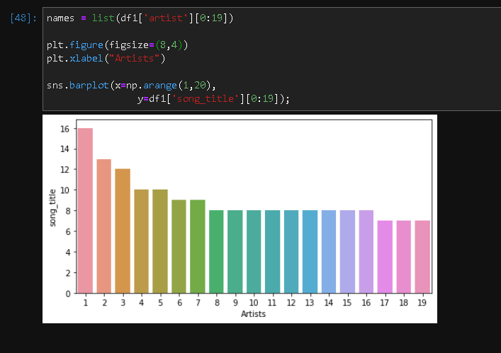
如何将xticks中的数字替换为名称?
回答 2
Stack Overflow用户
回答已采纳
发布于 2020-04-20 19:15:27
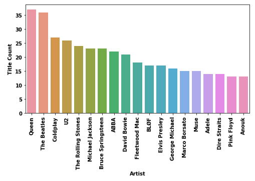
导入
import pandas as pd
import matplotlib.pyplot as plt
import seaborn as sns
数据
df = pd.read_csv('Spotify-2000.csv')
titles = pd.DataFrame(df.groupby(['Artist'])['Title'].count()).reset_index().sort_values(['Title'], ascending=False).reset_index(drop=True)
titles.rename(columns={'Title': 'Title Count'}, inplace=True)

# titles.head()

             Artist  Title Count
              Queen           37
        The Beatles           36
           Coldplay           27
                 U2           26
 The Rolling Stones           24
绘图
plt.figure(figsize=(8, 4))
chart = sns.barplot(x=titles.Artist[0:19], y=titles['Title Count'][0:19])
chart.set_xticklabels(chart.get_xticklabels(), rotation=90)
plt.show()
Stack Overflow用户
发布于 2020-04-21 02:49:27
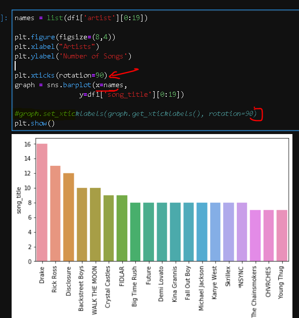
好的,所以我不知道这一点,虽然现在似乎愚蠢的不这样做,在事后!
- 在X轴的参数中传递名称(或字符串标签).
- 使用plt.xticks(rotate=90),这样标签就不会重叠
页面原文内容由Stack Overflow提供。腾讯云小微IT领域专用引擎提供翻译支持
原文链接:
https://stackoverflow.com/questions/61329779
复制相关文章
相似问题
腾讯云开发者

Copyright © 2013 - 2026 Tencent Cloud. All Rights Reserved. 腾讯云 版权所有
深圳市腾讯计算机系统有限公司 ICP备案/许可证号:粤B2-20090059 ![]() 粤公网安备44030502008569号
粤公网安备44030502008569号
腾讯云计算(北京)有限责任公司 京ICP证150476号 | 京ICP备11018762号