
带有粘性元素和媒体查询的布局问题
带有粘性元素和媒体查询的布局问题
提问于 2020-04-21 16:06:00
首先,我为我糟糕的标题感到抱歉,如果你想要一个更好的标题,请重新命名这个问题。
我想要显示,适应我的网页布局的移动。目前的桌面版本是:
我想做这样的事情:
文本是粘性的,并通过JS调整自己,同时滚动通过每一步。因此,我有一个.text-container元素,它的特定高度与绘图的整个高度相匹配。我的.text元素是sticky元素。
所以我的HTML看起来是:
<article>
<div class="figure">
<div class="step" id="step-1"></div>
<div class="step" id="step-2"></div>
<div class="step" id="step-2-5"></div>
<div class="step" id="step-3"></div>
<div class="step" id="step-4"></div>
</div>
<div class="text-container">
<div class="text">
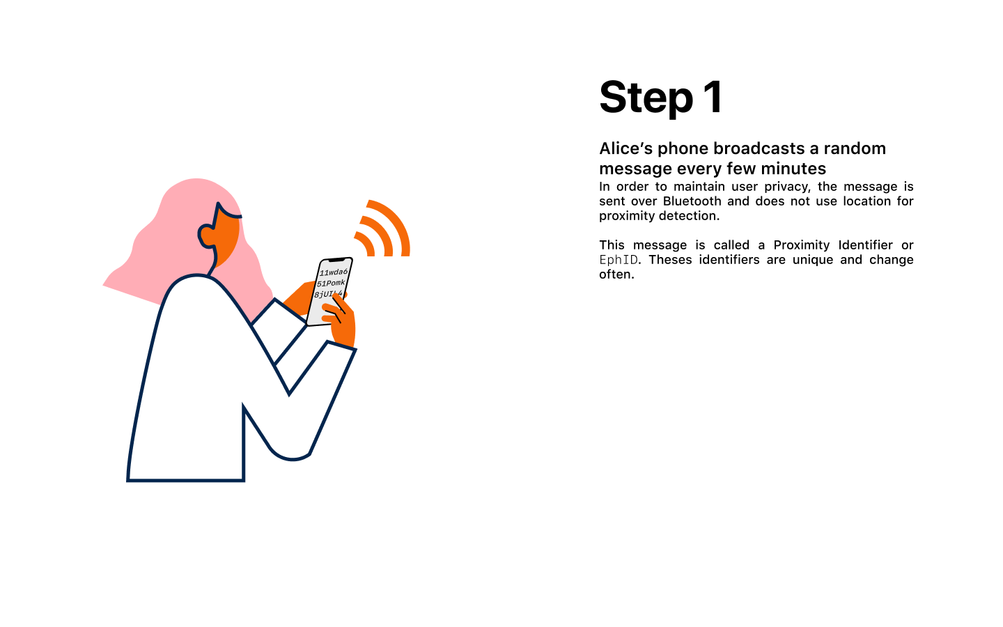
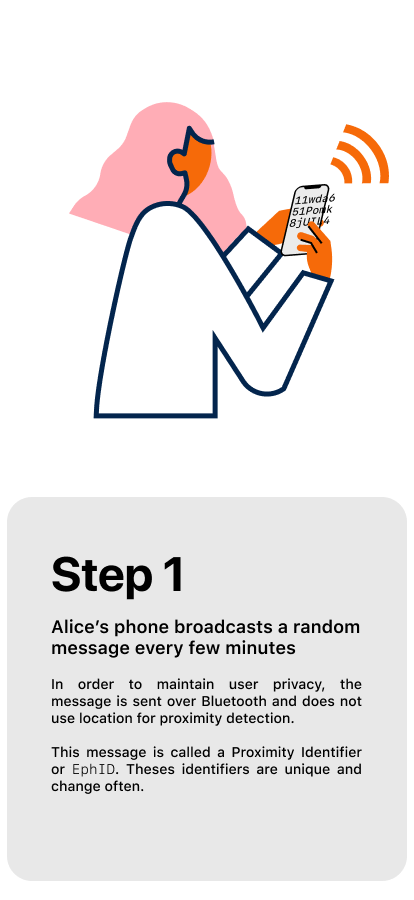
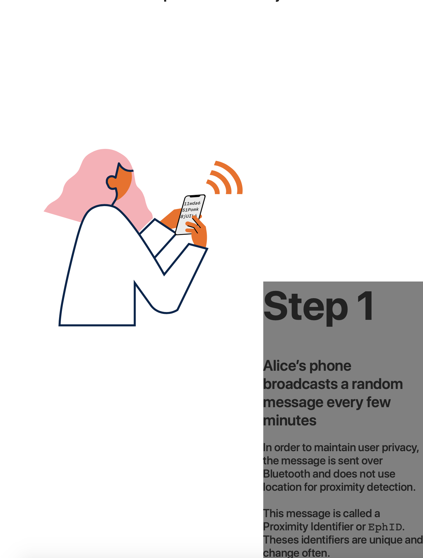
<h1>
Step <span>1</span>
</h1>
<div class="bold">Alice’s phone broadcasts a random message every few minutes</div>
<p>
In order to maintain user privacy, the message is sent over Bluetooth and does not use location for proximity detection.
<br>
This message is called a Proximity Identifier or EphID. Theses identifiers are unique and change often.
</p>
</div>
</div>
</article>下面是我应用的CSS来调整布局(这里的代码在SCSS中):
@media (max-width: 960px) {
    article {
        .text-container {
            .text {
                top: 50vh;
                left: 0;
                width: 100vw;
                height: 50vh;
                background: grey;
            }
        }
    }
}
不幸的是,我明白了:
.text元素的宽度和位置似乎有问题。
按照注释中的要求,这里是一个CodePen,没有图像,但它的工作方式相同)
回答 1
Stack Overflow用户
回答已采纳
发布于 2020-04-21 18:19:09
好吧,我刚刚意识到我的问题有点蠢。我有一个max-width属性,它破坏了布局。
我在发布我修改的代码,以防万一有人和我有同样的问题:
@media (max-width: 960px) {
    article {
        .text-container {
            position: absolute;
            top: 100vh;
            left: 0;
            .text {
                position: -webkit-sticky;
                position: sticky;
                top: 50vh;
                left: 0;
                width: 100vw;
                max-width: 100vw;
                height: 50vh;
                background: grey;
            }
        }
    }
}页面原文内容由Stack Overflow提供。腾讯云小微IT领域专用引擎提供翻译支持
原文链接:
https://stackoverflow.com/questions/61347907
复制相关文章
相似问题
腾讯云开发者

Copyright © 2013 - 2026 Tencent Cloud. All Rights Reserved. 腾讯云 版权所有
深圳市腾讯计算机系统有限公司 ICP备案/许可证号:粤B2-20090059  粤公网安备44030502008569号
腾讯云计算(北京)有限责任公司 京ICP证150476号 | 京ICP备11018762号