
用组名和它们的等式标记ggplot,可能是用ggpmisc标记?
用组名和它们的等式标记ggplot,可能是用ggpmisc标记?
提问于 2020-04-22 04:34:41
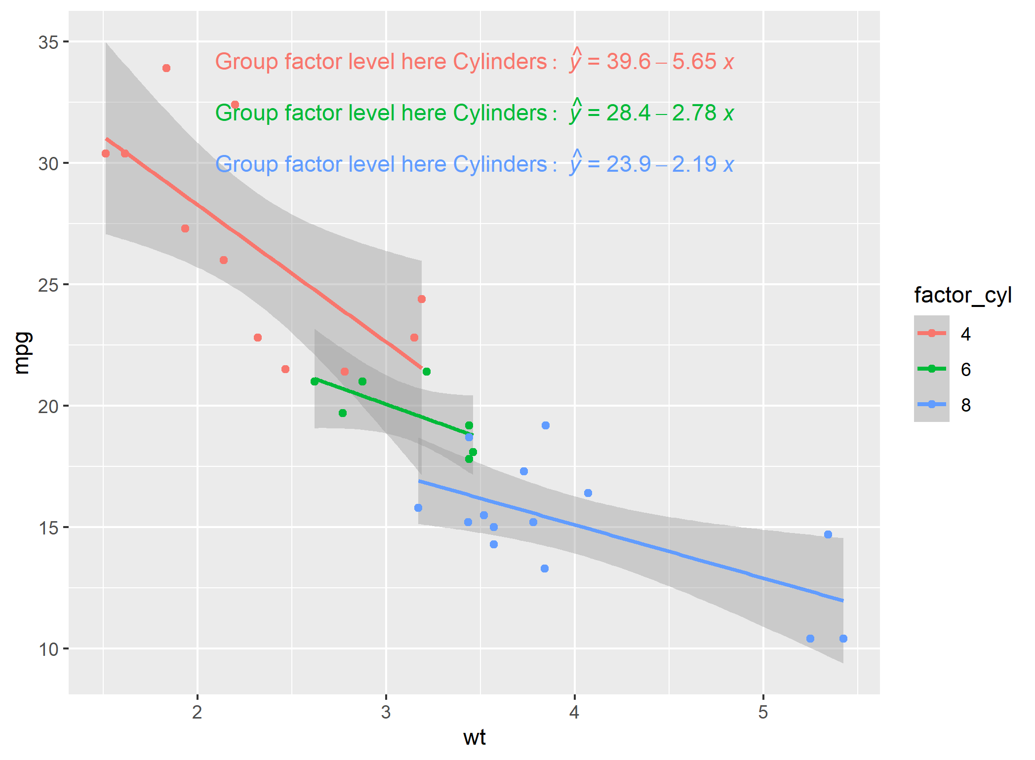
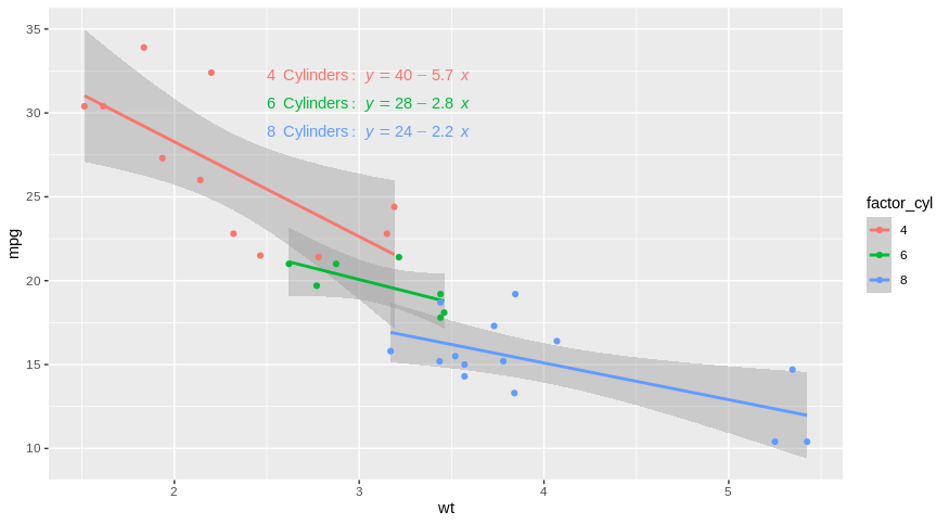
我想给我的情节贴上标签,可能使用ggpmisc的等式方法给出一个信息标签,链接到颜色和等式(然后我可以完全删除这个图例)。例如,在下面的图中,我的理想情况是在LHS方程中有4,6和8的因子水平。
library(tidyverse)
library(ggpmisc)

df_mtcars <- mtcars %>% mutate(factor_cyl = as.factor(cyl))

p <- ggplot(df_mtcars, aes(x = wt, y = mpg, group = factor_cyl, colour= factor_cyl))+
  geom_smooth(method="lm")+
  geom_point()+
  stat_poly_eq(formula = my_formula,
               label.x = "centre",
               #eq.with.lhs = paste0(expression(y), "~`=`~"),
               eq.with.lhs = paste0("Group~factor~level~here", "~Cylinders:", "~italic(hat(y))~`=`~"),
               aes(label = paste(..eq.label.., sep = "~~~")),
               parse = TRUE)
p
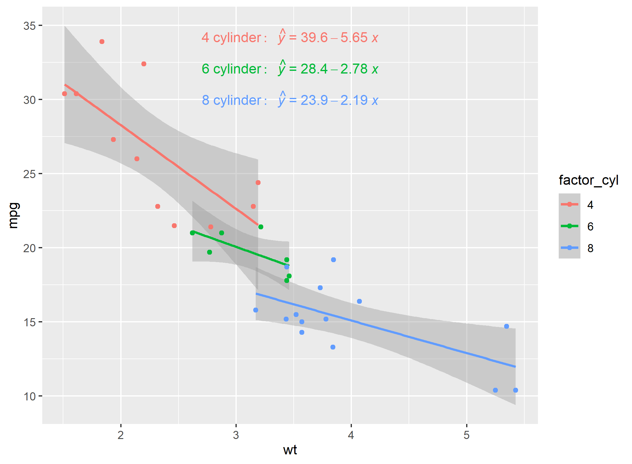
在使用描述的here技术修改绘图之后,有一个解决办法,但是肯定有更简单的方法吗?
p <- ggplot(df_mtcars, aes(x = wt, y = mpg, group = factor_cyl, colour= factor_cyl))+
  geom_smooth(method="lm")+
  geom_point()+
  stat_poly_eq(formula = my_formula,
               label.x = "centre",
               eq.with.lhs = paste0(expression(y), "~`=`~"),
               #eq.with.lhs = paste0("Group~factor~level~here", "~Cylinders:", "~italic(hat(y))~`=`~"),
               aes(label = paste(..eq.label.., sep = "~~~")),
               parse = TRUE)
p

# Modification of equation LHS technique from:
# https://stackoverflow.com/questions/56376072/convert-gtable-into-ggplot-in-r-ggplot2
temp <- ggplot_build(p)
temp$data[[3]]$label <- temp$data[[3]]$label %>%
  fct_relabel(~ str_replace(.x, "y", paste0(c("8","6","4"),"~cylinder:", "~~italic(hat(y))" )))
class(temp)

#convert back to ggplot object
#https://stackoverflow.com/questions/56376072/convert-gtable-into-ggplot-in-r-ggplot2
#install.packages("ggplotify")
library("ggplotify")
q <- as.ggplot(ggplot_gtable(temp))
class(q)
q
回答 3
Stack Overflow用户
回答已采纳
发布于 2020-04-22 12:07:45
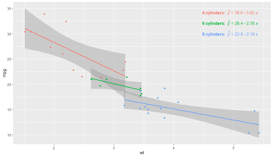
第一个例子将标签放在等式的右边,部分是手动的。另一方面,编写代码非常简单。之所以这样做,是因为group总是出现在data中,从层函数(统计数据和地理信息)可以看出这一点。
library(tidyverse)
library(ggpmisc)

df_mtcars <- mtcars %>% mutate(factor_cyl = as.factor(cyl))

my_formula <- y ~ x

p <- ggplot(df_mtcars, aes(x = wt, y = mpg, group = factor_cyl, colour = factor_cyl)) +
  geom_smooth(method="lm")+
  geom_point()+
  stat_poly_eq(formula = my_formula,
               label.x = "centre",
               eq.with.lhs = "italic(hat(y))~`=`~",
               aes(label = paste(stat(eq.label), "*\", \"*",
                                 c("4", "6", "8")[stat(group)],
                                 "~cylinders.",  sep = "")),
               label.x.npc = "right",
               parse = TRUE) +
  scale_colour_discrete(guide = FALSE)
p
事实上,只要再加一点杂耍,你就可以得到这个问题的几乎一个答案。我们需要通过在aes()中显式粘贴lhs来添加lhs,这样我们也可以根据计算变量向左添加粘贴文本。
library(tidyverse)
library(ggpmisc)

df_mtcars <- mtcars %>% mutate(factor_cyl = as.factor(cyl))

my_formula <- y ~ x

p <- ggplot(df_mtcars, aes(x = wt, y = mpg, group = factor_cyl, colour = factor_cyl)) +
  geom_smooth(method="lm")+
  geom_point()+
  stat_poly_eq(formula = my_formula,
               label.x = "centre",
               eq.with.lhs = "",
               aes(label = paste("bold(\"", c("4", "6", "8")[stat(group)],
                                 " cylinders:  \")*",
                                 "italic(hat(y))~`=`~",
                                 stat(eq.label),
                                 sep = "")),
               label.x.npc = "right",
               parse = TRUE) +
  scale_colour_discrete(guide = FALSE)
p
Stack Overflow用户
发布于 2020-04-22 06:22:03
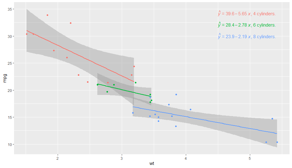
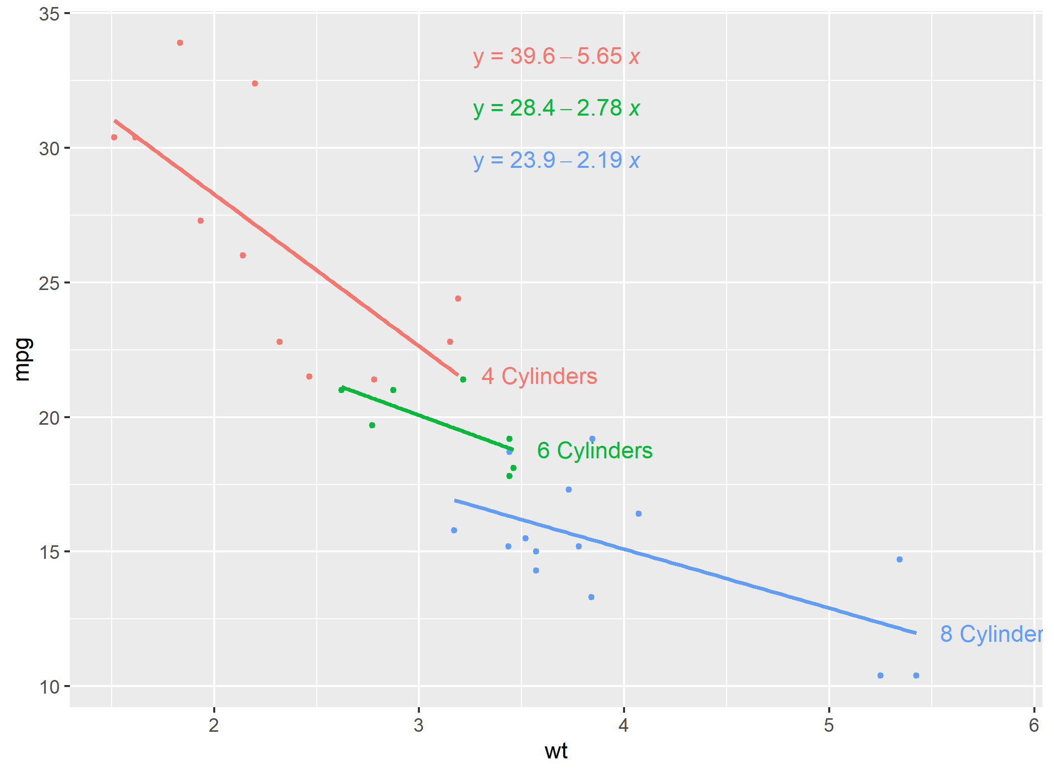
如果您可以将您的方程添加为geom_text的手动解决方案呢?
优点:高度定制/ Cons:需要根据您的等式手动编辑
在这里,使用您的示例和线性回归:
library(tidyverse)

df_label <- df_mtcars %>% group_by(factor_cyl) %>%
  summarise(Inter = lm(mpg~wt)$coefficients[1],
            Coeff = lm(mpg~wt)$coefficients[2]) %>% ungroup() %>%
  mutate(ypos = max(df_mtcars$mpg)*(1-0.05*row_number())) %>%
  mutate(Label2 = paste(factor_cyl,"~Cylinders:~", "italic(y)==",round(Inter,2),ifelse(Coeff <0,"-","+"),round(abs(Coeff),2),"~italic(x)",sep =""))

# A tibble: 3 x 5
  factor_cyl Inter Coeff  ypos Label2
  <fct>      <dbl> <dbl> <dbl> <chr>
1 4           39.6 -5.65  32.2 4~Cylinders:~italic(y)==39.57-5.65~italic(x)
2 6           28.4 -2.78  30.5 6~Cylinders:~italic(y)==28.41-2.78~italic(x)
3 8 23.9 -2.19 28.8 8~Cylinders:~italic(y)==23.87-2.19~italic(x)现在,您可以在ggplot2中传递它。
ggplot(df_mtcars,aes(x = wt, y = mpg, group = factor_cyl, colour= factor_cyl))+
  geom_smooth(method="lm")+
  geom_point()+
  geom_text(data = df_label,
            aes(x = 2.5, y = ypos,
                label = Label2, color = factor_cyl),
            hjust = 0, show.legend = FALSE, parse = TRUE)
Stack Overflow用户
发布于 2020-04-22 11:08:55
用等式标记的另一种方法是用合适的线进行标记。下面是一种从一个相关问题here的答案中改编的方法
#example of loess for multiple models
#https://stackoverflow.com/a/55127487/4927395
library(tidyverse)
library(ggpmisc)

df_mtcars <- mtcars %>% mutate(cyl = as.factor(cyl))

models <- df_mtcars %>%
  tidyr::nest(-cyl) %>%
  dplyr::mutate(
    # Perform loess calculation on each CpG group
    m = purrr::map(data, lm,
                   formula = mpg ~ wt),
    # Retrieve the fitted values from each model
    fitted = purrr::map(m, `[[`, "fitted.values")
  )

# Apply fitted y's as a new column
results <- models %>%
  dplyr::select(-m) %>%
  tidyr::unnest()

#find final x values for each group
my_last_points <- results %>% group_by(cyl) %>% summarise(wt = max(wt, na.rm=TRUE))

#Join dataframe of predictions to group labels
my_last_points$pred_y <- left_join(my_last_points, results)

# Plot with loess line for each group
ggplot(results, aes(x = wt, y = mpg, group = cyl, colour = cyl)) +
  geom_point(size=1) +
  geom_smooth(method="lm",se=FALSE)+
  geom_text(data = my_last_points, aes(x=wt+0.4, y=pred_y$fitted, label = paste0(cyl," Cylinders")))+
  theme(legend.position = "none")+
  stat_poly_eq(formula = "y~x",
             label.x = "centre",
             eq.with.lhs = paste0(expression(y), "~`=`~"),
             aes(label = paste(..eq.label.., sep = "~~~")),
             parse = TRUE)
页面原文内容由Stack Overflow提供。腾讯云小微IT领域专用引擎提供翻译支持
原文链接:
https://stackoverflow.com/questions/61357383
复制相关文章
相似问题
腾讯云开发者

Copyright © 2013 - 2026 Tencent Cloud. All Rights Reserved. 腾讯云 版权所有
深圳市腾讯计算机系统有限公司 ICP备案/许可证号:粤B2-20090059 ![]() 粤公网安备44030502008569号
粤公网安备44030502008569号
腾讯云计算(北京)有限责任公司 京ICP证150476号 | 京ICP备11018762号