
在同一地块上按3 DataFrame虚线后绘制
在同一地块上按3 DataFrame虚线后绘制
提问于 2020-04-28 15:02:17
我有三个不同的DataFrame(A,B和C),它们都有相同的列名,我想把它们画在同一个图上。
DataFrame之一的示例
A
    cbk_year    mean           units    representative
1   1       1.8041611624834875  6084    True
2   2       1.7408852714906902  8969    True
3   3       1.5521109207041595  7419    True
4   4       1.5265214963707425  9373    True
5   5       1.5133333333333334  6650    True
6   6       1.5703619909502262  4420    False
7   7       1.5744843391902215  3927    False
...
...
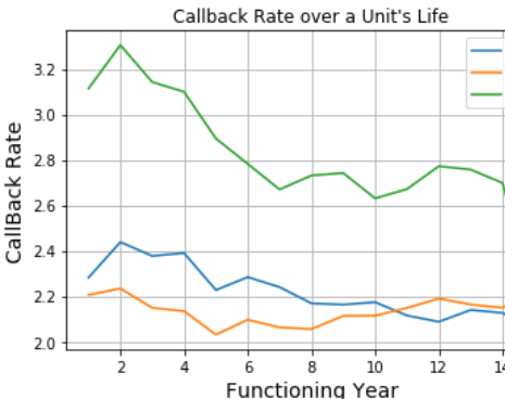
假设上面的数据用橙色线表示,其中'cbk_year‘代表x轴,’Me均‘用y轴表示。
如果“代表”是假的,我希望把情节描绘成虚线。例如,橙色线应该是(第1-5年连续)和(6-7虚线)。
回答 1
Stack Overflow用户
回答已采纳
发布于 2020-04-28 15:21:44
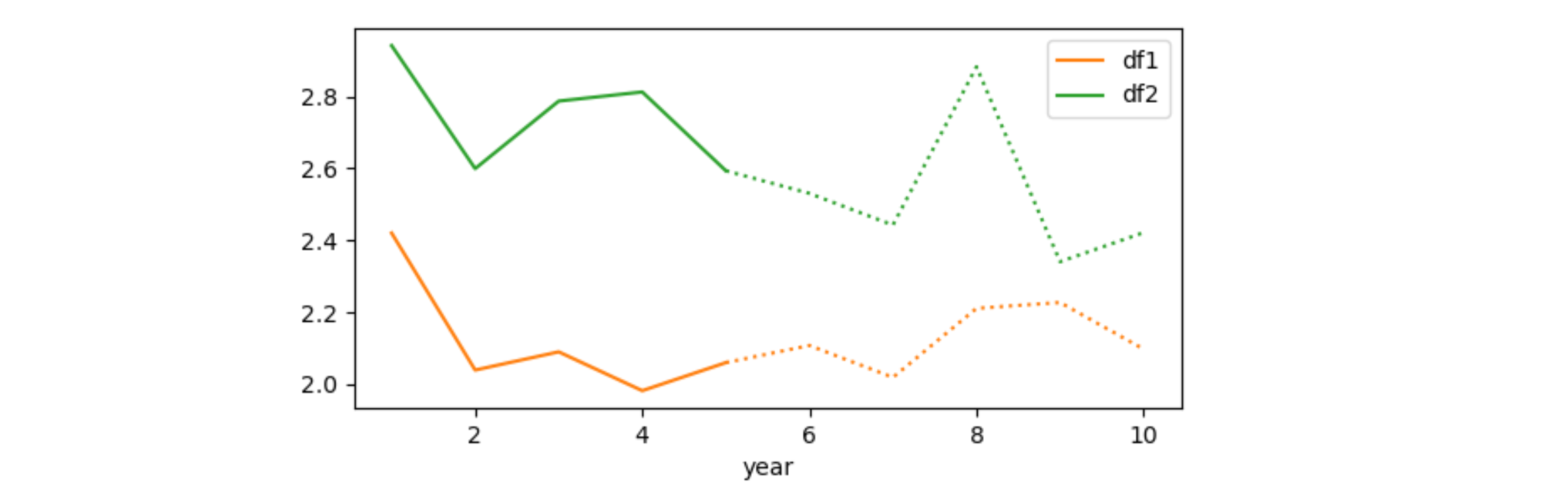
若要在同一绘图上绘制所有内容,应将相同的ax分配给所有人。要只绘制数据文件的一部分,可以像在df1[df1['year'] <= 5]中那样对其进行切片。可以设置不同的线条。请注意,“<=”和“>=”用于不间断地绘制线条。
以下划线开头的图例条目将在图例中被禁止(以防您不想使用它们两次)。但是您也可以提供一个不同的标签(类似于label='estimated')。
from matplotlib import pyplot as plt
import numpy as np
import pandas as pd

N = 10
df1 = pd.DataFrame({'year': np.arange(1, N + 1), 'rate': np.random.normal(2, 0.2, N)})
df2 = pd.DataFrame({'year': np.arange(1, N + 1), 'rate': np.random.normal(2.5, 0.2, N)})

fig, ax = plt.subplots()
df1[df1['year'] <= 5].plot('year', 'rate', color='C1', ls='-', ax=ax, label='df1')
df1[df1['year'] >= 5].plot('year', 'rate', color='C1', ls=':', ax=ax, label='_')
df2[df2['year'] <= 5].plot('year', 'rate', color='C2', ls='-', ax=ax, label='df2')
df2[df2['year'] >= 5].plot('year', 'rate', color='C2', ls=':', ax=ax, label='_')
plt.show()
页面原文内容由Stack Overflow提供。腾讯云小微IT领域专用引擎提供翻译支持
原文链接:
https://stackoverflow.com/questions/61483402
复制相关文章
相似问题
腾讯云开发者

Copyright © 2013 - 2026 Tencent Cloud. All Rights Reserved. 腾讯云 版权所有
深圳市腾讯计算机系统有限公司 ICP备案/许可证号:粤B2-20090059 ![]() 粤公网安备44030502008569号
粤公网安备44030502008569号
腾讯云计算(北京)有限责任公司 京ICP证150476号 | 京ICP备11018762号