
将html表格式化为css-grid
我有一个宽的html表,我想通过使用纯css来显示低屏幕宽度。
,这是未样式的表
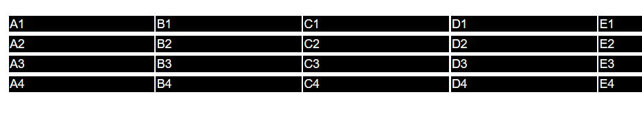
(单元格太宽,内容太多,这只是一个抽象的例子)
这是我想要的结果
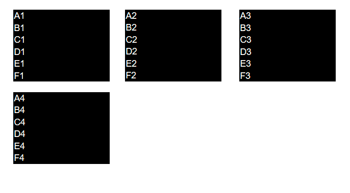
每一行都应该是块,表单元格以与html源相同的顺序堆叠在一起。然后,这些块应该被放置在一个网格中,这样就可以在屏幕宽度允许的范围内彼此相邻的块了。
极小示例
div {
  color: grey;
  border: 1px solid blue;
  width: 600px;
}

body {
  padding: 20px;
  font-family: Helvetica;
}

.box {
  background-color: black;
  color: #fff;

  padding: 10px;
  padding-right: 150px;
  font-size: 14px;
}

/*makes desired blocks*/
.wrapper td {
  display: block;
}

.wrapper td:last-child {
  margin-bottom: 10px;
}<div>
<table class="wrapper">
<tr>
<td class="box a">A1</td>
<td class="box b">B1</td>
<td class="box c">C1</td>
<td class="box d">D1</td>
<td class="box e">E1</td>
<td class="box f">F1</td>
</tr>
<tr>
<td class="box a">A2</td>
<td class="box b">B2</td>
<td class="box c">C2</td>
<td class="box d">D2</td>
<td class="box e">E2</td>
<td class="box f">F2</td>
</tr>
<tr>
<td class="box a">A3</td>
<td class="box b">B3</td>
<td class="box c">C3</td>
<td class="box d">D3</td>
<td class="box e">E3</td>
<td class="box f">F3</td>
</tr>
<tr>
<td class="box a">A4</td>
<td class="box b">B4</td>
<td class="box c">C4</td>
<td class="box d">D4</td>
<td class="box e">E4</td>
<td class="box f">F4</td>
</tr>
</table>
</div>
这确实给了我我想要的街区。但到目前为止,我未能在css网格中安排元素。
下面是我尝试过的css示例:
    .wrapper {
  display: grid;
  grid-auto-flow: row dense;
  grid-template-columns: repeat(3, 1fr);
  grid-gap: 10px;
  grid-auto-rows: minmax(300px, auto);
}这在嵌套的div上确实按预期工作(js Fiddle )。
我认为这与不允许将表格作为网格布局有关。
不过,我想避免用我的数据制作div表,因为在语义上它是一个表,而且我听说这对屏幕挑逗器之类的更好。
回答 2
Stack Overflow用户
发布于 2020-05-17 13:07:24
您可以使用flex模型,,但不要忘记,即使在HTML代码中没有,也会有 tbody:
可能的示例开始或您的网格小提琴尝试更新https://jsfiddle.net/218drc0t/:
div {
  color: grey;
  border: 1px solid blue;
  width: 600px;
}

body {
  padding: 20px;
  font-family: Helvetica;
}

.box {
  background-color: black;
  color: #fff;
  padding: 10px;
  padding-right: 150px;
  font-size: 14px;
}


/*makes desired blocks*/

.wrapper td {
  display: block;
}

.wrapper td:last-child {
  margin-bottom: 10px;
}

/* DEMO UPDATE */

tbody {
  display: flex;
  flex-wrap: wrap;
}

tr {
  margin: 5px 10px 0;
}<div>
<table class="wrapper">
<tr>
<td class="box a">A1</td>
<td class="box b">B1</td>
<td class="box c">C1</td>
<td class="box d">D1</td>
<td class="box e">E1</td>
<td class="box f">F1</td>
</tr>
<tr>
<td class="box a">A2</td>
<td class="box b">B2</td>
<td class="box c">C2</td>
<td class="box d">D2</td>
<td class="box e">E2</td>
<td class="box f">F2</td>
</tr>
<tr>
<td class="box a">A3</td>
<td class="box b">B3</td>
<td class="box c">C3</td>
<td class="box d">D3</td>
<td class="box e">E3</td>
<td class="box f">F3</td>
</tr>
<tr>
<td class="box a">A4</td>
<td class="box b">B4</td>
<td class="box c">C4</td>
<td class="box d">D4</td>
<td class="box e">E4</td>
<td class="box f">F4</td>
</tr>
</table>
</div>
Stack Overflow用户
发布于 2022-06-14 12:41:52
我认为您遇到的问题是,要使网格布局工作,网格单元格需要是网格的直接子单元。在HTML表中,单元格嵌套在表行中,这些行嵌套在表头/体/脚内。
display: contents属性可以在这里拯救您。它基本上告诉浏览器将一个元素当作它的子元素存在于它的位置。通过将其应用于表的thead、tbody、tfoot和所有tr,可以有效地使表单元格直接用于表的子表,从而使网格布局得到正确的应用:
.wrapper > thead, .wrapper > thead > tr, .wrapper > tbody, .wrapper > tbody > tr, .wrapper > tfoot, .wrapper > tfoot > tr {
  display: contents;
}https://stackoverflow.com/questions/61852090
复制相似问题
腾讯云开发者

Copyright © 2013 - 2026 Tencent Cloud. All Rights Reserved. 腾讯云 版权所有
深圳市腾讯计算机系统有限公司 ICP备案/许可证号:粤B2-20090059  粤公网安备44030502008569号
腾讯云计算(北京)有限责任公司 京ICP证150476号 | 京ICP备11018762号