
如何将多个列组合在一起并绘制条形图?
如何将多个列组合在一起并绘制条形图?
提问于 2020-06-10 10:14:37
我有一个使用splitstackshape包分割的数据框架。拆分后,我无法继续对多列进行分组并绘制条形图。代码如下,
library(tidyverse)
library(splitstackshape)
df <- data.frame(countries=(c("England","Australia,Pakistan", "India,England","Denmark", "",
                             "Australia, Pakistan, New Zealand, England", "United States, England,Pakistan")))
data_split <- splitstackshape::cSplit(df, "countries", ",")
data_split
输出如下,
countries_1       countries_2 countries_3     countries_4
1:       England        <NA>        <NA>        <NA>
2:     Australia    Pakistan        <NA>        <NA>
3:         India     England        <NA>        <NA>
4:       Denmark        <NA>        <NA>        <NA>
5:          <NA>        <NA>        <NA>        <NA>
6:     Australia    Pakistan New Zealand     England
7: United States England Pakistan <NA>有了上述输出,我希望绘制一个条形图,其中包含各国的频率降序。示例输出如下,按下降顺序显示国家频率的条形图
回答 1
Stack Overflow用户
回答已采纳
发布于 2020-06-10 10:20:16
如下所示:
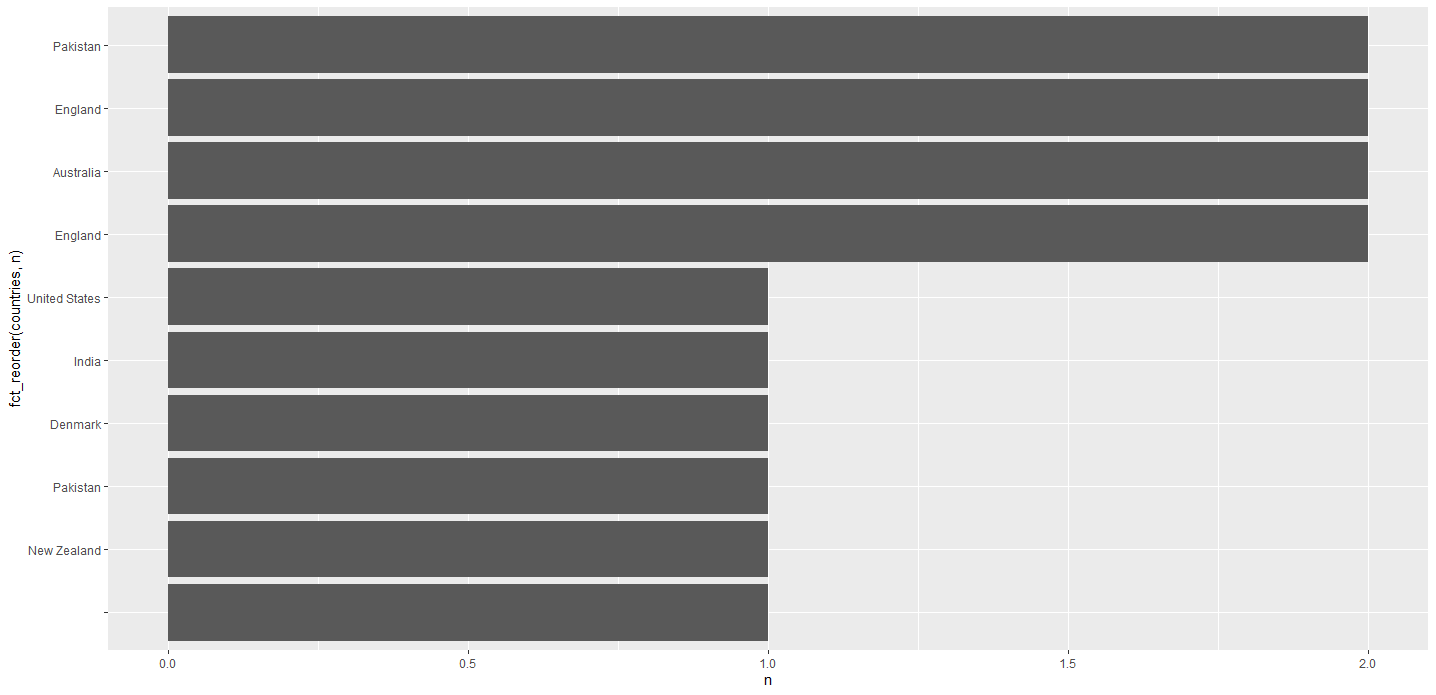
library(tidyverse)
library(ggplot2)

df %>%
  separate_rows(countries, sep = ",") %>%
  count(countries) %>%
  ggplot(aes(y = fct_reorder(countries, n), x = n)) +
  geom_col()
根据评论编辑:只列出10个最常见的国家:
df %>%
  separate_rows(countries, sep = ",") %>%
  count(countries) %>%
  slice_max(n, n = 10) %>%
  ggplot(aes(y = fct_reorder(countries, n), x = n)) +
geom_col()页面原文内容由Stack Overflow提供。腾讯云小微IT领域专用引擎提供翻译支持
原文链接:
https://stackoverflow.com/questions/62301074
复制相关文章
相似问题
腾讯云开发者

Copyright © 2013 - 2026 Tencent Cloud. All Rights Reserved. 腾讯云 版权所有
深圳市腾讯计算机系统有限公司 ICP备案/许可证号:粤B2-20090059 ![]() 粤公网安备44030502008569号
粤公网安备44030502008569号
腾讯云计算(北京)有限责任公司 京ICP证150476号 | 京ICP备11018762号