
如何创建包含两个因素的堆叠桶形图,这两个因素都决定了填充量?
如何创建包含两个因素的堆叠桶形图,这两个因素都决定了填充量?
提问于 2020-06-25 15:13:59
这是我正在处理的数据。
structure(list(NewRegion = c("Northeastern Atlantic", "Northeastern Atlantic",
"Northeastern Atlantic", "Northeastern Atlantic", "Northeastern Atlantic",
"Northeastern Atlantic", "Northeastern Atlantic", "Northeastern Atlantic",
"Northeastern Atlantic", "Northeastern Atlantic", "Northeastern Atlantic",
"Northeastern Atlantic"), New_categories = c("Behaviour", "Behaviour",
"Environmental conditions", "Environmental conditions", "Habitat use",
"Habitat use", "Interaction", "Invasive species", "Management",
"Management", "Movement", "Movement"), New_Water = c("Fresh",
"Marine", "Fresh", "Marine", "Fresh", "Marine", "Fresh", "Fresh",
"Fresh", "Marine", "Fresh", "Marine"), count = c(12L, 17L, 10L,
7L, 5L, 11L, 1L, 12L, 5L, 11L, 18L, 24L)), row.names = c(NA,
12L), class = "data.frame")
这是我目前的情节代码。
ggplot(EAtl, aes(x = New_categories, y = count, fill = New_categories, color = New_Water)) +
  geom_bar(position = 'stack', stat = 'identity', color = 'black')+ scale_fill_manual(values = colforplots)+
  scale_y_continuous(expand = c(0.01,0.01))+
  theme(panel.background = element_rect(fill = 'transparent', colour = NA),
        plot.background = element_rect(fill = 'transparent', colour = NA),
        panel.grid.minor = element_line(color = 'black'),
        panel.grid.major = element_line(color = 'black'),
        legend.position = 'none', axis.title.x = element_blank(),
        axis.text.x = element_blank(), axis.ticks.x = element_blank(),
        axis.text.y = element_text(size = 19, face = 'bold'), axis.title.y = element_blank())
这个条形图显示了东北大西洋地区每一个类别的数量。我添加了一个颜色参数来表示New_Water类别。但是,这不会改变任何颜色,只会增加一条将每个条形分割成两条的线条。我想保持配色方案,但有一个部分的每条(如淡水)有纹理(即斜线)通过它。
我发现了一些关于类似主题的旧讨论,但没有具体的答案/更新。
回答 1
Stack Overflow用户
回答已采纳
发布于 2020-06-25 15:50:48
这里有几件事值得注意,可以帮助你解决问题:
- 您将
color=美学设置为ggplot(),然后通过设置color="black"在geom_bar()中覆盖它。如果您删除color='black',您现在将拥有基于"New_Water“的彩色框和图例。这仍然帮不了你太多,因为它很难区分,但这是问题的一部分。 - 在
ggplot中不直接支持模式填充。你可以查看一个新的包裹调用了ggpattern,但是我无法在我的R版本上安装。看来geom_col_patterned()可能会帮到你。 - 一个可以不使用
ggpattern的简单解决方案是使用alpha=美学来改变基于"New_Water“的整体颜色强度。这在这里特别有用,因为你只有两个标签:淡水和海水。我将向您展示下面的实现。
用alpha美学模拟两种“模式”的解决方案
要设置alpha=美学,只需在代码的ggplot()行中将color=更改为alpha=即可。alpha的默认变体看起来不太好;但是,我不得不做一些更改,这样才能得到好的结果:
- 删除
theme(legend.position="none"<-我现在想看看传说 - 将网格线的颜色设置为较浅的灰色,这样它就不会与透明条产生太大的对比度。
- 使用
scale_alpha_manual()为两个标签选择一些合理的值。
下面是代码:
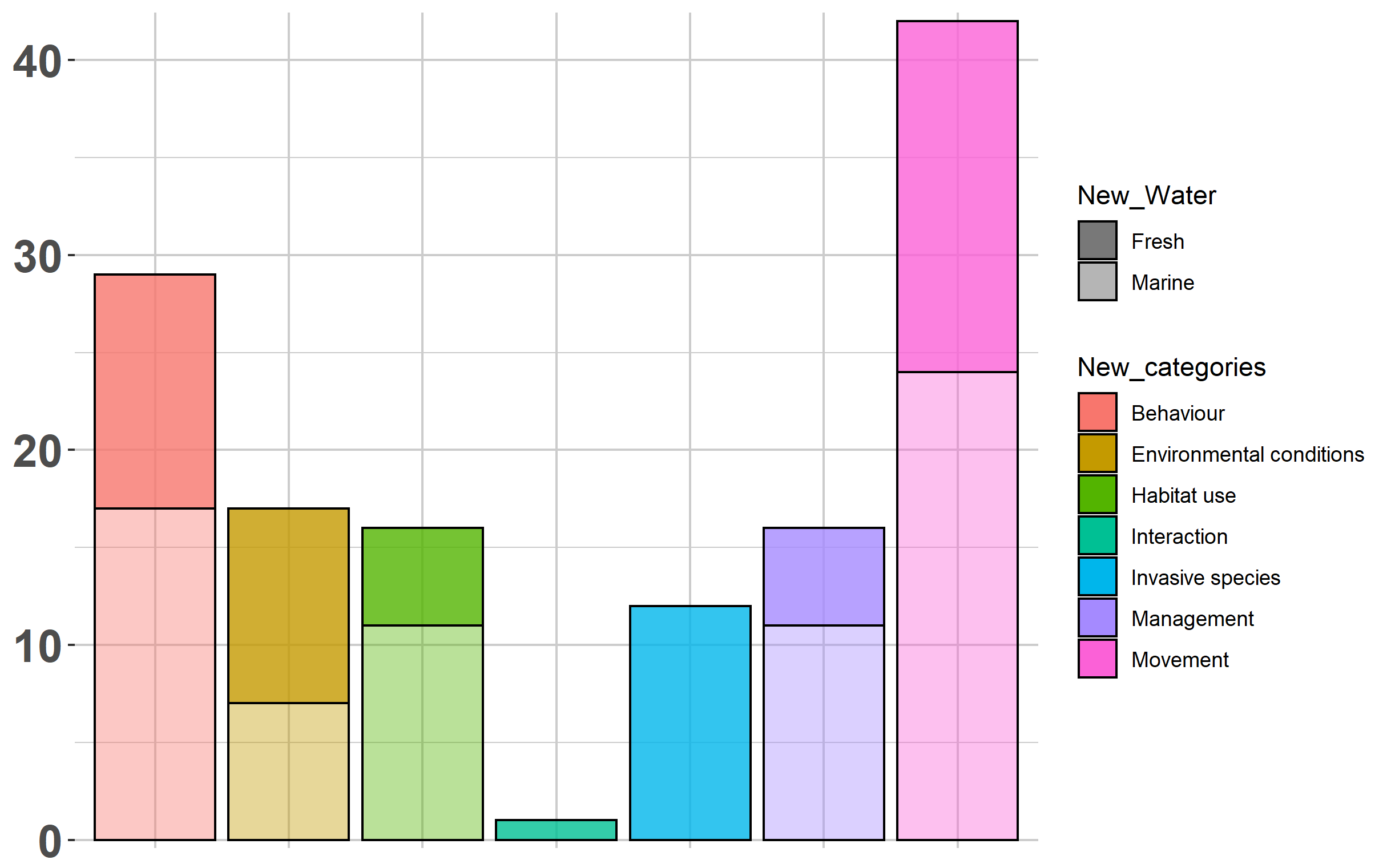
ggplot(EAtl, aes(x = New_categories, y = count, fill = New_categories, alpha = New_Water)) +
      geom_bar(position = 'stack', stat = 'identity', color = 'black')+
      scale_alpha_manual(values=c(0.8,0.4)) +
      scale_y_continuous(expand = c(0.01,0.01))+
      theme(panel.background = element_rect(fill = 'transparent', colour = NA),
            plot.background = element_rect(fill = 'transparent', colour = NA),
            panel.grid.minor = element_line(color = 'gray80'),
            panel.grid.major = element_line(color = 'gray80'),
            axis.title.x = element_blank(),
            axis.text.x = element_blank(), axis.ticks.x = element_blank(),
            axis.text.y = element_text(size = 19, face = 'bold'), axis.title.y = element_blank())
页面原文内容由Stack Overflow提供。腾讯云小微IT领域专用引擎提供翻译支持
原文链接:
https://stackoverflow.com/questions/62578632
复制相关文章
相似问题
腾讯云开发者

Copyright © 2013 - 2026 Tencent Cloud. All Rights Reserved. 腾讯云 版权所有
深圳市腾讯计算机系统有限公司 ICP备案/许可证号:粤B2-20090059 ![]() 粤公网安备44030502008569号
粤公网安备44030502008569号
腾讯云计算(北京)有限责任公司 京ICP证150476号 | 京ICP备11018762号