
如何巧妙地在卫星视图地图上绘制箭头
我正试图巧妙地将风向和强度可视化在卫星视图地图上。在Python中工作,但是,我想,这个问题并不是特定于平台的。
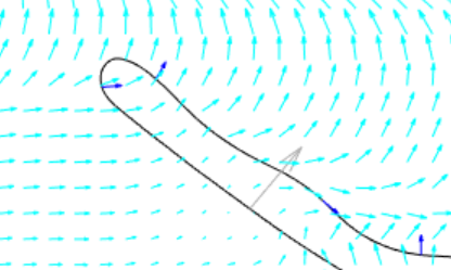
下面是过去用Matlab制作的风图的截图:
这有可能吗?我试图查看注释,但无法让它们在地图上工作。
我尝试了如下所示,但是当我添加注释时,映射就停止工作了:
import plotly.graph_objects as go
fig = go.Figure(go.Scattermapbox(
    mode = "lines",
    lon = [10, 20],
    lat = [10,20],
    marker = {'size': 10}))
fig.add_annotation(
    x = [10,],
    y = [10],
    xref = "x", yref = "y",
    axref = "x", ayref = "y",
    ax = [20],
    ay = [20],
    text = "",
    showarrow = True
)
fig.update_layout(
    margin ={'l':0,'t':0,'b':0,'r':0},
    mapbox = {
        'center': {'lon': 10, 'lat': 10},
        'style': "stamen-terrain",
        'center': {'lon': 10, 'lat': 10},
        'zoom': 3})

fig.show()回答 3
Stack Overflow用户
发布于 2020-08-07 15:58:00
不可能将箭头绘制为散乱框上的注释,并维护箭头的3D位置。
我所做的就是为每个箭头生成2个痕迹。第一个跟踪由2点(开始和结束)组成,第二个跟踪包含4个点( end、tipA、tipB、end)并填充"onself“。
windField.windvectorList.forEach((item) =>{
        this.TrackMapPlot_data.push({
          type: "scattermapbox",
          mode: "lines",
          lat: [item.startlat, item.stoplat],
          lon: [item.startlon, item.stoplon],
          line: { color: "rgb(48,151,255)", width: 3}
        });
        this.TrackMapPlot_data.push({
          type: "scattermapbox",
          mode: "lines",
          fill:"toself",
          fillcolor: "rgb(48,151,255)",
          lat: [item.stoplat, item.tipalat, item.tipblat, item.stoplat ],
          lon: [item.stoplon, item.tipalon, item.tipblon, item.stoplon],
          line: { color: "rgb(48,151,255)", width: 3}
        })
      });
要想得到tipA和tipB并使箭头尖与我定义的箭头长度成比例:
- 箭头开口:阿尔法
- 箭头长度占箭头长度的%:d
- 使用python后端的重力场库生成3个附加点。箭头末端和2个箭头提示。
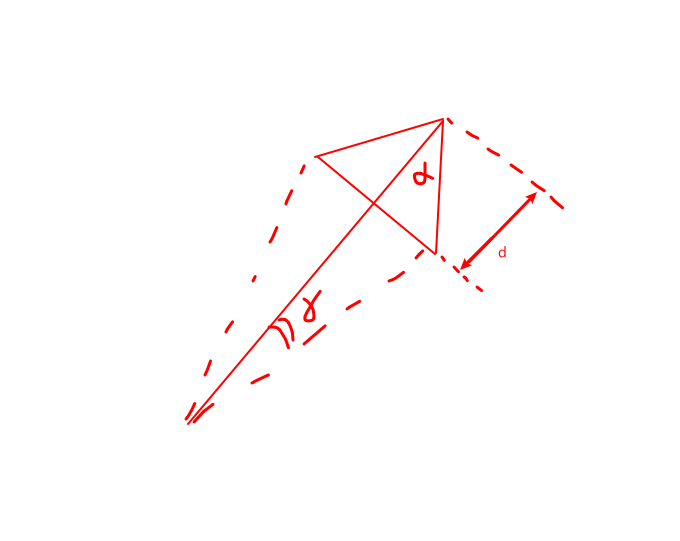
def AddArrowTipsToWindVectors(wind_table: pd.DataFrame(), scale: float) -> pd.DataFrame():
    #wind_table = wind_table.loc[:100, :]
    # Make wind vectors
    arrow_angle = 20
    arrow_length = 0.2
    wind_vectors = list()
    wind_table['WindArrowTipALat'] = 0
    wind_table['WindArrowTipALon'] = 0
    wind_table['WindArrowTipBLat'] = 0
    wind_table['WindArrowTipBLon'] = 0

    for index, wind_row in wind_table.iterrows():
        arrow_delta = math.asin(arrow_length*math.sin(math.radians(arrow_angle/2))/(1-arrow_length))
        arrow_dist = wind_row['WindSpeed']*scale*(1-arrow_length)/math.cos(arrow_delta)
        arrow_tip_A = GetTerminalLocFromDistAndHeading(wind_row['StationLat'], wind_row['StationLon'], arrow_dist, wind_row['WindDirection'] + math.degrees(arrow_delta))
        wind_table.loc[index, 'WindArrowTipALat'] = arrow_tip_A[0]
        wind_table.loc[index, 'WindArrowTipALon'] = arrow_tip_A[1]
        arrow_tip_B = GetTerminalLocFromDistAndHeading(wind_row['StationLat'], wind_row['StationLon'], arrow_dist, wind_row['WindDirection'] - math.degrees(arrow_delta))
        wind_table.loc[index, 'WindArrowTipBLat'] = arrow_tip_B[0]
wind_table.loc[index, 'WindArrowTipBLon'] = arrow_tip_B[1]这不是一个很好的解决方案,但有效。然而,巧妙地和mapbox有一个很大的问题。不幸的是,当添加几个跟踪时,一切都变得极其缓慢,如下github链接所指出的那样:https://github.com/plotly/plotly.js/issues/3227 https://github.com/plotly/plotly.js/issues/1535
问题不在于单个跟踪中的点数,而在于跟踪的数量。这使得我的应用程序无法使用。
AGM溶液
棱角谷歌地图似乎工作得很好。https://angular-maps.com/guides/getting-started/这里有一个片段展示了我是如何使用它的:
<agm-map
        [clickableIcons]="false"
        [disableDefaultUI]="true"
        [latitude]="trackDetails.mapboxlat"
        [longitude]="trackDetails.mapboxlon"
        [mapTypeId]="'satellite'"
        [zoom]="trackDetails.mapboxzoomsmall"
        (mapClick)="onChoseLocation($event)"
        >
    <agm-polyline *ngFor="let windvector of windField.windvectorList"
            [visible]="true" [strokeWeight]="2" [strokeColor]="'rgb(43,42,255)'">
        <agm-polyline-point
            [latitude]="windvector.startlat"
            [longitude]="windvector.startlon">
        </agm-polyline-point>
        <agm-polyline-point
            [latitude]="windvector.stoplat"
            [longitude]="windvector.stoplon">
        </agm-polyline-point>
        <agm-icon-sequence
                [fixedRotation]="false"
                [scale]="1.5"
                [path]="'FORWARD_OPEN_ARROW'"
                [fillColor]="'rgb(43,42,255)'">
        </agm-icon-sequence>
    </agm-polyline>
</agm-map>Stack Overflow用户
发布于 2020-09-29 11:14:45
还在艰难地绘制地图盒中的箭头。
我正在使用类似的方法@guidout来手动构建箭头,但是使用一个geojson层(这避免了使用多个跟踪的性能问题)。
我正在使用geojson MultiLineString层。
geojson MultiLineString的格式如下(来自维基百科):
{
    "type": "MultiLineString",
    "coordinates": [
        [[10, 10], [20, 20], [10, 40]], <-- each of this can be used to draw an arrow
        [[40, 40], [30, 30], [40, 20], [30, 10]]
    ]
}
代码:
function rotate(a, theta) {
    return [a[0]*Math.cos(theta) - a[1]*Math.sin(theta), a[0]*Math.sin(theta) + a[1]*Math.cos(theta)];
}

function createArrow(a, b) {
    // a: source point
    // b: destination point
    var angle = Math.atan2(a[1]-b[1], a[0]-b[0]);
    var v = [b[0]-a[0], b[1]-a[1]]        // get direction vector
    var m = Math.sqrt(Math.pow(v[0], 2) + Math.pow(v[1], 2))  // module
    var u = [v[0]/m, v[1]/m]              // get unitary vector in the direction
    var k = 0.2                           // how far to place the arrow end
    var newb = [b[0]-u[0]*k, b[1]-u[1]*k] // place the arrow end a bit before the destination
    var s1 = rotate([0.02, 0.02], angle)  // "sides" of the arrow. Applied to a base vector in left direction <--, and rotated to match the correct angle
    var s2 = rotate([0.02, -0.02], angle)
    return [a, newb, [newb[0]+s1[0], newb[1]+s1[1]], newb, [newb[0]+s2[0], newb[1]+s2[1]]]
}

//...

var arrows = sourceDestinationPairs.map(x => createArrow(x[0], x[1]));

var mapboxLayer = {
    'sourcetype': 'geojson',
    'source': {
        "type": "MultiLineString",
        "coordinates": arrows
    },
    'below': '', 'type': 'line',
    'color': 'grey', 'opacity': 1,
    'line': {'width': 2}
}
layout.mapbox.layers.push(mapboxLayer)

// ...

Plotly.plot('mapDiv', data, layout)
缺点:
manually
- Zooming必须构建箭头
- 还可以缩放箭头
- ,这取决于投影如何缩放经度与纬度坐标比(默认的Mercator投影可接受)
Stack Overflow用户
发布于 2020-07-23 13:03:58
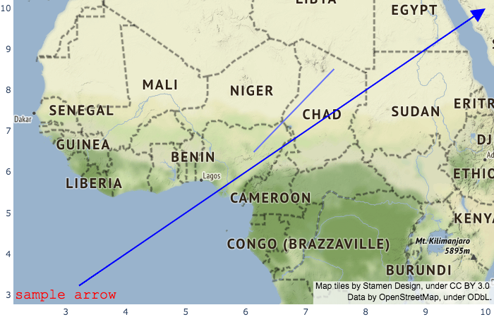
我已经看了很远,但我找不到一个箭头的例子,在地图上实现了这一点。我在这个方向上没有多少经验。我将把这作为一个无法按预期控制它的例子来回答。
import plotly.graph_objects as go
fig = go.Figure(go.Scattermapbox(
    mode = "lines",
    lon = [10, 20],
    lat = [10,20],
    marker = {'size': 10}))
fig.add_annotation(
    x = 10,
    y = 10,
    xref = "x",
    yref = "y",
    axref = "x",
    ayref = "y",
    ax = 3,
    ay = 3,
    text = "sample arrow",
    font=dict(
        family='Courier New, monospace',
        size=20,
        color='red'
    ),
    showarrow = True,
    align='center',
    arrowhead=2,
    arrowsize=2,
    arrowwidth=2,
    arrowcolor='blue'
)
fig.update_layout(
    margin ={'l':0,'t':0,'b':0,'r':0},
    mapbox = {
        'center': {'lon': 10, 'lat': 10},
        'style': "stamen-terrain",
        'center': {'lon': 10, 'lat': 10},
        'zoom': 3})

fig.show()
https://stackoverflow.com/questions/63053688
复制相似问题
腾讯云开发者

Copyright © 2013 - 2026 Tencent Cloud. All Rights Reserved. 腾讯云 版权所有
深圳市腾讯计算机系统有限公司 ICP备案/许可证号:粤B2-20090059 ![]() 粤公网安备44030502008569号
粤公网安备44030502008569号
腾讯云计算(北京)有限责任公司 京ICP证150476号 | 京ICP备11018762号