
R:通过将多个值与一个值进行比较来创建瀑布图
主要问题:你能找到一种更简洁的方法来将多个观察结果与一个长时间表中的一个值进行比较吗?
其目标是创建一个瀑布图,显示一个政党("A")的选票,并将其与竞争对手进行比较。
输入是一个列表(tibble),包含三列:neighbourhood、party和pct_votes。示例:
prop.long
# A tibble: 304 x 3
   neighbourhood    party       pct_votes
   <fct>            <chr>        <dbl>
 1 Region-A         A           0.0938
 2 Region-A         B           0.0672
 3 Region-A         C           0.0906
 4 Region-A         D           0.228
 5 Region-A         E           0.0318
 6 Region-B         A           0.0932
 7 Region-B         B           0.118
 8 Region-B         C           0.0837
 9 Region-B         D           0.199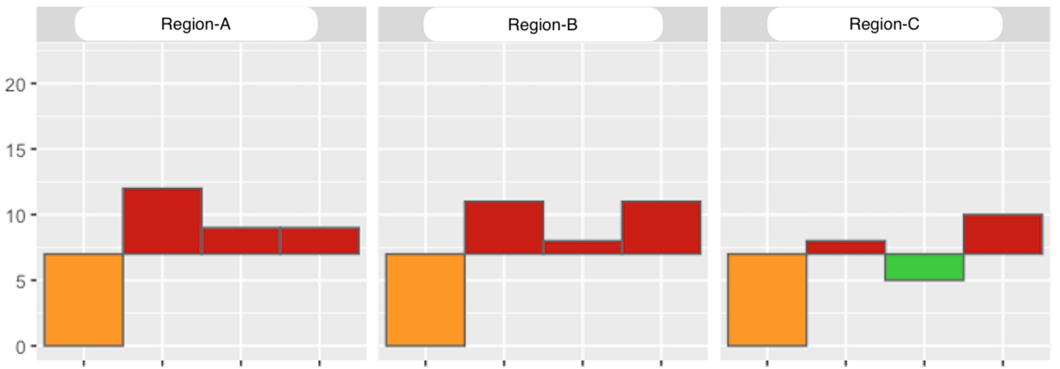
10 Region-B E 0.0544为了显示甲方是否比竞争对手做得更好或更差,需要使用direction属性。Y-变量将用于显示条形图。如果一方做得比A差,则应将y_min设置为甲方的值,否则,甲方的pct_votes值应被视为y_min。如果甲方的pct_votes值执行得更差,则应将其设置为pct_votes值,否则应采用自己的pct_votes值。X变量用于显示政党在情节中的特定顺序。
这是所需的输出:
prop.wf
# A tibble: 76 x 10
# Groups:   neighbourhood [19]
   neighbourhood    party   pct_votes   tmp     direction   y_min y_max x_min x_max
   <fct>            <fct>   <dbl>       <dbl>   <chr>       <int> <int> <int> <int>
 1 Region-A         A       0.0938      0.0938  target      0     9     0     1
 2 Region-A         B       0.0672      0.0938  lower       6     9     1     2
 3 Region-A         C       0.0906      0.0938  lower       9     9     3     4
 4 Region-A         D       0.228       0.0938  higher      9    22     4     5
 5 Region-B         A       0.0932      0.0932  target      0     9     0     1
 6 Region-B         B       0.118       0.0932  higher      9    11     1     2
 7 Region-B         C       0.0837      0.0932  lower       8     9     3     4
 8 Region-B         D       0.199       0.0932  higher      9    19     4     5
# … with 68 more rows
按需要产生输出的代码:
prop.wf <- prop.long %>%
  filter(party %in% c('A', 'B', 'C', 'D')) %>%
  group_by(neighbourhood) %>%
  mutate(tmp = pct_votes[party == 'A']) %>%
  mutate(party = factor(party, levels = c('A', 'B', 'C', 'D')),
    direction = ifelse(party == 'A', 'target', ifelse(pct_votes > tmp, 'higher', ifelse(pct_votes < tmp, 'lower', 'equal'))),
    y_min = as.integer((ifelse(party == 'A', 0, ifelse(direction == 'lower', pct_votes, tmp)) * 100)),
    y_max = as.integer((ifelse(party == 'A', pct_votes, ifelse(direction == 'lower', tmp, pct_votes)) * 100)),
    x_min = as.integer(ifelse(party == 'A', 0, ifelse(party == 'B', 1, ifelse(party == 'C', 2, ifelse(party == 'D', 3, 4))))),
x_max = as.integer(ifelse(party == 'A', 1, ifelse(party == 'B', 2, ifelse(party == 'C', 3, ifelse(party == 'D', 4, 5)))))) # `x_min + 1` did not yield int, even after casting with `as.integer()我的主要问题是:你能帮我把它重构成更清晰、更可伸缩的代码吗?(例如,如果需要增加两个缔约方,怎么办?更可取的是,这些ifelse()语句没有链接。)我不由自主地想:“应该有一个更简单的方法来制定这件事”,但我想不出来。
我的最后输出示例(使用ggplot的geom_rect):
杠杆资源:
回答 1
Stack Overflow用户
发布于 2020-08-09 19:56:49
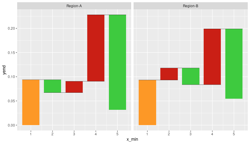
这是另一种方式,但不是像问题中那样的条形图。下面的代码生成一个瀑布图,类似于问题的第一个链接或维基百科。这些颜色来自于用户艾伦·卡梅伦的回答。数据转换包括计算线段端点的代码。
library(tidyverse)

bar.width <- 0.8

prop.long %>%
  group_by(neighbourhood) %>%
  mutate(y_min = dplyr::lag(pct_votes),
         y_max = pct_votes,
         x_min = as.integer(factor(party)) - bar.width/2,
         x_max = as.integer(factor(party)) + bar.width/2,
         xend = lead(x_max),
         yend = lead(y_min)) %>%
  replace_na(list(y_min = 0)) %>%
  mutate(fill = ifelse(party == "A", -y_max, y_max - y_min),
         fill = ifelse(party == "A", "#fd9826",
                       c("#3eca3f", "", "#ca1f15")[sign(fill) + 2])) %>%
  ggplot(aes(xmin = x_min, xmax = x_max, ymin = y_min, ymax = y_max)) +
  geom_rect(aes(fill = fill)) +
  geom_segment(aes(x = x_min, xend = xend, y = yend, yend = yend), size = 0.2) +
  scale_fill_identity() +
  facet_wrap(~ neighbourhood)
https://stackoverflow.com/questions/63329336
复制相似问题
腾讯云开发者

Copyright © 2013 - 2026 Tencent Cloud. All Rights Reserved. 腾讯云 版权所有
深圳市腾讯计算机系统有限公司 ICP备案/许可证号:粤B2-20090059 ![]() 粤公网安备44030502008569号
粤公网安备44030502008569号
腾讯云计算(北京)有限责任公司 京ICP证150476号 | 京ICP备11018762号