
如何使标题在移动上粘稠?
如何使标题在移动上粘稠?
提问于 2020-08-17 01:04:05
目标
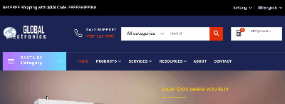
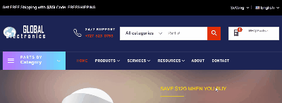
若要将此响应性HTML5模板调整为移动电话尺寸时,标题会变得粘稠。
问题
我似乎找不到添加CSS位置属性的正确元素。不管我添加了什么“粘性”类,它都不会固定在屏幕的顶部。
在行动中
桌面模式工作精细
移动大小失败
失败尝试
我试过附加一门课,像这样.
.makeSticky {
  position: -webkit-sticky; /* Safari */
  position: sticky;
  top: 0;
}
...to每个元素甚至远程接近标头。我只是找不到合适的,让它正常工作。
活着
下面是运行在服务器上的页面:http://stpete.epizy.com/en/index.html
代码
<header class="header-area header-3">
<div class="desktop-nav d-none d-lg-block">
<div class="header-nav">
<div class="container-fluid custom-container">
<div class="header-nav-wrapper d-flex justify-content-between">
<div class="header-static-nav">
<p>Get FREE Shipping with <span class="text">$35!</span> Code: FREESHIPPING</p>
</div>
<div class="header-menu-nav">
<ul class="menu-nav">
<li>
<div class="dropdown">
<button type="button" id="setting" data-toggle="dropdown" aria-haspopup="true" aria-expanded="false">Setting <i class="icon ion-chevron-down"></i></button>
<ul class="dropdown-menu" aria-labelledby="setting">
<li><a href="checkout.html">Checkout</a></li>
<li><a href="login.html">Sign in</a></li>
</ul>
</div>
</li>
<li>
<div class="dropdown">
<button type="button" id="langue" data-toggle="dropdown" aria-haspopup="true" aria-expanded="false"><img src="images/1.jpg" alt=""> English <i class="icon ion-chevron-down"></i></button>
<ul class="dropdown-menu" aria-labelledby="langue">
<li><a href="http://123globalelecronicsllc.com/en"><img src="images/1.jpg" alt=""> English</a></li>
<li><a href="http://123globalelecronicsllc.com/sp"><img src="images/2.jpg" alt=""> Spanish</a></li>
</ul>
</div>
</li>
</ul>
</div> <!-- header menu nav -->
</div> <!-- header nav wrapper -->
</div> <!-- container -->
</div> <!-- header nav -->
<div class="header-middle">
<div class="container-fluid custom-container">
<div class="row">
<div class="col-lg-3">
<div class="header-logo-contact d-flex ">
<div class="desktop-logo">
<a href="index.html">
<img src="images/logo-white.png" alt="Global Eletronics, LLC">
</a>
</div> <!-- desktop logo -->
</div>
</div>
<div class="col-lg-9">
<div class="header-search-cart d-flex align-items-center">
<div class="header-contact d-flex align-items-center">
<i class="icon ion-ios-telephone-outline"></i>
<div class="phone media-body">
<p>24/7 Support</p>
<a href="tel:+7276230753">+727-623-0753</a>
</div>
</div>
<div class="header-search media-body">
<form action="#">
<div class="search-category">
<select>
<option value="">All categories</option>
<option value="audio">Audio Parts</option>
<option value="accessories">- - Accessories</option>
<option value="buzzers">- - Buzzers</option>
<option value="batteries">Battery Products</option>
<option value="batteries">- - Primary Batteries</option>
</select>
</div>
<input id="search-box" type="text" placeholder="Part #">
<button><i class="icon ion-android-search"></i></button>
</form>
</div>
<div class="header-cart">
<div class="cart-btn">
<a href="cart.html">
<i class="icon ion-calculator"></i>
<span class="text">RFQ Parts :</span>
<span class="count">0</span>
</a>
</div>
<!--
<div class="mini-cart">
<ul class="cart-items">
<li>
<div class="single-cart-item d-flex">
<div class="cart-item-thumb">
<a href="cart.html"><img src="images/cart-1.jpg" alt="product"></a>
<span class="product-quantity">1x</span>
</div>
</div>
</li>
</ul>
<div class="price_content">
<div class="cart-subtotals">
</div>
<div class="cart-total price_inline">
<span class="label"># Items</span>
<span class="value">12</span>
</div>
</div>
<div class="checkout text-center">
<a href="checkout.html" class="main-btn">Send RFQ</a>
</div>
</div>
-->
</div>
</div> <!-- header search cart -->
</div>
</div> <!-- row -->
</div> <!-- container -->
</div> <!-- header middle -->
<div class="header-menu">
<div class="container-fluid custom-container">
<div class="row">
<div class="col-lg-3">
<div class="header-menu-vertical">
<h4 class="menu-title">
<span>Parts by</span>
Category
</h4>
<ul class="menu-content menu-expand">
<li class="menu-item">
<a href="products.html?cat=semiconductor">Semiconductor </a>
</li>
<li class="menu-item">
<a href="products.html?cat=semiconductor">Passives </a>
</li>
<li class="menu-item"><a href="products.html?cat=semiconductor">ElectroMechanical</a></li>
<li class="menu-item"><a href="products.html?cat=semiconductor">Power & Circuit</a></li>
<li class="menu-item"><a href="products.html?cat=semiconductor">Automation</a></li>
<li class="menu-item"><a href="products.html?cat=semiconductor">Connectors</a></li>
<li class="menu-item"><a href="products.html?cat=semiconductor">Cables & Wires</a></li>
<li class="menu-item"><a href="products.html?cat=semiconductor">Test</a></li>
</ul> <!-- menu content -->
</div> <!-- header menu vertical -->
</div>
<div class="col-lg-9 position-static">
<div class="header-horizontal-menu">
<ul class="menu-content">
<li class="active"><a href="index.html">Home </a>
</li> <li class="position-static"><a href="products.html?cat=all">Products <i class="fal fa-chevron-down"></i></a>
<ul class="mega-sub-menu d-flex flex-wrap">
<li>
<a class="menu-title" href="#">Shop Grid</a>
<ul class="submenu-item">
<li><a href="shop-3-column.html">Shop Grid Column 3</a></li>
<li><a href="shop-4-column.html">Shop Grid Column 4</a></li>
<li><a href="shop-left-sidebar.html">Shop Grid left sidebar</a></li>
<li><a href="shop-right-sidebar.html">Shop Grid Right sidebar</a></li>
</ul>
</li>
<li>
<a class="menu-title" href="#">Shop List</a>
<ul class="submenu-item">
<li><a href="shop-list.html">Shop List</a></li>
<li><a href="shop-list-left-sidebar.html">Shop List Left sidebar</a></li>
<li><a href="shop-list-right-sidebar.html">Shop List Right sidebar</a></li>
</ul>
</li>
<li>
<a class="menu-title" href="#">Shop Single</a>
<ul class="submenu-item">
<li><a href="single-product.html">Shop Single</a></li>
<li><a href="single-product-variable.html">Shop Variable</a></li>
<li><a href="single-product-affiliate.html">Shop Affiliate</a></li>
<li><a href="single-product-group.html">Shop Group</a></li>
<li><a href="single-product-tabstyle2.html">Shop Tabs 2</a></li>
<li><a href="single-product-tabstyle3.html">Shop Tabs 3</a></li>
</ul>
</li>
<li>
<a class="menu-title" href="#">Shop Single</a>
<ul class="submenu-item">
<li><a href="single-product-slider.html">Shop Slider</a></li>
<li><a href="single-product-gallery-left.html">Shop Gallery Left sidebar</a></li>
<li><a href="single-product-gallery-right.html">Shop Gallery Right sidebar</a></li>
<li><a href="single-product-sticky-left.html">Shop Sticky Left sidebar</a></li>
<li><a href="single-product-sticky-right.html">Shop Sticky Right sidebar</a></li>
</ul>
</li>
<li class="custom-banner">
<a href="shop-4-column.html"><img src="images/custom_banner.jpg" alt="" class="img-responsive"></a>
</li>
</ul>
</li>
<li><a href="#">Services <i class="fal fa-chevron-down"></i></a>
<ul class="sub-menu">
<li><a href="about.html">About</a></li>
</ul>
</li>
<li><a href="#">Resources <i class="fal fa-chevron-down"></i></a>
<ul class="sub-menu">
<li><a href="#">BOM Upload Tool</a></li>
<li><a href="#">Global Learning Lab</a></li>
<li><a href="#">Product Advisor</a></li>
<li><a href="#">Articles</a></li>
</ul>
<li><a href="about.html">About</a></li>
<li><a href="contact.html">Contact</a></li>
</ul>
</div> <!-- header horizontal menu -->
</div>
</div> <!-- row -->
</div> <!-- container -->
</div> <!-- header menu -->
</div> <!-- desktop nav -->
<div class="mobile-nav d-lg-none">
<div class="container-fluid">
<div class="mobile-nav-top">
<div class="row align-items-center">
<div class="col-sm-4 col-3">
<div class="mobile-toggle">
<a class="mobile-menu-open" href="javascript:;"><i class="fal fa-bars"></i></a>
</div>
</div>
<div class="col-sm-4 col-5">
<div class="mobile-logo text-center">
<a href="index.html">
<img src="images/logo-white.png" alt="Logo">
</a>
</div> <!-- mobile logo -->
</div>
<div class="col-sm-4 col-4">
<div class="mobile-account-cart">
<ul class="account-cart text-right">
<li>
<div class="dropdown">
<button type="button" id="dropdownMenuButton" data-toggle="dropdown" aria-haspopup="true" aria-expanded="false"><i class="fal fa-user"></i></button>
<ul class="dropdown-menu" aria-labelledby="dropdownMenuButton">
<li><a href="#">My account</a></li>
<li><a href="#">Checkout</a></li>
<li><a href="#">Sign in</a></li>
</ul>
</div>
</li>
<li class="header-cart">
<a href="#">
<i class="fal fa-envelope-open-dollar"></i>
<span>0</span>
</a>
<div class="mini-cart">
<ul class="cart-items">
<li>
<div class="single-cart-item d-flex">
<div class="cart-item-thumb">
<a href="single-product.html"><img src="images/cart-1.jpg" alt="product"></a>
<span class="product-quantity">1x</span>
</div>
<div class="cart-item-content media-body">
<h5 class="product-name"><a href="single-product.html">New Balance Fresh Foam LAZR</a></h5>
<span class="product-price">€18.90</span>
<span class="product-color"><strong>Color:</strong> White</span>
<a href="#" class="product-close"><i class="fal fa-times"></i></a>
</div>
</div>
</li>
<li>
<div class="single-cart-item d-flex">
<div class="cart-item-thumb">
<a href="single-product.html"><img src="images/cart-2.jpg" alt="product"></a>
<span class="product-quantity">3x</span>
</div>
<div class="cart-item-content media-body">
<h5 class="product-name"><a href="single-product.html">New Balance Fresh Foam LAZR</a></h5>
<span class="product-price">€18.90</span>
<span class="product-color"><strong>Color:</strong> White</span>
<a href="#" class="product-close"><i class="fal fa-times"></i></a>
</div>
</div>
</li>
</ul>
<div class="price_content">
<div class="cart-subtotals">
<div class="products price_inline">
<span class="label">Subtotal</span>
<span class="value">€30.80</span>
</div>
<div class="shipping price_inline">
<span class="label">Shipping</span>
<span class="value">€7.00</span>
</div>
<div class="tax price_inline">
<span class="label">Taxes</span>
<span class="value">€0.00</span>
</div>
</div>
<div class="cart-total price_inline">
<span class="label">Total</span>
<span class="value">€37.80</span>
</div>
</div> <!-- price content -->
<div class="checkout text-center">
<a href="checkout.html" class="main-btn">Checkout</a>
</div>
</div> <!-- mini cart -->
</li>
</ul>
</div>
</div>
</div> <!-- row -->
</div> <!-- mobile nav top -->
<div class="header-search">
<form action="#">
<div class="search-category">
<select>
<option value="0">All categories</option>
<option value="12">Laptop</option>
<option value="13">- - Hot Categories</option>
<option value="19">- - - - Dresses</option>
<option value="20">- - - - Jackets & Coats</option>
<option value="21">- - - - Sweaters</option>
<option value="22">- - - - Jeans</option>
<option value="23">- - - - Blouses & Shirts</option>
</select>
</div>
<input type="text" placeholder="Enter your search key ... ">
<button><i class="icon ion-android-search"></i></button>
</form>
</div>
</div> <!-- container -->
<div class="mobile-off-canvas-menu">
<div class="mobile-canvas-menu-top">
<ul class="menu-nav">
<li><a href="compare.html"><i class="fal fa-repeat"></i> Compare (0)</a></li>
<h6 class="custom-title">Women is Clothes & Fashion</h6>
<p>Shop women is clothing and accessories and get inspired by the latest fashion trends.</p>
</div>
</div>
<div class="col-lg-4 col-md-12">
<div class="menu-block">
<h6 class="custom-title">Simple Style</h6>
<p>A new flattering style with all the comfort of our linen.</p>
</div>
</div>
<div class="col-lg-4 col-md-12">
<div class="menu-block">
</ul>
</li>
<li class="menu-item-has-children">
<a href="#"><span>Outerwear & Jackets</span></a>
<li><a href="shop-left-sidebar.html">Bags & Cases</a></li>
</ul> <!-- menu content -->
</div> <!-- mobile main menu -->
</div> <!-- mobile off canvas menu -->
<div class="overlay"></div>
</div> <!-- mobile nav -->
</header>CSS
/*===== header 3 =====*/
.header-3 {
  background-color: #1c2454; }
  .header-3 .header-nav {
    background-color: #000;
    border-bottom: 0; }
    .header-3 .header-nav .header-nav-wrapper .header-static-nav p {
      color: #fff; }
      .header-3 .header-nav .header-nav-wrapper .header-static-nav p .text {
        color: #fff; }
    .header-3 .header-nav .header-nav-wrapper .header-menu-nav .menu-nav li + li {
      margin-left: 30px; }
      @media only screen and (min-width: 992px) and (max-width: 1199px) {
        .header-3 .header-nav .header-nav-wrapper .header-menu-nav .menu-nav li + li {
          margin-left: 20px; } }
      .header-3 .header-nav .header-nav-wrapper .header-menu-nav .menu-nav li + li::before {
        color: rgba(255, 255, 255, 0.4); }
    .header-3 .header-nav .header-nav-wrapper .header-menu-nav .menu-nav li a {
      color: #fff; }
    .header-3 .header-nav .header-nav-wrapper .header-menu-nav .menu-nav li .dropdown button {
      color: #fff; }
  .header-3 .header-contact i {
    color: #fff; }
  .header-3 .header-contact .phone p {
    color: #fff; }
  .header-3 .mobile-toggle a {
    color: #fff; }
  .header-3 .mobile-account-cart .account-cart li .dropdown button {
    color: #fff; }
    .header-3 .mobile-account-cart .account-cart li .dropdown button i {
      font-size: 24px; }
  .header-3 .mobile-account-cart .account-cart li a {
    color: #fff; }
  .header-3 .header-menu {
    background-color: #1c2454;
    border-top: 1px solid rgba(255, 255, 255, 0.4); }
    .header-3 .header-menu.sticky {
      border-top: 0; }
我继承了这个项目,HTML是从某个模板公司购买的。我没有写HTML -所以任何帮助都是非常感谢的。
谢谢。
回答 2
Stack Overflow用户
回答已采纳
发布于 2020-08-17 01:11:56
您需要为移动导航指定position: fixed。桌面导航具有相同的属性,但也有一个自定义动画sticky。您还可能希望调整它下面的元素,因为菜单现在是固定的。
@media and (max-width: 600px) { /* Target only devices below 600px */
  .header-area {
    position: fixed;
    z-index: 999; /* So that it is not under the other elements */
    background: #1c2454; /* It was transparent */
  }

  .slider-area {
    top: 85px; /* Can change according to your liking */
  }
}
输出:
Stack Overflow用户
发布于 2020-08-17 01:17:32
粘性位置需要空间,为了使其工作,.header-area类需要粘性。只需将此规则添加到媒体查询中!我刚试过,粘稠的姿势是这样工作的:
.header-area {
    position: sticky;
    top: 0;
    z-index: 9999;
}页面原文内容由Stack Overflow提供。腾讯云小微IT领域专用引擎提供翻译支持
原文链接:
https://stackoverflow.com/questions/63443350
复制相关文章
相似问题
腾讯云开发者

Copyright © 2013 - 2026 Tencent Cloud. All Rights Reserved. 腾讯云 版权所有
深圳市腾讯计算机系统有限公司 ICP备案/许可证号:粤B2-20090059  粤公网安备44030502008569号
腾讯云计算(北京)有限责任公司 京ICP证150476号 | 京ICP备11018762号