
ggplot2 -如何使用geom_bar绘制时间长度?
我试图通过显示多个地区的作物种植和收获日期来显示不同的生长季节。
我的最终目标是一个如下所示的图表:
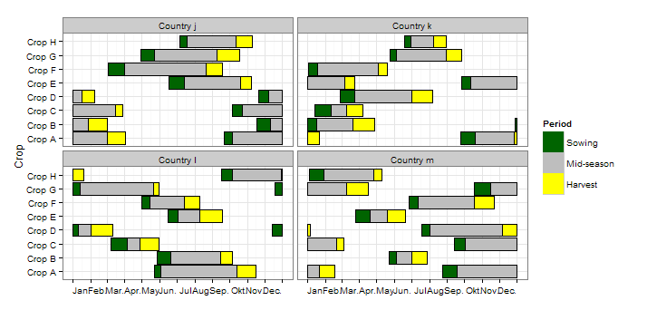
这是从this question的回答中得到的。请注意,日期以朱利安日(一年中的日)为单位。
我第一次尝试复制类似的情节是:
library(data.table)
library(ggplot2)

mydat <- "Region\tCrop\tPlanting.Begin\tPlanting.End\tHarvest.Begin\tHarvest.End\nCenter-West\tSoybean\t245\t275\t1\t92\nCenter-West\tCorn\t245\t336\t32\t153\nSouth\tSoybean\t245\t1\t1\t122\nSouth\tCorn\t183\t336\t1\t153\nSoutheast\tSoybean\t275\t336\t1\t122\nSoutheast\tCorn\t214\t336\t32\t122"

# read data as data table
mydat <- setDT(read.table(textConnection(mydat), sep = "\t", header=T))

# melt data table
m <- melt(mydat, id.vars=c("Region","Crop"), variable.name="Period", value.name="value")

# plot stacked bars
ggplot(m, aes(x=Crop, y=value, fill=Period, colour=Period)) +
  geom_bar(stat="identity") +
  facet_wrap(~Region, nrow=3) +
  coord_flip() +
  theme_bw(base_size=18) +
  scale_colour_manual(values = c("Planting.Begin" = "black", "Planting.End" = "black",
                                 "Harvest.Begin" = "black", "Harvest.End" = "black"), guide = "none")
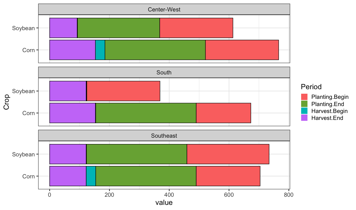
然而,这个阴谋有几个问题:
- ,因为条形图是堆叠的,所以x轴上的值会被聚集起来,并且在代表一年中的1-365的比例范围内会变得太高。
- I需要将
Planting.Begin和Planting.End组合成相同的颜色,并对Harvest.Begin和Harvest.Begin进行相同的组合
此外,需要在Harvest.End.和之间创建“
- ”(或完全未着色的条形条)。
也许可以用geom_rect或geom_segment来实现图形,但我真的想坚持使用geom_bar,因为它更可定制(例如,它接受scale_colour_manual以便向条形图中添加黑色边框)。
对于如何创建这样的图形有什么提示吗?
回答 1
Stack Overflow用户
发布于 2020-08-27 02:06:15
我不认为这是你可以用geom_bar或geom_col做的事情。一种更普遍的方法是使用geom_rect绘制矩形。要做到这一点,我们需要对数据进行一些整形。
plotdata <- mydat %>%
  dplyr::mutate(Crop = factor(Crop)) %>%
  tidyr::pivot_longer(Planting.Begin:Harvest.End, names_to="period") %>%
  tidyr::separate(period, c("Type","Event")) %>%
  tidyr::pivot_wider(names_from=Event, values_from=value)


#    Region      Crop    Type     Begin   End
#    <chr>       <fct>   <chr>    <int> <int>
#  1 Center-West Soybean Planting   245   275
#  2 Center-West Soybean Harvest      1    92
#  3 Center-West Corn    Planting   245   336
#  4 Center-West Corn    Harvest     32   153
#  5 South       Soybean Planting   245     1
# ...我们使用tidyr来重新塑造数据,所以我们想要绘制的每一个矩形有一行,我们也使裁剪成为一个因素。这样我们就可以画成这样
ggplot(plotdata) +
  aes(ymin=as.numeric(Crop)-.45, ymax=as.numeric(Crop)+.45, xmin=Begin, xmax=End, fill=Type) +
  geom_rect(color="black") +
  facet_wrap(~Region, nrow=3) +
  theme_bw(base_size=18) +
  scale_y_continuous(breaks=seq_along(levels(plotdata$Crop)), labels=levels(plotdata$Crop))
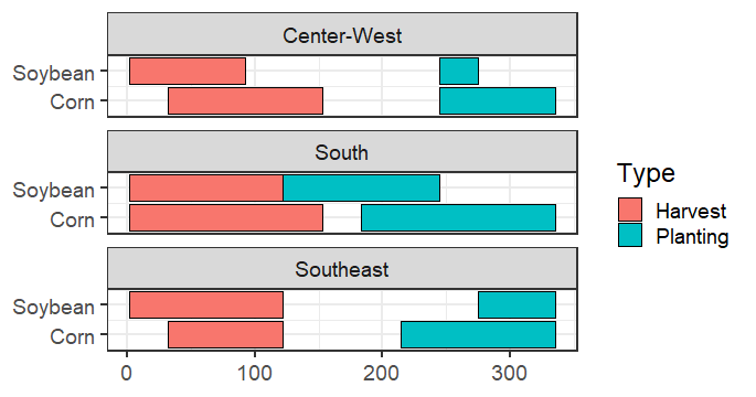
这里的部分有点混乱,我们对y使用了一个离散的标度,但是geom_rect更喜欢数字值,所以由于这些值现在是因子,所以我们使用数值来创建ymin和ymax位置。然后,我们需要用因子级别的名称替换y轴。
如果您还想在x轴上获取月份名称,则可以执行以下操作
dateticks <- seq.Date(as.Date("2020-01-01"), as.Date("2020-12-01"),by="month")
# then add this to you plot
  ... +
    scale_x_continuous(breaks=lubridate::yday(dateticks),
labels=lubridate::month(dateticks, label=TRUE, abbr=TRUE))https://stackoverflow.com/questions/63605163
复制相似问题
腾讯云开发者

Copyright © 2013 - 2026 Tencent Cloud. All Rights Reserved. 腾讯云 版权所有
深圳市腾讯计算机系统有限公司 ICP备案/许可证号:粤B2-20090059 ![]() 粤公网安备44030502008569号
粤公网安备44030502008569号
腾讯云计算(北京)有限责任公司 京ICP证150476号 | 京ICP备11018762号