
用散点图显示某x变量的盒形图
用散点图显示某x变量的盒形图
提问于 2020-09-21 16:25:36
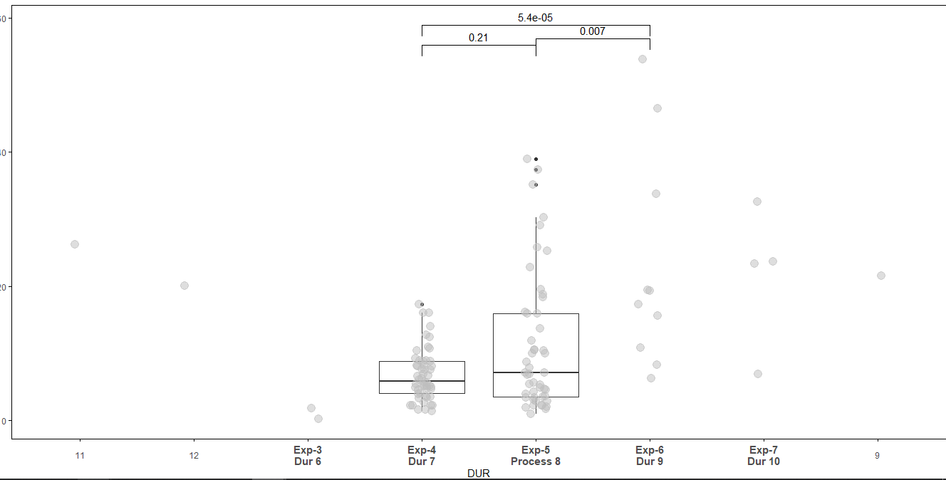
我试图显示一些x变量的方框图,比如这里的持续时间为4和5,我必须显示方格图和与散点图重叠。另外,我还必须重命名x轴。我正在使用下面的代码。问题是x轴正变得不对齐,就像.11,12在3,4之前得到的一样。
ggplot(data=data_1,aes(x=DUR,y=val))+
  geom_boxplot(data=subset(data_1[,c("val","ID","DUR")],data_1$DUR %in% c(4,5)), aes(DUR,val))+
  geom_jitter(data=subset(data_1, !is.na(DUR)),aes(x=DUR,y=val),position=position_jitter(width=.1, height=0),alpha=0.5,size=4,color='grey')+
  labs(y = "val", x = "Duration",title='val data%')+
  stat_compare_means(comparisons = comparison_1, label.y =  c(56,57,59))+
  stat_compare_means(size=5,label.y = 50,method ="anova")+theme(
    axis.text.x = element_text(size=16,angle=0,vjust = 0.5),
    panel.grid.major.x = element_blank(),
    panel.grid.minor.x = element_blank())+
  theme(axis.ticks=element_line(colour = "black"),
        panel.border =  element_rect(colour = "black", fill=NA, size=0.5),panel.background = element_blank())+
  theme(legend.position = "none")+
  scale_x_discrete(name = 'DUR',breaks = c('3','4', '5', '6', '7', '9','11','12'),
                   labels = c('Exp-3\nDur 6','Exp-4\nDur 7', 'Exp-5\nProcess 8', 'Exp-6\nDur 9', 'Exp-7\nDur 10', '9','11','12'))+
  theme(axis.text.x = element_text(face = c('bold', 'bold', 'bold', 'bold', 'bold','plain', 'plain','plain'),size = c('11','11','11','11','11','9','9','9')))
回答 1
Stack Overflow用户
回答已采纳
发布于 2020-09-21 17:53:03
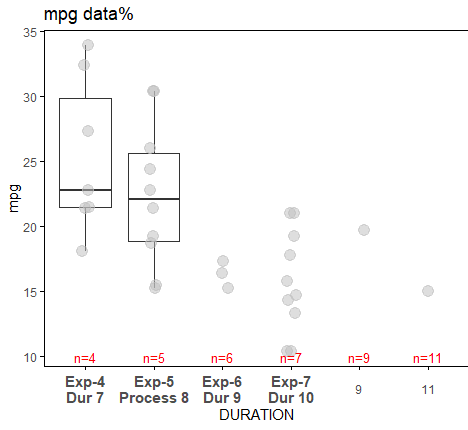
请在breaks中用limits替换scale_x_discrete。这样就行了。例如,我在下面的mtcars上运行了它。使用breaks,在x-axis上,您将在4之前得到11,就像在您的例子中一样。
  data1 <- mtcars %>% select(mpg, cyl, carb) %>% rename(val=mpg, ID=cyl, DUR=carb)
  data1$DURN <- data1$DUR + 3
  data_1 <- data1
  data_1$DUR <- as.character(data1$DURN)

  p <- ggplot(data=data_1,aes(x=DUR, y=val))+
    geom_boxplot(data=subset(data_1[,c("val","ID","DUR")],data_1$DUR %in% c(4,5)), aes(DUR,val))+
    geom_jitter(data=subset(data_1, !is.na(DUR)),aes(x=DUR,y=val),position=position_jitter(width=.1, height=0),alpha=0.5,size=4,color='grey')+
    labs(y = "mpg", x = "carb plus three",title='mpg data%')  +
    # stat_compare_means(comparisons = comparison_1, label.y =  c(56,57,59))+
    # stat_compare_means(size=5,label.y = 20,method ="anova") +
    theme(
      axis.text.x = element_text(size=12,angle=0,vjust = 0.5),
      panel.grid.major.x = element_blank(),
      panel.grid.minor.x = element_blank(),
      axis.ticks=element_line(colour = "black"),
      panel.border =  element_rect(colour = "black", fill=NA, size=0.5),
      panel.background = element_blank()) +
    theme(legend.position = "none") +
    scale_x_discrete(name = 'DURATION', limits = c('4', '5', '6', '7', '9','11'),
                     labels = c('Exp-4\nDur 7', 'Exp-5\nProcess 8', 'Exp-6\nDur 9', 'Exp-7\nDur 10', '9','11')
                     )  +
theme(axis.text.x = element_text(face = c( 'bold', 'bold', 'bold', 'bold','plain', 'plain'),size = c('11','11','11','11','9','9')))更新:在底部添加了一些红色的自定义注释。
  ### create a dataframe to pass in textGrob
  xc <- c('4', '5', '6', '7', '9', '11')
  x_axis <- c(1:6)
  y_axis <- rep(10,6)
  dfx <- data.frame(xc, x_axis, y_axis)

  #Add annotations
  for (i in 1:length(unique(dfx$xc))){
    p <- p + annotation_custom(textGrob(label = paste0('n=',dfx$xc[i]),
                               # rot = 90,  ## if you wish to rotate
                               gp = gpar(fontsize = 10, col="red")),
      xmin = dfx$x_axis[i],
      xmax = dfx$x_axis[i],
      ymin = dfx$y_axis[i],
      ymax = dfx$y_axis[i]
    )
  }
  p
页面原文内容由Stack Overflow提供。腾讯云小微IT领域专用引擎提供翻译支持
原文链接:
https://stackoverflow.com/questions/63996337
复制相关文章
相似问题
腾讯云开发者

Copyright © 2013 - 2026 Tencent Cloud. All Rights Reserved. 腾讯云 版权所有
深圳市腾讯计算机系统有限公司 ICP备案/许可证号:粤B2-20090059 ![]() 粤公网安备44030502008569号
粤公网安备44030502008569号
腾讯云计算(北京)有限责任公司 京ICP证150476号 | 京ICP备11018762号