
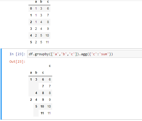
如何使用ggplot2编辑线条图的值?
如何使用ggplot2编辑线条图的值?
提问于 2020-09-28 00:43:16
所以我有下面的图表:
https://i.stack.imgur.com/wo7uV.png
正如您所看到的,Y轴显示/标记数字从10到25,我需要它显示从0到100,打破5。
有什么想法吗?谢谢!!
这是代码:
  ggplot(tabla4, aes(x = Año, y = per2, colour = Género)) +
  geom_line(size=2) +
  geom_point(size = 4, shape = 21, fill = "white") +
  ylab("Personas que simpatizan con un partido político") +
  xlab("") +
  theme_gray(base_size = 12) +
  scale_y_continuous(labels = scales::percent_format(accuracy = 1))
关于我的数据库的信息:
'data.frame':   10 obs. of  7 variables:
 $ Año     : num  2006 2008 2010 2012 2014 ...
 $ Género  : Factor w/ 2 levels "Hombre","Mujer": 1 1 1 1 1 2 2 2 2 2
 $ Simpatía: Factor w/ 2 levels "No","Sí": 2 2 2 2 2 2 2 2 2 2
 $ Freq    : num  188 150 91 88 80 196 164 124 131 116
 $ countT  : num  677 601 738 557 503 ...
 $ per     : num  27.8 25 12.3 15.8 15.9 23.8 19 10.3 13.5 11.7
$ per2 : num 0.278 0.25 0.123 0.158 0.159 0.238 0.19 0.103 0.135 0.117回答 1
Stack Overflow用户
回答已采纳
发布于 2020-09-28 00:50:33
试试这段代码。您的per2变量介于0-1之间,因为它看起来是百分比。您可以在limits和breaks中启用scale_y_continuous()以获得预期的输出。如果您想要中断每5个单元,则可以使用seq()函数使用by=0.05定义序列。在这里,代码:
library(ggplot2)
#Code
ggplot(tabla4, aes(x = Año, y = per2, colour = Género)) +
  geom_line(size=2) +
  geom_point(size = 4, shape = 21, fill = "white") +
  ylab("Personas que simpatizan con un partido político") +
  xlab("") +
  theme_gray(base_size = 12) +
  scale_y_continuous(labels = scales::percent_format(accuracy = 1),
                     limits = c(0,1),
                     breaks = seq(0,1,by=0.05))
由于没有提供数据,这里有一个具有虚拟数据的可重复的小示例,以说明新元素是如何工作的(请下次包括数据的示例):
#Data
df <- data.frame(x=1:10,y=seq(0,0.5,length.out = 10))
#Plot
ggplot(df,aes(x=x,y=y))+
  geom_point()+
  scale_y_continuous(labels = scales::percent_format(accuracy = 1),
                     limits = c(0,1),
                     breaks = seq(0,1,by=0.05))
输出:
并使用与你相似的数据:
library(tidyverse)
#Data 2
df <- data.frame(Año=c(2006,2008,2010,2012,2014),
                 Mujer=c(0.24,0.19,0.10,0.14,0.12),
                 Hombre=c(0.34, 0.29, 0.2, 0.24, 0.22))
#Plot
df %>% pivot_longer(-Año) %>%
  ggplot(aes(x = Año, y = value, colour = name)) +
  geom_line(size=2) +
  geom_point(size = 4, shape = 21, fill = "white") +
  ylab("Personas que simpatizan con un partido político") +
  xlab("") +
  theme_gray(base_size = 12) +
  scale_y_continuous(labels = scales::percent_format(accuracy = 1),
                     limits = c(0,1),
                     breaks = seq(0,1,by=0.05))
输出:
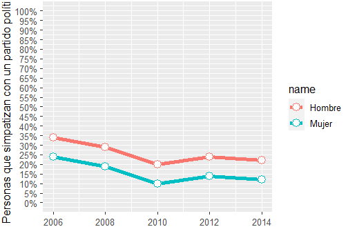
您可以尝试在breaks选项上进行任何定制。
页面原文内容由Stack Overflow提供。腾讯云小微IT领域专用引擎提供翻译支持
原文链接:
https://stackoverflow.com/questions/64094581
复制相关文章
相似问题
腾讯云开发者

Copyright © 2013 - 2026 Tencent Cloud. All Rights Reserved. 腾讯云 版权所有
深圳市腾讯计算机系统有限公司 ICP备案/许可证号:粤B2-20090059 ![]() 粤公网安备44030502008569号
粤公网安备44030502008569号
腾讯云计算(北京)有限责任公司 京ICP证150476号 | 京ICP备11018762号