
用中间的线图创建两条镜像密度曲线的ggplot2图形(或:在R中重新创建漂移扩散模型图)
用中间的线图创建两条镜像密度曲线的ggplot2图形(或:在R中重新创建漂移扩散模型图)
提问于 2020-09-28 00:33:47
注:我松散地使用了镜像这个词,我的意思是一条密度曲线是倒转的。
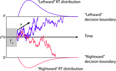
可能有更好的方法来问这个问题,但我想使用ggplot2重新创建这种标准类型的DDM (漂移扩散模型)图:
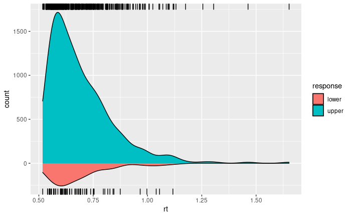
下面我开发的代码创建了两条密度曲线,但我很难弄清楚如何在这两条曲线之间创建一个空间来绘制漂移图(即沿模拟扩散过程移动的点)。
pacman::p_load(ggplot2, rdists)

rt1 <- rdiffusion(500, a=1, v=2, t0=0.5)
ggplot() +
  geom_density(data=subset(rt1, response=="upper"), aes(rt, fill="upper", y= ..count..)) +
  geom_rug(data=subset(rt1, response=="upper"), aes(rt, fill="upper"), sides = "tr") +
  geom_density(data=subset(rt1, response=="lower"), aes(rt, fill="lower", y= -..count..)) +
  geom_rug(data=subset(rt1, response=="lower"), aes(rt, fill="lower")) +
  scale_fill_hue("response")
这就产生了这样的数字:
回答 1
Stack Overflow用户
回答已采纳
发布于 2020-09-28 15:43:16
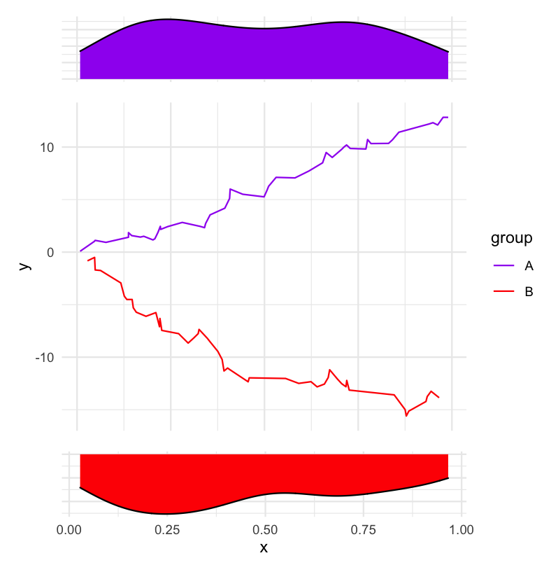
这里有一个使用patchwork的解决方案。
虚拟数据:
library(tidyverse)
library(patchwork)

df <- tibble(
  x = c(sort(runif(50)), sort(runif(50))),
  y = c(cumsum(runif(50, -0.5)), cumsum(runif(50, -1.5))),
  group = rep(c("A", "B"), each = 50)
)
创建三个情节。
p_density_top <-
  df %>%
  filter(group == "A") %>%
  ggplot(aes(x)) +
    geom_density(fill = "purple") +
    theme_minimal() +
    theme(
      axis.title = element_blank(),
      axis.text = element_blank()
    )

p_density_bottom <-
  df %>%
  filter(group == "B") %>%
  ggplot(aes(x)) +
    geom_density(fill = "red") +
    scale_y_reverse() +
    theme_minimal() +
    theme(
      axis.title.y = element_blank(),
      axis.text.y = element_blank()
    )

p_middle <-
  ggplot(df, aes(x, y, col = group)) +
    geom_line() +
    scale_color_manual(values = c("purple", "red")) +
    theme_minimal() +
    theme(
      axis.title.x = element_blank(),
      axis.text.x = element_blank()
)使用patchwork将它们显示在一起。
(p_density_top + p_middle + p_density_bottom) + plot_layout(ncol = 1, heights = c(1, 5, 1))
页面原文内容由Stack Overflow提供。腾讯云小微IT领域专用引擎提供翻译支持
原文链接:
https://stackoverflow.com/questions/64094534
复制相关文章
相似问题
腾讯云开发者

Copyright © 2013 - 2026 Tencent Cloud. All Rights Reserved. 腾讯云 版权所有
深圳市腾讯计算机系统有限公司 ICP备案/许可证号:粤B2-20090059 ![]() 粤公网安备44030502008569号
粤公网安备44030502008569号
腾讯云计算(北京)有限责任公司 京ICP证150476号 | 京ICP备11018762号