
css网格的垂直间距问题
css网格的垂直间距问题
提问于 2020-10-03 05:17:31
div.text前两个div总是顶部(也是第二个div将是粘滞div),其他div将由js insertAdjacentHTML()从底部动态添加。
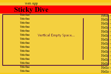
我在两个垂直的div.text之间得到一个额外的空间
是否有可能用css grid 来解决
最终结果
  *{
box-sizing: border-box;
margin:0;
padding:0;
}
h1,h2,h3,h4,h5,h6{
    margin:0;
padding:0;
}
.grid-container {
  display: grid;
  grid-template-columns: repeat(2,1fr)  ;
  grid-gap: 1px;
  background-color: #f7ca18;
  padding: 10px;
   color:#000;
  height:300px;

}

.grid-container > div.item {
   display: grid;
  grid-template-columns: 1fr ;
  grid-template-rows: auto;
  background-color: #f4d03f;
  text-align: center;
  font-size: 14px;
  overflow-y:auto;
  overflow-x:hidden;
}
.grid-container > div.item div.text {
   align-self: end;
   display:grid;
   grid-template-columns: 1fr max-content ;
}
.grid-container > div.item div.text:nth-child(2){
  position: -webkit-sticky;
  position: sticky;
  top: 0;
  background:red;
  align-self: start;
}<div class="grid-container">
<div class="item">
<p>It is a long established fact that a reader will be distracted by the readable content of a page when looking at its layout. The point of using Lorem Ipsum is that it has a more-or-less normal distribution of letters, as opposed to using 'Content here, content here', making it look like readable English. Many desktop publishing packages and web page editors now use Lorem Ipsum as their default model text, and a search for 'lorem ipsum' will uncover many web sites still in their infancy. Various versions have evolved over the years, sometimes by accident, sometimes on purpose (injected humour and the like).
It is a long established fact that a reader will be distracted by the readable content of a page when looking at its layout. The point of using Lorem Ipsum is that it has a more-or-less normal distribution of letters, as opposed to using 'Content here, content here', making it look like readable English. Many desktop publishing packages and web page editors now use Lorem Ipsum as their default model text, and a search for 'lorem ipsum' will uncover many web sites still in their infancy. Various versions have evolved over the years, sometimes by accident, sometimes on purpose (injected humour and the like).
</p>
</div>
<div class="item">
<div class="text">
<span>Web App</span>
</div>
<div class="text">
<h1>Sticky Dive</h1>
</div>
<div class="text">
<h6>Title One</h6>
<span>Hello - <i>X</i></span>
</div>
<div class="text">
<h6>Title One</h6>
<span>Hello - <i>X</i></span>
</div>
<div class="text">
<h6>Title One</h6>
<span>Hello - <i>X</i></span>
</div>
<div class="text">
<h6>Title One</h6>
<span>Hello - <i>X</i></span>
</div>
<div class="text">
<h6>Title One</h6>
<span>Hello - <i>X</i></span>
</div>
<div class="text">
<h6>Title One</h6>
<span>Hello - <i>X</i></span>
</div>
<div class="text">
<h6>Title One</h6>
<span>Hello - <i>X</i></span>
</div>
<div class="text">
<h6>Title One</h6>
<span>Hello - <i>X</i></span>
</div>
<div class="text">
<h6>Title One</h6>
<span>Hello - <i>X</i></span>
</div>
<div class="text">
<h6>Title One</h6>
<span>Hello - <i>X</i></span>
</div>
<div class="text">
<h6>Title One</h6>
<span>Hello - <i>X</i></span>
</div>
<div class="text">
<h6>Title One</h6>
<span>Hello - <i>X</i></span>
</div>
<div class="text">
<h6>Title One</h6>
<span>Hello - <i>X</i></span>
</div>
<div class="text">
<h6>Title One</h6>
<span>Hello - <i>X</i></span>
</div>
<div class="text">
<h6>Title One</h6>
<span>Hello - <i>X</i></span>
</div>
<div class="text">
<h6>Title One</h6>
<span>Hello - <i>X</i></span>
</div>
<div class="text">
<h6>Title One</h6>
<span>Hello - <i>X</i></span>
</div>
<div class="text">
<h6>Title One</h6>
<span>Hello - <i>X</i></span>
</div>
<div class="text">
<h6>Title One</h6>
<span>Hello - <i>X</i></span>
</div>
<div class="text">
<h6>Title One</h6>
<span>Hello - <i>X</i></span>
</div>
<div class="text">
<h6>Title One</h6>
<span>Hello - <i>X</i></span>
</div>
<div class="text">
<h6>Title One</h6>
<span>Hello - <i>X</i></span>
</div>
</div>
</div>
当两个或三个div.text 添加时,具有垂直空间的初始问题
  *{
box-sizing: border-box;
margin:0;
padding:0;
}
h1,h2,h3,h4,h5,h6{
    margin:0;
padding:0;
}
.grid-container {
  display: grid;
  grid-template-columns: repeat(2,1fr)  ;
  grid-gap: 1px;
  background-color: #f7ca18;
  padding: 10px;
   color:#000;
  height:300px;

}

.grid-container > div.item {
   display: grid;
  grid-template-columns: 1fr ;
  grid-template-rows: auto;
  background-color: #f4d03f;
  text-align: center;
  font-size: 14px;
  overflow-y:auto;
  overflow-x:hidden;
}
.grid-container > div.item div.text {
   align-self: end;
   display:grid;
   grid-template-columns: 1fr max-content ;
}
.grid-container > div.item div.text:nth-child(2){
  position: -webkit-sticky;
  position: sticky;
  top: 0;
  background:red;
  align-self: start;
}<div class="grid-container">
<div class="item">
<p>It is a long established fact that a reader will be distracted by the readable content of a page when looking at its layout. The point of using Lorem Ipsum is that it has a more-or-less normal distribution of letters, as opposed to using 'Content here, content here', making it look like readable English. Many desktop publishing packages and web page editors now use Lorem Ipsum as their default model text, and a search for 'lorem ipsum' will uncover many web sites still in their infancy. Various versions have evolved over the years, sometimes by accident, sometimes on purpose (injected humour and the like).
It is a long established fact that a reader will be distracted by the readable content of a page when looking at its layout. The point of using Lorem Ipsum is that it has a more-or-less normal distribution of letters, as opposed to using 'Content here, content here', making it look like readable English. Many desktop publishing packages and web page editors now use Lorem Ipsum as their default model text, and a search for 'lorem ipsum' will uncover many web sites still in their infancy. Various versions have evolved over the years, sometimes by accident, sometimes on purpose (injected humour and the like).
</p>
</div>
<div class="item">
<div class="text">
<span>Web App</span>
</div>
<div class="text">
<h1>Sticky Dive</h1>
</div>
<div class="text">
<h6>Title One</h6>
<span>Hello - <i>X</i></span>
</div>
<div class="text">
<h6>Title One</h6>
<span>Hello - <i>X</i></span>
</div>
</div>
</div>
最初的样子,当添加两个div时,
回答 2
Stack Overflow用户
回答已采纳
发布于 2020-10-21 19:44:23
您可以使用grid-template-rows: auto 1fr;,它将解决您的问题。
* {
  box-sizing: border-box;
  margin: 0;
  padding: 0;
}

h1,
h2,
h3,
h4,
h5,
h6 {
  margin: 0;
  padding: 0;
}

.grid-container {
  display: grid;
  grid-template-columns: repeat(2, 1fr);
  grid-gap: 1px;
  background-color: #f7ca18;
  padding: 10px;
  color: #000;
  height: 300px;
}

.grid-container>div.item {
  display: grid;
  grid-template-columns: 1fr;
  grid-template-rows: auto 1fr;
  background-color: #f4d03f;
  text-align: center;
  font-size: 14px;
  overflow-y: auto;
  overflow-x: hidden;
}

.grid-container>div.item div.text {
  align-self: end;
  display: grid;
  grid-template-columns: 1fr max-content;
}

.grid-container>div.item div.text:nth-child(2) {
  position: -webkit-sticky;
  position: sticky;
  top: 0;
  background: red;
  align-self: start;
}<div class="grid-container">
<div class="item">
<p>It is a long established fact that a reader will be distracted by the readable content of a page when looking at its layout. The point of using Lorem Ipsum is that it has a more-or-less normal distribution of letters, as opposed to using 'Content
here, content here', making it look like readable English. Many desktop publishing packages and web page editors now use Lorem Ipsum as their default model text, and a search for 'lorem ipsum' will uncover many web sites still in their infancy.
Various versions have evolved over the years, sometimes by accident, sometimes on purpose (injected humour and the like). It is a long established fact that a reader will be distracted by the readable content of a page when looking at its layout.
The point of using Lorem Ipsum is that it has a more-or-less normal distribution of letters, as opposed to using 'Content here, content here', making it look like readable English. Many desktop publishing packages and web page editors now use Lorem
Ipsum as their default model text, and a search for 'lorem ipsum' will uncover many web sites still in their infancy. Various versions have evolved over the years, sometimes by accident, sometimes on purpose (injected humour and the like).
</p>
</div>
<div class="item">
<div class="text">
<span>Web App</span>
</div>
<div class="text">
<h1>Sticky Dive</h1>
</div>
<div class="text">
<h6>Title One</h6>
<span>Hello - <i>X</i></span>
</div>
<div class="text">
<h6>Title One</h6>
<span>Hello - <i>1</i></span>
</div>
<div class="text">
<h6>Title One</h6>
<span>Hello - <i>2</i></span>
</div>
<div class="text">
<h6>Title One</h6>
<span>Hello - <i>3</i></span>
</div>
<div class="text">
<h6>Title One</h6>
<span>Hello - <i>4</i></span>
</div>
</div>
</div>
Stack Overflow用户
发布于 2020-10-03 06:03:33
尝试删除align-content: end;中的.grid-container>div.item { ... }。我已经在代码中评论过了。
* {
  box-sizing: border-box;
  margin: 0;
  padding: 0;
}

h1,h2,h3,h4,h5,h6 {
  margin: 0;
  padding: 0;
}

.grid-container {
  display: grid;
  grid-template-columns: repeat(2, 1fr);
  grid-gap: 1px;
  background-color: #f7ca18;
  padding: 10px;
  color: #000;
  height: 300px;
}

.grid-container>div.item {
  display: grid;
  grid-template-columns: 1fr;
  grid-template-rows: auto;
  /*align-content: end;*/  /* removed this */
  align-items: end; /* added this */

  background-color: #f4d03f;
  text-align: center;
  font-size: 14px;
  overflow-y: auto;
  overflow-x: hidden;
  height: 100%;
}

.grid-container>div.item div.text:first-child {
  align-self: start;
}

.grid-container>div.item div.text:first-child h1 {
  /*align-self: start;*/   /* removed this */

  position: -webkit-sticky;
  position: sticky;
  top: 0;
  background: red;
  color: white;
}

.grid-container>div.item div.text:not(:first-child) {
  display: grid;
  grid-template-columns: 1fr max-content;
}<div class="grid-container">
<div class="item">
<p>It is a long established fact that a reader will be distracted by the readable content of a page when looking at its layout. The point of using Lorem Ipsum is that it has a more-or-less normal distribution of letters, as opposed to using 'Content here, content here', making it look like readable English. Many desktop publishing packages and web page editors now use Lorem Ipsum as their default model text, and a search for 'lorem ipsum' will uncover many web sites still in their infancy. Various versions have evolved over the years, sometimes by accident, sometimes on purpose (injected humour and the like). It is a long established fact that a reader will be distracted by the readable content of a page when looking at its layout. The point of using Lorem Ipsum is that it has a more-or-less normal distribution of letters, as opposed to using 'Content here, content here', making it look like readable English. Many desktop publishing packages and web page editors now use Lorem Ipsum as their default model text, and a search for 'lorem ipsum' will uncover many web sites still in their infancy. Various versions have evolved over the years, sometimes by accident, sometimes on purpose (injected humour and the like).</p>
</div>
<div class="item">
<div class="text">
<p>Web App</p>
<h1>Sticky Dive</h1>
</div>
<div class="text">
<h6>Title One</h6>
<span>Hello - <i>X</i></span>
</div>
<div class="text">
<h6>Title One</h6>
<span>Hello - <i>X</i></span>
</div>
</div>
</div>
页面原文内容由Stack Overflow提供。腾讯云小微IT领域专用引擎提供翻译支持
原文链接:
https://stackoverflow.com/questions/64180962
复制相关文章
相似问题
腾讯云开发者

Copyright © 2013 - 2026 Tencent Cloud. All Rights Reserved. 腾讯云 版权所有
深圳市腾讯计算机系统有限公司 ICP备案/许可证号:粤B2-20090059  粤公网安备44030502008569号
腾讯云计算(北京)有限责任公司 京ICP证150476号 | 京ICP备11018762号