
CSS网格布局卡的中心化
在我做了一些帮助,一些CSS网格布局,他们以及网络响应和移动,我有一个问题来集中这些卡。我尝试了说明内容:在网格容器上居中,但没有成功!有线索吗?
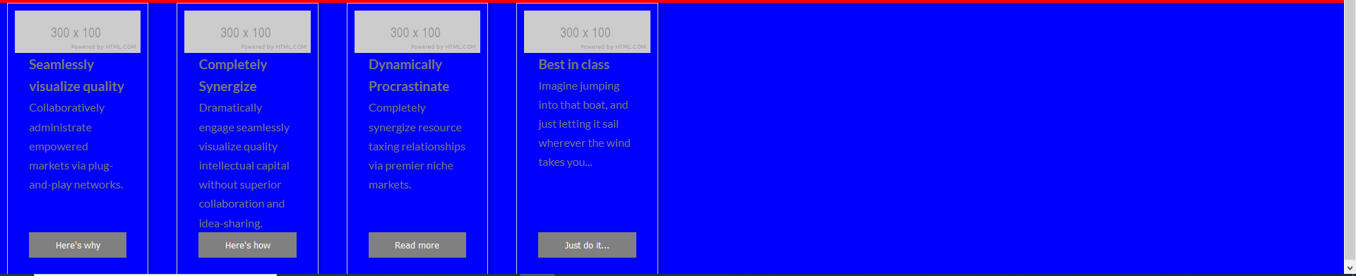
我还附上了一张照片
在css和html代码下面
   .grid {
    display: grid;
    grid-area:test;
    background-color: blue;
    grid-template-columns: repeat(auto-fill, minmax(200px, 1fr));

    grid-gap: 20px;

    align-items: stretch;

  }

  article{
    padding:10px;
    margin-left: 10px;
    margin-right: 10px;


  }

  .grid>article {
    border: 1px solid #ccc;
    box-shadow: 2px 2px 6px 0px rgba(0, 0, 0, 0.3);
    display: flex; /* <-------------- changes */
    flex-direction: column; /* <-------------- changes */

  }

  .grid>article img {
    max-width: 100%;
  }

  .text {
    padding: 0 20px 20px;
    flex-grow: 1;
    display: flex; /* <-------------- changes */
    flex-direction: column; /* <-------------- changes */
  }

  .text>p {
    flex-grow: 1; /* <-------------- changes */
  }

  .text>button {
    background: gray;
    border: 0;
    color: white;
    padding: 10px;
    width: 100%;
  }
HTML
 <main class="grid">
        <article>
          <img src="https://via.placeholder.com/300x100" alt="Sample photo">
          <div class="text">
            <h3>Seamlessly visualize quality</h3>
            <p>Collaboratively administrate empowered markets via plug-and-play networks.</p>
            <button>Here's why</button>
          </div>
        </article>
        <article>
          <img src="https://via.placeholder.com/300x100" alt="Sample photo">
          <div class="text">
            <h3>Completely Synergize</h3>
            <p>Dramatically engage seamlessly visualize quality intellectual capital without superior collaboration and idea-sharing.</p>
            <button>Here's how</button>
          </div>
        </article>
        <article>
          <img src="https://via.placeholder.com/300x100" alt="Sample photo">
          <div class="text">
            <h3>Dynamically Procrastinate</h3>
            <p>Completely synergize resource taxing relationships via premier niche markets.</p>
            <button>Read more</button>
          </div>
        </article>
        <article>
          <img src="https://via.placeholder.com/300x100" alt="Sample photo">
          <div class="text">
            <h3>Best in class</h3>
            <p>Imagine jumping into that boat, and just letting it sail wherever the wind takes you...</p>
            <button>Just do it...</button>
          </div>
        </article>
        <article>
另外,谁会有一个更好的建议设计动态网页响应CSS网格版图卡?虽然我喜欢他们当前的宽度和高度,当浏览器到达一个特定的视口时,他们会变得很正方形。
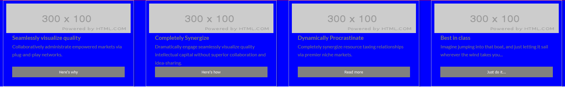
编辑:当我使用重复(auto,minmax(200 am,1FR));而不是参数自动填充,我得到了这个丑陋的streching.On,我的整个浏览器视图。当我把窗口最小化时,他们就像第一幅画中的自动填充一样
回答 1
Stack Overflow用户
发布于 2020-10-15 23:49:08
看来这个问题是随着你使用自动填充而产生的.基于出色的博客css技巧中的这一资源,自动填充将创建空列来填充屏幕(如您所指定的,最小宽度为200 as )。
自动填充在行中填充尽可能多的列。因此,每当新列合适时,它都会创建隐式列,因为它试图尽可能多地填充行。新添加的列可以也可能是空的,但它们仍将占用行中指定的空间。自动安装将当前可用的列扩展到空间中,以便它们占用任何可用的空间。浏览器使用额外的列填充额外的空间(如自动填充),然后折叠空的列,浏览器就会这样做。
试着换到
.grid {
    grid-template-columns: repeat(auto-fit, minmax(200px, 1fr));
}https://stackoverflow.com/questions/64380050
复制相似问题
腾讯云开发者

Copyright © 2013 - 2026 Tencent Cloud. All Rights Reserved. 腾讯云 版权所有
深圳市腾讯计算机系统有限公司 ICP备案/许可证号:粤B2-20090059  粤公网安备44030502008569号
腾讯云计算(北京)有限责任公司 京ICP证150476号 | 京ICP备11018762号