
创建带有字幕的ggplotly对象
创建带有字幕的ggplotly对象
提问于 2020-10-30 09:35:52
我正在用ggplot()绘制一个分散图,如下所示:
library(data.table)
library(plotly)
library(ggplot2)
library(lubridate)

dt.allData <- data.table(date = seq(as.Date('2020-01-01'), by = '1 day', length.out = 365),
                         DE = rnorm(365, 4, 1), Austria = rnorm(365, 10, 2),
                         Czechia = rnorm(365, 1, 2), check.names = FALSE)

## Calculate Pearson correlation coefficient: ##
corrCoeff <- cor(dt.allData$Austria, dt.allData$DE,  method = "pearson", use = "complete.obs")
corrCoeff <- round(corrCoeff, digits = 2)

## Linear regression function extraction by creating linear model: ##
regLine <- lm(DE ~ Austria, data = dt.allData)

## Extract k and d values for the linear function f(x) = kx+d: ##
k <- round(regLine$coef[2], digits = 5)
d <- round(regLine$coef[1], digits = 2)
linRegFunction <- paste0("y = ", d, " + (", k, ")x")

## PLOT: ##
p1 <- ggplot(data = dt.allData, aes(x = Austria, y = DE,
                                    text = paste("Date: ", date, '\n',
                                                 "Austria: ", Austria, "MWh/h", '\n',
                                                 "DE: ", DE, "\u20ac/MWh"),
                                    group = 1)
      ) +
      geom_point(aes(color = ifelse(date >= now()-weeks(5), "#419F44", "#F07D00"))) +
      scale_color_manual(values = c("#F07D00", "#419F44")) +
      geom_smooth(method = "lm", se = FALSE, color = "#007d3c") +
      annotate("text", x = 10, y = 10,
               label = paste("\u03c1 =", corrCoeff, '\n',
                             linRegFunction), parse = TRUE) +
      theme_classic() +
      theme(legend.position = "none") +
      theme(panel.background = element_blank()) +
      xlab("Austria") +
      ylab("DE")+
      ggtitle("DE vs Austria") +
      theme(plot.title = element_text(hjust = 0.5, face = "bold"))

# Correlation plot converting from ggplot to plotly: #
plot <- plotly::ggplotly(p1, tooltip = "text")
它给出了下面的情节:
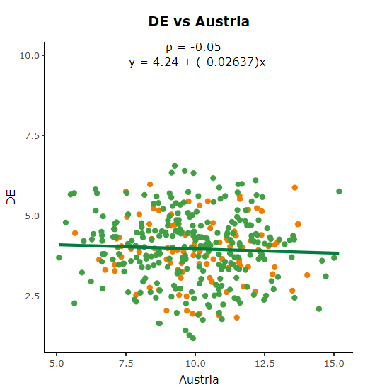
用annotate()表示相关系数和回归函数。我手动定义x和y坐标,以便文本输出显示在顶部的中间。由于我有一些这样的数据表dt.allData具有不同的轴标度,所以我想在图中定义文本应该始终显示在顶部的中间,这取决于以前不手动定义x和y坐标的轴缩放。
回答 1
Stack Overflow用户
发布于 2020-10-30 09:42:18
首先,我想看看这样的事情是否对你有帮助:
annotate("text",
         x = mean(dt.allData$Austria, na.rm = TRUE),
         y = max(dt.allData$DE, na.rm = TRUE),
         label = paste("\u03c1 =",
                       corrCoeff, '\n',
                       linRegFunction),
         parse = TRUE,
hjust = .5)然后,在您想要查看x,y对列表的情况下,您最终会希望转向函数式编程,将x列x1, x2, x3和y列y1, y2, y3传递给map函数,然后map函数从每一对中提取相关信息并绘制它们。
页面原文内容由Stack Overflow提供。腾讯云小微IT领域专用引擎提供翻译支持
原文链接:
https://stackoverflow.com/questions/64605828
复制相关文章
相似问题
腾讯云开发者

Copyright © 2013 - 2026 Tencent Cloud. All Rights Reserved. 腾讯云 版权所有
深圳市腾讯计算机系统有限公司 ICP备案/许可证号:粤B2-20090059 ![]() 粤公网安备44030502008569号
粤公网安备44030502008569号
腾讯云计算(北京)有限责任公司 京ICP证150476号 | 京ICP备11018762号