
CSS旋转(对角线) div,区段,肚脐和页脚,使用svg或只是转换斜,使用什么?
我开始做一个前端的web开发人员。目前,我有困难时,试图实现一个客户网站的布局。
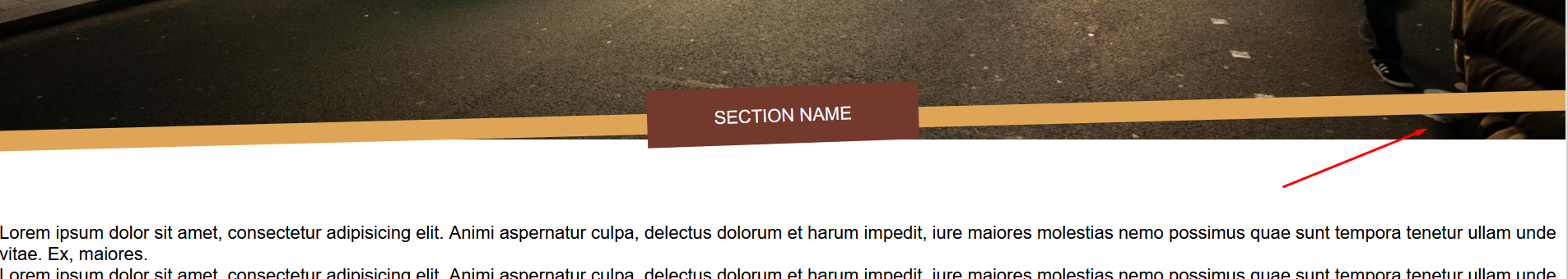
设计师要求这样的布局。

正如你所看到的,布局不是矩形的,肚脐也是页脚,很多网站都是对角线的。
我搜索了很多,我找到了两种方法来实现这一点。
第一种方法是创建一些SVG,并在CSS中为所有旋转的内容添加这些背景。这会在调整屏幕大小时引起问题。如果用户的视口非常宽,则由于SVG被拉伸,旋转效果会丢失一些。
我发现的第二个方法是对内部的每个部分和内容应用一个transform skew,以避免旋转文本。这是一项很大的工作,因为我必须在网站的每一个元素中应用轮换。但是,与第一种方法相比,它赢得了灵活性,因为使用媒体查询,如果效果丢失,我可以修复旋转。
以前有人遇到过这个问题吗?我正确地处理了这个问题?你会用什么方法?有谁知道解决这个问题的其他方法吗?
更新
在看到您的一些帮助之后,我开始编写应用这些答案的代码。谢谢你:A Haworth,G-Cyrillus,内森
我还没有找到一种方法,使正确的部分图像隐藏在酒吧。也许我可以把线性渐变的最后一个选项作为背景颜色。有人有更好的解决方案吗?
这是密码。
<!DOCTYPE html>
<html lang="en">
<head>
    <meta charset="utf-8">
    <title>title</title>

    <meta content="width=device-width, initial-scale=1" name="viewport">
    <link href="favicon.ico" rel="icon" type="image/x-icon">
    <style>
        *,
        *::after,
        *::before,
        html {
            margin: 0;
            padding: 0;
            box-sizing: border-box;
        }

        .nav {
            width: 100%;
            height: 100px;

            position: fixed;
            top: 0;
            left: 0;
            background-color: white;
            z-index: 999;
        }

        .nav::after {
            content: '';
            width: 100%;
            height: 175%;
            display: inline-block;
            background: linear-gradient(178.5deg, white 65%, #dfa557 65.3%, #dfa557 75%, transparent 75.3%);
        }

        .nav svg {
            max-height: 100px;
            position: absolute;
        }

        .nav svg:nth-child(2) {
            float: right;
            top: 30px;
            right: 30px;
        }

        .content {
            width: 100%;
            margin-top: 100px;
            position: relative;
        }

        .content img {
            max-width: 100%;
            vertical-align: bottom;
        }

        .content .img::after {
            content: '';
            width: 100%;
            height: 75px;
            background: linear-gradient(178.5deg, transparent 49px, #dfa557 50px, #dfa557 74px, transparent 75px);
            float: left;
            position: relative;
            margin-top: -60px;
        }

        .content p {
            padding: 1rem;
            background-color: #73392c;
            width: 15em;
            text-align: center;
            transform: translateX(-50%) rotateZ(-2deg);
            color: white;
            float: left;
            position: relative;
            margin-left: 50%;
            margin-top: -80px;
        }
    </style>
<body>

<div class="nav">
    <svg data-name='Layer 1' id='logoipsum' viewBox='0 0 177.78 100' xmlns='http://www.w3.org/2000/svg'><title>
        logo-5</title>
        <path d='M63.87,44.07h3V56.2h-3Zm4.19,7.55c0-3,1.84-4.79,4.68-4.79s4.68,1.79,4.68,4.79-1.8,4.8-4.68,4.8S68.06,54.67,68.06,51.62Zm6.35,0c0-1.65-.65-2.62-1.67-2.62s-1.66,1-1.66,2.62.63,2.6,1.66,2.6S74.41,53.3,74.41,51.63Zm4.14,5.17h2.88a1.55,1.55,0,0,0,1.62.9c1.14,0,1.74-.62,1.74-1.52V54.49h-.06A2.84,2.84,0,0,1,82,56.13c-2.19,0-3.64-1.67-3.64-4.54s1.38-4.68,3.68-4.68a2.87,2.87,0,0,1,2.76,1.76h0V47h3V56.1c0,2.19-1.93,3.55-4.78,3.55C80.37,59.65,78.72,58.46,78.55,56.8Zm6.25-5.18c0-1.46-.67-2.38-1.73-2.38s-1.71.91-1.71,2.38.64,2.3,1.71,2.3S84.8,53.1,84.8,51.62Zm4.13,0c0-3,1.84-4.79,4.68-4.79s4.69,1.79,4.69,4.79-1.8,4.8-4.69,4.8S88.93,54.67,88.93,51.62Zm6.35,0c0-1.65-.65-2.62-1.67-2.62S92,50,92,51.63s.63,2.6,1.65,2.6S95.28,53.3,95.28,51.63Zm4.16-6.79A1.53,1.53,0,1,1,101,46.31,1.46,1.46,0,0,1,99.44,44.84Zm0,2.2h3V56.2h-3Zm13.89,4.59c0,3-1.33,4.71-3.61,4.71a2.86,2.86,0,0,1-2.8-1.7h-.06v4.52h-3V47h3v1.64h.06a2.87,2.87,0,0,1,2.78-1.77C112,46.91,113.37,48.63,113.37,51.63Zm-3,0c0-1.46-.67-2.39-1.72-2.39s-1.72.94-1.73,2.39.68,2.38,1.73,2.38S110.33,53.08,110.33,51.63Zm8.15-4.8c2.49,0,4,1.18,4.07,3.07h-2.73c0-.65-.54-1.06-1.37-1.06s-1.2.32-1.2.79.33.62,1,.76l1.92.39c1.83.39,2.61,1.13,2.61,2.52,0,1.9-1.73,3.12-4.28,3.12s-4.22-1.22-4.35-3.09h2.89c.09.68.63,1.08,1.51,1.08s1.28-.29,1.28-.77-.28-.58-1-.73l-1.73-.37c-1.79-.37-2.73-1.32-2.73-2.72C114.39,48,116,46.83,118.48,46.83Zm14.31,9.37H129.9V54.47h-.06a2.61,2.61,0,0,1-2.66,1.91,3.19,3.19,0,0,1-3.36-3.45V47h3v5.24c0,1.09.56,1.67,1.49,1.67a1.53,1.53,0,0,0,1.52-1.73V47h3ZM134.24,47h2.9v1.77h.06a2.66,2.66,0,0,1,2.61-1.94,2.39,2.39,0,0,1,2.55,2h.06a2.82,2.82,0,0,1,2.82-2,2.91,2.91,0,0,1,3,3.12V56.2h-3V50.75c0-1-.45-1.46-1.29-1.46a1.31,1.31,0,0,0-1.31,1.48V56.2h-2.85V50.71c0-.92-.45-1.42-1.27-1.42a1.34,1.34,0,0,0-1.33,1.5V56.2h-3Z'
              style='fill:#394149'/>
        <path d='M55.48,44.62a13.25,13.25,0,0,0-2-3.22A13.53,13.53,0,1,0,34.8,60.72,13.09,13.09,0,0,0,38,62.55a13.39,13.39,0,0,0,5.07,1A13.56,13.56,0,0,0,56.6,50,13.39,13.39,0,0,0,55.48,44.62ZM43.06,39.19a10.71,10.71,0,0,1,4.52,1h0a4.39,4.39,0,0,1-1.08.31,5.73,5.73,0,0,0-4.85,4.85A3,3,0,0,1,38.94,48a5.73,5.73,0,0,0-4.85,4.85,2.91,2.91,0,0,1-.79,1.74h0a10.8,10.8,0,0,1,9.77-15.42ZM34.79,57c.12-.11.24-.21.36-.33a5.48,5.48,0,0,0,1.62-3.23,2.92,2.92,0,0,1,.87-1.82,2.83,2.83,0,0,1,1.81-.86,5.73,5.73,0,0,0,4.85-4.85A2.92,2.92,0,0,1,45.17,44,2.87,2.87,0,0,1,47,43.17a5.48,5.48,0,0,0,3-1.43,10.51,10.51,0,0,1,2.36,2.78.86.86,0,0,1-.13.14,2.87,2.87,0,0,1-1.81.88,5.71,5.71,0,0,0-4.85,4.85,3,3,0,0,1-2.69,2.68A5.76,5.76,0,0,0,38,57.92a3.14,3.14,0,0,1-.49,1.37A10.89,10.89,0,0,1,34.79,57Zm8.27,3.86a10.84,10.84,0,0,1-3-.42,5.78,5.78,0,0,0,.64-2,3,3,0,0,1,2.68-2.68,5.73,5.73,0,0,0,4.86-4.85,3,3,0,0,1,2.68-2.68,5.71,5.71,0,0,0,2.56-1A10.82,10.82,0,0,1,43.06,60.81Z'
              style='fill:#394149'/>
    </svg>
    <svg fill="none" height="46" viewBox="0 0 46 46" width="46" xmlns="http://www.w3.org/2000/svg"
         xmlns:xlink="http://www.w3.org/1999/xlink">
        <rect fill="url(#pattern0)" height="46" width="46"/>
        <defs>
            <pattern height="1" id="pattern0" patternContentUnits="objectBoundingBox" width="1">
                <use transform="translate(-0.0037037) scale(0.00740741)" xlink:href="#image0"/>
            </pattern>
            <image height="135" id="image0" width="136"
                   xlink:href="data:image/png;base64,iVBORw0KGgoAAAANSUhEUgAAAIgAAACHCAYAAADN7BGHAAAACXBIWXMAAAsSAAALEgHS3X78AAACK0lEQVR4nO3dsW0TURzA4ReUARgh2SBVWqDMBFhKkxFoUpOeghWMhKVsQBtaqkyAGYENjCxRIfyzLYUknL9P8gDv7ic96Z3v/kffP7+9GmOsf/Cnd8djjJMxxiuXhr94+cJVoQiEJBCSQEgCIQmEJBCSQEgCIQmEJBCSQEjHLs9kfBpj/NhhMa/3eTgrkOmYn17e3m1bzXIxu9knEFsMSSAkgZAEQhIISSAkgZAEQnJQNh1ny8Vsl8Wc7LNigUzHx3+xElsMSSAkgZAEQhIISSAkgZAEQhIISSCk9VH7fIyx9c+uHKT7o9Vq5dazkS2GJBCSQEgCIQmEJBCSQEgCIQmEJBCSQEhP9l7M9cX5jVvz7M2f8sWp9//JRTpkd7YYkkBIAiEJhCQQkkBIAiEJhCQQkkBIAiH5iN10mBdDmn/48m3rK7S/n6KbF8PDEAhJICSBkARCEghJICSBkByUTcfZ9cX5LosxL+ZAmRfD4xMISSAkgZAEQhIISSAkgZAEQhIISSCkp3wW89WtefZ+GihEssWQBEISCEkgJIGQBEISCEkgJIGQBEISCOl4uZid7Pu2FQfjfv0098pwHzZ4Y4shCYQkEJJASAIhCYQkEJJASAIhCYTkI3bTYV4MaX56ebt1XsxyMTMvhocjEJJASAIhCYQkEJJASAIhOSibjrPlYrbLYsyLOVDmxfD4BEISCEkgJIGQBEISCEkgJIGQBEISCEkgJIGw2RjjF5bMMooWWQ8lAAAAAElFTkSuQmCC"/>
        </defs>
    </svg>
</div>
<div class="content">
    <div class="img"><img
            src="https://i.picsum.photos/id/690/1920/1080.jpg?hmac=GGas7WQ8CNFLrnTOF_qILl5UBklCgc56yjrMKbzCGrM"/></div>
    <p>SECTION NAME</p>
</div>
<div style="padding-top: 100px">
    <p>Lorem ipsum dolor sit amet, consectetur adipisicing elit. Animi aspernatur culpa, delectus dolorum et harum impedit, iure maiores molestias nemo possimus quae sunt tempora tenetur ullam unde vitae. Ex, maiores.</p>
    <p>Lorem ipsum dolor sit amet, consectetur adipisicing elit. Animi aspernatur culpa, delectus dolorum et harum impedit, iure maiores molestias nemo possimus quae sunt tempora tenetur ullam unde vitae. Ex, maiores.</p>
    <p>Lorem ipsum dolor sit amet, consectetur adipisicing elit. Animi aspernatur culpa, delectus dolorum et harum impedit, iure maiores molestias nemo possimus quae sunt tempora tenetur ullam unde vitae. Ex, maiores.</p>
</div>

</body>
</html>
这是错误的截图。
回答 4
Stack Overflow用户
发布于 2020-11-04 12:22:20
这里有一个混合梯度和旋转以及几个边距的想法:
html {
  font-size: clamp(12px, 2.5vw, 20px);/* abiut responsive idea */
}
body {
  margin: auto;
  color: white;
  text-shadow: 0 0 1px black;
}
.bod {/* let's use a container to avoid growing too wide */
  max-width: 1200px;
  margin: auto;
  box-shadow: 0 0 1px gray, 0 0 0 50vw #dea45780;
}
nav {
  display: flex;
  justify-content: space-between;
  align-items: center;
  flex-wrap: wrap;
  position: relative;
  overflow: hidden;
}
/* let's use a pseudo gradient a few times */
nav:after,
.content:after,
section:before {
  content: "";
  height: calc(40px + 1vw);/* responsive idea */
  width: 140%;
  margin: 0 -20%;
  display: block;
  background: linear-gradient(
    to bottom right,
    white 45%,
    #dfa557 46%,
    #dfa557 55%,
    transparent 56%
  );
}
h1,
h2,
p,
h3 {
  padding: 1rem;
  margin: 0.5rem;
}
nav svg {
  max-height: 100px;
  margin-right: 3vw;
}
.content {
  overflow: hidden;
  margin-top: calc((40px + 1vw) * -1);/* hide it partially */
  display: grid;
  grid-auto-rows: auto;/* to dispatch element over the image instead absolute positionning */
}
.content img {
  max-width: 100%;
  min-height: 400px;
  margin-bottom: 0.75em;
  object-fit: cover;/* clip it if needed */
  grid-column: 1;
  grid-row: 1/6;
}
.content h1 {
  grid-column: 1;
  grid-row: 2;
}
.content h2 {
  grid-column: 1;
  grid-row: 3;
}
.content h1,
.content h2 {
  background: linear-gradient(
    to top,
    transparent 1.25rem,
    #dfa557 1.25rem,
    #dfa557 2.25rem,
    transparent 2.25rem
  );
  font-size: 3rem;
  text-transform: uppercase;
  width: max-content;
}
.content h3 {
  grid-column: 1;
  grid-row: 5 / 6;
  margin: auto;
  transform: rotate(-3deg);/* rotate it a bit to match gradient rotation */
  background: #73392c;
  z-index: 1;
}
.content:after {
  grid-column: 1;
  grid-row: 5;
  transform: scale(-1);
}
section {
  mix-blend-mode: color-burn;/* blend with previous tag to  not hide */
  position: relative;
  z-index: 1;
  overflow: hidden;
  background: #8f250c;
}
section:before {
  transform: scale(-1, 1);
}<div class="bod"><nav>
<svg data-name='Layer 1' id='logoipsum' viewBox='0 0 177.78 100' xmlns='http://www.w3.org/2000/svg'><title>
logo-5</title>
<path d='M63.87,44.07h3V56.2h-3Zm4.19,7.55c0-3,1.84-4.79,4.68-4.79s4.68,1.79,4.68,4.79-1.8,4.8-4.68,4.8S68.06,54.67,68.06,51.62Zm6.35,0c0-1.65-.65-2.62-1.67-2.62s-1.66,1-1.66,2.62.63,2.6,1.66,2.6S74.41,53.3,74.41,51.63Zm4.14,5.17h2.88a1.55,1.55,0,0,0,1.62.9c1.14,0,1.74-.62,1.74-1.52V54.49h-.06A2.84,2.84,0,0,1,82,56.13c-2.19,0-3.64-1.67-3.64-4.54s1.38-4.68,3.68-4.68a2.87,2.87,0,0,1,2.76,1.76h0V47h3V56.1c0,2.19-1.93,3.55-4.78,3.55C80.37,59.65,78.72,58.46,78.55,56.8Zm6.25-5.18c0-1.46-.67-2.38-1.73-2.38s-1.71.91-1.71,2.38.64,2.3,1.71,2.3S84.8,53.1,84.8,51.62Zm4.13,0c0-3,1.84-4.79,4.68-4.79s4.69,1.79,4.69,4.79-1.8,4.8-4.69,4.8S88.93,54.67,88.93,51.62Zm6.35,0c0-1.65-.65-2.62-1.67-2.62S92,50,92,51.63s.63,2.6,1.65,2.6S95.28,53.3,95.28,51.63Zm4.16-6.79A1.53,1.53,0,1,1,101,46.31,1.46,1.46,0,0,1,99.44,44.84Zm0,2.2h3V56.2h-3Zm13.89,4.59c0,3-1.33,4.71-3.61,4.71a2.86,2.86,0,0,1-2.8-1.7h-.06v4.52h-3V47h3v1.64h.06a2.87,2.87,0,0,1,2.78-1.77C112,46.91,113.37,48.63,113.37,51.63Zm-3,0c0-1.46-.67-2.39-1.72-2.39s-1.72.94-1.73,2.39.68,2.38,1.73,2.38S110.33,53.08,110.33,51.63Zm8.15-4.8c2.49,0,4,1.18,4.07,3.07h-2.73c0-.65-.54-1.06-1.37-1.06s-1.2.32-1.2.79.33.62,1,.76l1.92.39c1.83.39,2.61,1.13,2.61,2.52,0,1.9-1.73,3.12-4.28,3.12s-4.22-1.22-4.35-3.09h2.89c.09.68.63,1.08,1.51,1.08s1.28-.29,1.28-.77-.28-.58-1-.73l-1.73-.37c-1.79-.37-2.73-1.32-2.73-2.72C114.39,48,116,46.83,118.48,46.83Zm14.31,9.37H129.9V54.47h-.06a2.61,2.61,0,0,1-2.66,1.91,3.19,3.19,0,0,1-3.36-3.45V47h3v5.24c0,1.09.56,1.67,1.49,1.67a1.53,1.53,0,0,0,1.52-1.73V47h3ZM134.24,47h2.9v1.77h.06a2.66,2.66,0,0,1,2.61-1.94,2.39,2.39,0,0,1,2.55,2h.06a2.82,2.82,0,0,1,2.82-2,2.91,2.91,0,0,1,3,3.12V56.2h-3V50.75c0-1-.45-1.46-1.29-1.46a1.31,1.31,0,0,0-1.31,1.48V56.2h-2.85V50.71c0-.92-.45-1.42-1.27-1.42a1.34,1.34,0,0,0-1.33,1.5V56.2h-3Z'
style='fill:#394149'/>
<path d='M55.48,44.62a13.25,13.25,0,0,0-2-3.22A13.53,13.53,0,1,0,34.8,60.72,13.09,13.09,0,0,0,38,62.55a13.39,13.39,0,0,0,5.07,1A13.56,13.56,0,0,0,56.6,50,13.39,13.39,0,0,0,55.48,44.62ZM43.06,39.19a10.71,10.71,0,0,1,4.52,1h0a4.39,4.39,0,0,1-1.08.31,5.73,5.73,0,0,0-4.85,4.85A3,3,0,0,1,38.94,48a5.73,5.73,0,0,0-4.85,4.85,2.91,2.91,0,0,1-.79,1.74h0a10.8,10.8,0,0,1,9.77-15.42ZM34.79,57c.12-.11.24-.21.36-.33a5.48,5.48,0,0,0,1.62-3.23,2.92,2.92,0,0,1,.87-1.82,2.83,2.83,0,0,1,1.81-.86,5.73,5.73,0,0,0,4.85-4.85A2.92,2.92,0,0,1,45.17,44,2.87,2.87,0,0,1,47,43.17a5.48,5.48,0,0,0,3-1.43,10.51,10.51,0,0,1,2.36,2.78.86.86,0,0,1-.13.14,2.87,2.87,0,0,1-1.81.88,5.71,5.71,0,0,0-4.85,4.85,3,3,0,0,1-2.69,2.68A5.76,5.76,0,0,0,38,57.92a3.14,3.14,0,0,1-.49,1.37A10.89,10.89,0,0,1,34.79,57Zm8.27,3.86a10.84,10.84,0,0,1-3-.42,5.78,5.78,0,0,0,.64-2,3,3,0,0,1,2.68-2.68,5.73,5.73,0,0,0,4.86-4.85,3,3,0,0,1,2.68-2.68,5.71,5.71,0,0,0,2.56-1A10.82,10.82,0,0,1,43.06,60.81Z'
style='fill:#394149'/>
</svg>
<svg fill="none" height="46" viewBox="0 0 46 46" width="46" xmlns="http://www.w3.org/2000/svg"
xmlns:xlink="http://www.w3.org/1999/xlink">
<rect fill="url(#pattern0)" height="46" width="46"/>
<defs>
<pattern height="1" id="pattern0" patternContentUnits="objectBoundingBox" width="1">
<use transform="translate(-0.0037037) scale(0.00740741)" xlink:href="#image0"/>
</pattern>
<image height="135" id="image0" width="136"
xlink:href="data:image/png;base64,iVBORw0KGgoAAAANSUhEUgAAAIgAAACHCAYAAADN7BGHAAAACXBIWXMAAAsSAAALEgHS3X78AAACK0lEQVR4nO3dsW0TURzA4ReUARgh2SBVWqDMBFhKkxFoUpOeghWMhKVsQBtaqkyAGYENjCxRIfyzLYUknL9P8gDv7ic96Z3v/kffP7+9GmOsf/Cnd8djjJMxxiuXhr94+cJVoQiEJBCSQEgCIQmEJBCSQEgCIQmEJBCSQEjHLs9kfBpj/NhhMa/3eTgrkOmYn17e3m1bzXIxu9knEFsMSSAkgZAEQhIISSAkgZAEQnJQNh1ny8Vsl8Wc7LNigUzHx3+xElsMSSAkgZAEQhIISSAkgZAEQhIISSCk9VH7fIyx9c+uHKT7o9Vq5dazkS2GJBCSQEgCIQmEJBCSQEgCIQmEJBCSQEhP9l7M9cX5jVvz7M2f8sWp9//JRTpkd7YYkkBIAiEJhCQQkkBIAiEJhCQQkkBIAiH5iN10mBdDmn/48m3rK7S/n6KbF8PDEAhJICSBkARCEghJICSBkByUTcfZ9cX5LosxL+ZAmRfD4xMISSAkgZAEQhIISSAkgZAEQhIISSCkp3wW89WtefZ+GihEssWQBEISCEkgJIGQBEISCEkgJIGQBEISCOl4uZid7Pu2FQfjfv0098pwHzZ4Y4shCYQkEJJASAIhCYQkEJJASAIhCYTkI3bTYV4MaX56ebt1XsxyMTMvhocjEJJASAIhCYQkEJJASAIhOSibjrPlYrbLYsyLOVDmxfD4BEISCEkgJIGQBEISCEkgJIGQBEISCEkgJIGw2RjjF5bMMooWWQ8lAAAAAElFTkSuQmCC"/>
</defs>
</svg>
</nav>
<div class="content">
<img src="https://i.picsum.photos/id/690/1920/1080.jpg?hmac=GGas7WQ8CNFLrnTOF_qILl5UBklCgc56yjrMKbzCGrM"/>
<h1>Slogum</h1>
<h2>Slogum</h2>
<h3>SECTION NAME</h3>
<section>
<p>Lorem ipsum dolor sit amet, consectetur adipisicing elit. Animi aspernatur culpa, delectus dolorum et harum impedit, iure maiores molestias nemo possimus quae sunt tempora tenetur ullam unde vitae. Ex, maiores.</p>
<p>Lorem ipsum dolor sit amet, consectetur adipisicing elit. Animi aspernatur culpa, delectus dolorum et harum impedit, iure maiores molestias nemo possimus quae sunt tempora tenetur ullam unde vitae. Ex, maiores.</p>
<p>Lorem ipsum dolor sit amet, consectetur adipisicing elit. Animi aspernatur culpa, delectus dolorum et harum impedit, iure maiores molestias nemo possimus quae sunt tempora tenetur ullam unde vitae. Ex, maiores.</p>
</section>
</div>
</div>
/* there is a few comments inside the css part to tell purpose of some rules */
Stack Overflow用户
发布于 2020-11-01 18:07:17
我建议以传统的方式(即矩形)把所有的东西都放出来,然后当需要倾斜的边界时,把它作为一个伪元素使用。这样,您就不必在普通文本/图像中“更正”任何内容。如果你把伪元素变成绝对元素,它们不会影响其他事物的自然流动。所以对于顶部的米黄色多边形,你用通常的方式把它画成一个矩形和文本,并给它一个伪元素,在底部画一个额外的倾斜位。让它与下一个div重叠。
类似于:
.a {
  width:300px;
  height: 150px;
  background-color: beige;
}
.a::after {
  content: '';
  width: 100%;
  height: 250px;
  display: inline-block;
  transform: skewY(-20deg);
  background-image: linear-gradient(to bottom, beige, beige);
}<div class="a">text stuff</div>
对于实际旋转的文本,您必须旋转它所在的div -而不是斜的。
Stack Overflow用户
发布于 2020-11-01 17:37:03
您可以将页眉和页脚元素设置为包含一个位置:相对;然后使用一个位置:绝对值;psuedo::psuedo/ ::after元素来创建一个倾斜的元素,该元素位于内容的后面,其各自的顶部/底部位置取决于它是页眉还是页脚。
header {
position:relative;
  &::after {
    position:absolute; bottom:0; left:0; z-index:-1; width:100%; height:100%; background:white; border-bottom:.3125em solid orange; -webkit-transform: skewY(3deg); -moz-transform: skewY(3deg); -ms-transform: skewY(3deg); -o-transform: skewY(3deg); transform: skewY(3deg); content:'';
  }
}https://stackoverflow.com/questions/64634553
复制相似问题
腾讯云开发者

Copyright © 2013 - 2026 Tencent Cloud. All Rights Reserved. 腾讯云 版权所有
深圳市腾讯计算机系统有限公司 ICP备案/许可证号:粤B2-20090059  粤公网安备44030502008569号
腾讯云计算(北京)有限责任公司 京ICP证150476号 | 京ICP备11018762号