
GeoPandas:如何绘制六边形几何?
GeoPandas:如何绘制六边形几何?
提问于 2020-12-18 22:28:40
我有一个带有六边形几何图形和标签的地质雷达数据,我很难弄清楚如何:
- 用我自己的配色方案画六边形
- 显示传说中的
数据片段如下所示:
    geometry    pred_labels color
0   POLYGON ((63.06967 29.61571, 63.07798 29.60487...   1   0.000000
1   POLYGON ((63.18163 29.99343, 63.18998 29.98255...   3   0.666667
2   POLYGON ((62.99624 29.69126, 63.00458 29.68042...   1   0.000000
3   POLYGON ((63.32191 29.58779, 63.33018 29.57693...   1   0.000000
4   POLYGON ((63.64046 29.59359, 63.64869 29.58271...   1   0.000000

10509 rows × 3 columns
当我策划:
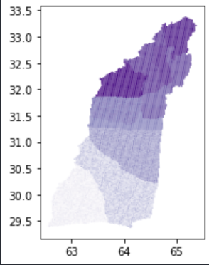
df_january.plot(cmap='Purples', legend=True);
我得到了一些看起来正确的东西,但是如果我将列指定为pred_labels或颜色,我将得到非常不稳定和混乱的情节。例如:
df_january.plot(column='pred_labels', cmap='Purples', legend=True);
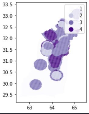
放大:
回答 1
Stack Overflow用户
发布于 2020-12-18 23:12:12
在J.Warren之后,将几何图形列放置在df的末尾改进了绘图。
页面原文内容由Stack Overflow提供。腾讯云小微IT领域专用引擎提供翻译支持
原文链接:
https://stackoverflow.com/questions/65364730
复制相关文章
相似问题
腾讯云开发者

Copyright © 2013 - 2026 Tencent Cloud. All Rights Reserved. 腾讯云 版权所有
深圳市腾讯计算机系统有限公司 ICP备案/许可证号:粤B2-20090059 ![]() 粤公网安备44030502008569号
粤公网安备44030502008569号
腾讯云计算(北京)有限责任公司 京ICP证150476号 | 京ICP备11018762号