
使用柔性盒/网格灵活调整内容
使用柔性盒/网格灵活调整内容
提问于 2020-12-23 21:10:56
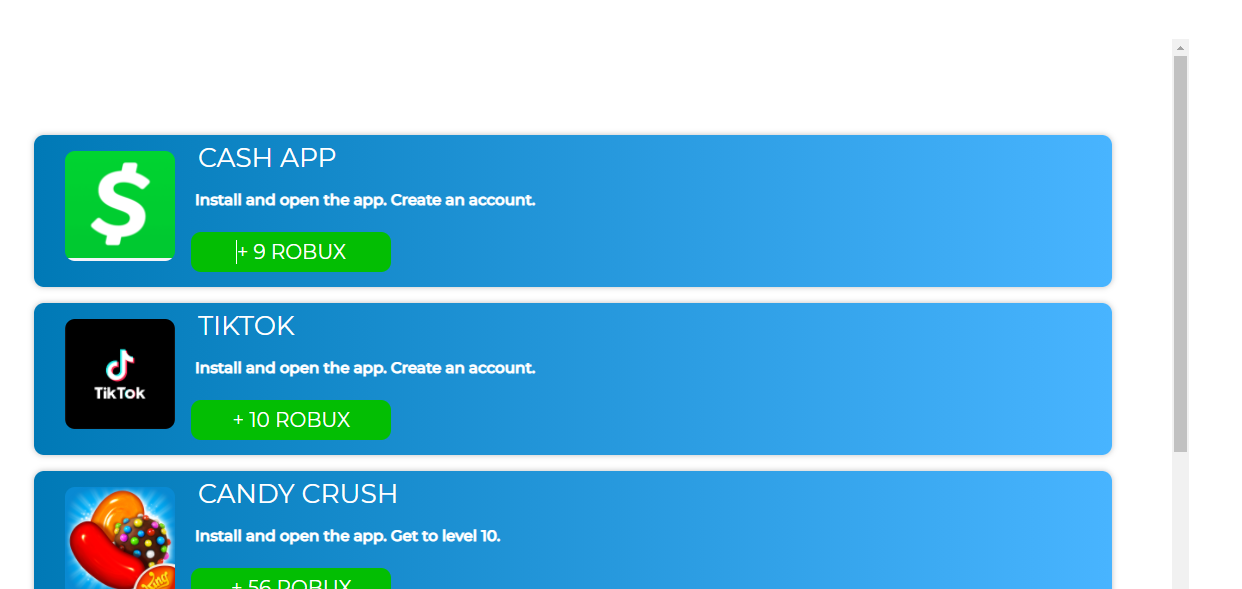
在这个图像中,元素和内容看起来是正常的。
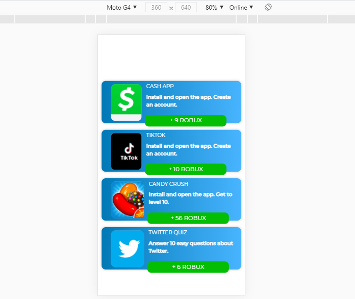
如此图像所示,当您调整页面大小时,内容无法正确调整大小。我知道我必须使用Flexbox来完成这个任务,但是,我对它并不熟悉。
我尝试过使用媒体查询,但这是非常无效的,还有一种更简单的方法来处理flexbox,我被告知。
我只是想要内容调整大小,而不破坏,或有任何问题。
<!doctype html>
<html lang="en">
  <head>
    <!-- Required meta tags -->
    <meta charset="utf-8">
    <meta name="viewport" content="width=device-width, initial-scale=1, shrink-to-fit=no">

    <!-- Bootstrap CSS -->
    <link rel="preconnect" href="https://fonts.gstatic.com">
    <link href="https://fonts.googleapis.com/css2?family=Montserrat:wght@100;200;300;400;500&display=swap" rel="stylesheet">
    <link rel="stylesheet" href="https://stackpath.bootstrapcdn.com/bootstrap/4.5.2/css/bootstrap.min.css" integrity="sha384-JcKb8q3iqJ61gNV9KGb8thSsNjpSL0n8PARn9HuZOnIxN0hoP+VmmDGMN5t9UJ0Z" crossorigin="anonymous">
    <link rel = "stylesheet" href="style.css">


  </head>
  <body>
    <div class = "main-box">
       <div class = "container-parent">
            <div class = "container">
                <div class = "img-box img-1"></div>

                <div class = "offer-details-box">
                    <div class = "offer-heading">Cash App</div>
                    <div class = "offer-inst">Install and open the app. Create an account.</div>


                    <div class = "rbx-amt">
                       +
                        <span class = "amt">9</span>
                        ROBUX
                    </div>

                </div>


            </div>
            <div class = "container">
                <div class = "img-box img-2">
                </div>
                <div class = "offer-details-box">
                    <div class = "offer-heading">TikTok</div>
                    <div class = "offer-inst">Install and open the app. Create an account.</div>
                    <div class = "rbx-amt">
                       +
                        <span class = "amt">10</span>
                        ROBUX
                    </div>
                </div>
            </div>

            <div class = "container">
                <div class = "img-box img-3">
                </div>
                <div class = "offer-details-box">
                    <div class = "offer-heading">Candy Crush</div>
                    <div class = "offer-inst">Install and open the app. Get to level 10.</div>
                    <div class = "rbx-amt">
                       +
                        <span class = "amt">56</span>
                        ROBUX
                    </div>
                </div>
            </div>

            <div class = "container">
                <div class = "img-box img-4">
                </div>
                <div class = "offer-details-box">
                    <div class = "offer-heading">Twitter Quiz</div>
                    <div class = "offer-inst">Answer 10 easy questions about Twitter.</div>
                    <div class = "rbx-amt">
                       +
                        <span class = "amt">6</span>
                        ROBUX
                    </div>
                </div>
            </div>
       </div>
    </div>

    <!-- Optional JavaScript -->
    <!-- jQuery first, then Popper.js, then Bootstrap JS -->
    <script src="https://code.jquery.com/jquery-3.5.1.slim.min.js" integrity="sha384-DfXdz2htPH0lsSSs5nCTpuj/zy4C+OGpamoFVy38MVBnE+IbbVYUew+OrCXaRkfj" crossorigin="anonymous"></script>
    <script src="https://cdn.jsdelivr.net/npm/popper.js@1.16.1/dist/umd/popper.min.js" integrity="sha384-9/reFTGAW83EW2RDu2S0VKaIzap3H66lZH81PoYlFhbGU+6BZp6G7niu735Sk7lN" crossorigin="anonymous"></script>
    <script src="https://stackpath.bootstrapcdn.com/bootstrap/4.5.2/js/bootstrap.min.js" integrity="sha384-B4gt1jrGC7Jh4AgTPSdUtOBvfO8shuf57BaghqFfPlYxofvL8/KUEfYiJOMMV+rV" crossorigin="anonymous"></script>
  </body>
</html>
CSS
* {margin: none;
padding: none;
box-sizing: border-box;
font-family: 'Montserrat';}

body {
height: 100vh;
width: 100%;}


.main-box {width: 90%;
border-radius: 10px solid black;
display: block;
height: 90%;
width: 90%;
margin: 5% auto;
border-radius: 10px;
overflow-y: scroll;
}

.container-parent {
margin-top: 5em;
margin-right: auto;
margin-left: auto;
display: inline-block;
width: 100%;
height: 100%;}

.img-box {
background-color: #f4f4f8;
height: 110px;
width: 110px;
display: inline-block;
float:left;
margin:1em;
border-radius: 10px;
background-size: cover;
background-repeat: no-repeat;

}

.img-1 {background-image: url(img/cash-app.png);
background-size: 100%;
background-repeat: none;}

.img-2 {background-image: url(img/tiktok-logo.png);}

.img-3 {background-image: url(img/candy-crush.png);}

.img-4 {background-image: url(img/twitter-logo.png);}

.container {
display: flex;
width: 90%;
height: 27%;
margin: 1em auto;
border-radius: 10px;
background: linear-gradient(90deg, rgba(0,121,182,1) 0%, rgba(72,180,255,1) 100%);
box-shadow: 0px 0px 6px 0px rgba(0,0,0,0.25);
}

.offer-heading {
    display: inline-block;
    font-size: 1.65em;
    text-transform: uppercase;
    padding: 0.1em 0.25em;


    color: white;
    border-radius: 5px;
    font-weight: 400;}

.offer-desc {
    display:block;
    font-size: 0.95em;
    padding: 0.1em 0.25em;
    color: white;
    border-radius: 5px;
    font-weight: 300;
    text-transform: uppercase;}

.offer-inst {
    margin-top: 0.5em;
    display:block;
    font-size: 0.95em;
    padding: 0.1em 0.25em;
    color: white;
    font-weight: 600;
    border-radius: 5px;}

.rbx-amt {color: white;
font-size: 1.25em;
background-color: #03be03;
text-align: center;
padding: 0.25em;
width: 200px;
margin-top: 1em;
border-radius: 10px;
}

float: right;}
.offer-details-box {
margin-top: 1.5em;
margin-left:1em;
display:inline-block;}

@media all and (max-width:1024px)

{.img-box{height: 150px;
    width: 150px;}
    .rbx-amt {font-size: 2em;}
    .offer-inst {font-size: 1.3em;}
    .container {height: 30%;}}

@media all and (max-width:1005px)

{.rbx-amt{font-size: 1.5em;
    margin-top: 0.5em;}}

@media all and (max-width:800px)

{.main-box{width:100%; }
    .container{width: 100%;}}

@media all and (max-width:769px)

{.img-box{height:120px;}}

@media all and (max-width:627px)

{.main-box{width: 100%;}
    .container {width: 95%;}}

@media all and (max-width:720px)

{.offer-heading{font-size: 1.25em;
    margin-top: 0.25em;}
    .offer-desc{font-size: 1.1em;}
    .offer-inst {font-size: 1.1em;
    margin-top: 0.25em;}
    .rbx-amt {margin-top: 1em;
    font-size: 1.4em;}
    .img-box {height: 120px;}

    .container {height: 25%;}}

@media all and (max-width:500px)

{.offer-heading{font-size: 0.8em;}
    .offer-inst{font-size: 0.8em;}
    .rbx-amt {font-size: 0.9em;}
    .container {height: 18%;}
    .img-box {width: 100px;
    height: 90px;
    margin: 0.5em;}}
https://codepen.io/smallbluecactus/pen/poEWQzO
(在将代码放到html文件中时,外观已损坏)
回答 1
Stack Overflow用户
回答已采纳
发布于 2020-12-23 21:18:06
问题是你在container div上不同的断点设置了高度。我把它换成了汽车,现在看起来很好。
CODEPEN工作代码: https://codepen.io/emmeiWhite/pen/bGwoQEv?editors=1100
* {margin: none;
padding: none;
box-sizing: border-box;
font-family: 'Montserrat';}

body {
height: 100vh;
width: 100%;}


.main-box {width: 90%;
border-radius: 10px solid black;
display: block;
height: 90%;
width: 90%;
margin: 5% auto;
border-radius: 10px;
overflow-y: scroll;
}

.container-parent {
margin-top: 5em;
margin-right: auto;
margin-left: auto;
display: inline-block;
width: 100%;
height: 100%;}

.img-box {
background-color: #f4f4f8;
height: 110px;
width: 110px;
display: inline-block;
float:left;
margin:1em;
border-radius: 10px;
background-size: cover;
background-repeat: no-repeat;

}

.img-1 {background-image: url(img/cash-app.png);
background-size: 100%;
background-repeat: none;}

.img-2 {background-image: url(img/tiktok-logo.png);}

.img-3 {background-image: url(img/candy-crush.png);}

.img-4 {background-image: url(img/twitter-logo.png);}

.container {
display: flex;
width: 90%;
height: auto;
margin: 1em auto;
border-radius: 10px;
background: linear-gradient(90deg, rgba(0,121,182,1) 0%, rgba(72,180,255,1) 100%);
box-shadow: 0px 0px 6px 0px rgba(0,0,0,0.25);
}

.offer-heading {
    display: inline-block;
    font-size: 1.65em;
    text-transform: uppercase;
    padding: 0.1em 0.25em;


    color: white;
    border-radius: 5px;
    font-weight: 400;}

.offer-desc {
    display:block;
    font-size: 0.95em;
    padding: 0.1em 0.25em;
    color: white;
    border-radius: 5px;
    font-weight: 300;
    text-transform: uppercase;}

.offer-inst {
    margin-top: 0.5em;
    display:block;
    font-size: 0.95em;
    padding: 0.1em 0.25em;
    color: white;
    font-weight: 600;
    border-radius: 5px;}

.rbx-amt {color: white;
font-size: 1.25em;
background-color: #03be03;
text-align: center;
padding: 0.25em;
width: 200px;
margin-top: 1em;
border-radius: 10px;
}

float: right;}
.offer-details-box {
margin-top: 1.5em;
margin-left:1em;
display:inline-block;}

@media all and (max-width:1024px)

{.img-box{height: 150px;
    width: 150px;}
    .rbx-amt {font-size: 2em;}
    .offer-inst {font-size: 1.3em;}
    .container {height: auto;}}

@media all and (max-width:1005px)

{.rbx-amt{font-size: 1.5em;
    margin-top: 0.5em;}}

@media all and (max-width:800px)

{.main-box{width:100%; }
    .container{width: 100%;}}

@media all and (max-width:769px)

{.img-box{height:120px;}}

@media all and (max-width:627px)

{.main-box{width: 100%;}
    .container {width: 95%;}}

@media all and (max-width:720px)

{.offer-heading{font-size: 1.25em;
    margin-top: 0.25em;}
    .offer-desc{font-size: 1.1em;}
    .offer-inst {font-size: 1.1em;
    margin-top: 0.25em;}
    .rbx-amt {margin-top: 1em;
    font-size: 1.4em;}
    .img-box {height: 120px;}

    .container {height: auto}}

@media all and (max-width:500px)

{.offer-heading{font-size: 0.8em;}
    .offer-inst{font-size: 0.8em;}
    .rbx-amt {font-size: 0.9em;}
    .container {height: auto;}
    .img-box {width: 100px;
    height: 90px;
margin: 0.5em;}}<!doctype html>
<html lang="en">
<head>
<!-- Required meta tags -->
<meta charset="utf-8">
<meta name="viewport" content="width=device-width, initial-scale=1, shrink-to-fit=no">
<!-- Bootstrap CSS -->
<link rel="preconnect" href="https://fonts.gstatic.com">
<link href="https://fonts.googleapis.com/css2?family=Montserrat:wght@100;200;300;400;500&display=swap" rel="stylesheet">
<link rel="stylesheet" href="https://stackpath.bootstrapcdn.com/bootstrap/4.5.2/css/bootstrap.min.css" integrity="sha384-JcKb8q3iqJ61gNV9KGb8thSsNjpSL0n8PARn9HuZOnIxN0hoP+VmmDGMN5t9UJ0Z" crossorigin="anonymous">
<link rel = "stylesheet" href="style.css">
</head>
<body>
<div class = "main-box">
<div class = "container-parent">
<div class = "container">
<div class = "img-box img-1"></div>
<div class = "offer-details-box">
<div class = "offer-heading">Cash App</div>
<div class = "offer-inst">Install and open the app. Create an account.</div>
<div class = "rbx-amt">
+
<span class = "amt">9</span>
ROBUX
</div>
</div>
</div>
<div class = "container">
<div class = "img-box img-2">
</div>
<div class = "offer-details-box">
<div class = "offer-heading">TikTok</div>
<div class = "offer-inst">Install and open the app. Create an account.</div>
<div class = "rbx-amt">
+
<span class = "amt">10</span>
ROBUX
</div>
</div>
</div>
<div class = "container">
<div class = "img-box img-3">
</div>
<div class = "offer-details-box">
<div class = "offer-heading">Candy Crush</div>
<div class = "offer-inst">Install and open the app. Get to level 10.</div>
<div class = "rbx-amt">
+
<span class = "amt">56</span>
ROBUX
</div>
</div>
</div>
<div class = "container">
<div class = "img-box img-4">
</div>
<div class = "offer-details-box">
<div class = "offer-heading">Twitter Quiz</div>
<div class = "offer-inst">Answer 10 easy questions about Twitter.</div>
<div class = "rbx-amt">
+
<span class = "amt">6</span>
ROBUX
</div>
</div>
</div>
</div>
</div>
<!-- Optional JavaScript -->
<!-- jQuery first, then Popper.js, then Bootstrap JS -->
<script src="https://code.jquery.com/jquery-3.5.1.slim.min.js" integrity="sha384-DfXdz2htPH0lsSSs5nCTpuj/zy4C+OGpamoFVy38MVBnE+IbbVYUew+OrCXaRkfj" crossorigin="anonymous"></script>
<script src="https://cdn.jsdelivr.net/npm/popper.js@1.16.1/dist/umd/popper.min.js" integrity="sha384-9/reFTGAW83EW2RDu2S0VKaIzap3H66lZH81PoYlFhbGU+6BZp6G7niu735Sk7lN" crossorigin="anonymous"></script>
<script src="https://stackpath.bootstrapcdn.com/bootstrap/4.5.2/js/bootstrap.min.js" integrity="sha384-B4gt1jrGC7Jh4AgTPSdUtOBvfO8shuf57BaghqFfPlYxofvL8/KUEfYiJOMMV+rV" crossorigin="anonymous"></script>
</body>
</html>
页面原文内容由Stack Overflow提供。腾讯云小微IT领域专用引擎提供翻译支持
原文链接:
https://stackoverflow.com/questions/65430994
复制相关文章
相似问题
腾讯云开发者

Copyright © 2013 - 2026 Tencent Cloud. All Rights Reserved. 腾讯云 版权所有
深圳市腾讯计算机系统有限公司 ICP备案/许可证号:粤B2-20090059  粤公网安备44030502008569号
腾讯云计算(北京)有限责任公司 京ICP证150476号 | 京ICP备11018762号