
如何使用ggrepel放置数据标签
如何使用ggrepel放置数据标签
提问于 2021-01-05 20:10:22
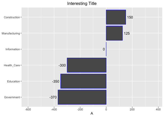
首先是示例数据和一些操作。
  A<- c(150,125,0,-300,-350,-370)
  Series<-
  c("Construction","Manufacturing","Information","Health_Care","Education","Government")

  testdf <- data.frame(A,Series)

  jobgrowth<-ggplot(data=testdf, aes(y=A, x = reorder(Series,A))) +
  geom_col(color="blue") + coord_flip() +
  labs(x = NULL) + ggtitle("Interesting Title") +
  theme(plot.title.position = "plot",
plot.title = element_text(hjust = 0.5))+环顾四周,我发现ggrepel是一个很好的包(https://ggrepel.slowkow.com/articles/examples.html)。但是,我的尝试会导致一个错误。
Error: geom_text_repel requires the following missing aesthetics: label那么,我的问题是,在哪里插入标签文本,然后如何使数据标签在值为正时在右边,当值为负值时,在左边?例如,建筑将有150人在酒吧的右边。
回答 1
Stack Overflow用户
回答已采纳
发布于 2021-01-05 20:24:00
你不需要ggrepel。如果必须处理重叠标签,ggrepel是一个很好的选择。但是,如果使用条形图,我建议使用默认的geom_text,如下所示:
使用ifelse你可以
- 将
hjust设置为右或左对齐标签 - ,在栏和标签
之间添加一些空格。
A <- c(150, 125, 0, -300, -350, -370)
Series <-
  c("Construction", "Manufacturing", "Information", "Health_Care", "Education", "Government")

testdf <- data.frame(A, Series)

library(ggplot2)

ggplot(data = testdf, aes(y = A, x = reorder(Series, A))) +
  geom_col(color = "blue") +
  coord_flip() +
  scale_y_continuous(expand = expansion(mult = 0.5)) +
  geom_text(aes(label = A, hjust = ifelse(A > 0, 0, 1), y = A + ifelse(A > 0, 10, -10))) +
  labs(x = NULL) +
  ggtitle("Interesting Title") +
  theme(
    plot.title.position = "plot",
    plot.title = element_text(hjust = 0.5)
  )
页面原文内容由Stack Overflow提供。腾讯云小微IT领域专用引擎提供翻译支持
原文链接:
https://stackoverflow.com/questions/65585887
复制相关文章
相似问题
腾讯云开发者

Copyright © 2013 - 2026 Tencent Cloud. All Rights Reserved. 腾讯云 版权所有
深圳市腾讯计算机系统有限公司 ICP备案/许可证号:粤B2-20090059 ![]() 粤公网安备44030502008569号
粤公网安备44030502008569号
腾讯云计算(北京)有限责任公司 京ICP证150476号 | 京ICP备11018762号