
如何在r中使用ggtext来显示轴数据标签?
如何在r中使用ggtext来显示轴数据标签?
提问于 2021-01-10 11:10:27
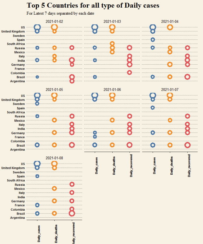
我遇到了ggtext包,从https://wilkelab.org/ggtext/到用element_markdown()给axis数据标签着色,并尝试给我的轴标签着色,但失败了。
代码(没有ggtext)
library(tidyverse)

read.csv("https://raw.githubusercontent.com/johnsnow09/covid19-df_stack-code/main/df_stack_limited.csv") %>%

  ggplot(aes(x = Cases_type, y = Country.Region)) +
  geom_point(shape = 21, aes(size = Cases_size, color = Cases_type), fill="#f8f2e4", stroke=3) +
  # theme_minimal() +
  theme_wsj() +
  theme(axis.text.x = element_text(angle = 90),
        axis.text = element_text(size = 8),
        legend.position = "none",
        plot.title = element_text(face = "bold", family = "serif", size = 20),
        plot.subtitle = element_text(face = "plain", family = "serif", size = 12),
        plot.caption = element_text(face = "plain", family = "serif", size = 9)) +

  scale_color_tableau(palette = "Tableau 10") +
  # scale_color_wsj(palette = "colors6") +

  facet_wrap(~Date) +
  labs(title = "Top 5 Countries for all type of Daily cases",
       subtitle = "For Latest 7 days separated by each date",
       caption = "created by ViSa (SciArt!!)") +
  coord_cartesian(clip = "off")
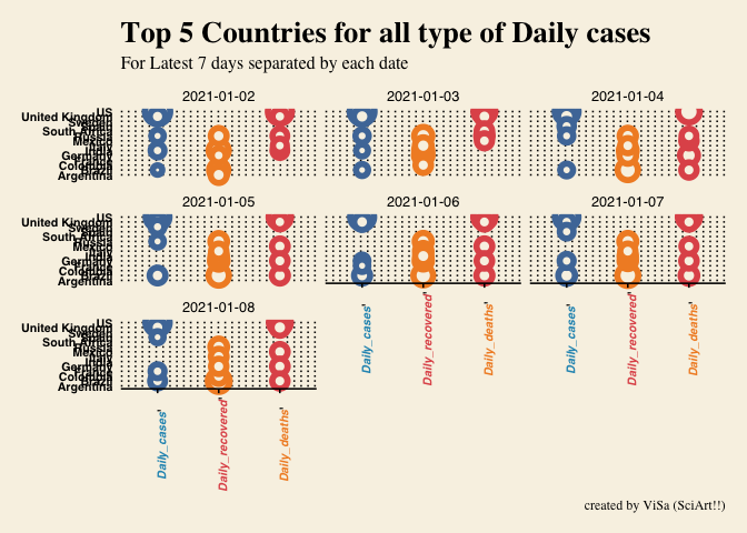
现在,如果我将ggtext x-axis 添加到x-axis数据标签中,则会得到错误。
library(tidyverse)
library(ggtext)

color = c("#2596be", "#f28e2b", "#e15759")

read.csv("https://raw.githubusercontent.com/johnsnow09/covid19-df_stack-code/main/df_stack_limited.csv") %>%

  mutate(Cases_type = glue("<i style='color:{color}>{Cases_type}</i>'")) %>%

  ggplot(aes(x = Cases_type, y = Country.Region)) +
  geom_point(shape = 21, aes(size = Cases_size, color = Cases_type), fill="#f8f2e4", stroke=3) +
  # theme_minimal() +
  theme_wsj() +
  theme(axis.text.x = element_text(angle = 90),
        axis.text = element_text(size = 8),
        legend.position = "none",
        plot.title = element_text(face = "bold", family = "serif", size = 20),
        plot.subtitle = element_text(face = "plain", family = "serif", size = 12),
        plot.caption = element_text(face = "plain", family = "serif", size = 9)) +

  theme(axis.text.x = element_markdown()) +
  scale_color_tableau(palette = "Tableau 10") +
  # scale_color_wsj(palette = "colors6") +

  facet_wrap(~Date) +
  labs(title = "Top 5 Countries for all type of Daily cases",
       subtitle = "For Latest 7 days separated by each date",
       caption = "created by ViSa (SciArt!!)") +
coord_cartesian(clip = "off")回答 2
Stack Overflow用户
回答已采纳
发布于 2021-01-10 11:31:26
问题是,您尝试使用长度为105的向量glue长度为3的color向量和Cases_type列。相反,让color成为一个命名的向量,并使用color[Cases_type],以确保您分配正确的颜色。此外,您的glue语句中缺少一个引号。
library(tidyverse)
library(ggtext)
library(glue)
library(ggthemes)

color = c(Daily_cases = "#2596be", Daily_deaths = "#f28e2b", Daily_recovered = "#e15759")

d <- read.csv("https://raw.githubusercontent.com/johnsnow09/covid19-df_stack-code/main/df_stack_limited.csv") %>%
  mutate(Cases_type = glue("<i style='color: {color[Cases_type]}'>{Cases_type}</i>'"))

d %>%
  ggplot(aes(x = Cases_type, y = Country.Region)) +
  geom_point(shape = 21, aes(size = Cases_size, color = Cases_type), fill="#f8f2e4", stroke=3) +
  #theme_minimal() +
  theme_wsj() +
  theme(axis.text.x = element_text(angle = 90),
        axis.text = element_text(size = 8),
        legend.position = "none",
        plot.title = element_text(face = "bold", family = "serif", size = 20),
        plot.subtitle = element_text(face = "plain", family = "serif", size = 12),
        plot.caption = element_text(face = "plain", family = "serif", size = 9)) +
  theme(axis.text.x = element_markdown()) +
  scale_color_tableau(palette = "Tableau 10") +
  # scale_color_wsj(palette = "colors6") +
  facet_wrap(~Date) +
  labs(title = "Top 5 Countries for all type of Daily cases",
       subtitle = "For Latest 7 days separated by each date",
       caption = "created by ViSa (SciArt!!)") +
  coord_cartesian(clip = "off")
Stack Overflow用户
发布于 2021-01-10 11:29:31
我认为你需要改变
"<i style='color:{color}>{Cases_type}</i>'"至
"<i style='color:{color}'>{Cases_type}</i>"页面原文内容由Stack Overflow提供。腾讯云小微IT领域专用引擎提供翻译支持
原文链接:
https://stackoverflow.com/questions/65652600
复制相关文章
相似问题
腾讯云开发者

Copyright © 2013 - 2026 Tencent Cloud. All Rights Reserved. 腾讯云 版权所有
深圳市腾讯计算机系统有限公司 ICP备案/许可证号:粤B2-20090059 ![]() 粤公网安备44030502008569号
粤公网安备44030502008569号
腾讯云计算(北京)有限责任公司 京ICP证150476号 | 京ICP备11018762号