
是否有一种简洁的方法可以用geom_quantile()中的方程和其他统计数据来标记一个ggplot?
我想包括geom_quantile()拟合线的相关统计数据,其方式类似于geom_smooth(method="lm")拟合的线性回归(以前使用过ggpmisc,即太棒了)。例如,这段代码:
# quantile regression example with ggpmisc equation
# basic quantile code from here:
# https://ggplot2.tidyverse.org/reference/geom_quantile.html
library(tidyverse)
library(ggpmisc)
# see ggpmisc vignette for stat_poly_eq() code below:
# https://cran.r-project.org/web/packages/ggpmisc/vignettes/user-guide.html#stat_poly_eq
my_formula <- y ~ x
#my_formula <- y ~ poly(x, 3, raw = TRUE)
# linear ols regression with equation labelled
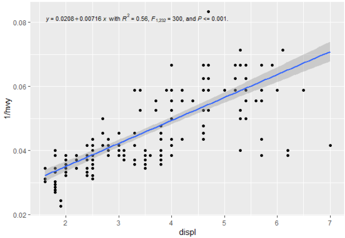
m <- ggplot(mpg, aes(displ, 1 / hwy)) +
geom_point()
m +
geom_smooth(method = "lm", formula = my_formula) +
stat_poly_eq(aes(label = paste(stat(eq.label), "*\" with \"*",
stat(rr.label), "*\", \"*",
stat(f.value.label), "*\", and \"*",
stat(p.value.label), "*\".\"",
sep = "")),
formula = my_formula, parse = TRUE, size = 3) 生成以下内容:
对于分位数回归,您可以将geom_smooth()替换为geom_quantile(),并绘制一条可爱的分位数回归线(在本例中为中位数):
# quantile regression - no equation labelling
m +
  geom_quantile(quantiles = 0.5)
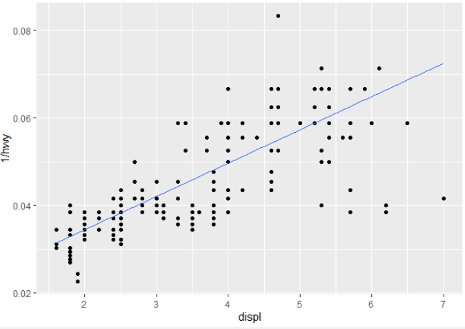
您将如何将汇总统计信息输出到标签中,或者在运行过程中重新创建它们?(也就是说,除了在调用ggplot之前进行回归,然后将其传递给注释(例如,类似于线性回归的这里或这里 )?
回答 2
Stack Overflow用户
发布于 2021-01-29 03:46:51
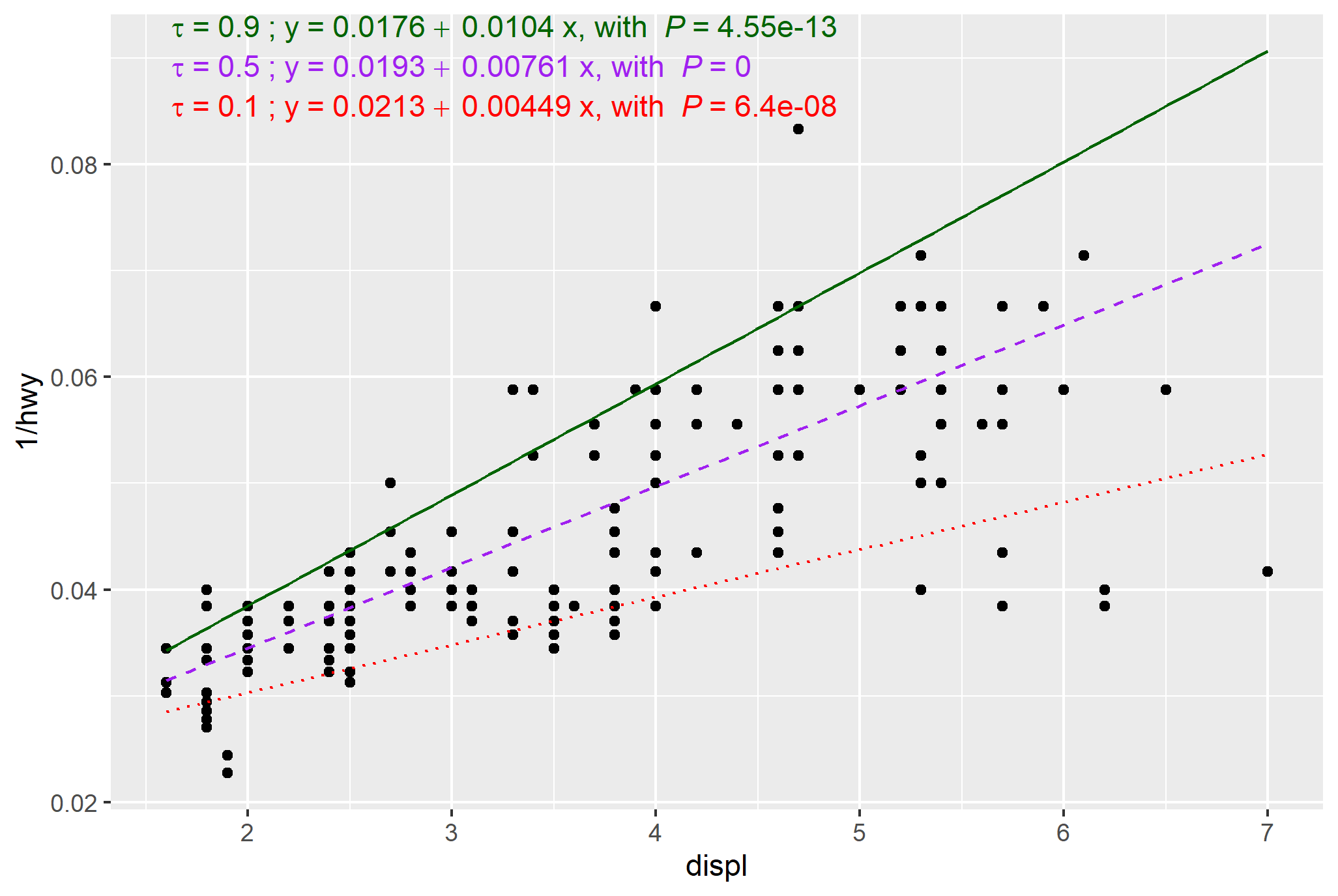
请考虑这是Pedro出色答案的附录,他做了大部分繁重的工作--这增加了一些表示调整(颜色和线型)和代码来简化多个分位数,产生了下面的情节:
library(tidyverse)
library(ggpmisc) #ensure version 0.3.8 or greater
library(quantreg)
library(generics)

my_formula <- y ~ x
#my_formula <- y ~ poly(x, 3, raw = TRUE)

# base plot
m <- ggplot(mpg, aes(displ, 1 / hwy)) +
  geom_point()

# function for labelling
# Doesn't neatly handle P values (e.g return "P<0.001 where appropriate)

stat_rq_eqn <- function(formula = y ~ x, tau = 0.5, colour = "red", label.y = 0.9, ...) {
  stat_fit_tidy(method = "rq",
                method.args = list(formula = formula, tau = tau),
                tidy.args = list(se.type = "nid"),
                mapping = aes(label = sprintf('italic(tau)~"="~%.3f~";"~y~"="~%.3g~+~%.3g~x*", with "~italic(P)~"="~%.3g',
                                              after_stat(x_tau),
                                              after_stat(Intercept_estimate),
                                              after_stat(x_estimate),
                                              after_stat(x_p.value))),
                parse = TRUE,
                colour = colour,
                label.y = label.y,
                ...)
}

# This works, though with double entry of plot specs
# custom colours and linetype
# https://stackoverflow.com/a/44383810/4927395
# https://stackoverflow.com/a/64518380/4927395


m +
  geom_quantile(quantiles = c(0.1, 0.5, 0.9),
                aes(colour = as.factor(..quantile..),
                    linetype = as.factor(..quantile..))
                )+
  scale_color_manual(values = c("red","purple","darkgreen"))+
  scale_linetype_manual(values = c("dotted", "dashed", "solid"))+
  stat_rq_eqn(tau = 0.1, colour = "red", label.y = 0.9)+
  stat_rq_eqn(tau = 0.5, colour = "purple", label.y = 0.95)+
  stat_rq_eqn(tau = 0.9, colour = "darkgreen", label.y = 1.0)+
  theme(legend.position = "none") # suppress legend


# not a good habit to have double entry above
# modified with reference to tibble for plot specs,
# though still a stat_rq_eqn call for each quantile and manual vertical placement
# https://www.r-bloggers.com/2019/06/curly-curly-the-successor-of-bang-bang/

my_tau = c(0.1, 0.5, 0.9)
my_colours = c("red","purple","darkgreen")
my_linetype = c("dotted", "dashed", "solid")

quantile_plot_specs <- tibble(my_tau, my_colours, my_linetype)

m +
  geom_quantile(quantiles = {{quantile_plot_specs$my_tau}},
                aes(colour = as.factor(..quantile..),
                    linetype = as.factor(..quantile..))
  )+
  scale_color_manual(values = {{quantile_plot_specs$my_colours}})+
  scale_linetype_manual(values = {{quantile_plot_specs$my_linetype}})+
  stat_rq_eqn(tau = {{quantile_plot_specs$my_tau[1]}}, colour = {{quantile_plot_specs$my_colours[1]}}, label.y = 0.9)+
  stat_rq_eqn(tau = {{quantile_plot_specs$my_tau[2]}}, colour = {{quantile_plot_specs$my_colours[2]}}, label.y = 0.95)+
  stat_rq_eqn(tau = {{quantile_plot_specs$my_tau[3]}}, colour = {{quantile_plot_specs$my_colours[3]}}, label.y = 1.0)+
theme(legend.position = "none")Stack Overflow用户
发布于 2021-01-21 18:16:48
@mark-neal stat_fit_glance()确实与quantreg::rq()一起工作。然而,使用stat_fit_glance()更复杂。这个stat并不“知道”glance()会带来什么,因此必须手动组装label。
我们需要知道这方面有什么可用的。您可以运行fit模型,并使用glance()查找它返回的列,也可以通过包'gginnards‘在gg图中执行此操作。我将展示这个替代方案,继续上面的代码示例。
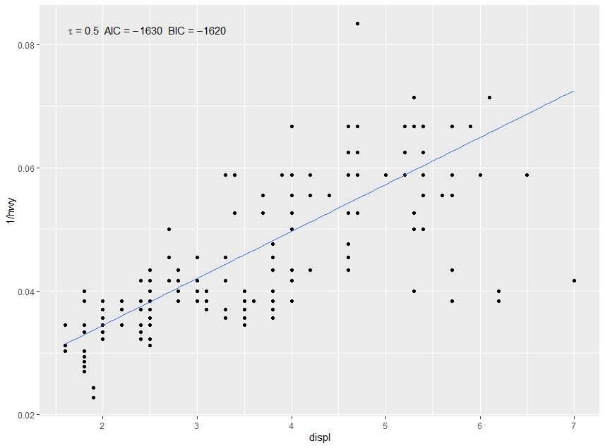
library(gginnards)

m +
  geom_quantile(quantiles = 0.5) +
stat_fit_glance(method = "rq", method.args = list(formula = y ~ x), geom = "debug")默认情况下,geom_debug()只将它的输入输出到R控制台,它的输入就是统计数据返回的内容。
# A tibble: 1 x 11
   npcx  npcy   tau logLik    AIC    BIC df.residual     x      y PANEL group
  <dbl> <dbl> <dbl>  <dbl>  <dbl>  <dbl>       <int> <dbl>  <dbl> <fct> <int>
1 NA NA 0.5 816. -1628. -1621. 232 1.87 0.0803 1 -1我们可以使用after_stat()访问这些列中的每一列(早期的化身是stat(),并包含名称... )。我们需要使用sprintf()的编码符号进行格式化。如果像在本例中一样,我们组装了一个需要解析为表达式的字符串,则还需要parse = TRUE。
m +
  geom_quantile(quantiles = 0.5) +
  stat_fit_glance(method = "rq", method.args = list(formula = y ~ x),
                  mapping = aes(label = sprintf('italic(tau)~"="~%.2f~~AIC~"="~%.3g~~BIC~"="~%.3g',
                                                after_stat(tau), after_stat(AIC), after_stat(BIC))),
                  parse = TRUE)
此示例的结果如下所示。
对于stat_fit_tidy(),同样的方法应该是有效的。但是,在'ggpmisc‘(<= 0.3.7)中,它使用的是"lm“,而不是"rq”。这个bug在'ggpmisc‘(>= 0.3.8)中修复,现在在CRAN中。
下面的示例仅适用于“ggpmisc”(>= 0.3.8)
剩下的问题是,glance()或tidy()返回的tidy()是否包含要添加到情节中的信息,至少在默认情况下,这似乎并不是tidy.qr()的情况。但是,tidy.rq()有一个参数se.type,用于确定tibble中返回的值。修改后的stat_fit_tidy()接受要传递给tidy()的命名参数,从而使以下操作成为可能。
m +
geom_quantile(quantiles = 0.5) +
stat_fit_tidy(method = "rq",
method.args = list(formula = y ~ x),
tidy.args = list(se.type = "nid"),
mapping = aes(label = sprintf('y~"="~%.3g~+~%.3g~x*", with "*italic(P)~"="~%.3f',
after_stat(Intercept_estimate),
after_stat(x_estimate),
after_stat(x_p.value))),
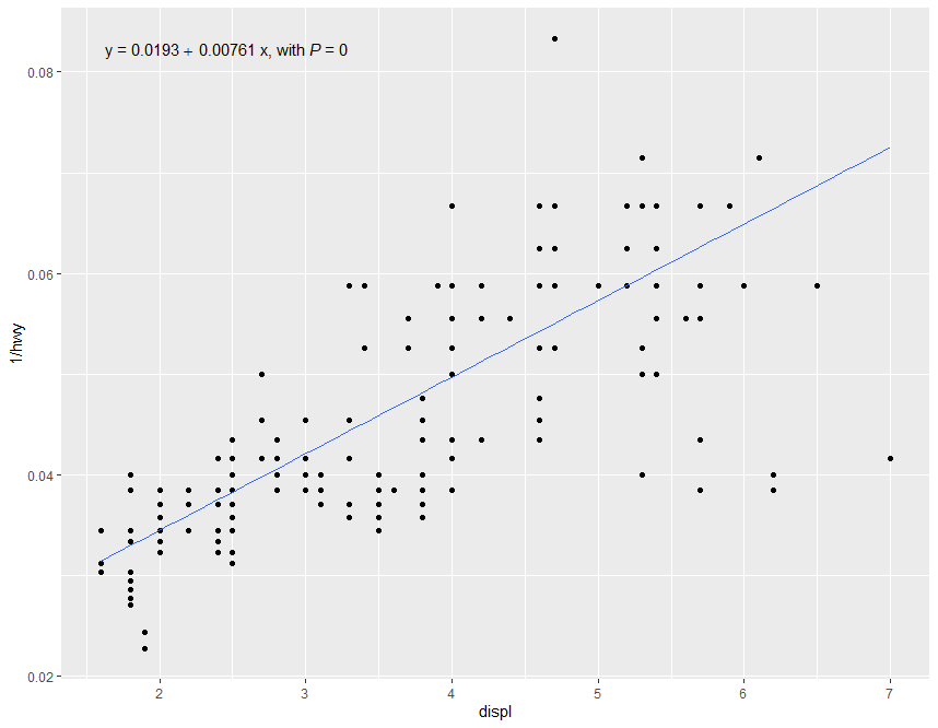
parse = TRUE)此示例的结果如下所示。
定义一个新的stat stat_rq_eq()将使这变得更加简单:
stat_rq_eqn <- function(formula = y ~ x, tau = 0.5, ...) {
  stat_fit_tidy(method = "rq",
                method.args = list(formula = formula, tau = tau),
                tidy.args = list(se.type = "nid"),
                mapping = aes(label = sprintf('y~"="~%.3g~+~%.3g~x*", with "*italic(P)~"="~%.3f',
                                              after_stat(Intercept_estimate),
                                              after_stat(x_estimate),
                                              after_stat(x_p.value))),
                parse = TRUE,
                ...)
}
答案变成:
m +
  geom_quantile(quantiles = 0.5) +
stat_rq_eqn(tau = 0.5)https://stackoverflow.com/questions/65695409
复制相似问题
腾讯云开发者

Copyright © 2013 - 2026 Tencent Cloud. All Rights Reserved. 腾讯云 版权所有
深圳市腾讯计算机系统有限公司 ICP备案/许可证号:粤B2-20090059 ![]() 粤公网安备44030502008569号
粤公网安备44030502008569号
腾讯云计算(北京)有限责任公司 京ICP证150476号 | 京ICP备11018762号