
R中的Web抓取数据映射
R中的Web抓取数据映射
提问于 2021-01-19 01:20:28
我试图在一张世界地图上可视化一张从维基百科上刮来的Polity系列数据集中的表格。
在去掉一些变量之后,我希望通过颜色编码来可视化国家及其政权类型(编码为Polity数据集IV类)。在网页上有一个世界地图可视化作为我复制的基础。
我查阅了来自这个网站的文档,似乎我需要将我的数据集与打包的地理数据结合起来。不过,我不知道该怎么做。
输入:
library(rvest)
library(dplyr)

polity <- read_html("https://en.wikipedia.org/wiki/Polity_data_series")

table <- polity %>% html_table(fill=T)

second_table <- table[[2]]
second_table <- second_table[c(1,5)]

polity <- second_table

library(sf)
library(rnaturalearth)
library(rnaturalearthdata)
library(ggplot2)

world <- ne_countries(scale = "medium", returnclass = "sf")

ggplot(data = world) +
    geom_sf() +
    xlab("Longitude") + ylab("Latitude") +
ggtitle("World map", subtitle = paste0("(", length(unique(world$NAME)), " countries)"))回答 1
Stack Overflow用户
回答已采纳
发布于 2021-01-19 09:03:08
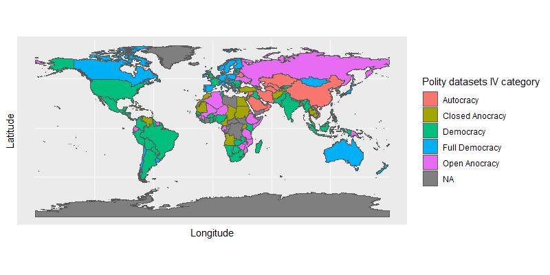
这个能做你想要的吗?
world2 <- left_join(world, polity,
                    by = c("name" = "Country"))

ggplot(data = world2) +
  geom_sf(aes(fill = `Polity datasets IV category`)) +
  xlab("Longitude") +
  ylab("Latitude")
页面原文内容由Stack Overflow提供。腾讯云小微IT领域专用引擎提供翻译支持
原文链接:
https://stackoverflow.com/questions/65784283
复制相关文章
相似问题
腾讯云开发者

Copyright © 2013 - 2026 Tencent Cloud. All Rights Reserved. 腾讯云 版权所有
深圳市腾讯计算机系统有限公司 ICP备案/许可证号:粤B2-20090059 ![]() 粤公网安备44030502008569号
粤公网安备44030502008569号
腾讯云计算(北京)有限责任公司 京ICP证150476号 | 京ICP备11018762号