
在ggplot中重命名和删除yaxis标签
在ggplot中重命名和删除yaxis标签
提问于 2021-03-10 02:16:56
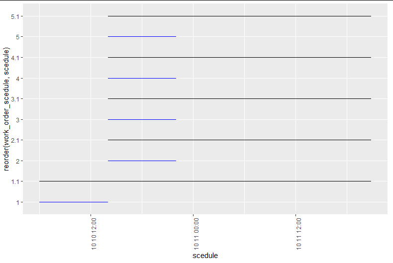
我试图想象工作是否按计划执行。
然而,我找不到一个好的包,所以我决定使用ggplot段代替。
但是,我找不到编辑yaxis详细标签的方法,所以我有几个问题。
No1。
我做了一个图表,当工作是排定的,什么时候做。
我在yaxis中添加了0.1来移动它们,但是它创建了一个不需要的轴标签。
有没有办法除去标签1.1,2.1,3.1,.?
No2。
我想用work_name列代替1,2,3,.
有办法这样做吗?
No3。
我想将xaxis改为显示"M/D“或"YMD”,而不是"M / D“格式,
有办法这样做吗?
我有这个数据集。
> test$work_name
[1] "work-11" "work-12" "work-13" "work-14" "work-15"
> test$work_order_scedule
[1] 1 2 3 4 5
> test$scedule
[1] "2019-10-10 06:00:01 UTC" "2019-10-10 14:00:03 UTC" "2019-10-10 14:00:03 UTC"
[4] "2019-10-10 14:00:03 UTC" "2019-10-10 14:00:03 UTC"
> test$scedule_end
[1] "2019-10-10 14:00:02 UTC" "2019-10-10 22:00:00 UTC" "2019-10-10 22:00:00 UTC"
[4] "2019-10-10 22:00:00 UTC" "2019-10-10 22:00:00 UTC"
> test$do
[1] "2019-10-10 06:00:01 UTC" "2019-10-10 14:00:03 UTC" "2019-10-10 14:00:03 UTC"
[4] "2019-10-10 14:00:03 UTC" "2019-10-10 14:00:03 UTC"
> test$do_end
[1] "2019-10-11 20:50:08 UTC" "2019-10-11 20:49:57 UTC" "2019-10-11 20:49:54 UTC"
[4] "2019-10-11 20:49:52 UTC" "2019-10-11 20:49:50 UTC"test<- data.frame(work_name=c("work-11","work-12","work-13","work-14","work-15"),
work_order_scedule=c(1 ,2 ,3 ,4 ,5),
scedule =c("2019-10-10 06:00:01" ,"2019-10-10 14:00:03", "2019-10-10 14:00:03","2019-10-10 14:00:03","2019-10-10 14:00:03"),
scedule_end=c("2019-10-10 14:00:02", "2019-10-10 22:00:00" ,"2019-10-10 22:00:00","2019-10-10 22:00:00" ,"2019-10-10 22:00:00"),
do=c("2019-10-10 06:00:01", "2019-10-10 14:00:03", "2019-10-10 14:00:03","2019-10-10 14:00:03" ,"2019-10-10 14:00:03"),
do_end=c("2019-10-11 20:50:08", "2019-10-11 20:49:57" ,"2019-10-11 20:49:54","2019-10-11 20:49:52" ,"2019-10-11 20:49:50")
)和地块代码
test %>%
ggplot() +
  geom_segment(
    aes(y=reorder(work_order_scedule,scedule), yend=reorder(work_order_scedule,scedule),
        x=scedule, xend=scedule_end),
    color="blue",
    size=0.1)+
  theme(axis.text.x = element_text(angle=90, hjust=1))+

  geom_segment(
    aes(y=reorder(work_order_scedule+0.1,scedule), yend=reorder(work_order_scedule+0.1,scedule),
        x=do, xend=do_end),
    color="black",
    size=0.1)+
  theme(axis.text.x = element_text(angle=90, hjust=1))
回答 1
Stack Overflow用户
回答已采纳
发布于 2021-03-10 17:14:48
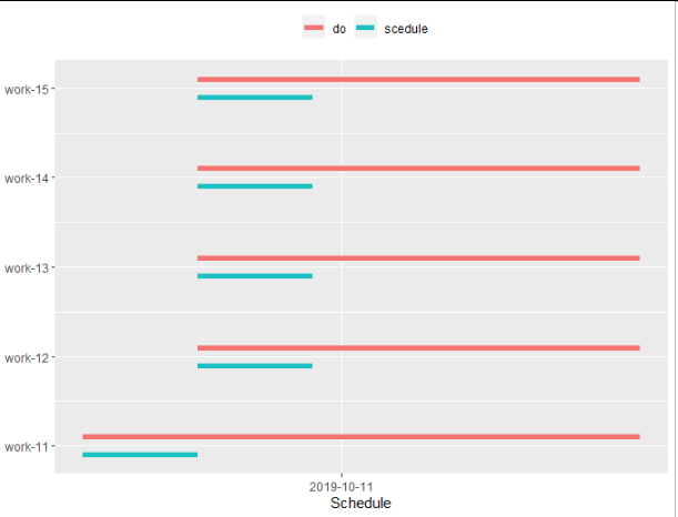
为了简化过程,我首先对数据进行了重组。
test2 <-
full_join(test%>%transmute(work_name, work_order_scedule, what = "scedule",
                           start = as.POSIXct(scedule), end = as.POSIXct(scedule_end)),
          test%>%transmute(work_name, work_order_scedule, what = "do",
                           start = as.POSIXct(do), end = as.POSIXct(do_end))) %>%
  arrange(start)

test2
##    work_name work_order_scedule    what               start                 end
## 1    work-11                  1 scedule 2019-10-10 06:00:01 2019-10-10 14:00:02
## 2    work-11                  1      do 2019-10-10 06:00:01 2019-10-11 20:50:08
## 3    work-12                  2 scedule 2019-10-10 14:00:03 2019-10-10 22:00:00
## 4    work-13                  3 scedule 2019-10-10 14:00:03 2019-10-10 22:00:00
## 5    work-14                  4 scedule 2019-10-10 14:00:03 2019-10-10 22:00:00
## 6    work-15                  5 scedule 2019-10-10 14:00:03 2019-10-10 22:00:00
## 7    work-12                  2      do 2019-10-10 14:00:03 2019-10-11 20:49:57
## 8    work-13                  3      do 2019-10-10 14:00:03 2019-10-11 20:49:54
## 9    work-14                  4      do 2019-10-10 14:00:03 2019-10-11 20:49:52
## 10   work-15                  5      do 2019-10-10 14:00:03 2019-10-11 20:49:50
然后我策划了:
ggplot(mapping = aes(x = start, xend = end,
                     y = work_order_scedule, yend = work_order_scedule,
                     color = what)) +
  geom_segment(data = test2%>%filter(what == "scedule"),
               position = position_nudge(y = -0.1), #move down by 0.1
               size = 2) +
  geom_segment(data = test2%>%filter(what == "do"),
               position = position_nudge(y = 0.1), #move up y 0.1
               size = 2) +
  scale_x_datetime(name = "Schedule", # rename x axis
                   date_breaks = "days", # daily time-step
                   date_labels = "%Y-%m-%d") + #time format of the axis label
  scale_y_continuous(name = NULL, # remove y title
                     breaks = unique(as.integer(test2$work_order_scedule)),
                     labels = unique(test2$work_name)) + #replace 1:5 by the work name
  scale_color_discrete(name = NULL) + #remove legend name
  theme(legend.position = "top") #move the legend to the top
页面原文内容由Stack Overflow提供。腾讯云小微IT领域专用引擎提供翻译支持
原文链接:
https://stackoverflow.com/questions/66557448
复制相关文章
相似问题
腾讯云开发者

Copyright © 2013 - 2026 Tencent Cloud. All Rights Reserved. 腾讯云 版权所有
深圳市腾讯计算机系统有限公司 ICP备案/许可证号:粤B2-20090059 ![]() 粤公网安备44030502008569号
粤公网安备44030502008569号
腾讯云计算(北京)有限责任公司 京ICP证150476号 | 京ICP备11018762号