
使用gaussian_kde和海上部署时不同的KDE渲染
然而,在使用seaborn和gaussian_kde绘图时,我得到了两个不同的发行版,尽管使用了相同的bandwidth大小。
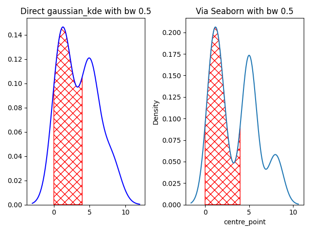
在上面的图片中,如果数据直接输入到gaussian_kde中,则左边是分布。如果数据输入seaborn kdeplot,则正确的绘图是数据的分布。
另外,给定边界的曲线下面积在这两种绘制分布的方法之间并不相似。
auc使用gaussian_kde : 47.7,auc使用海运: 49.5
我可以知道是什么原因造成了这种差异吗?是否有一种方法来标准化输出,而不管使用什么方法(例如,seaborn或gaussian_kde)?
下面给出了再现上述plot和auc的代码。
import seaborn as sns
import matplotlib.pyplot as plt
from scipy.stats import gaussian_kde


time_window_order = ['272', '268', '264', '260', '256', '252', '248', '244', '240']
order_dict = {k: i for i, k in enumerate ( time_window_order )}
df = pd.DataFrame ( {'time_window': ['268', '268', '268', '264', '252', '252', '252', '240',
                                     '256', '256', '256', '256', '252', '252', '252', '240'],
                     'seq_no': ['a', 'a', 'a', 'a', 'a', 'a', 'a', 'a',
                                'b', 'b', 'b', 'b', 'b', 'b', 'b', 'b']} )
df ['centre_point'] = df ['time_window'].map ( order_dict )
filter_band = df ["seq_no"].isin ( ['a'] )
df = df [filter_band].reset_index ( drop=True )
auc_x_min, auc_x_max = 0, 4
bandwith=0.5
########################

plt.subplots(1, 2)
# make the first plot
plt.subplot(1, 2, 1)
kde0 = gaussian_kde ( df ['centre_point'], bw_method=bandwith )
xmin, xmax = -3, 12
x_1 = np.linspace ( xmin, xmax, 500 )
kde0_x = kde0 ( x_1 )
sel_region_x = x_1 [(x_1 > auc_x_min) * (x_1 < auc_x_max)]
sel_region_y = kde0_x [(x_1 > auc_x_min) * (x_1 < auc_x_max)]
auc_bond_1 = np.trapz ( sel_region_y, sel_region_x )
area_whole = np.trapz ( kde0_x, x_1 )
plt.plot ( x_1, kde0_x, color='b', label='KDE' )
plt.ylim(bottom=0)
plt.title(f'Direct gaussian_kde with bw {bandwith}')
plt.fill_between ( sel_region_x, sel_region_y, 0, facecolor='none', edgecolor='r', hatch='xx',
                   label='intersection' )

# make second plot
plt.subplot(1, 2, 2)

g = sns.kdeplot ( data=df, x="centre_point", bw_adjust=bandwith )
c = g.get_lines () [0].get_data ()
x_val = c [0]
kde0_x = c [1]
idx = (x_val> auc_x_min) * (x_val < auc_x_max)
sel_region_x = x_val [idx]
sel_region_y = kde0_x [idx]
auc_bond_2 = np.trapz ( sel_region_y, sel_region_x )
g.fill_between ( sel_region_x, sel_region_y, 0, facecolor='none', edgecolor='r', hatch='xx' )
plt.title(f'Via Seaborn with bw {bandwith}')
plt.tight_layout()
plt.show()

# show much the area differ between these two plotting
print ( f'auc using gaussian_kde : {auc_bond_1 * 100:.1f} and auc using via seaborn : {auc_bond_2 * 100:.1f}' )
x=1
编辑
基于姆瓦斯康,这两条线的变化
kde0 = gaussian_kde ( df ['centre_point'], bw_method='scott' )

g = sns.kdeplot ( data=df, x="centre_point", bw_adjust=1 ) # Seaborn by default use the scott method to determine the bw size
返回
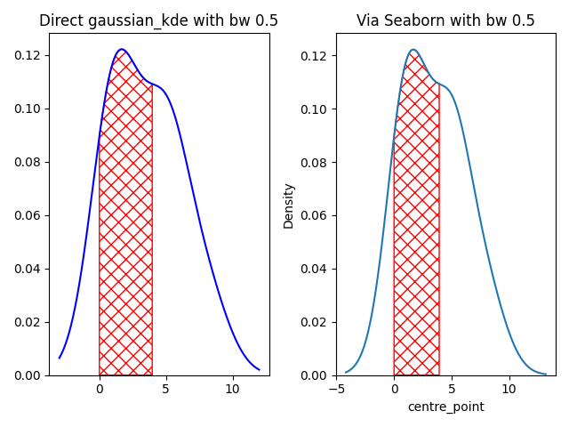
从视觉上看,这两个情节看起来是一样的。
但是,图之间的auc仍然返回两个不同的值。
auc使用gaussian_kde : 45.1,auc使用海运: 44.6
回答 1
Stack Overflow用户
发布于 2021-03-12 12:10:34
你这样称呼我:
kde0 = gaussian_kde ( df ['centre_point'], bw_method=bandwith )像这样在海上航行
g = sns.kdeplot ( data=df, x="centre_point", bw_adjust=bandwith )但是部署文档告诉我们bw_adjust是
使用bw_method对所选值进行倍数缩放的因子。增加会使曲线更加平滑。见注。
而kdeplot也有一个bw_method参数,即
用于确定要使用的平滑带宽的方法;传递给scipy.stats.gaussian_kde。
因此,如果要将两个库的结果等同起来,就需要确保使用的参数是正确的。
https://stackoverflow.com/questions/66597199
复制相似问题
腾讯云开发者

Copyright © 2013 - 2026 Tencent Cloud. All Rights Reserved. 腾讯云 版权所有
深圳市腾讯计算机系统有限公司 ICP备案/许可证号:粤B2-20090059 ![]() 粤公网安备44030502008569号
粤公网安备44030502008569号
腾讯云计算(北京)有限责任公司 京ICP证150476号 | 京ICP备11018762号