
更改likert()绘图颜色
更改likert()绘图颜色
提问于 2021-05-10 19:46:30
我正试图用利克特包绘制一个热表。以下代码可转载:
library("likert")
data("pisaitems")
title <- "How often do you read these materials because you want to?"
items29 <- pisaitems[,substr(names(pisaitems), 1,5) == 'ST25Q']
names(items29) = c("Magazines", "Comic books", "Fiction", "Non-fiction books", "Newspapers")
l29 <-  likert(items29)
l29s <- likert(summary = l29$results)

plot(l29s, type = 'heat') + ggtitle(title) + theme(legend.position = 'none')
输出
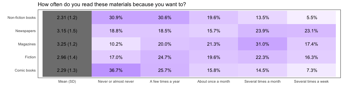
问题
如何绘制第一列“均值(SD)”白色和粗体文本,而不是灰色,并可能调整填充/空白之间的情节边框和项目相等(left+right似乎大于顶部和底部填充)?
提前感谢!
回答 1
Stack Overflow用户
回答已采纳
发布于 2021-05-10 20:45:49
热图只是绘制总结的数据框架。likert.heat.plot函数为-100赋值,以便在平均值(SD)列中获得灰色输出。您可以使其为零,并得到第一列为白色。因为罐装函数不接受这个参数,所以您可以定义一个新函数并绘制所需的输出。
library("likert")[![enter image description here][1]][1]
data("pisaitems")
title <- "How often do you read these materials because you want to?"
items29 <- pisaitems[,substr(names(pisaitems), 1,5) == 'ST25Q']
names(items29) = c("Magazines", "Comic books", "Fiction", "Non-fiction books", "Newspapers")
l29 <-  likert(items29)
l29s <- likert(summary = l29$results)

lplot = function (likert, low.color = "white", high.color = "blue",
            text.color = "black", text.size = 4, wrap = 50, ...)
  {
    if (!is.null(likert$grouping)) {
      stop("heat plots with grouping are not supported.")
    }
    lsum <- summary(likert)
    results = reshape2::melt(likert$results, id.vars = "Item")
    results$variable = as.character(results$variable)
    results$label = paste(format(results$value, digits = 2, drop0trailing = FALSE),
                          "%", sep = "")
    tmp = data.frame(Item = lsum$Item, variable = rep("Mean (SD)",
                                                      nrow(lsum)), value = rep(0, nrow(lsum)), label = paste(format(lsum$mean,
                                                                                                                       digits = 3, drop0trailing = FALSE), " (", format(lsum$sd,
                                                                                                                                                                        digits = 2, drop0trailing = FALSE), ")", sep = ""),
                     stringsAsFactors = FALSE)
    results = rbind(tmp, results)
    p = ggplot(results, aes(x = Item, y = variable, fill = value,
                            label = label)) + scale_y_discrete(limits = c("Mean (SD)",
                                                                          names(likert$results)[2:ncol(likert$results)])) + geom_tile() +
      geom_text(size = text.size, colour = text.color) + coord_flip() +
      scale_fill_gradient2("Percent", low = "white",
                           mid = low.color, high = high.color, limits = c(0,
                                                                          100)) + xlab("") + ylab("") + theme(panel.grid.major = element_blank(),
                                                                                                              panel.grid.minor = element_blank(), axis.ticks = element_blank(),
                                                                                                              panel.background = element_blank()) + scale_x_discrete(breaks = likert$results$Item
                                                                                                                                                                     #, labels = label_wrap_mod(likert$results$Item, width = wrap)
                                                                                                                                                                     )
    class(p) <- c("likert.heat.plot", class(p))
    return(p)
}


lplot(l29s, type = 'heat') + ggtitle(title) + theme(legend.position = 'none')
您可以编写自己的代码并制作漂亮的情节,而不是使用固定的函数。
页面原文内容由Stack Overflow提供。腾讯云小微IT领域专用引擎提供翻译支持
原文链接:
https://stackoverflow.com/questions/67476809
复制相关文章
相似问题
腾讯云开发者

Copyright © 2013 - 2026 Tencent Cloud. All Rights Reserved. 腾讯云 版权所有
深圳市腾讯计算机系统有限公司 ICP备案/许可证号:粤B2-20090059 ![]() 粤公网安备44030502008569号
粤公网安备44030502008569号
腾讯云计算(北京)有限责任公司 京ICP证150476号 | 京ICP备11018762号