
如何根据特定类别绘制多个时间序列数据ei:灾害类型==洪水
我创建了以下df,它包含特定类型的灾难在给定年份中发生的次数,我想要创建一个多行的图表,描述随着时间的变化,每年发生的每一次灾难的数量。因此,每一种灾害类型都有自己的界线,例如,人们可以看到,冬天的风暴在减少,而干旱在增加吗?
目前,我已经尝试定义X和y,但是,我不知道如何按洪水分组,并且每年都要添加这个数字。由于某些原因,当运行时,我得到了一个关键错误:'Start_year‘--这可能是因为开始年被用作一个索引,但是我重新设置了它,如下所示,它应该已经处理好了。抱歉,这个有点新。
#Number of each type of disaster each year
df_yearly_tcount = df_time.groupby(['Start_year', 'Disaster_Type']).size()

yearly_tcount=pd.DataFrame(df_yearly_tcount)
yearly_tcount.reset_index()

X = yearly_tcount['Start_year']
y = yearly_tcount(['Disaster_type']=='Flood')

plt.plot(X, y, label = 'Flood')
整个代码:
import numpy as np
import matplotlib.pyplot as plt
import pandas as pd
import seaborn as sns


from scipy.stats import zscore

#Import Datased
df = pd.read_csv('database.csv')

df_time = (df[['County','Disaster Type','Start Date', 'End Date']][0: :])

#Preprocessing

#Number of NaN values
df_nan = df[['County','Disaster Type','Start Date', 'End Date']].isna().sum()

#NaN values as a percentage as total
df_nan_number = [(df_nan.sum(axis=0)), str((((539/45330)*100))) +'%']

#Remove NaN values
df_time.dropna(subset = ["County", 'End Date'], inplace=True)

#Set Date Format
df_time['Start_Date_A'] = pd.to_datetime(df['Start Date'], format='%m/%d/%Y')
df_time['End_Date_A'] = pd.to_datetime(df['End Date'], format='%m/%d/%Y')

#Create new column == Disaster Length
df_time['Disaster_Length'] = (df_time.Start_Date_A - df_time.End_Date_A).dt.days

#Create new column == start year
df_time['Start_year'] = df_time['Start_Date_A'].dt.year

#Dropped  Old Date Formats from df
df_time = df_time.drop(columns=['Start Date', 'End Date'], axis=1)

#Replace 0 day values with 1 to indicate a Disaster length of 1 Day
df_time['Disaster_Length'] = df_time['Disaster_Length'].replace({0:1})

#Replace all values with absolute values so all days are represented as positive numeric values
df_time['Disaster_Length'] = df_time['Disaster_Length'].abs()


# Locating man-made and non 'natural' disasters, sorting Disaster types, and analyzing value counts
df_DTypes= df_time['Disaster Type'].values

df_DTypes=pd.DataFrame(df_DTypes)

df_DType_VCounts=(df_DTypes.value_counts()).sort_values(ascending=True)

df_DType_Natural=(df_DType_VCounts.drop(['Human Cause', 'Chemical', 'Dam/Levee Break', 'Terrorism','Other'],axis=0)).sort_values(ascending=True)

df_time = df_time.rename(columns={'Disaster Type': 'Disaster_Type'})

#Removing non-natural disasters from main df_time
df_time = df_time[(df_time.Disaster_Type != 'Human Cause') & (df_time.Disaster_Type != 'Chemical') & (df_time.Disaster_Type != 'Dam/Levee Break') & (df_time.Disaster_Type != 'Terrorism') & (df_time.Disaster_Type != 'Other') ]

#Resetting index for final df Analysis
df_time.reset_index(drop=True, inplace = True)

#Analysis

#Dataframe with mean disaster length for each year
df_yearly_mean_len = df_time.groupby(['Start_year']).mean()

df_yearly_mean_len.reset_index().plot('Start_year','Disaster_Length')


#Number of disasters declared per year
yearly_dcount = df_time.groupby(['Start_year']).size()


yearly_dcount=pd.DataFrame(yearly_dcount)
yearly_dcount.columns=['Number_of_Disasters']


#Visualizing change in total number of disasters over time
yearly_dcount.reset_index().plot('Start_year','Number_of_Disasters')


#Number of each type of disaster each year
df_yearly_tcount = df_time.groupby(['Start_year', 'Disaster_Type']).size()

yearly_tcount=pd.DataFrame(df_yearly_tcount)
yearly_tcount.reset_index()

X = yearly_tcount['Start_year']
y = yearly_tcount(['Disaster_type']=='Flood')

plt.plot(X, y, label = 'Flood')
Df
                            0
Start_year Disaster_Type
1959       Flood            1
1964       Flood          115
1965       Drought         51
           Earthquake       6
           Flood          198
           Hurricane       56
           Storm            6
           Tornado        112
1966       Flood          113
           Tornado          2
           Typhoon          5
1967       Fire            10
           Flood          121
           Hurricane       29
           Tornado         36
           Typhoon          1
1968       Flood           76
           Hurricane       14
           Ice             21
           Tornado         50
           Typhoon          1
1969       Flood          394
           Hurricane       64
           Storm            1
           Tornado         46
1970       Fire             6
           Flood          180
           Hurricane        7
           Storm           17
Tornado 11回答 1
Stack Overflow用户
发布于 2021-07-14 19:13:01
看来你走在正确的轨道上。您的许多代码/样式似乎都在朝着正确的方向发展。我把你的数据放进CSV重新设置多个索引。在此之后,绘制数据是相当简单的。如果有更多的数据,情况可能会更好,但目前有多个异常值和缺失数据的灾害(例如1959年和1964年)。此外,如果你使用一个线图,那么你比较的是相同的y轴,这会使你很难比较低频和高频的灾难(例如。地震与洪水)。您也可以绘制百分比变化图,但如果提供数据,这看起来也不太好。最后,您可以使用堆叠条形图代替。就我个人而言,我认为这看起来最好。您选择如何表示您的数据取决于您图表的目标、您想要的数量或质量,以及您是否想显示原始数据,如散点图。无论如何,这里有一些图表和一些代码应该会有所帮助。
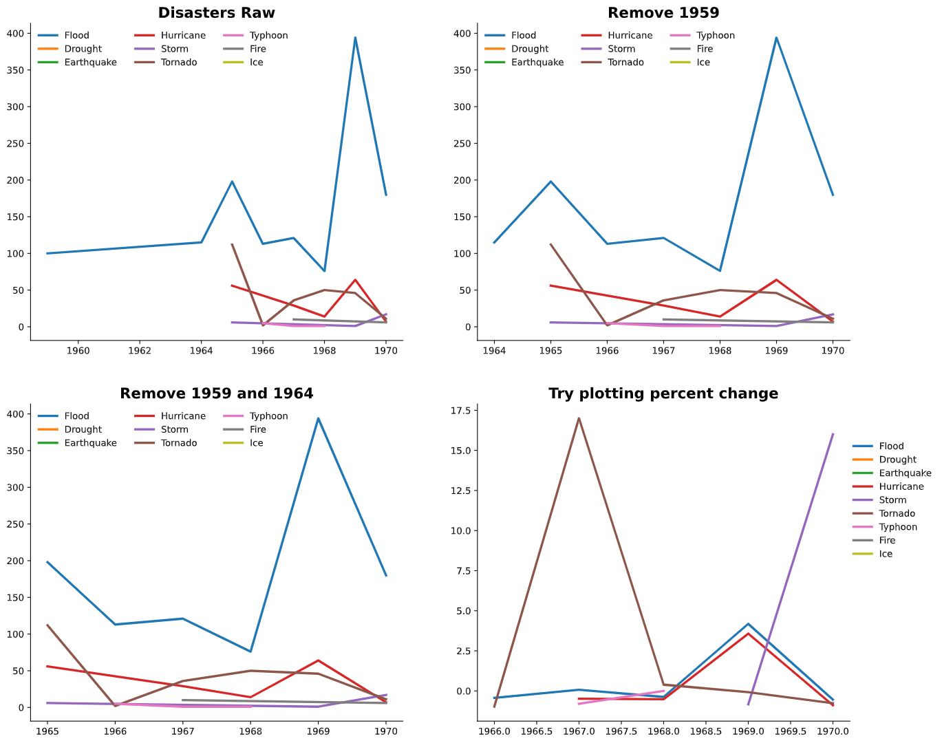
types = ['Flood', 'Drought', 'Earthquake', 'Hurricane', 'Storm', 'Tornado',
       'Typhoon', 'Fire', 'Ice']

fig, axes = plt.subplots(ncols=2, nrows=2, figsize=(16,14))
axes = axes.flatten()

ax = axes[0]
for i in range(len(types)):
    disaster_df = df[df.Disaster_Type == types[i]]
    ax.plot(disaster_df.Start_year, disaster_df.Size, linewidth=2.5, label=types[i])
ax.legend(ncol=3, edgecolor='w')
[ax.spines[s].set_visible(False) for s in ['top','right']]
ax.set_title('Disasters Raw', fontsize=16, fontweight='bold')

#remove 1959
ax = axes[1]
df2 = df.iloc[1:]

for i in range(len(types)):
    disaster_df = df2[df2.Disaster_Type == types[i]]
    ax.plot(disaster_df.Start_year, disaster_df.Size, linewidth=2.5, label=types[i])
ax.legend(ncol=3, edgecolor='w')
[ax.spines[s].set_visible(False) for s in ['top','right']]
ax.set_title('Remove 1959', fontsize=16, fontweight='bold')

#remove 1964
ax = axes[2]
df2 = df.iloc[2:]
for i in range(len(types)):
    disaster_df = df2[df2.Disaster_Type == types[i]]
    ax.plot(disaster_df.Start_year, disaster_df.Size, linewidth=2.5, label=types[i])
ax.legend(ncol=3, edgecolor='w')
[ax.spines[s].set_visible(False) for s in ['top','right']]
ax.set_title('Remove 1959 and 1964', fontsize=16, fontweight='bold')

#plot percent change
ax = axes[3]
df2 = df.iloc[2:]
for i in range(len(types)):
    disaster_df = df2[df2.Disaster_Type == types[i]]
    ax.plot(disaster_df.Start_year, disaster_df.Size.pct_change(), linewidth=2.5, label=types[i])
ax.legend(ncol=1, edgecolor='w', loc=(1, 0.5))
[ax.spines[s].set_visible(False) for s in ['top','right']]
ax.set_title('Try plotting percent change', fontsize=16, fontweight='bold')
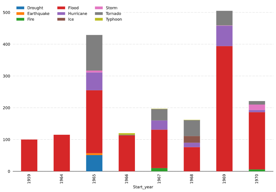
fig, ax = plt.subplots(figsize=(12,8))
df.pivot(index='Start_year', columns = 'Disaster_Type', values='Size' ).plot.bar(stacked=True, ax=ax, zorder=3)
ax.legend(ncol=3, edgecolor='w')
[ax.spines[s].set_visible(False) for s in ['top','right', 'left']]
ax.tick_params(axis='both', left=False, bottom=False)

ax.grid(axis='y', dashes=(8,3), color='gray', alpha=0.3)https://stackoverflow.com/questions/68383292
复制相似问题
腾讯云开发者

Copyright © 2013 - 2026 Tencent Cloud. All Rights Reserved. 腾讯云 版权所有
深圳市腾讯计算机系统有限公司 ICP备案/许可证号:粤B2-20090059 ![]() 粤公网安备44030502008569号
粤公网安备44030502008569号
腾讯云计算(北京)有限责任公司 京ICP证150476号 | 京ICP备11018762号