
geom_path与geom_text在on图上的结合困难
我正在尝试使用geom_path和geom_text创建一个有标签的映射,但是它并不顺利。我可以分别使用每个geom_path和geom_text,但我似乎无法让它们一起工作。我认为这与geom_polygon有关,但我不确定是什么原因。
下面是我如何准备用于映射的shapefile:
meck.hiv <- as(meck.hiv, "Spatial")
meck.hiv@data$seq_id <- seq(1:nrow(meck.hiv@data)) #create unique id for each polygon
meck.hiv@data$id <- rownames(meck.hiv@data)
meck.hivdf <- fortify(meck.hiv) #fortify the data
zipcodedf <- merge(meck.hivdf, meck.hiv@data,
               by = "id")# merge the "fortified" data with the data from our spatial object
cnames <- aggregate(cbind(long, lat) ~ zip, data=zipcodedf, FUN=function(x)mean(range(x))) #get the names of our zipcode (and center the coordinates for labels)
有了这个,我就能得到以下地图:
带有标签的,没有路径:
p2 <- ggplot(data = zipcodedf, aes(x = long, y = lat)) +
  geom_polygon(aes(group=group, fill=hispanic.dis)) +
  geom_text(data=cnames, aes(long, lat, label = zip), size=3, fontface='bold', color="black")+ #This put in zip code names
  scale_fill_brewer(breaks=c(1, 2, 3, 4, 5, 6, 7), labels=c("<5", "5-10", "11-15", "16-20", "21-25", "26-30", "31+"), palette="Reds",
                    na.value="darkgrey") +
  coord_equal() +
  theme(panel.background= element_rect(color="black")) +
  theme(axis.title = element_blank(), axis.text = element_blank()) +
  labs(title = "Hispanic Population by Zip Code", fill="Hispanic Population (% of Total)")
路径,但没有标签:
p3 <- ggplot(data = zipcodedf, aes(x = long, y = lat, group = group, fill = hispanic.dis)) +
  geom_polygon() +
  geom_path(color = "black", size = 0.2)+ #Oddly, use of geom_path with the above leads to weird stuff, but we can customize map lines without labels here
  scale_fill_brewer(breaks=c(1, 2, 3, 4, 5, 6, 7), labels=c("<5", "5-10", "11-15", "16-20", "21-25", "26-30", "31+"), palette="Reds",
                    na.value="darkgrey") +
  coord_equal() +
  theme(panel.background=element_blank())+
  theme(panel.background= element_rect(color="black")) +
  theme(axis.title = element_blank(), axis.text = element_blank()) +
  labs(title = "Hispanic Population by Zip Code", fill="Hispanic Population(% of Total)")
试图合并
p4 <- ggplot(data = zipcodedf, aes(x = long, y = lat)) +
  geom_polygon(aes(group=group, fill=hispanic.dis)) +
  geom_text(data=cnames, aes(long, lat, label = zip), size=3, fontface='bold', color="black")+
  geom_path(color = "black", size = 0.2)+ #Oddly, use of geom_path with the above leads to weird stuff, but we can customize map lines without labels here
  scale_fill_brewer(breaks=c(1, 2, 3, 4, 5, 6, 7), labels=c("<5", "5-10", "11-15", "16-20", "21-25", "26-30", "31+"), palette="Reds",
                    na.value="darkgrey") +
  coord_equal() +
  theme(panel.background=element_blank())+
  theme(panel.background= element_rect(color="black")) +
  theme(axis.title = element_blank(), axis.text = element_blank()) +
  labs(title = "Hispanic Population by Zip Code", fill="Hispanic Population(% of Total)")
我的问题解决方案表明,geom_path与geom_polygon的交互方式与ggplot()相结合,但是如果我将所有指令都移动到geom_polygon中,则路径根本就不会出现(虽然一个图会生成),如果我将所有指令都移动到ggplot()中,就会得到一个错误:“X[i],.:object 'group‘combined”(下面)。
p5 <- ggplot(data = zipcodedf, aes(x = long, y = lat, group = group, fill = hispanic.dis)) +
  geom_polygon() +
  geom_path(color = "black", size = 0.2)+
  geom_text(data=cnames, mapping=aes(x=long, y=lat))+#Oddly, use of geom_path with the above leads to weird stuff, but we can customize map lines without labels here
  scale_fill_brewer(breaks=c(1, 2, 3, 4, 5, 6, 7), labels=c("<5", "5-10", "11-15", "16-20", "21-25", "26-30", "31+"), palette="Reds",
                    na.value="darkgrey") +
  coord_equal() +
  theme(panel.background=element_blank())+
  theme(panel.background= element_rect(color="black")) +
  theme(axis.title = element_blank(), axis.text = element_blank()) +
  labs(title = "Hispanic Population by Zip Code", fill="Hispanic Population(% of Total)")
任何帮助都是非常感谢的。如果我需要提供更多的信息,请告诉我。
回答 1
Stack Overflow用户
发布于 2021-07-20 18:50:27
{ggplot2}的分层和继承有时会让人感到困惑。我希望以下内容对此有所帮助。还可以看看你是否真的想要一个“额外的”geom_path()层。感觉上你想要描绘/突出县的边界。请注意在示例中使用color来设置图层的boundary(线条)颜色。
我不得不仿效你的问题,因为你没有提供一个可重复的例子。最初的代码是给我北卡罗莱纳州的地图数据。我为县名构造了一个名称数据。您应该能够将此应用于县一级的邮政编码问题. :)
library(dplyr)
library(ggplot)
library(maps)    # helper package to get some map data
library(mapdata) # helper for some map data

counties <- map_data("county") %>% filter(region == "north carolina")
head(counties)
生成数据帧
       long      lat group order         region subregion
1 -79.53800 35.84424  1857 54915 north carolina  alamance
2 -79.54372 35.89008  1857 54916 north carolina  alamance
3 -79.53800 35.98175  1857 54917 north carolina  alamance
4 -79.52081 36.23385  1857 54918 north carolina  alamance
5 -79.26298 36.23385  1857 54919 north carolina  alamance
6 -79.27444 35.90726 1857 54920 north carolina alamance只标出县(注:这将是您的邮政编码级别)。为了解释层继承的原理,我“设置”了层调用(即geom_polygon())中的所有参数:
ggplot() +
  geom_polygon(data = counties
              , aes(x = long, y = lat, group = group)  # aesthetic mapping
              , color = "white"                        # fixed value for "line"
              , fill = "lightblue")                    # fixed value for "fill"
如果您现在要添加geom_path()层,而不赋予它美观性,则情节不会改变。为了演示目的,请检查我将颜色设置为蓝色,并将线条大小设置为2。
ggplot() +
  geom_polygon(data = counties, aes(x = long, y = lat, group = group), colour = "white", fill = "lightblue") +
# ---------------- adding a layer with no aesthetics -----------
geom_path(color = "blue", size = 2) # ... no joy!如果您现在将数据和美学移到ggplot() "base"-layer,那么路径也将继承美学。在这种情况下,path将绘制分组lat/lon位置的“轮廓”。geom_path()的层序和颜色/大小将“覆盖”白色的多边形线。
ggplot(data = counties, aes(x = long, y = lat, group = group)) +
  geom_polygon( colour = "white", fill = "lightblue") +
#------------ path layer with inherited "polygon" grouping
  geom_path(color = "blue", size = 2)
接下来,让我们通过平均不同多边形段点的lat/lon值来创建(zipcode :)又名文本标签。
cnames <- counties %>%
   group_by(subregion) %>%
   summarise(long = mean(long), lat = mean(lat) # averaging for "mid"-point
)
> cnames
# A tibble: 100 x 3
   subregion  long   lat
   <chr>     <dbl> <dbl>
 1 alamance  -79.4  36.0
 2 alexander -81.2  35.9
3 alleghany -81.1 36.5现在添加一个geom_text()层来显示(邮政编码),也就是分区名称。
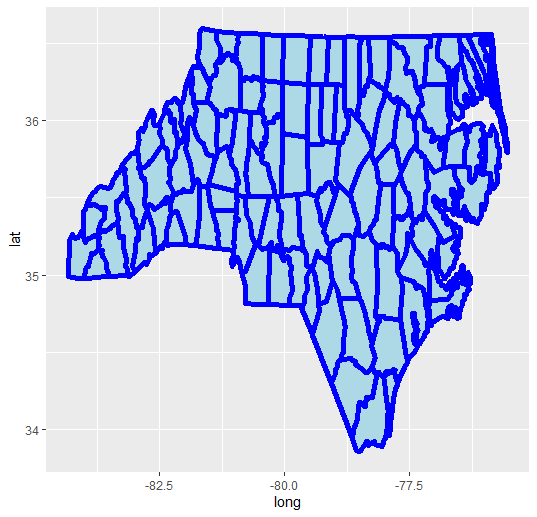
ggplot(data = counties, aes(x = long, y = lat, group = group)) +
   geom_polygon( colour = "white", fill = "lightblue") +
   geom_path(color = "blue", size = 2) +
# --------------- adding a geom_text() layer
   geom_text(data = cnames, aes(x = long, y = lat), color = "green")
## ------- uuummmppfff throws an error
Error in FUN(X[[i]], ...) : object 'group' not found这会引发一个错误。那这是为什么?暗指ggplot()调用中的群体审美被geom_polygon()和geom_path()理解。但是,geom_text()存在问题。
把群体美学移到多边形层..。
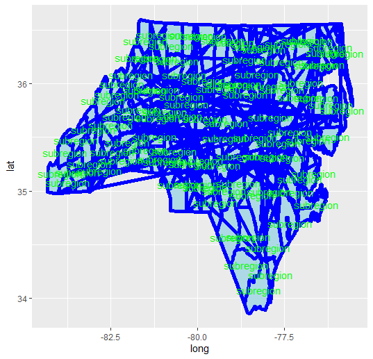
ggplot(data = counties, aes(x = long, y = lat)) +
    geom_polygon( aes(group=group), colour = "white", fill = "lightblue") +
    geom_path(color = "blue", size = 2) +
    geom_text(data = cnames, aes(x = long, y = lat, label = "subregion"), color = "green")
做了这件事,但是破坏了geom_path()层。
这里所发生的情况是,数据点(即lat/lon)不再分组,ggplot按照它们在县数据帧中出现的顺序将端点连接起来。这些是你在你的情节中看到的跳汰机线。
因此,您需要为geom_path层添加另一个geom_path!假设你真的想要轮廓的路径。
ggplot(data = counties, aes(x = long, y = lat)) +
    geom_polygon( aes(group=group), colour = "white", fill = "lightblue") +
    geom_path(aes(group=group), color = "blue", size = 2) +
    geom_text(data = cnames, aes(x = long, y = lat, label = "subregion"), color = "green")
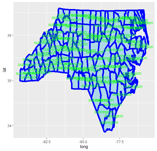
显然,color = "white"被geom_path()调用覆盖。你可以跳过一个或另一个。
作为一条经验法则,ggplot可以很好地处理“长”数据表。当您添加第二个(或更多其他数据对象)时,请确保跟踪需要和/或从一个层继承到另一个层的美学。在最初的示例中,您可以将geom_path()向上移动,使group = group美观从geom_polygon()调用。
如果有疑问,请始终填充数据=.在跨层组合(并继承)参数之前,对每个层进行aes()。
祝好运!
https://stackoverflow.com/questions/68457129
复制相似问题
腾讯云开发者

Copyright © 2013 - 2026 Tencent Cloud. All Rights Reserved. 腾讯云 版权所有
深圳市腾讯计算机系统有限公司 ICP备案/许可证号:粤B2-20090059 ![]() 粤公网安备44030502008569号
粤公网安备44030502008569号
腾讯云计算(北京)有限责任公司 京ICP证150476号 | 京ICP备11018762号