
Matplotlib:如何根据第三类列(而不是X和Y)的颜色图绘制错误条图
Matplotlib:如何根据第三类列(而不是X和Y)的颜色图绘制错误条图
提问于 2021-09-09 00:14:44
我在做一个个人实验项目。我有以下数据:
treat_repr = pd.DataFrame({'kpi': ['cpsink', 'hpu', 'mpu', 'revenue', 'wallet']
                    ,'diff_pct': [0.655280, 0.127299, 0.229958, 0.613308, -0.718421]
                    ,'me_pct': [1.206313, 0.182875, 0.170821, 1.336590, 2.229763]
                    ,'p': [0.287025, 0.172464, 0.008328, 0.368466, 0.527718]
                    ,'significance': ['insignificant', 'insignificant', 'significant', 'insignificant', 'insignificant']})

pre_treat_repr = pd.DataFrame({'kpi': ['cpsink', 'hpu', 'mpu', 'revenue', 'wallet']
                    ,'diff_pct': [0.137174, 0.111005, 0.169490, -0.152929, -0.450667]
                    ,'me_pct': [1.419080, 0.207081, 0.202014, 1.494588, 1.901672]
                    ,'p': [0.849734, 0.293427, 0.100091, 0.841053, 0.642303]
                    ,'significance': ['insignificant', 'insignificant', 'insignificant', 'insignificant', 'insignificant']})
我使用了下面的代码来构造错误条图,它工作得很好:
def confint_plot(df):
  plt.style.use('fivethirtyeight')
  fig, ax = plt.subplots(figsize=(18, 10))

  plt.errorbar(df[df['significance'] == 'significant']["diff_pct"], df[df['significance'] == 'significant']["kpi"], xerr = df[df['significance'] == 'significant']["me_pct"], color = '#d62828', fmt = 'o', capsize = 10)
  plt.errorbar(df[df['significance'] == 'insignificant']["diff_pct"], df[df['significance'] == 'insignificant']["kpi"], xerr = df[df['significance'] == 'insignificant']["me_pct"], color =  '#2a9d8f', fmt = 'o', capsize = 10)
  plt.legend(['significant', 'insignificant'], loc = 'best')

  ax.axvline(0, c='red', alpha=0.5, linewidth=3.0,
             linestyle = '--', ymin=0.0, ymax=1)

  plt.title("Confidence Intervals of Continous Metrics", size=14, weight='bold')
  plt.xlabel("% Difference of Control over Treatment", size=12)
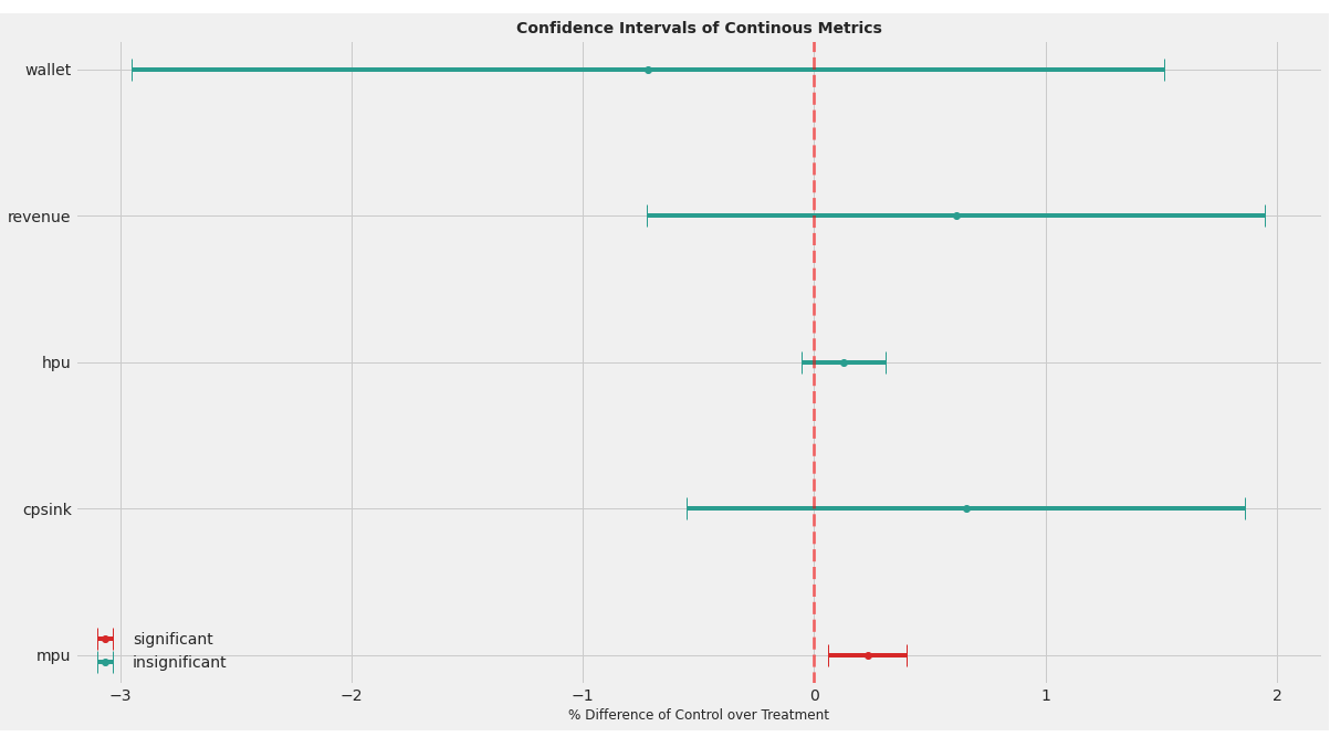
plt.show()confint_plot(treat_repr)的输出如下所示:
现在,如果我在预处理数据格式confint_plot(pre_treat_repr)上运行相同的绘图函数,这个图看起来如下所示:
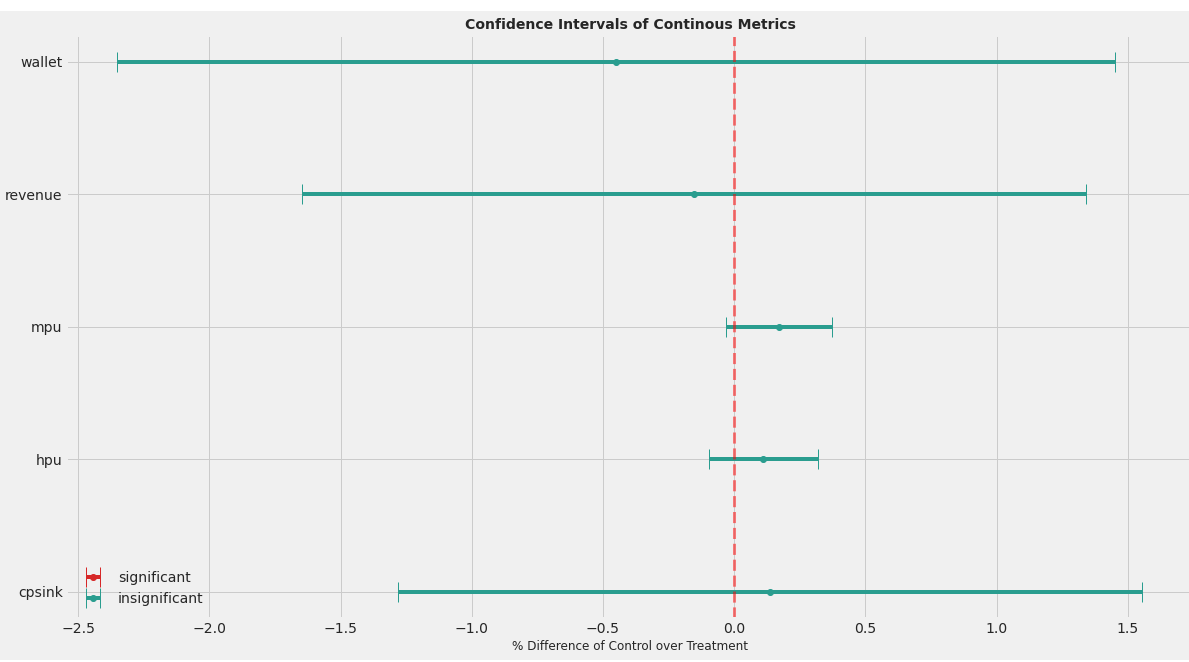
我们可以从这两个图中观察到变量的顺序从第1点到第2点,这取决于kpi是否显着(这就是我在很多尝试之后的计算方法)。
问题
- 如何更改代码,以便在不改变y轴上kpis顺序的情况下动态分配颜色映射?
- ,目前我已经手动输入了这些传说。是否有一种动态填充传说的方法?
感谢你的帮助!
回答 1
Stack Overflow用户
回答已采纳
发布于 2021-09-10 21:44:30
因为您首先绘制了重要的KPI,所以它们总是出现在图表的底部。如何解决这个问题并保持所需的颜色取决于您使用matplotlib制作的图表类型。使用散点图,可以在c参数中指定颜色数组。错误条形图不提供该功能。
解决这一问题的一种方法是对KPI进行排序,给出数字位置(0,1,2,3,.),绘制它们两次(一次是有意义的,一次是无意义的),然后重划它们:
def confint_plot(df):
  plt.style.use('fivethirtyeight')
  fig, ax = plt.subplots(figsize=(18, 10))

  # Sort the KPIs alphabetically. You can change the order to anything
  # that fits your purpose
  df_plot = df.sort_values('kpi').assign(y=range(len(df)))

  for significance in ['significant', 'insignificant']:
    cond = df_plot['significance'] == significance
    color = '#d62828' if significance == 'significant' else '#2a9d8f'

    # Plot them in their numeric positions first
    plt.errorbar(
      df_plot.loc[cond, 'diff_pct'], df_plot.loc[cond, 'y'],
      xerr=df_plot.loc[cond, 'me_pct'], label=significance,
      fmt='o', capsize=10, c=color
    )

  plt.legend(loc='best')
  ax.axvline(0, c='red', alpha=0.5, linewidth=3.0,
             linestyle = '--', ymin=0.0, ymax=1)

  # Re-tick to show the KPIs
  plt.yticks(df_plot['y'], df_plot['kpi'])

  plt.title("Confidence Intervals of Continous Metrics", size=14, weight='bold')
  plt.xlabel("% Difference of Control over Treatment", size=12)

plt.show()页面原文内容由Stack Overflow提供。腾讯云小微IT领域专用引擎提供翻译支持
原文链接:
https://stackoverflow.com/questions/69110883
复制相关文章
相似问题
腾讯云开发者

Copyright © 2013 - 2026 Tencent Cloud. All Rights Reserved. 腾讯云 版权所有
深圳市腾讯计算机系统有限公司 ICP备案/许可证号:粤B2-20090059 ![]() 粤公网安备44030502008569号
粤公网安备44030502008569号
腾讯云计算(北京)有限责任公司 京ICP证150476号 | 京ICP备11018762号