
在一个普通的条形码旁边创建一个堆叠的条形图?
在一个普通的条形码旁边创建一个堆叠的条形图?
提问于 2021-09-17 20:30:51
我有一个名为'CountryCounts'的系列文章,它是在原始dataframe的“Country”列OGdf['Country']上调用.value_counts()的结果。
United States           1234
United Kingdom           332
Canada                   111
France                    61
Australia                 55
                        ...
Israel                     1
Bahamas                    1
Romania                    1
Greece                     1
United Arab Emirates       1
Name: Country, Length: 63, dtype: int64
我想要做的是创建一个圆滑的条形图,其中第一行(在本例中是美国- 1234)被绘制为自己的条形图。
然后,在它旁边的每一行合并为一个堆叠条(总长度将是其他行的总和),但每一行的悬停信息(这样,您仍然可以看到联合王国作为它自己的颜色在该酒吧,加拿大等)。
我创建了一个简短的函数来分离其余的条目,直到它们与第一个条目等效:
def find_next_series_equivalent(series):
  primary = series[0]
  if series[1:-1].sum() > primary:
    i = 2
    while series[1:i].sum() < primary:
      i += 1
    return series[1:i]
  else:
    return series[1:-1]
我试过做直方图:
fig = px.histogram(OGdf, x='Country', barmode='stack')和酒保:
first_entry = OGdf['Country'].value_counts()[0]
fig = px.bar(y = [first_entry.index], x= [first_entry.values], orientation='h')
fig.update_xaxes(title='# From Country')
fig.update_yaxes(title='Country')

othersdict = find_next_series_equivalent(OGdf['Country'].value_counts()).to_dict()


othersBar = go.Bar(
     y = othersdict.index,
     x = othersdict.values)

fig.add_trace(othersBar, row=1, col=1)

fig.update_layout(barmode='stack')
两者都不能实现我的目标。帮助是非常感谢的。(预先谢谢:)
(顺便说一句,我用的是巧妙的表达方式,我的熊猫画的后端也被设置成了巧妙的)
回答 1
Stack Overflow用户
回答已采纳
发布于 2021-09-17 21:38:38
,
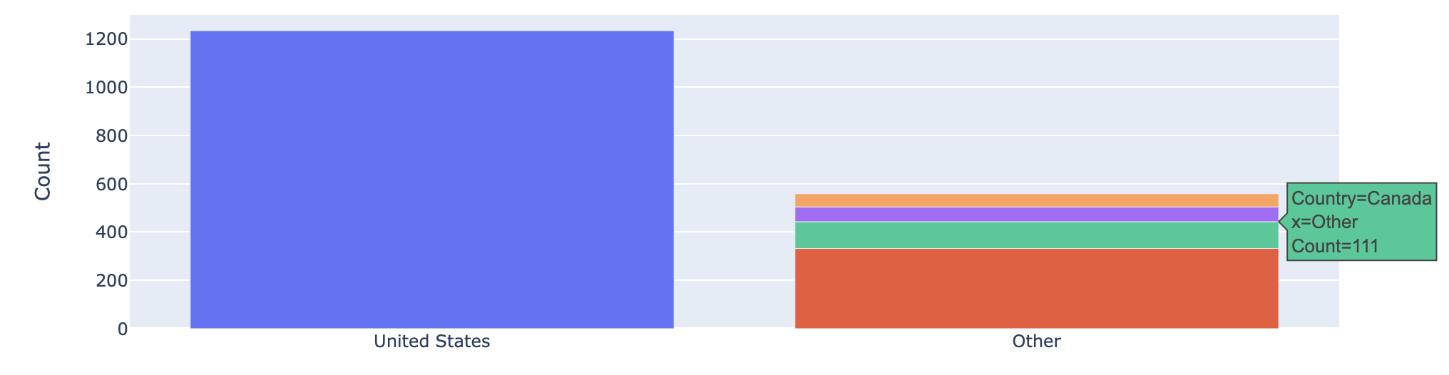
- ,如果你按照你的描述创建图形,那就很简单了。bar
- have xaxis是两个值之一,
- rest然后将参数设置为,以巧妙地表示
value_counts()
隐藏图例,如果您愿意,可以显示,但是可能会使用value_counts()中的value_counts()示例数据太长。
import plotly.express as px
import io
import pandas as pd
import numpy as np

df = pd.read_csv(io.StringIO("""United States           1234
United Kingdom           332
Canada                   111
France                    61
Australia                 55
Israel                     1
Bahamas                    1
Romania                    1
Greece                     1
United Arab Emirates       1"""), sep="\s\s+", engine="python", header=None).rename(columns={0:"Country",1:"Count"})

fig = px.bar(df, x=np.where(df["Country"].eq("United States"), "United States", "Other"), y="Count",
       hover_data=["Country"], color="Country")

# if legend is not wanted...
fig = fig.update_layout(showlegend=False)
fig
页面原文内容由Stack Overflow提供。腾讯云小微IT领域专用引擎提供翻译支持
原文链接:
https://stackoverflow.com/questions/69229182
复制相关文章
相似问题
腾讯云开发者

Copyright © 2013 - 2026 Tencent Cloud. All Rights Reserved. 腾讯云 版权所有
深圳市腾讯计算机系统有限公司 ICP备案/许可证号:粤B2-20090059 ![]() 粤公网安备44030502008569号
粤公网安备44030502008569号
腾讯云计算(北京)有限责任公司 京ICP证150476号 | 京ICP备11018762号