
用Python绘制catecorigal XY数据,包括标签(例如BCG矩阵)
我喜欢绘制2x2 / BCG矩阵。这一次我有一个相当大的数据集(超过50个主题和多个值,例如a和B)。我想知道如何用Python绘制这个图?
其结果应与此类似:
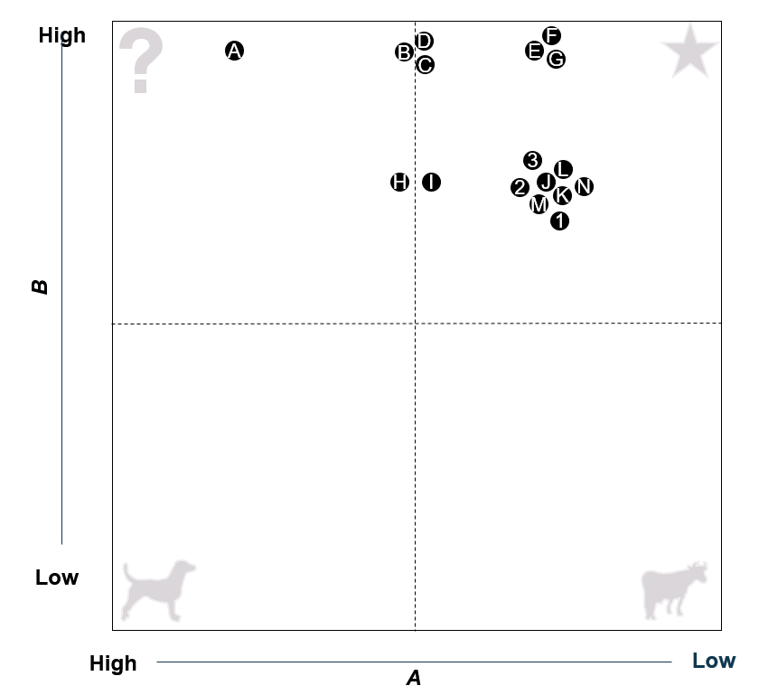
我发现了一些关于散点图的问题,但没有一个真正能很好地处理两个数值相同的主题(见主题3,2,L,J,……在图中)。
ID应显示在绘图中,具有相同值集的ID不应重叠,而应保持相当接近的位置。
有办法这样做吗?如果不是Python,我也很乐意听取其他建议。
下面是一个示例数据集:
ID  Name        value_A     value_B
A   topic_1     2           4
B   topic_2     4           2
C   topic_3     3           3
D   topic_4     3           5
E   topic_5     3           4
F   topic_6     5           1
G   topic_7     4           5
H   topic_8     1           2
I   topic_9     4           1
J   topic_10    3           3
K   topic_11    5           5
L   topic_12    5           3
M   topic_13    3           5
N   topic_14    1           5
O   topic_15    4           1
P   topic_16    4           2
Q   topic_17    1           5
R   topic_18    2           3
S   topic_19    1           2
T   topic_20    5           1
U   topic_21    3           4
V   topic_22    2           5
W   topic_23    1           3
X   topic_24    3           3
Y   topic_25    4           1
Z   topic_26    2           4
1   topic_27    2           4
2   topic_28    5           4
3   topic_29    3           3
4   topic_30    4           4
5   topic_31    3           2
6   topic_32    4           2
7   topic_33    2           3
8   topic_34    2           3
9   topic_35    2           5
10 topic_36 4 2回答 1
Stack Overflow用户
发布于 2021-09-20 00:08:45
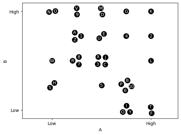
我认为,下面的代码应该非常接近您正在寻找的内容。其基本思想是,每一组聚在一个位置上的点被放置在一个以该位置为中心的圆中。我用一种特殊的方式定义了圆圈的半径,只是为了让它看起来更适合我遇到的维度,但是你可能需要根据你的具体任务对它做一些修改。
首先,这只是将您的值复制/粘贴到列表中。
values = ['ID  Name        value_A     value_B',
          'A   topic_1     2           4',
          'B   topic_2     4           2',
          'C   topic_3     3           3',
          'D   topic_4     3           5',
          'E   topic_5     3           4',
          'F   topic_6     5           1',
          'G   topic_7     4           5',
          'H   topic_8     1           2',
          'I   topic_9     4           1',
          'J   topic_10    3           3',
          'K   topic_11    5           5',
          'L   topic_12    5           3',
          'M   topic_13    3           5',
          'N   topic_14    1           5',
          'O   topic_15    4           1',
          'P   topic_16    4           2',
          'Q   topic_17    1           5',
          'R   topic_18    2           3',
          'S   topic_19    1           2',
          'T   topic_20    5           1',
          'U   topic_21    3           4',
          'V   topic_22    2           5',
          'W   topic_23    1           3',
          'X   topic_24    3           3',
          'Y   topic_25    4           1',
          'Z   topic_26    2           4',
          '1   topic_27    2           4',
          '2   topic_28    5           4',
          '3   topic_29    3           3',
          '4   topic_30    4           4',
          '5   topic_31    3           2',
          '6   topic_32    4           2',
          '7   topic_33    2           3',
          '8   topic_34    2           3',
          '9   topic_35    2           5',
          '10  topic_36    4           2']
接下来,将上面提供的数据组织为A和B的一个ID列表和另一个值列表。
import re
values = [re.split(r'\s+', v) for v in values][1:]
points = [[int(v[2]), int(v[3])] for v in values]
labels = [v[0] for v in values]
现在我们需要找到唯一的AB对和他们的ID。有很多方法可以从你的原始列表中得到这一点,其他人可能会根据你的原始数据结构和效率考虑得到更好的建议。
unique_points = []
n_labels = []

for i in range(len(points)):
    if points[i] not in unique_points:
        unique_points.append(points[i])
        n_labels.append([labels[i],])
    else:
        n_labels[unique_points.index(points[i])] += [labels[i],]
对于我的另一个项目,我设计了这个类来做一些与你想做的非常相似的事情,所以我在这里用几个变体来实现它。基本上,每个唯一的点和伴随的ID都进入它们自己的对象,这使得您可以轻松地绘制围绕唯一点的圆圈中的点。
import numpy as np
from matplotlib import pyplot as plt


class clique():
    def __init__(self, center, labels, r):
        self.n = len(labels)
        self.x = center[0]
        self.y = center[1]
        self.labels = labels
        self.r = r

        # The random addition below just spins the points about
        # the circle so groups of the same size look different
        self.theta = np.arange(0, 2 * np.pi, 2 * np.pi / self.n) + np.random.rand() * 2 * np.pi

        if self.n == 1:
            self.nodes_x = [self.x,]
            self.nodes_y = [self.y,]
        else:
            self.nodes_x = self.x + r * np.cos(self.theta)
            self.nodes_y = self.y + r * np.sin(self.theta)

    def draw_nodes(self, shape = 'o', color = 'k', markersize = 12):
        for i in range(len(self.nodes_x)):
            plt.plot(self.nodes_x[i], self.nodes_y[i], shape, color = color,
                     markersize = markersize)
    def label_nodes(self, color = 'w', fs = 10):
        for i in range(len(self.nodes_x)):
            plt.text(self.nodes_x[i], self.nodes_y[i], self.labels[i],
va = 'center', ha = 'center', color = color, fontsize = fs)现在,为每一组点创建clique对象并绘制它。
for i in range(len(unique_points)):
    radius = 0.05 + 0.2 / 5 * len(n_labels[i])
    G = clique(unique_points[i], n_labels[i], radius)
    G.draw_nodes()
    G.label_nodes()
最后,把情节搞清楚一点。
plt.axis('equal') # This ensures things look circular on the
                  # figure. If you want non-equal axes and a circular
                  # look, you'll need to work out the equation for
                  # plotting in "clique" as ellipses based on the
                  # figure dimensions

A = np.array([u[0] for u in unique_points])
B = np.array([u[1] for u in unique_points])
plt.xticks([min(A), max(A)], ['Low', 'High'])
plt.yticks([min(B), max(B)], ['Low', 'High'])
plt.xlabel('A')
plt.ylabel('B')
https://stackoverflow.com/questions/69224987
复制相似问题
腾讯云开发者

Copyright © 2013 - 2026 Tencent Cloud. All Rights Reserved. 腾讯云 版权所有
深圳市腾讯计算机系统有限公司 ICP备案/许可证号:粤B2-20090059 ![]() 粤公网安备44030502008569号
粤公网安备44030502008569号
腾讯云计算(北京)有限责任公司 京ICP证150476号 | 京ICP备11018762号