
ggplot2:颜色特异性ID、红色和其他点取决于单独的变量
我想把我队列中的参与者,他们的具体结果用图形显示出来。有100多个参与者有多个时间点,我希望发送给他们的方式是将他们的特定数据点染成红色,并保持其他样本ie以分组为条件(即。疫苗状况)。我知道如何根据某一组来决定点的颜色,但我有困难,包括基于特定学习I的另一种情况。下面插入Plotly的代码是无缝工作的,但是Plotly也有它的问题。我更喜欢使用ggplot2来生成图表。
不幸的是,我无法共享数据集,因此这里有一个简短的描述:
participant
- Timepoint
- sample =研究ID,每个
- =相对于疫苗接种日期(第一或第二次)的血液样本收集的唯一ID,
- 组=描述每个参与者的疫苗和每个时间点的感染状况的条件(即。0组->无疫苗;1 ->单剂量;等)
这是我的密码:
df %>%
  mutate(Group = as.factor(Group)) %>%
  mutate(Timepoint = fct_relevel(Timepoint, c("Pre-vaccine",
                                              "< 3.5 weeks after first",
                                              "3-6 weeks after first",
                                              "6-12 weeks after first",
                                              "> 12 weeks after first",

                                              "< 3 weeks after second",
                                              "3-6 weeks after second",
                                              "6-12 weeks after second",
                                              "> 12 weeks after second"))) %>%
  droplevels() %>%
  filter(Assay == "Antibody levels" & Group %in% c(0,1,2,3,4)) %>%
  ggplot(aes(Timepoint, Concentration)) +
  geom_jitter(position = position_jitter(width =  0.0001),
              aes(fill = ifelse(str_detect(Sample, "V1"), Sample, Group)), # Here is where I specify the colour fill of data points if they match the study ID, if not they are coloured by 'Group'
              pch = 21,
              size = 2.5) +
  scale_y_log10(labels = scales::comma,
                  limits = c(10,10000000),
                  breaks = breaks,
                minor_breaks = minor_breaks) +
  theme_classic()+
  labs(title = "Antibody levels",
       x = "",
       y = "Concentration (AU/ml)") +
  annotation_logticks(base = 10, sides = "l") +
  scale_fill_manual(values = pal) +
  theme(plot.title = element_text(hjust = 0.5),
        axis.text.y = element_text(face = "bold"),
        axis.text.x = element_text(angle = 45, hjust = 1, face = "bold"),
        legend.position = "none")
图1.通过分组着色的示例。忽略样本ID。
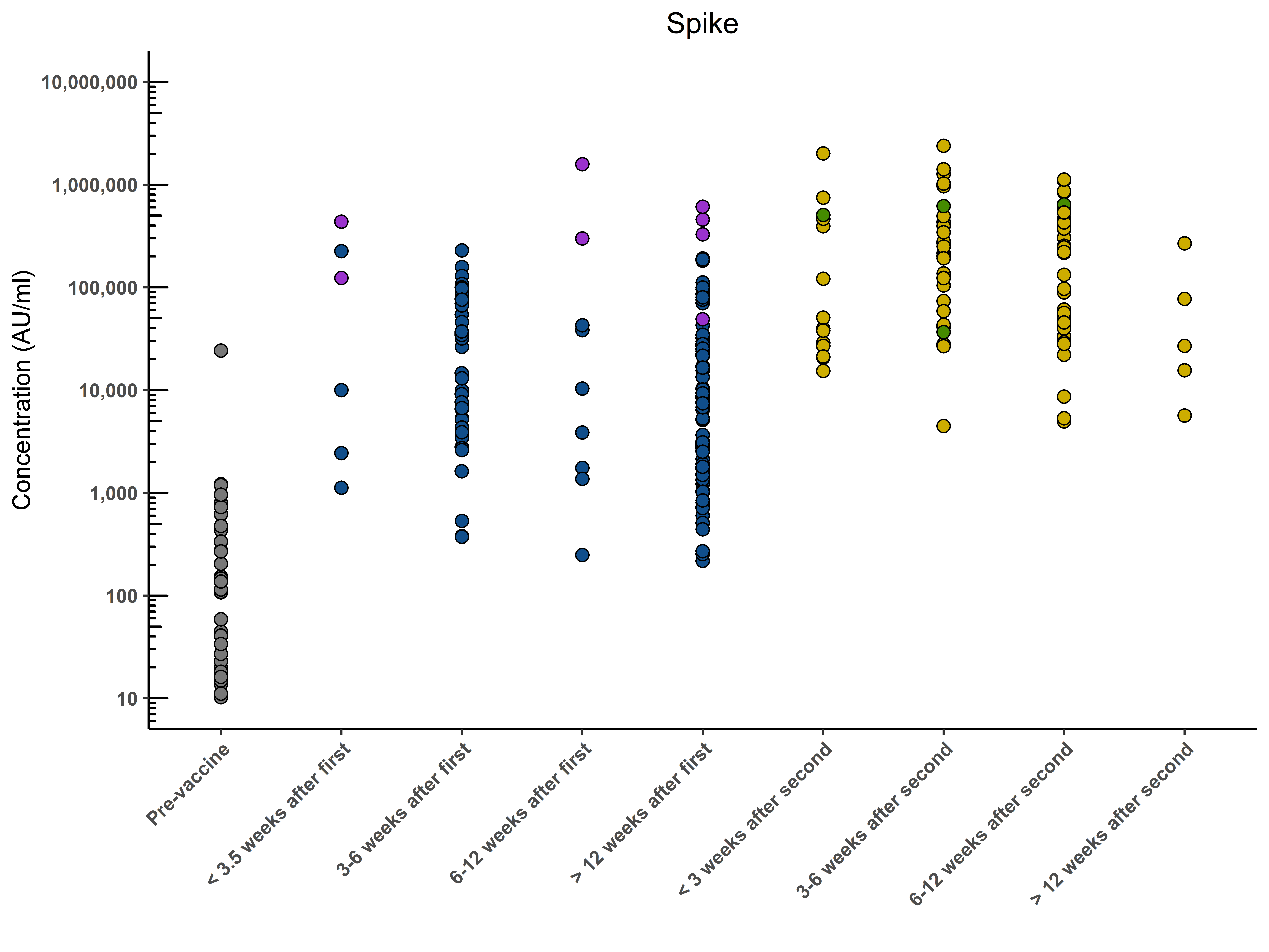
图2.在Plotly中生成的图形显示了所需的结果。这能在ggplot2中完成吗?
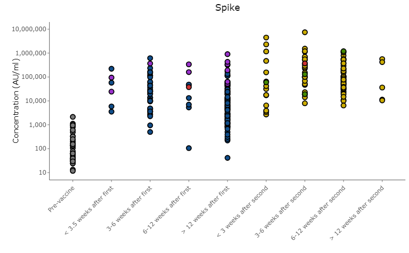
编辑:它看起来实际上是在ggplot中工作,但是红点被其他数据点掩盖了。有没有办法把它们移到最前面,同时尽量减少代码的数量?
回答 2
Stack Overflow用户
发布于 2021-10-03 10:28:23
我会尽力帮你的。但是如果没有你的数据,我就不可能做到这一点。所以我生成的数据应该和你的数据相似。请注意使用Timepoint属性对变量进行因子处理的一个小细节。这与你的数据有点不同。
library(tidyverse)

n=400
TimepointLev = c("Pre-vaccine",
                 "< 3.5 weeks after first",
                 "3-6 weeks after first",
                 "6-12 weeks after first",
                 "> 12 weeks after first",
                 "< 3 weeks after second",
                 "3-6 weeks after second",
                 "6-12 weeks after second",
                 "> 12 weeks after second")

df = tibble(
  Sample = 1:n,
  Group = sample(0:4, n, replace = TRUE) %>% paste() %>% factor(),
  Timepoint = sample(1:9, n, replace = TRUE) %>% paste()
  %>% factor(labels=TimepointLev),
  Concentration = sample(1:15000, n, replace = TRUE)
)
df
输出
# A tibble: 400 x 4
   Sample Group Timepoint               Concentration
    <int> <fct> <fct>                           <int>
 1      1 2     6-12 weeks after second         12021
 2      2 1     > 12 weeks after second         13608
 3      3 4     6-12 weeks after second         10417
 4      4 0     3-6 weeks after second           2545
 5      5 2     Pre-vaccine                      2167
 6      6 2     6-12 weeks after first          13725
 7      7 3     3-6 weeks after second           3367
 8      8 0     Pre-vaccine                      3900
 9      9 1     > 12 weeks after second           144
10 10 0 < 3 weeks after second 8219现在让我们准备一下图表。要突出显示的数据应重新绘制。在我的例子中,这是Sample的数据,可除以13。
df %>% ggplot(aes(Timepoint, Concentration, fill=Group))+
  geom_jitter(position = position_jitter(width =  0.1),pch = 21, size = 2.5)+
  geom_point(data = df %>% filter(Sample %% 13==0),
              position = position_jitter(width =  0.2), pch = 23, size = 3,
              fill="red", color = "red")
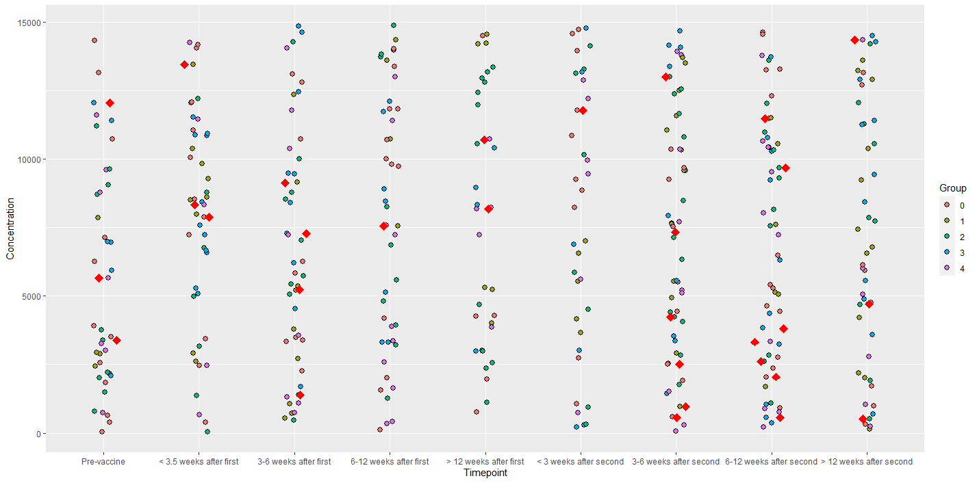
注意,我应用了数据过滤器data = df %>% filter(Sample %% 13 == 0)。您可以使自己的过滤器适应您所拥有的数据。
最后,还有一件事。我完全不明白为什么要使用geom_jitter和设置position_jitter(width = 0.0001)。这完全没有意义。geom_jitter只是为了使数据分散一点,这样它们就不会重叠。但是,当您设置width = 0.0001时,就好像根本不使用抖动。
Stack Overflow用户
发布于 2021-10-03 10:51:48
我首先要说的是,把红色作为一种颜色来表示一件事,而已经用颜色来表示另一件事是令人困惑的。
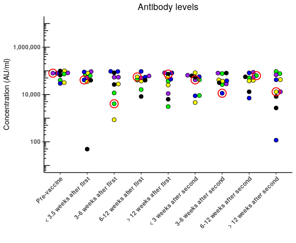
你可以在兴趣点周围画一个红色的圆圈。或者添加箭头。
就像建议的那样,gghighlight可能对你有一个选择。也可能不会。
不想为了我的个人喜好重新画出你的全部情节..。...can我建议来自ggbeeswarm的geom_beoswarm()可能在理解数据分布方面更容易读懂你的情节。
好的,现在来讨论基本的问题。当我们没有你的数据样本时总是很棘手的
require(ggpolot)
require(tidyverse)
seed(42)
someData <- tibble(
    Timepoint = as.factor(rep(seq(0,8),10)),
    Concentration = sample(1:100000, 90, replace=F),
    Group = rep(seq(0,4), 18 )
) %>%
    mutate( Sample = paste0("V",ceiling(row_number()/9)))

someData %>%
    mutate(Group = as.factor(Group)) %>%
    mutate(Timepoint = fct_recode(Timepoint,  `Pre-vaccine` = "0",
                                             "< 3.5 weeks after first" = "1",
                                             "3-6 weeks after first" = "2",
                                             "6-12 weeks after first" ="3",
                                             "> 12 weeks after first" = "4",
                                                "< 3 weeks after second" = "5",
                                                "3-6 weeks after second" = "6",
                                                "6-12 weeks after second" ="7" ,
                                                "> 12 weeks after second" = "8")) -> someData

# You have defined some constants that aren't explained
pal <- c("V1" = "red", "0"= "Purple", "1" = "Blue", "2" = "Green", "3" = "Yellow", "4" = "Black", "5"="Pink")
# I've simply omitted breaks and minor_breaks from your code below
这只是您使用上面的示例数据的图表。
someData %>%
ggplot(aes(Timepoint, Concentration)) +
    geom_jitter(position = position_jitter(width =  0.0001),
                aes(fill = ifelse(str_detect(Sample, "V1"), Sample, Group)), # Here is where I specify the colour fill of data points if they match the study ID, if not they are coloured by 'Group'
                pch = 21,
                size = 2.5) +
    scale_y_log10(labels = scales::comma,
                  limits = c(10,10000000),
                  #breaks = breaks,
                  #minor_breaks = minor_breaks
                  ) +
    theme_classic()+
    labs(title = "Antibody levels",
         x = "",
         y = "Concentration (AU/ml)") +
    annotation_logticks(base = 10, sides = "l") +
    scale_fill_manual(values = pal) +
    theme(plot.title = element_text(hjust = 0.5),
          axis.text.y = element_text(face = "bold"),
          axis.text.x = element_text(angle = 45, hjust = 1, face = "bold"),
          legend.position = "none")
您可以简单地在第一个上面添加第二个geom_jitter,代码中最近的一行位于另一行的前面,并且只需为要突出显示的行指定一个填充,就可以达到您的要求。
someData %>%
ggplot(aes(Timepoint, Concentration)) +
geom_jitter(position = position_jitter(width = 0.0001),
aes(fill = Group),
pch = 21,
size = 2.5) +
geom_jitter(position = position_jitter(width = 0.0001),
aes(fill = ifelse(str_detect(Sample, "V1"), "V1", NA)), # Here is where I specify the colour fill of data points if they match the study ID, if not they are coloured by 'Group'
pch = 21,
size = 2.5) +
scale_y_log10(labels = scales::comma,
limits = c(10,10000000),
#breaks = breaks,
#minor_breaks = minor_breaks
) +
theme_classic()+
labs(title = "Antibody levels",
x = "",
y = "Concentration (AU/ml)") +
annotation_logticks(base = 10, sides = "l") +
scale_fill_manual(values = pal) +
theme(plot.title = element_text(hjust = 0.5),
axis.text.y = element_text(face = "bold"),
axis.text.x = element_text(angle = 45, hjust = 1, face = "bold"),
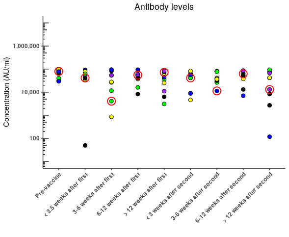
legend.position = "none")在我看来,更好的做法是按照您的意愿,将填充物作为“组”,但突出显示关键的数据点。
# I've added a new palette that will highlight the sample of interest
pal2 <- c("V1" = "red", "V2"= NA, "V3" = NA, "V4" = NA, "V5" = NA,
          "V6"=NA, "V7" = NA, "V8" = NA, "V9" = NA, "V10"= NA)

someData %>%
    ggplot(aes(Timepoint, Concentration), warn) +
    geom_jitter(position = position_jitter(width =  0.0001),
                aes(fill = Group),
                pch = 21,
                size = 2.5) +

    # You will get an error warning that some rows have missing values... thats becasue
    # you only want to highlight some values
    # If you need to - save the plot as an object using -> gg at the end
    # and then suppressWarnings(print(gg))

    geom_jitter(position = position_jitter(width =  0.0001),
                aes( color=Sample, stroke = 1, fill = NA),
                pch = 21,
                size = 5) +

    scale_y_log10(labels = scales::comma,
                  limits = c(10,10000000),
                  #breaks = breaks,
                  #minor_breaks = minor_breaks
    ) +
    theme_classic()+
    labs(title = "Antibody levels",
         x = "",
         y = "Concentration (AU/ml)") +
    annotation_logticks(base = 10, sides = "l") +
    scale_fill_manual(values = pal) +
    scale_color_manual(values = pal2) +
    theme(plot.title = element_text(hjust = 0.5),
          axis.text.y = element_text(face = "bold"),
          axis.text.x = element_text(angle = 45, hjust = 1, face = "bold"),
          legend.position = "none")
为了我自己的放纵
require(ggbeeswarm)
someData %>%
    ggplot(aes(Timepoint, Concentration)) +
    geom_beeswarm(
        cex=1.75,
                aes(fill = Group),
                pch = 21,
                size = 2.5) +
    scale_y_log10(labels = scales::comma,
                  limits = c(10,10000000),
                  #breaks = breaks,
                  #minor_breaks = minor_breaks
    ) +

    geom_beeswarm(
        cex=1.75,
        aes( color=Sample, stroke = 1, fill = NA),
        pch = 21,
        size = 5
    ) +
    theme_classic()+
    labs(title = "Antibody levels",
         x = "",
         y = "Concentration (AU/ml)") +
    annotation_logticks(base = 10, sides = "l") +
    scale_fill_manual(values = pal) +
    scale_color_manual(values = pal2) +
    theme(plot.title = element_text(hjust = 0.5),
          axis.text.y = element_text(face = "bold"),
          axis.text.x = element_text(angle = 45, hjust = 1, face = "bold"),
          legend.position = "none")
https://stackoverflow.com/questions/69419991
复制相似问题
腾讯云开发者

Copyright © 2013 - 2026 Tencent Cloud. All Rights Reserved. 腾讯云 版权所有
深圳市腾讯计算机系统有限公司 ICP备案/许可证号:粤B2-20090059 ![]() 粤公网安备44030502008569号
粤公网安备44030502008569号
腾讯云计算(北京)有限责任公司 京ICP证150476号 | 京ICP备11018762号