
Iphone 5的头部CSS
Iphone 5的头部CSS
提问于 2021-11-06 21:33:39
我想让我的屏幕适应iPhone 5

iPhone 5的大小为320x568
我的问题是元素不在一条线上。
我必须缩小字体大小?问题是屏幕太小了。
@media only screen and (max-width: 374px) and (min-width: 320px) {
    /* Iphone 5 */

    .top-bar {
        position: relative;
        height: 45px;
        background-color: aqua;
    }

    .container {
        display: flex;
        width: 100%;
    }
}
我现在不知道如何解决我的问题。
下面是我用HTML和CSS编写的代码:
/*******************************/
/********* General CSS *********/
/*******************************/


body {
    margin: 0;
    padding: 0;
    font-family: 'Roboto Slab', serif;
}

a {
    text-decoration: none;
    transition: .3s;
    color: black;
}

ul {
    list-style-type: none;
    margin: 0;
    padding: 0;
}

li {
    display: inline-block;
}

h1,
h2,
h3,
h4,
h5,
h6 {
    margin: 0;
}

p {
    margin: 0;
}

/**********************************/
/********** Top Bar CSS ***********/
/**********************************/

.top-bar {
    position: relative;
    height: 45px;
    background-color: aqua;
}

.container {
    display: flex;
    justify-content: space-between;
    margin: 0 auto;
    width: 80%;
}

.top-bar .top-bar-left {
    display: flex;
}

.top-bar .text {
    display: flex;
    align-items: center;
 /* aligne les éléments sur la même ligne */
    justify-content: center;
    height: 50px;
    margin-right: 10px;
}

.top-bar .text i {
    color: #C22312;
    margin-right: 5px;
}

.top-bar .text h2 {
    font-size: 14px;
    letter-spacing: 1px;
    font-weight: 400;
    text-transform: uppercase;
    margin-right: 10px;
}

.top-bar .top-bar-right {
    display: flex;
    align-items: center;
    justify-content: flex-end;
}

.top-bar .hyper-text {
    display: flex;
    align-items: center;
    justify-content: center;
    margin-right: 7px;
    text-transform: uppercase;
}

.top-bar .hyper-text i {
    color: black;
    margin-right: 5px;
    margin-left: 5px;
}

@media only screen and (max-width: 374px) and (min-width: 320px) {
    /* Iphone 5 */

    .top-bar {
        position: relative;
        height: 45px;
        background-color: aqua;
    }

    .container {
        display: flex;
        font-size: 15px;
        width: 100%;
    }
}<!DOCTYPE html>
<html>
<head>
<title>HTML CSS JS</title>
<meta name="viewport" content="width=device-width, initial-scale=1, maximum-scale=1">
<link href="https://cdnjs.cloudflare.com/ajax/libs/font-awesome/5.10.0/css/all.min.css" rel="stylesheet">
</head>
<body>
<div class="top-bar">
<div class="container">
<div class="top-bar-left">
<div class="text">
<i class="far fa-calendar"></i>
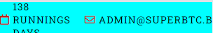
<h2>138 runnings days</h2>
</div>
<div class="text">
<i class="far fa-envelope"></i>
<h2>admin@superbtc.biz</h2>
</div>
</div>
<div class="top-bar-right">
<div class="hyper-text">
<select name="language" id="language-select">
<option value="english">English</option>
<option value="french">French</option>
</select>
<a href="#"><i class="fas fa-angle-right"></i>Deposit</a>
<a href="#"><i class="fas fa-angle-right"></i>Paidout</a>
</div>
</div>
</div>
</div>
</body>
</html>
回答 1
Stack Overflow用户
发布于 2021-11-06 22:54:04
我喜欢在CSS中使用vw和%单元来响应网页设计。
有一种简单的方法可以使用vw生成响应的字体大小
.back {
  background: #e9e9e9;
  text-align: center;
  padding: 0.5vw 0;
}
.fore {
  margin: 5px;
  font-size: 2.5vw;
}<div class="back">
<span class="fore">Responsive.</span>
</div>
下面是一个有用的例子:
body {
    margin: 0;
    padding: 0;
    font-family: 'Roboto Slab', serif;
    height: 100vh;
    width: 100vw;
}

a {
    text-decoration: none;
    transition: .3s;
    color: black;
    font-size: 1.5vw;
    margin-left: 2px;
    padding: 0;
}

ul {
    list-style-type: none;
    margin: 0;
    padding: 0;
}

li {
    display: inline-block;
}

h1,
h2,
h3,
h4,
h5,
h6 {
    margin: 0;
}

p {
    margin: 0;
}

/**********************************/
/********** Top Bar CSS ***********/
/**********************************/

.top-bar {
    position: relative;
    height: 45px;
    background-color: aqua;
}

.container {
    display: flex;
    justify-content: space-between;
    margin: 0 auto;
    width: 80%;
}

.top-bar .top-bar-left {
    display: flex;
}

.top-bar .text {
    display: inline-flex;
    align-items: center;
 /* aligne les éléments sur la même ligne */
    justify-content: center;
    height: 50px;
    margin-right: 10px;
    font-size: 1.2vw !important;
}

.top-bar .text i {
    color: #C22312;
    margin-right: 5px;
}

.top-bar .text h2 {
    letter-spacing: 1px;
    font-weight: 400;
    text-transform: uppercase;
    margin-right: 10px;
}

.top-bar .top-bar-right {
    display: flex;
    align-items: center;
    justify-content: flex-end;
}

.top-bar .hyper-text {
    display: flex;
    align-items: center;
    justify-content: center;
    margin-right: 7px;
    text-transform: uppercase;
}

.top-bar .hyper-text i {
    color: black;
    margin-right: 5px;
    margin-left: 5px;
}

@media only screen and (max-width: 374px) and (min-width: 320px) {
    /* Iphone 5 */

    .top-bar {
        position: relative;
        height: 45px;
        background-color: aqua;
    }

    .container {
        display: flex;
        font-size: 15px;
        width: 100%;
    }
}<!DOCTYPE html>
<html>
<head>
<title>HTML CSS JS</title>
<meta name="viewport" content="width=device-width, height=device-height, initial-scale=1.0, maximum-scale=1.0">
<link href="https://cdnjs.cloudflare.com/ajax/libs/font-awesome/5.10.0/css/all.min.css" rel="stylesheet">
</head>
<body>
<div class="top-bar">
<div class="container">
<div class="top-bar-left">
<div class="text">
<i class="far fa-calendar"></i>
<h2>138 runnings days</h2>
</div>
<div class="text">
<i class="far fa-envelope"></i>
<h2>admin@superbtc.biz</h2>
</div>
</div>
<div class="top-bar-right">
<div class="hyper-text">
<select name="language" id="language-select">
<option value="english">English</option>
<option value="french">French</option>
</select>
<a href="#"><i class="fas fa-angle-right"></i>Deposit</a>
<a href="#"><i class="fas fa-angle-right"></i>Paidout</a>
</div>
</div>
</div>
</div>
</body>
</html>
如果浏览器/设备具有特定的宽度/高度,则可以使用称为“@media”的CSS规则创建元素样式:
p {
  color: #333;
  font-size: 2.5vw;
  font-family: Arial, Helvetica, sans-serif;
}
body {
  background-color: #f9f9f9;
}
@media only screen and (max-width: 600px) {
  body {
    background-color: #333;
  }
  p {
    color: white;
  }
}<!DOCTYPE html>
<html>
<body>
<p style="text-align: center;">Resize the browser to see the effect.</p>
</body>
</html>
参见https://www.w3schools.com/whatis/whatis_responsive.asp的更多信息
页面原文内容由Stack Overflow提供。腾讯云小微IT领域专用引擎提供翻译支持
原文链接:
https://stackoverflow.com/questions/69868077
复制相关文章
相似问题
腾讯云开发者

Copyright © 2013 - 2026 Tencent Cloud. All Rights Reserved. 腾讯云 版权所有
深圳市腾讯计算机系统有限公司 ICP备案/许可证号:粤B2-20090059  粤公网安备44030502008569号
腾讯云计算(北京)有限责任公司 京ICP证150476号 | 京ICP备11018762号