
将同一地块中的数据与R中的点图结合起来
将同一地块中的数据与R中的点图结合起来
提问于 2021-11-06 10:01:35
我有一个长格式的数据框架,我想生成一个条形图,只使用一个因素的子集,并在同一图表中使用其他因素的信息/数据添加点。
我想出了以下解决方案,但我想知道是否有更好的方法。
下面是一个示例:
rbind(df_fund_contributions,benmark_comp_returns) %>%
ggplot2::ggplot(aes(x = Date, y = Ra_contributions*100, fill =Fund)) +    #plot
               geom_col() +
               geom_point(data = benmark_comp_returns, aes(color=Fund)) +
               scale_color_manual(labels = c("Benchmark_Returns", 'portfolio_isa'), values = c("black", 'red')) +
               ylab('Returns Contributions (%)')+
               scale_fill_brewer(palette = "Paired") +
               scale_x_date(breaks = scales::breaks_pretty(10)) +
               theme_minimal()+theme(legend.position="bottom", text = element_text(size=20),
                                     legend.title = element_blank())
我正在绘制的图表如下:
我不明白为什么所有的传说在各自的传说中都有一个要点。我怎么能摆脱这个?
那么,极右的两个传说( Benchmark_returns和portfolio_isa)就不对齐了。我想看看portoflio_isa在Benchmar_Returns下面的传说
有什么更好的方法来获得一个数据,然后可以使用一个因素的子集来做条形图,而另一个子集来做geom_point,同时有更好的控制和更对齐的传说?
数据
benmark_comp_returns <-  structure(list(Date = structure(c(18687, 18718, 18748, 18779,
    18809, 18840, 18871, 18901, 18932, 18687, 18718, 18748, 18779,
    18809, 18840, 18871, 18901, 18932), class = "Date"), Fund = structure(c(1L,
    1L, 1L, 1L, 1L, 1L, 1L, 1L, 1L, 2L, 2L, 2L, 2L, 2L, 2L, 2L, 2L,
    2L), .Label = c("Benchmark_returns", "portfolio_isa"), class = "factor"),
        Ra_contributions = c(0.0478973275493924, 0.0429625498691601,
        -0.00987146529562977, 0.0410011423823866, 0.00941758614497523,
        0.0349864600422998, -0.0223448750023872, 0.0381121681545589,
        0.0351134695720898, 0.0166496661166204, 0.0531586687108598,
        -0.0111559412001453, 0.0445469287928051, 0.00281101024533914,
        0.0406282718668045, -0.0247869783939432, 0.0182891154197813,
        0.0306387718131751)), row.names = c(NA, -18L), class = "data.frame")

df_fund_contributions <- structure(list(Date = structure(c(18687, 18718, 18748, 18779,
    18809, 18840, 18871, 18901, 18932, 18687, 18718, 18748, 18779,
    18809, 18840, 18871, 18901, 18932, 18687, 18718, 18748, 18779,
    18809, 18840, 18871, 18901, 18932, 18687, 18718, 18748, 18779,
    18809, 18840, 18871, 18901, 18932, 18687, 18718, 18748, 18779,
    18809, 18840, 18871, 18901, 18932, 18687, 18718, 18748, 18779,
    18809, 18840, 18871, 18901, 18932, 18687, 18718, 18748, 18779,
    18809, 18840, 18871, 18901, 18932, 18687, 18718, 18748, 18779,
    18809, 18840, 18871, 18901, 18932, 18687, 18718, 18748, 18779,
    18809, 18840, 18871, 18901, 18932, 18687, 18718, 18748, 18779,
    18809, 18840, 18871, 18901, 18932), class = "Date"), Fund = structure(c(1L,
    1L, 1L, 1L, 1L, 1L, 1L, 1L, 1L, 2L, 2L, 2L, 2L, 2L, 2L, 2L, 2L,
    2L, 3L, 3L, 3L, 3L, 3L, 3L, 3L, 3L, 3L, 4L, 4L, 4L, 4L, 4L, 4L,
    4L, 4L, 4L, 5L, 5L, 5L, 5L, 5L, 5L, 5L, 5L, 5L, 6L, 6L, 6L, 6L,
    6L, 6L, 6L, 6L, 6L, 7L, 7L, 7L, 7L, 7L, 7L, 7L, 7L, 7L, 8L, 8L,
    8L, 8L, 8L, 8L, 8L, 8L, 8L, 9L, 9L, 9L, 9L, 9L, 9L, 9L, 9L, 9L,
    10L, 10L, 10L, 10L, 10L, 10L, 10L, 10L, 10L), .Label = c("Artemis.UK",
    "BG.American", "BG.European", "BG.Income", "BG.Pacific", "BG.Positive.Change",
    "BNY.Investment", "Fidelity.Global.Tech", "MI.UK.Growth", "World.ex.UK"
    ), class = "factor"), Ra_contributions = c(0.00427165860999756,
    0.00239847079026867, 0.00117754431202788, -0.00182894880661211,
    0.0015714866119696, 0.00201985515304526, -0.000716111837747446,
    0.00010844025664758, 0.000296559872361435, -0.00508106647547668,
    0.00539584888044975, -0.00383796593852037, 0.00855760451422838,
    -0.00105783414147886, 0.000502473932103786, -0.00329749205964847,
    0.00209960811690113, 0.00183961510114417, 6.71423347435862e-05,
    0.00403497203293068, -0.000284608500461858, 0.00233153961039023,
    0.00146119835882152, 0.00315505857164022, -0.00417470041499501,
    0.00138159592845111, 0.00343378138815176, 0.00245278797963633,
    0.00441384714166171, -0.00064894253810821, 0.00358075762309507,
    0.000857235410842261, 0.00280005532175731, -0.00250885316984295,
    0.000953426797174473, 0.00363500835515063, -0.00685496500594374,
    0.00588805087459376, -0.00243735627253794, 0.00752211168889483,
    -0.00664016151247449, 0.00452144840571567, -0.00231800643829383,
    0.00349181572848734, 0.00287501425724956, -0.00352018405882992,
    0.0049448322743415, -0.00271660296964804, 0.0062422319547486,
    0.00220134456831755, 0.00537823632154089, -0.00325469442031678,
    0.000355838099185712, 0.00314657419344022, 0.00360353406021052,
    0.00258097460780138, 0.000249327400845045, 0.00100446224081341,
    0.00127957955088753, 0.00369878329082507, -0.00180152113372478,
    0.00157127690034642, 0.00202363989457321, 0.00454903485057523,
    0.00393549763466505, -0.00261753482244564, 0.00595399549768572,
    -0.000685767558080919, 0.00461089490695632, -0.00194258549446136,
    0.00202935948974536, 0.0050601619875501, 0.00692337793283104,
    0.008156643520149, 0.00273205877224991, -0.000360455871006415,
    0.00227382442135737, 0.00534524356313515, 0.000194645051589504,
    -0.003185806335541, -8.25666847555917e-05, 0.0107961198005677,
    0.00969975634580234, -0.00215785565985938, 0.0091873637594504,
    0.00218940885990282, 0.00788171585200015, -0.00507956513557561,
    0.00868991655727291, 0.00809432118772446)), row.names = c(NA,
    -90L), class = "data.frame")


[1]: https://i.stack.imgur.com/mUqsF.png回答 2
Stack Overflow用户
发布于 2021-11-06 10:41:37
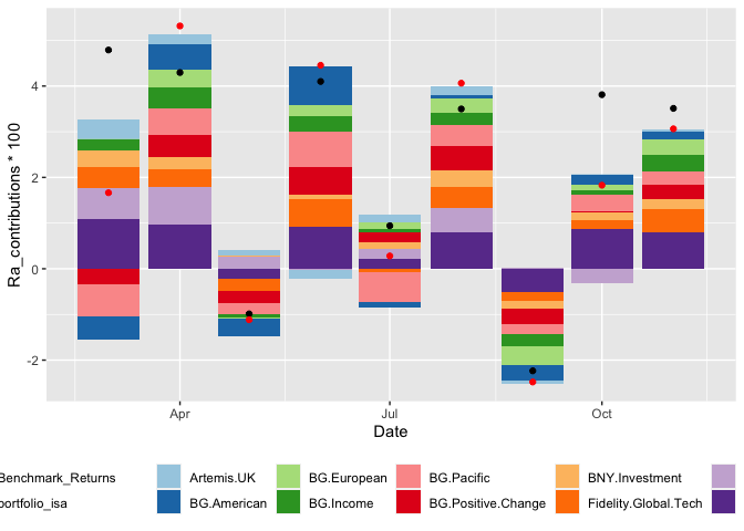
您的第一个问题很容易解决--分别将美学传递给每个geom。
对于第二个问题,您可以指定guides中的行数,以使颜色美观。
library(tidyverse)

ggplot() +
  geom_col(data = df_fund_contributions, aes(x = Date, y = Ra_contributions*100, fill =Fund)) +
  geom_point(data = benmark_comp_returns, aes(x = Date, y = Ra_contributions*100, color=Fund)) +
  scale_color_manual(labels = c("Benchmark_Returns", 'portfolio_isa'), values = c("black", 'red')) +
  scale_fill_brewer(palette = "Paired") +
  theme(legend.position="bottom",
                        legend.title = element_blank()) +
  guides(color = guide_legend(nrow = 2))
Stack Overflow用户
发布于 2021-11-06 11:20:36
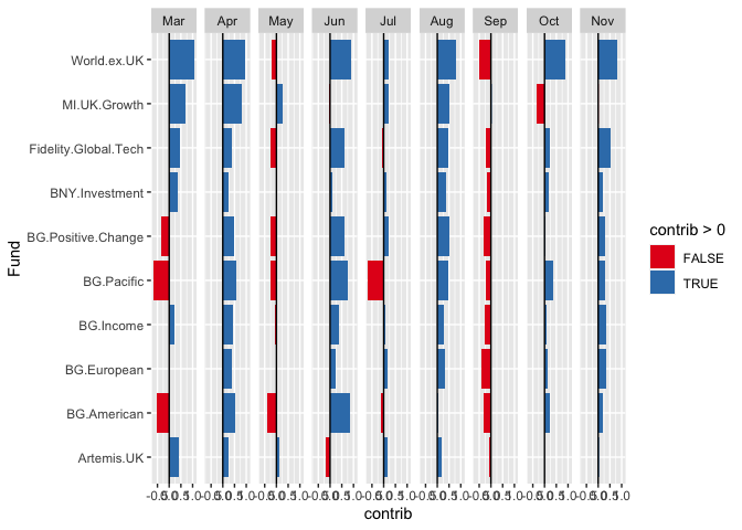
你问过如何使用面使你的可视化更有说服力。这是一个非常快速的想法。
library(tidyverse)

df_new <-
  df_fund_contributions %>%
  mutate(contrib = 100*Ra_contributions,
         month = lubridate::month(Date, label = TRUE, abbr = TRUE))

ggplot(df_new) +
  geom_col(aes(x = Fund, y = contrib, fill = contrib >0)) +
  scale_fill_brewer(palette = "Set1") +
  geom_hline(yintercept = 0) +
  facet_grid(~month) +
  coord_flip()
页面原文内容由Stack Overflow提供。腾讯云小微IT领域专用引擎提供翻译支持
原文链接:
https://stackoverflow.com/questions/69863014
复制相关文章
相似问题
腾讯云开发者

Copyright © 2013 - 2026 Tencent Cloud. All Rights Reserved. 腾讯云 版权所有
深圳市腾讯计算机系统有限公司 ICP备案/许可证号:粤B2-20090059 ![]() 粤公网安备44030502008569号
粤公网安备44030502008569号
腾讯云计算(北京)有限责任公司 京ICP证150476号 | 京ICP备11018762号