
如何将物体从开始移动到半圆?
我有一个半圆(green)和一个对象(blue).我想把这个对象从开始(left)移动到结束(right)。对象应该遵循半圆的路径(black) .
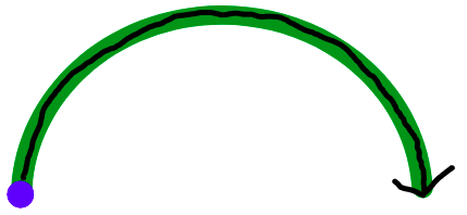
对象应根据特定值移动。值是一个从0到1的数字。开始= 0,结束= 1。
我目前的解决方案:
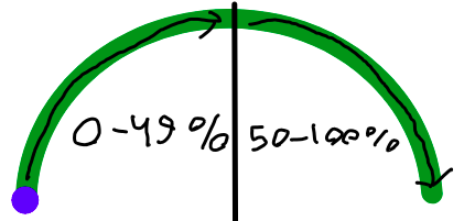
- 将该值乘以100,从而将其转换为百分比。因此,0= 0%,0.5 = 50%,1=100% container
- half
- 对象是一个绝对元素,它放置在相对的
50-100% - I'm圆圈中,也放置在相对容器中,但它不是绝对的
- ,对象将使用CSS
left和bottom进行移动,初始值是0% - first,半圆的一半是
0-49%,下半部分是50-100% - I‘m,半圆是
padding,对象是translate。padding只需要漂亮的外观,实际上并不影响解决方案。translate是left和bottom相对于“相对容器”
的正确位置所必需的。
我想出了如何在Y轴上移动物体:
// p is from 0 to 100
const bottom = (
    p < 50 ?
    p * 2 :
    100 - (p - 50) * 2
);
但我想不出如何正确地在X轴上移动。现在我有这样的想法:
const left = p;这给了我这个结果:
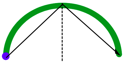
那么,如何正确地将对象移动到X轴上呢?,或者对X轴和Y轴都有更好的解决方案?。
请注意:
- 很可能是依赖JavaScript的解决方案,而不仅仅是CSS。我需要控制
value。我将手动设置它并手动更新它。有时根本没有动画,因为我不会从0迭代到1,而是只设置一次。 - 我需要与这两个
<svg>元素交互,而不是创建自己的元素。原因是每个border.
都有线性梯度填充,不能用<svg>正确地进行填充。
下面是我当前解决方案的片段:
async function main() {
    let value = 0; // from 0 to 1

    while (value < 1) {
        await new Promise((resolve) => {
            window.setTimeout(resolve, 10);
        });
        value += 0.01;
        move(value);
    }

}

function move(value) {
    const p = 100 * value;
    const bottom = (
        p < 50 ?
        p * 2 :
        100 - (p - 50) * 2
    );
    const left = p;
    const css = {
        left: `${left}%`,
        bottom: `${bottom}%`,
        transform: `translate(-${left}%, ${bottom}%)`,
    };
    const element = document.getElementById("ellipse-2-container")

    element.style.left = css.left;
    element.style.bottom = css.bottom;
    element.style.transform = css.transform;
}

main().root {
position: relative;
width: 20rem;
}
.ellipse-1 {
width: 100%;
height: auto;
box-sizing: border-box;
padding: 0.3rem;
}
.ellipse-2 {
width: 1.5rem;
height: auto;
}
.ellipse-2-container {
position: absolute;
left: 0;
bottom: 0;
display: flex;
}<div class="root">
<svg class="ellipse-1" xmlns="http://www.w3.org/2000/svg" width="272" height="125" viewBox="0 0 272 125"
fill="none">
<path
d="M265.2 124.5C268.956 124.5 272.021 121.452 271.797 117.703C269.975 87.1607 255.916 58.2064 232.167 36.4652C206.662 13.1169 172.069 2.4929e-06 136 0C99.9306 -2.4929e-06 65.3384 13.1169 39.8335 36.4652C16.084 58.2064 2.0254 87.1607 0.202617 117.703C-0.0211153 121.452 3.04446 124.5 6.8 124.5C10.5555 124.5 13.5766 121.451 13.8251 117.704C15.6319 90.4658 28.2517 64.6746 49.4501 45.2687C72.4046 24.2552 103.538 12.45 136 12.45C168.463 12.45 199.595 24.2552 222.55 45.2687C243.748 64.6746 256.368 90.4658 258.175 117.704C258.423 121.451 261.444 124.5 265.2 124.5Z"
fill="green">
</path>
</svg>
<div class="ellipse-2-container" id="ellipse-2-container">
<svg
class="ellipse-2" xmlns="http://www.w3.org/2000/svg" width="30" height="30" viewBox="0 0 30 30"
fill="none">
<path
d="M27.1759 15C27.1759 21.9292 21.6265 27.5 14.838 27.5C8.04943 27.5 2.5 21.9292 2.5 15C2.5 8.07077 8.04943 2.5 14.838 2.5C21.6265 2.5 27.1759 8.07077 27.1759 15Z"
fill="blue">
</path>
</svg>
</div>
</div>
关于解的注记.
我用了Temani Afif溶液,但几乎没有修改。在我指出的问题中,我需要保留这两个<svg>元素。因此,我将div.arc边框颜色设置为透明,删除不必要的:before, :after。将div.arc设置为position: relative,将我的孩子<svg>设置为position: absolute。对齐后,它看起来像是在<svg>元素上移动的对象,但实际上它在div.arc上移动。
回答 2
Stack Overflow用户
发布于 2021-11-19 15:44:40
那么只使用CSS和更简单的解决方案呢:
.arc {
  width:250px;
  aspect-ratio:2/1;
  border:20px solid blue;
  border-bottom:0;
  border-radius:200px 200px 0 0;
  box-sizing:border-box;
  display:grid;
}
.arc:before,
.arc:after,
.arc div{
  content:"";
  width:20px;
  aspect-ratio:1/1;
  border-radius:50%;
  grid-area:1/1;
  background:blue;
}
.arc > div {
  background:lightgreen;
  margin:auto auto -10px;
  animation:a 3s linear both 1s;
}
@keyframes a{ /* 115px = (250px - 20px)/2 */
  from {transform:rotate(-180deg) translate(115px)}
  to   {transform:rotate(   0deg) translate(115px)}
}

.arc:before {
  margin:auto auto -10px -20px;
}
.arc:after {
  margin:auto -20px -10px auto;
}<div class="arc">
<div></div>
</div>
使用CSS变量控制值:
.arc {
  width:250px;
  aspect-ratio:2/1;
  border:20px solid blue;
  border-bottom:0;
  border-radius:200px 200px 0 0;
  box-sizing:border-box;
  display:grid;
}
.arc:before,
.arc:after,
.arc div{
  content:"";
  width:20px;
  aspect-ratio:1/1;
  border-radius:50%;
  grid-area:1/1;
  background:blue;
}
.arc > div {
  background:lightgreen;
  margin:auto auto -10px;
  transform:rotate(calc(180deg*var(--x) - 180deg)) translate(115px)
}


.arc:before {
  margin:auto auto -10px -20px;
}
.arc:after {
  margin:auto -20px -10px auto;
}<div class="arc" style="--x:0">
<div></div>
</div>
<div class="arc" style="--x:0.2">
<div></div>
</div>
<div class="arc" style="--x:0.6">
<div></div>
</div>
<div class="arc" style="--x:1">
<div></div>
</div>
Stack Overflow用户
发布于 2021-11-19 16:07:44
你觉得这个有用吗?
.dot {
  width: 10px;
  height: 10px;
  border-radius: 50%;
  background: blue;
  position: absolute;
  left: -7px;
  top: 45px;
}

.container {
  width: 100px;
  height: 100px;
  position: relative;
  border-radius: 50%;
  border: 5px solid green;
  animation: rot 3s infinite;
  box-sizing: content
}

@keyframes rot {
  0% {
    transform: rotate(0deg)
  }
  100% {
    transform: rotate(180deg)
  }
}<div class="container">
<span class="dot"></span>
</div>
https://stackoverflow.com/questions/70037322
复制相似问题
腾讯云开发者

Copyright © 2013 - 2026 Tencent Cloud. All Rights Reserved. 腾讯云 版权所有
深圳市腾讯计算机系统有限公司 ICP备案/许可证号:粤B2-20090059  粤公网安备44030502008569号
腾讯云计算(北京)有限责任公司 京ICP证150476号 | 京ICP备11018762号