
从零到曲线的梯度填充
从零到曲线的梯度填充
提问于 2021-12-03 09:41:07
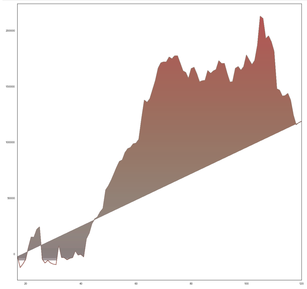
我一直在用Is it possible to get color gradients under curve in matplotlib?作为参考(你可以看到相似之处,但我无法在我的生活中弄清楚如何在Y轴上把阴影一直推到0,因为某些原因我找不到,它有一条向上倾斜的直线切断阴影,我在我的数据中找不到任何东西来说明为什么会这样做。
对于上下文,y轴可以显示为正的和负的,所以我希望用渐变颜色填充从0到直线(正),然后从0填充到负线(参见前面图表-same数据中的蓝色示例-)。
这是我的密码
import numpy as np
import matplotlib.pyplot as plt
import matplotlib.colors as mcolors
from matplotlib.patches import Polygon
# Variables
AUM = df['#AHD_AUM'].head(104)
MM = df['#AHD_Managed_Money_Net'].head(104)
PRICE = df['#AHD_Price'].head(104)
DATES = df['DATES'].head(104)
# Date Friendly Variables for Plot
List_AUM = df['#AHD_AUM'].head(104).to_list()
List_MM = df['#AHD_Managed_Money_Net'].head(104).to_list()
List_DATES = df['DATES'].head(104).to_list()
X = 0 * df['#AHD_AUM'].head(104)
# Make a date list changing dates with numbers to avoid the issue with the plot
interpreting dates
for i in range(len(df['DATES'].head(104))):
count = i
df['count'][i] = 120 - i
# X and Y data variables changed to arrays as when i had these set as dates
matplotlib hates it
x = df['count'].head(104).to_numpy()
y = df['#AHD_Managed_Money_Net'].head(104).to_numpy()
#DD = AUM.to_numpy()
#MMM = MM.to_numpy()
def main():
for _ in range(len(DD)):
gradient_fill(x,y)
plt.show()
def gradient_fill(x,y, fill_color=None, ax=None, **kwargs):
"""
"""
if ax is None:
ax = plt.gca()
line, = ax.plot(x, y, **kwargs)
if fill_color is None:
fill_color = line.get_color()
zorder = line.get_zorder()
alpha = line.get_alpha()
alpha = 1.0 if alpha is None else alpha
z = np.empty((100, 1, 4), dtype=float)
rgb = mcolors.colorConverter.to_rgb(fill_color)
z[:,:,:3] = rgb
z[:,:,-1] = np.linspace(0, alpha, 100)[:,None]
xmin, xmax, ymin, ymax = x.min(), x.max(), y.min(), y.max()
im = ax.imshow(z, aspect='auto', extent=[xmin, xmax, ymin, ymax],
origin='lower', zorder=zorder)
xy = np.column_stack([x, y])
# xy = np.vstack([[xmin, ymin], xy, [xmax, ymin], [xmin, ymin]]) ### i dont
need this so i have just commented it out
clip_path = Polygon(xy, facecolor='none', edgecolor='none', closed=True)
ax.add_patch(clip_path)
im.set_clip_path(clip_path)
ax.autoscale(True)
return line, im
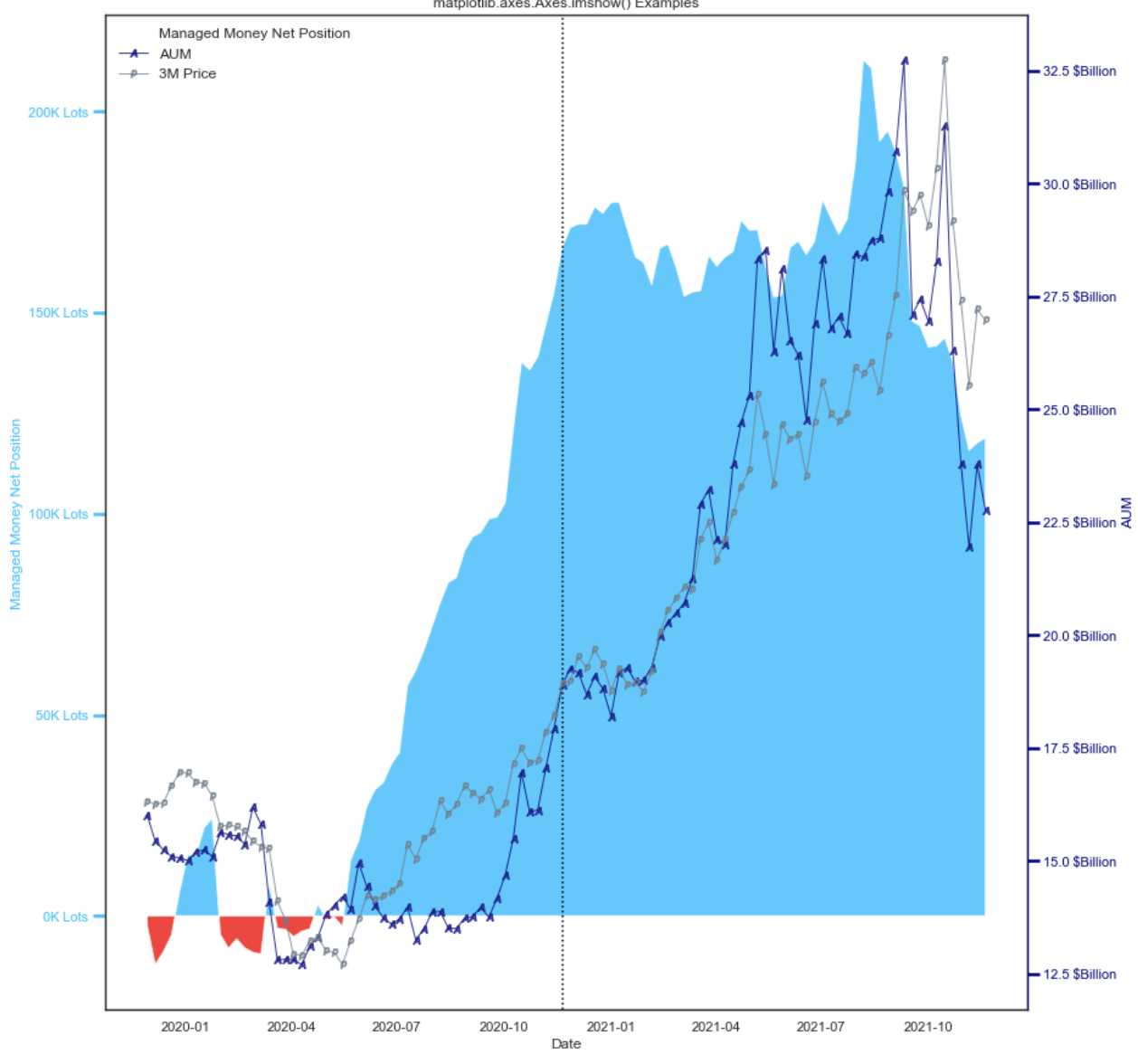
main()这是我目前的输出
回答 2
Stack Overflow用户
回答已采纳
发布于 2021-12-03 12:52:26
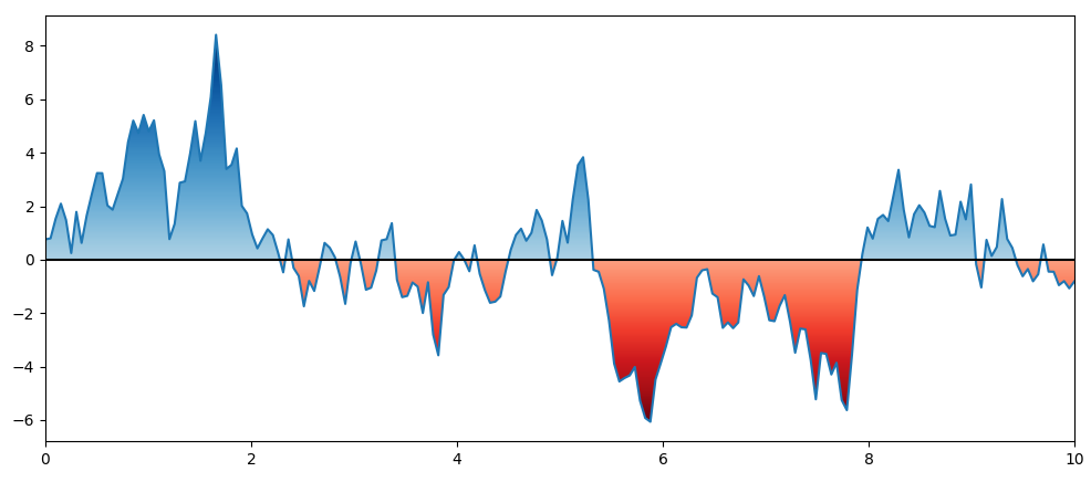
通过曲线裁剪梯度的一种更简单的方法是使用从fill_between获得的多边形。
下面是一些示例代码,可以让您开始工作。
import numpy as np
import matplotlib.pyplot as plt

np.random.seed(123)
x = np.linspace(0, 10, 200)
y = np.random.normal(0.01, 1, 200).cumsum()
fig, ax = plt.subplots(figsize=(12, 5))
ax.plot(x, y)

ylim = ax.get_ylim()

grad1 = ax.imshow(np.linspace(0, 1, 256).reshape(-1, 1), cmap='Blues', vmin=-0.5, aspect='auto',
                  extent=[x.min(), x.max(), 0, y.max()], origin='lower')
poly_pos = ax.fill_between(x, y.min(), y, alpha=0.1)
grad1.set_clip_path(poly_pos.get_paths()[0], transform=ax.transData)
poly_pos.remove()

grad2 = ax.imshow(np.linspace(0, 1, 256).reshape(-1, 1), cmap='Reds', vmin=-0.5, aspect='auto',
                  extent=[x.min(), x.max(), y.min(), 0], origin='upper')
poly_neg = ax.fill_between(x, y, y.max(), alpha=0.1)
grad2.set_clip_path(poly_neg.get_paths()[0], transform=ax.transData)
poly_neg.remove()

ax.set_ylim(ylim)
ax.axhline(0, color='black')  # show a line at x=0
plt.show()
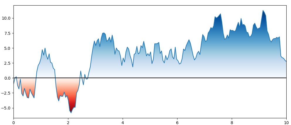
PS:vmin in imshow可用于移除非常轻的颜色范围:
grad1 = ax.imshow(np.linspace(0, 1, 256).reshape(-1, 1), cmap='Blues', vmin=-0.5, aspect='auto',
                  extent=[x.min(), x.max(), 0, y.max()], origin='lower')

grad2 = ax.imshow(np.linspace(0, 1, 256).reshape(-1, 1), cmap='Reds', vmin=-0.5, aspect='auto',
                  extent=[x.min(), x.max(), y.min(), 0], origin='upper')
Stack Overflow用户
发布于 2021-12-08 19:21:36
import pandas as pd  # For data handling
import seaborn as sns  # For plotting
import numpy as np
import matplotlib.pyplot as plt # For plotting
import matplotlib
#some preferred user settings
plt.rcParams['figure.figsize'] = (18.0, 12.0)
pd.set_option('display.max_columns', None)
%matplotlib inline
import warnings
warnings.filterwarnings(action='ignore')

from mpl_toolkits.axisartist.parasite_axes import HostAxes, ParasiteAxes
import matplotlib.pyplot as plt
from matplotlib.ticker import MultipleLocator
import datetime as dt
import matplotlib.dates as mdates
import pandas

Metal = CAD


# Variables
AUM = Metal.iloc[:,[7]].head(104)
MM = Metal.iloc[:,[0]].head(104)
PRICE = Metal.iloc[:,[8]].head(104)
#Last_Report = Metal.iloc[:,[9]].head(1).dt.strftime('%d %b %Y').to_list()
DATES = Metal.iloc[:,[10]].head(104)

# Dataframe for Net Position High
Net_High = Metal[Metal.iloc[:,[0]] == Metal.iloc[:,[0]].max()]
# Variables for Chart Annotation for Net Position High
Pos_High_Date = Net_High.iloc[:, [0]]
Pos_High_AUM = Net_High.iloc[:, [7]][0]/[1000000000]
Pos_High_Price = Net_High.iloc[:, [8]].to_numpy()[0].round().astype('int')
Pos_High = Net_High.iloc[:, [0]][0].astype('int')
Str_Date = mdates.num2date(Pos_High_Date)
Str_Date = pd.to_datetime(Str_Date[0]).strftime("%d %b %y")[0]

# Dataframe for Net Position Low
Net_Low = df[df['#CAD_Managed_Money_Net'] == df['#CAD_Managed_Money_Net'].head(104).min()]
# Variables for Chart Annotation for Net Position High
Pos_Low_Date = Net_Low.iloc[:, [55]].to_numpy()
Pos_Low_AUM = Net_Low.iloc[:, [26]].to_numpy()[0].round()/[1000000000]
Pos_Low_Price = Net_Low.iloc[:, [27]].to_numpy()[0].round().astype('int')
Pos_Low = Net_Low['#CAD_Managed_Money_Net'][0].astype('int')
Str_Date_Low = mdates.num2date(Pos_Low_Date)
Str_Date_Low = pd.to_datetime(Str_Date_Low[0]).strftime("%d %b %y")[0]


# C Brand Colour Scheme
C = ['deepskyblue', '#003399', 'slategray', '#027608','#cc0000']

def make_patch_spines_invisible(ax):
    ax.set_frame_on(True)
    ax.patch.set_visible(False)
    for sp in ax.spines.values():
        sp.set_visible(False)

fig, host = plt.subplots(figsize=(25,15))
fig.subplots_adjust(right=0.8)
#twinx() creates another axes sharing the x axis we do this twice
par1 = host.twinx()
par2 = host.twinx()

# Offset the right spine of par2 the ticks
par2.spines["right"].set_position(("axes",1.08))

#because par2 was created by twinx the frame is off so we need to use the method created above
make_patch_spines_invisible(par2)

# second, show the right spine
par2.spines["right"].set_visible(True)

######### Colouring in Plots

x = DATES
y = MM

ylim = host.get_ylim()

Long = host.imshow(np.linspace(0, 1, 256).reshape(-1, 1), cmap= 'Blues', vmin=-0.5, aspect='auto',
                  extent=[x.min(), x.max(), 0, y.max()], origin='lower')
poly_pos = host.fill_between(x, y.min(), y, alpha=0.1)
Long.set_clip_path(poly_pos.get_paths()[0], transform=host.transData)
poly_pos.remove()

Short = host.imshow(np.linspace(0, 1, 256).reshape(-1, 1), cmap='OrRd', vmin=-0.5, aspect='auto',
                  extent=[x.min(), x.max(), y.min(), 0], origin='upper')
poly_neg = host.fill_between(x, y, y.max(), alpha=0.1)
Short.set_clip_path(poly_neg.get_paths()[0], transform=host.transData)
poly_neg.remove()

##########

#plot data
p1, = host.plot(DATES, MM, label="Managed Money Net Position", linewidth=0.0,color = Citi[1], alpha = 0.8)
p2, = par1.plot(DATES, AUM, label="AUM",linewidth=1, marker = '$A$',mew = 1,mfc = 'w', color = Citi[0], alpha = 0.8)
p3, = par2.plot(DATES, PRICE, label="3M Price",linewidth=1, marker = '$p$', color = Citi[2], alpha = 0.8)

#Automatically scale and format

host_labels = ['{:,.0f}'.format(x) + 'K Lots' for x in host.get_yticks()/1000]
host.set_yticklabels(host_labels)

par1_labels = ['{:,.1f}'.format(x) + ' $Billion' for x in par1.get_yticks()/1000000000]
par1.set_yticklabels(par1_labels)

par2_labels = ['{:,.0f}'.format(x) + ' $' for x in par2.get_yticks()]
par2.set_yticklabels(par2_labels)

# x Axis formatting (date)
formatter = matplotlib.dates.DateFormatter('%b- %Y')
host.xaxis.set_major_formatter(formatter)

# Rotates and right-aligns the x labels so they don't crowd each other.
for label in host.get_xticklabels(which='major'):
    label.set(rotation=30, horizontalalignment='right')

# Axis Labels
host.set_xlabel("Date")
host.set_ylabel("Managed Money Net Position")
par1.set_ylabel("AUM")
par2.set_ylabel("3M Price")


# Tick Parameters

tkw = dict(size=10, width=2.5)
# Set tick colours
host.tick_params(axis = 'y', colors = Citi[1], **tkw)
par1.tick_params(axis = 'y', colors = Citi[0], **tkw)
par2.tick_params(axis = 'y', colors = Citi[2], **tkw)
#host.tick_params(which='major',axis = 'x',direction='out', colors = Citi[2], **tkw)
#plt.xticks(x, rotation='vertical')
#host.xaxis.set_major_locator(AutoMajorLocator())
host.xaxis.set_major_locator(MultipleLocator(24))
host.tick_params('x',which='major', length=7)

#Label colours taken from plot
host.yaxis.label.set_color(p1.get_color())
par1.yaxis.label.set_color(p2.get_color())
par2.yaxis.label.set_color(p3.get_color())

# Map Title
host.set_title('Aluminium Managed Money Net Positioning as of %s'% Last_Report[0],fontsize='large')

#Colour Spines cant figure out how to do it for the host

par1.spines["right"].set_edgecolor(p2.get_color())
par2.spines["right"].set_edgecolor(p3.get_color())

###### Annotation Tests ##########
## Net Position High Box
host.annotate(f' Net Position High | {Pos_High} \n Date | {Str_Date} \n AUM | ${Pos_High_AUM[0].round(1)} Billion\n 3M Price | ${Pos_High_Price[0]}$',
            xy=(Pos_High_Date, Pos_High), xycoords='data',
            xytext=(0.02, .85), textcoords='axes fraction',
            horizontalalignment='left',
            verticalalignment='bottom',
            color='white',
            bbox=dict(boxstyle="round", fc= Citi[1],edgecolor='white'),
            arrowprops=dict(
            facecolor='black',
            arrowstyle= '->'))

## Net Position Low Box
host.annotate(f' Net Position Low | {Pos_Low} \n Date | {Str_Date_Low} \n AUM | ${Pos_Low_AUM[0].round(1)} Billion\n 3M Price | ${Pos_Low_Price[0]}$',
            xy=(Pos_Low_Date, Pos_Low), xycoords='data',
            xytext=(0.02, .80), textcoords='axes fraction',
            horizontalalignment='left',
            verticalalignment='top',
            color='white',
            bbox=dict(boxstyle="round", fc= Citi[4],edgecolor='white'),
            arrowprops=dict(
            facecolor='black',
            arrowstyle= '->'))

################


# Legend - a little complicated as we have to take from multiple axis
lines = [p1, p2, p3]

########## Plot text and line on chart if you want to
# host.axvline(x = DATES[52] , linestyle='dotted', color='black') ###Dotted Line when Needed
# host.text(2020.3, 10, 'Managed Money \n     Aluminium')
# host.text(2020.5, 92, r'Ali',color='black')
# host.text(2020.8,15, r'some event', rotation=90)

host.legend(lines,[l.get_label() for l in lines],loc=2, fontsize=12,frameon=False)
plt.savefig('multiple_axes.png', dpi=300, bbox_inches='tight')页面原文内容由Stack Overflow提供。腾讯云小微IT领域专用引擎提供翻译支持
原文链接:
https://stackoverflow.com/questions/70212212
复制相关文章
相似问题
腾讯云开发者

Copyright © 2013 - 2026 Tencent Cloud. All Rights Reserved. 腾讯云 版权所有
深圳市腾讯计算机系统有限公司 ICP备案/许可证号:粤B2-20090059 ![]() 粤公网安备44030502008569号
粤公网安备44030502008569号
腾讯云计算(北京)有限责任公司 京ICP证150476号 | 京ICP备11018762号