
Matplotlib:多条直方图
Matplotlib:多条直方图
提问于 2021-12-03 16:28:17
我似乎无法掌握如何绘制多条直方图。这是我的密码:
import matplotlib.pyplot as mpl

tags = 'manual (4 serv.)', 'Cromlech (average, 4 serv.)', 'Cromlech (0.925, 4 serv.)', 'Cromlech (0.925 improved, 7 serv.)', 'Cromlech (15 serv.)', 'Pangaea', 'ServiceCutter (4 serv.)'
a = (0.385, 0.4128, 0.406, 0.5394, 0.7674, 0.306, 0.3505)
b = (0.4025, 0.1935, 0.189, 0.189, 0.415, 0.238, 0.1714)
c = (1, 0.3619, 0.5149, 1, 0.4851, 0.4092, 0.4407)
d = (1, 0.3495, 0.4888, 1, 0.4861, 0.4985, 0.5213)
mpl.hist((a, b, c, d), 7, label=("decoupling", "op. cost", "op. similarity", "data similarity"))
mpl.legend()
mpl.xticks((1, 2, 3, 4, 5, 6, 7), (tags))
mpl.show()
我想要做的是生成一个有7个数据点的图,每个数据点的特征是四倍(解耦,op )。费用,行动。相似,数据相似)。"a,b,c,d“分别包含解耦运算的值。费用..。我想用代码中的一个标记来标记每个数据点。
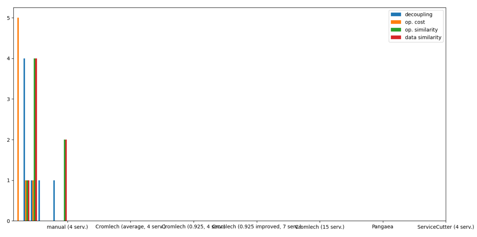
我不明白我做错了什么。你能帮我一下吗?
回答 1
Stack Overflow用户
回答已采纳
发布于 2021-12-03 17:33:17
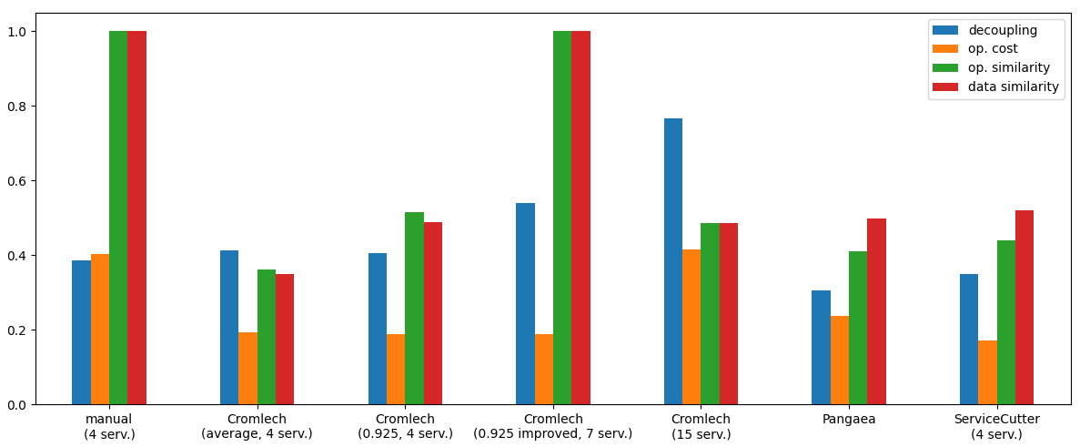
看起来你想要创建一个条形图,而不是直方图。
在本例中,如果创建一个熊猫 数据帧并使用熊猫绘图(熊猫使用matplotlib绘图),则分组、标签和图例是最简单的:
import matplotlib.pyplot as plt
import pandas as pd

tags = ('manual (4 serv.)', 'Cromlech (average, 4 serv.)', 'Cromlech (0.925, 4 serv.)',
        'Cromlech (0.925 improved, 7 serv.)', 'Cromlech (15 serv.)', 'Pangaea', 'ServiceCutter (4 serv.)')
# insert some newlines in the tags to better fit into the plot
tags = [tag.replace(' (', '\n(') for tag in tags]
a = (0.385, 0.4128, 0.406, 0.5394, 0.7674, 0.306, 0.3505)
b = (0.4025, 0.1935, 0.189, 0.189, 0.415, 0.238, 0.1714)
c = (1, 0.3619, 0.5149, 1, 0.4851, 0.4092, 0.4407)
d = (1, 0.3495, 0.4888, 1, 0.4861, 0.4985, 0.5213)
# create a dataframe
df = pd.DataFrame({"decoupling": a, "op. cost": b, "op. similarity": c, "data similarity": d}, index=tags)
df.plot.bar(rot=0, figsize=(12, 5))
plt.tight_layout() # fit labels etc. nicely into the plot
plt.show()
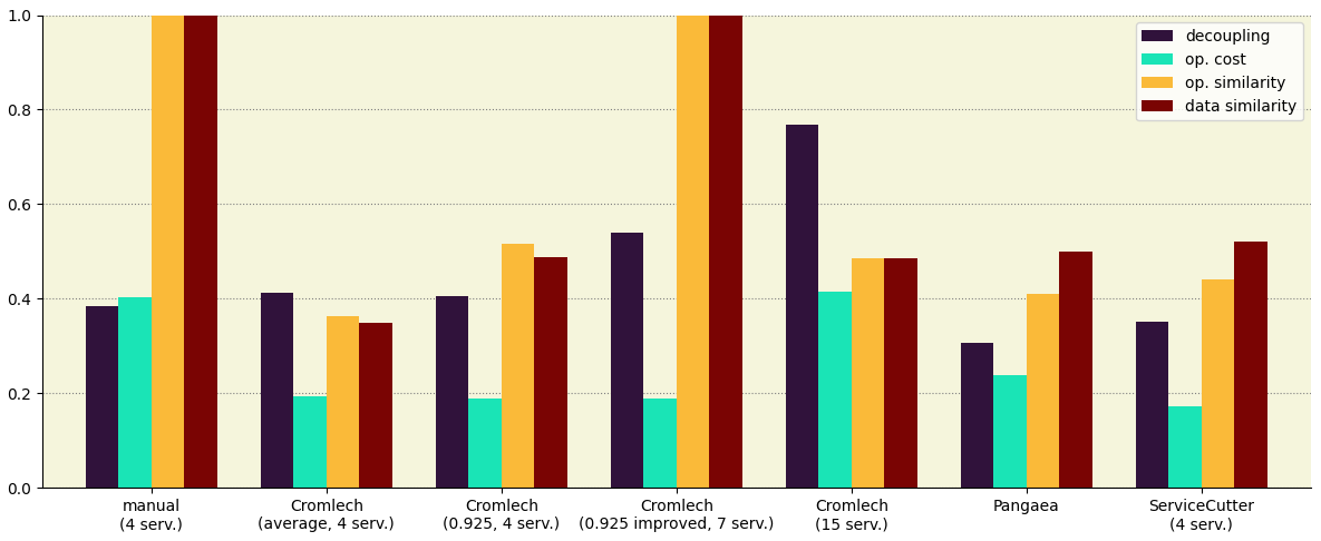
或者,您可以修改可视化方面。下面是一个示例:
ax = df.plot.bar(rot=0, figsize=(12, 5), width=0.75, cmap='turbo')
for spine in ['top', 'right']:
    ax.spines[spine].set_visible(False)
ax.set_axisbelow(True)
ax.grid(axis='y', color='grey', ls=':')
ax.set_facecolor('beige')
ax.set_ylim(0, 1)
plt.tight_layout()
页面原文内容由Stack Overflow提供。腾讯云小微IT领域专用引擎提供翻译支持
原文链接:
https://stackoverflow.com/questions/70217623
复制相关文章
相似问题
腾讯云开发者

Copyright © 2013 - 2026 Tencent Cloud. All Rights Reserved. 腾讯云 版权所有
深圳市腾讯计算机系统有限公司 ICP备案/许可证号:粤B2-20090059 ![]() 粤公网安备44030502008569号
粤公网安备44030502008569号
腾讯云计算(北京)有限责任公司 京ICP证150476号 | 京ICP备11018762号