
动态地在子图元之间标注线条图
动态地在子图元之间标注线条图
提问于 2022-11-14 13:17:54
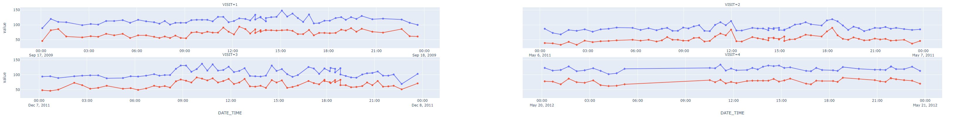
我有一个与下面类似的数据集。请注意,单个ID有多个值。
import pandas as pd
import numpy as np
import random

df = pd.DataFrame({'DATE_TIME':pd.date_range('2022-11-01', '2022-11-05 23:00:00',freq='h'),
                   'SBP':[random.uniform(110, 160) for n in range(120)],
                   'DBP':[random.uniform(60, 100) for n in range(120)],
                   'ID':[random.randrange(1, 100) for n in range(120)],
                   'TIMEINTERVAL':[random.randrange(1, 200) for n in range(120)]})

df['VISIT'] = df['DATE_TIME'].dt.day

df['MODE'] = np.select([df['VISIT']==1, df['VISIT'].isin([2,3])], ['New', 'InProgress'], 'Done')
我使用以下破折号代码来制作滑块:
app = Dash(__name__)


app.layout = html.Div([
    html.H4('Interactive Scatter Plot with ABPM dataset'),
    dcc.Graph(id="scatter-plot"),
    html.P("Filter by time interval:"),
    dcc.Dropdown(df.ID.unique(), id='pandas-dropdown-1'), # for choosing ID,
    dcc.RangeSlider(
        id='range-slider',
        min=0, max=600, step=10,
        marks={0: '0', 50: '50', 100: '100', 150: '150', 200: '200', 250: '250', 300: '300', 350: '350', 400: '400', 450: '450', 500: '500', 550: '550', 600: '600'},
        value=[0, 600]
    ),
    html.Div(id='dd-output-container')
])


@app.callback(
    Output("scatter-plot", "figure"),
    Input("pandas-dropdown-1", "value"),
    Input("range-slider", "value"),
    prevent_initial_call=True)

def update_bar_chart(value,slider_range):
    low, high = slider_range
    df1 = df.query("ID == @value & TIMEINTERVAL > @low & TIMEINTERVAL < @high").copy()

    if df1.shape[0] != 0:
        fig = px.scatter(df1, x="DATE_TIME", y=["SBP","DBP"],
                         hover_data=['TIMEINTERVAL'],facet_col='VISIT',
                         facet_col_wrap=2,
                         symbol='MODE')

        fig.update_xaxes(matches= None, showticklabels=True)

        return fig
    else:
        return dash.no_update


app.run_server(debug=True, use_reloader=False)
如果df1访问列的值大于1,那么我想用箭头注释子情节,以明确阅读。为此,我用update_bar_charts函数编写了以下文本,但它没有编译。
def update_bar_chart(value,slider_range):
    low, high = slider_range
    df1 = df.query("ID == @value & TIMEINTERVAL > @low & TIMEINTERVAL < @high").copy()

    if df1.shape[0] != 0:
        fig = px.scatter(df1, x="DATE_TIME", y=["SBP","DBP"],
                         hover_data=['TIMEINTERVAL'],facet_col='VISIT',
                         facet_col_wrap=2,
                         symbol='MODE')

        fig.update_xaxes(matches= None, showticklabels=True)

                if df1.VISIT!=1:
                fig.add_annotation(
                xref="x domain",
                yref="y domain",
                # The arrow head will be 25% along the x axis, starting from the left
                x=0.25,
                # The arrow head will be 40% along the y axis, starting from the bottom
                y=0.4,
                arrowhead=2,
            )

                   return fig
    else:
        return dash.no_update


app.run_server(debug=True, use_reloader=False)
我拥有的是
我想达到的目标是:
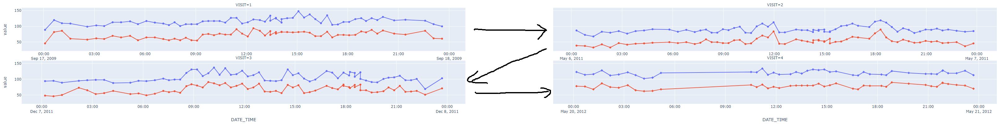
我怎样才能添加那些箭头,使阅读情节更容易?箭头的数量应该动态变化,因为每个ID都有不同的访问次数。
回答 2
Stack Overflow用户
回答已采纳
发布于 2022-11-17 05:51:46
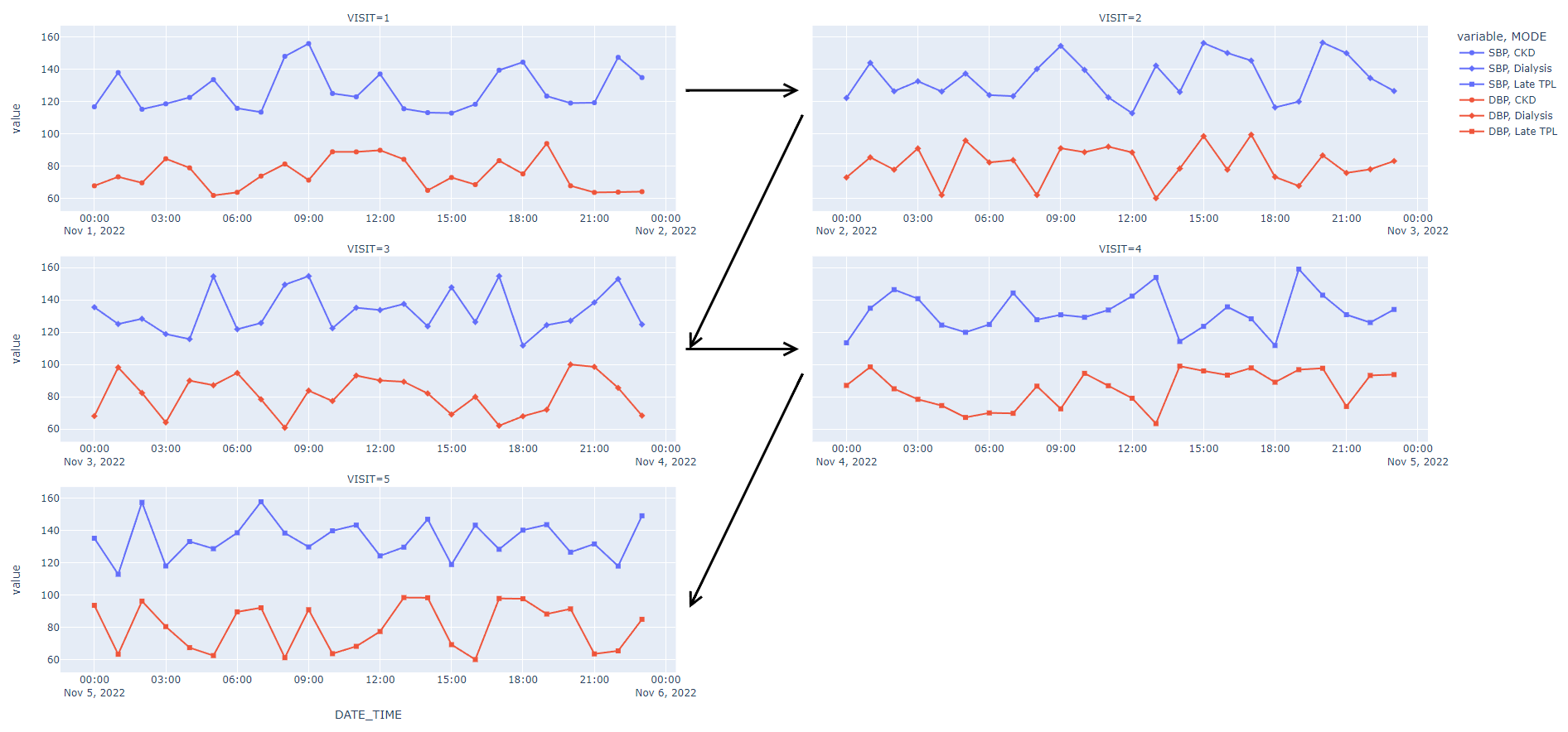
添加批注,循环遍历子图行。使用注释的'xref'/'yref‘属性的' x/y * domain’值,将坐标指定为x/y域的比率(子图的帧的宽度/高度)。还可以使用'ax'/'ay‘属性来指定箭头的起始点。
这是一个例子。
n_plots = len(df1['VISIT'].unique())
n_rows = (n_plots+1)//2
row_spacing = 1/((1/0.5+1) * n_rows - 1) # 50% of y domain
col_spacing = 0.1
col_spacing_in_x_domain = 1/((1/col_spacing-1)/2)
row_spacing_in_y_domain = 1/((1/row_spacing+1)/n_rows - 1)

fig = px.scatter(df1,
    facet_col='VISIT',
    facet_col_wrap=2,
    facet_row_spacing=row_spacing, facet_col_spacing=col_spacing,
    ...
)
fig.update_xaxes(matches= None, showticklabels=True)

for i in range(n_rows):
    # A row number 1 is the bottom one.
    trace = next(fig.select_traces(row=n_rows-i, col=1))
    xref, yref = trace.xaxis + ' domain', trace.yaxis + ' domain'
    if i*2+1 < n_plots:
        fig.add_annotation(
            xref=xref, yref=yref, axref=xref, ayref=yref,
            ax=1, ay=0.5,
            x=1 + col_spacing_in_x_domain, y=0.5,
            arrowhead = 2,
        )
    if i*2+2 < n_plots:
        fig.add_annotation(
            xref=xref, yref=yref, axref=xref, ayref=yref,
            ax=1 + col_spacing_in_x_domain, ay=0.5,
            x=1, y=-row_spacing_in_y_domain - 0.5,
            arrowhead = 2,
)Stack Overflow用户
发布于 2022-11-16 20:21:14
我很高兴看到我对你另一个问题的回答有所帮助。你可能必须玩箭头的位置取决于你的最终尺寸的数字,但这完成了你想要的东西。
fig = px.line(df,
          x='DATE_TIME',
          y=['SBP', 'DBP'],
          facet_col='VISIT',
          facet_col_wrap=2,
          facet_col_spacing=0.1,
          symbol='MODE',
          markers=True)
fig.update_xaxes(matches=None,
                 showticklabels=True)

fig.add_annotation(xref='paper', yref='paper', x=0.46, y=0.1, ax=140, ay=-290, arrowhead=5, arrowsize=1, arrowwidth=3, arrowcolor='black')

fig.add_annotation(xref='paper', yref='paper', x=0.46, y=0.5, ax=140, ay=-290, arrowhead=5, arrowsize=1, arrowwidth=3, arrowcolor='black')

fig.add_annotation(xref='paper', yref='paper', x=0.54, y=0.5, ax=-140, ay=0, arrowhead=5, arrowsize=1, arrowwidth=3, arrowcolor='black')

fig.add_annotation(xref='paper', yref='paper', x=0.54, y=0.9, ax=-140, ay=0, arrowhead=5, arrowsize=1, arrowwidth=3, arrowcolor='black')

fig.show()
页面原文内容由Stack Overflow提供。腾讯云小微IT领域专用引擎提供翻译支持
原文链接:
https://stackoverflow.com/questions/74432287
复制相关文章
相似问题
腾讯云开发者

Copyright © 2013 - 2026 Tencent Cloud. All Rights Reserved. 腾讯云 版权所有
深圳市腾讯计算机系统有限公司 ICP备案/许可证号:粤B2-20090059 ![]() 粤公网安备44030502008569号
粤公网安备44030502008569号
腾讯云计算(北京)有限责任公司 京ICP证150476号 | 京ICP备11018762号