
如何绘制以R为单位的10个最大值的时间序列数据?
如何绘制以R为单位的10个最大值的时间序列数据?
提问于 2022-11-11 18:14:25
如果我有以下数据集
#venice {VGAM}

data(venice)

#Year Largest values
1931 103 99 98 96 94 89 86 85 84 79
1932 78 78 74 73 73 72 71 70 70 69
1933 121 113 106 105 102 89 89 88 86 85
1934 116 113 91 91 91 89 88 88 86 81
我如何使用上面的数据来绘制像下面这样的图表呢?其中x轴为每年,y轴为每年绘制10个数据,并给出其数据的曲施。
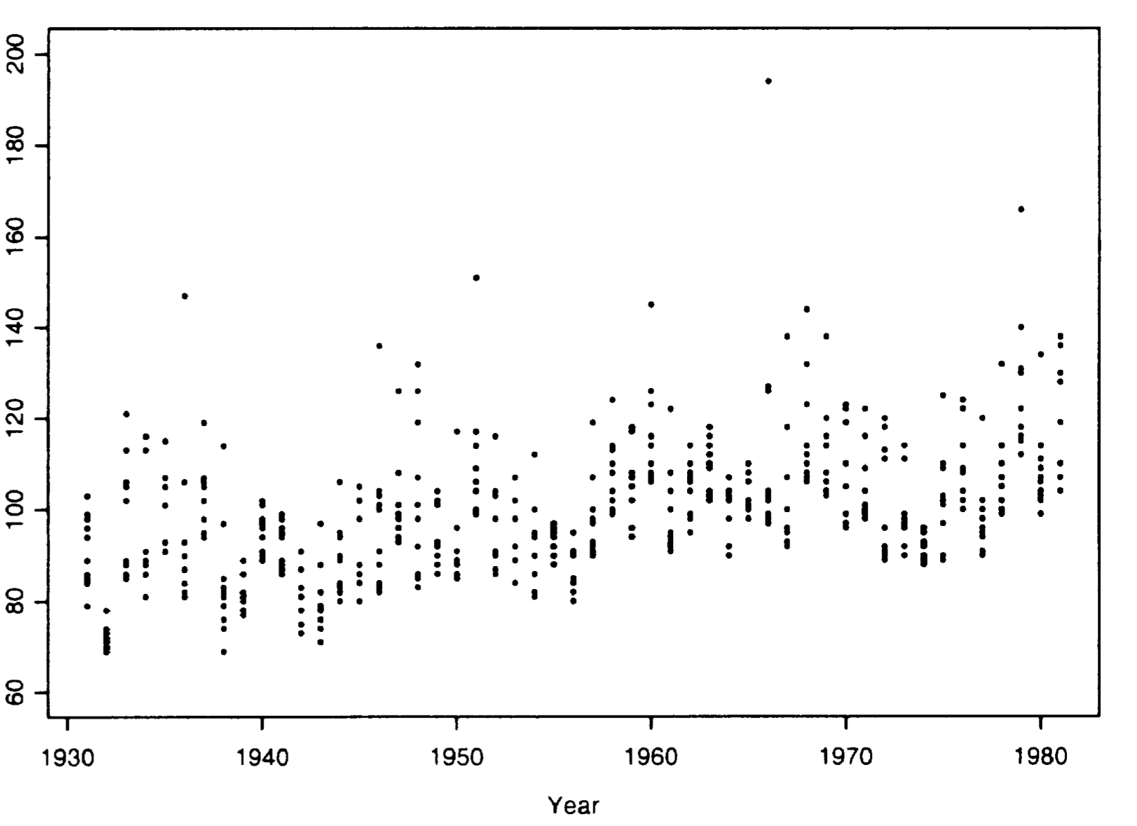
七年移动平均数:
根据这些评论,
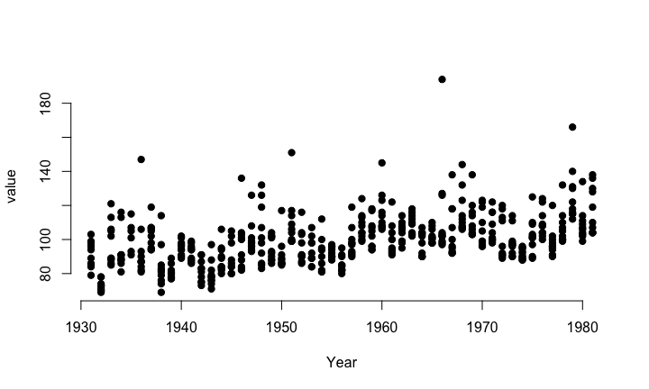
df_long <- reshape2::melt(data = venice, id.vars = 'Year');
plot(value ~ Year, data = df_long, bty = 'n', type = 'p', pch = 19)
产出:
回答 1
Stack Overflow用户
回答已采纳
发布于 2022-11-11 19:35:55
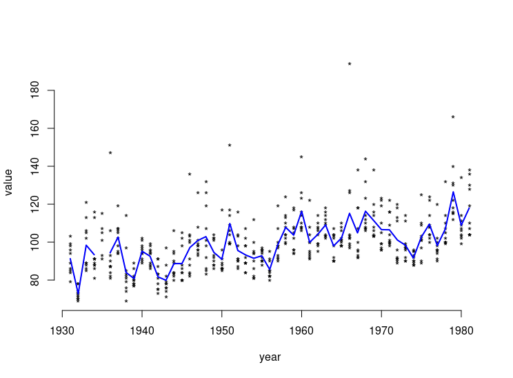
library(VGAM)
data(venice)

df_long <- reshape2::melt(data = venice, id.vars = 'year')
plot(value ~ year, data = df_long, bty = 'n', type = 'p', pch = 19)
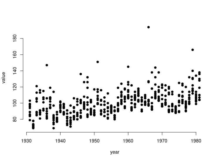
plot(value ~ year, data = df_long, bty = 'n', type = 'p', pch = '*')
lines(venice[ , 1 ], venice[ , -1 ] |> rowMeans(), lwd = 2, col = 'blue')
页面原文内容由Stack Overflow提供。腾讯云小微IT领域专用引擎提供翻译支持
原文链接:
https://stackoverflow.com/questions/74406604
复制相关文章
相似问题
腾讯云开发者

Copyright © 2013 - 2026 Tencent Cloud. All Rights Reserved. 腾讯云 版权所有
深圳市腾讯计算机系统有限公司 ICP备案/许可证号:粤B2-20090059 ![]() 粤公网安备44030502008569号
粤公网安备44030502008569号
腾讯云计算(北京)有限责任公司 京ICP证150476号 | 京ICP备11018762号