
单线平面图中的双X轴
单线平面图中的双X轴
提问于 2022-11-09 09:38:42
我试图在python中创建一个绘图,它允许我将2x轴添加到一个绘图中。我刚刚试过了,但是每个教程和文档都用y和x数据在绘图中添加第二条跟踪,但是如果这样做,它将生成第二行,我只想要一条表示两轴的行。我的意思是,主要是x轴是底部的,第二轴可以是上的。图将使用y和x数据生成(主要是x轴)。
我已经有了,但你可以看到不是很清楚.
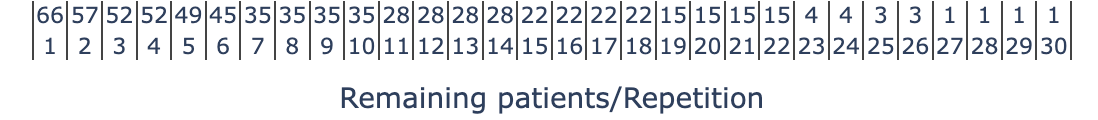
fig = go.Figure()

for percentile, color in zip(percentiles_m, colors_m):
        fig.add_trace(
            go.Scatter(
                y=curves_df[percentile],
                x=[curves_df.index, remaining_patients],
                name=percentile + "th",
                mode="lines+markers",
                textposition="top center",
                line=dict(color=color),
            )
        )

fig.update_xaxes(title_text="Remaining patients/Repetition", tickangle=0, tickfont=dict(size=11), dividerwidth=1)

fig.update_yaxes(title_text=feature_selected, tickfont=dict(size=11))回答 1
Stack Overflow用户
发布于 2022-11-09 10:54:26
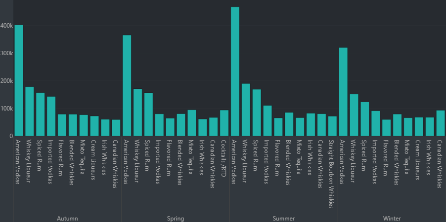
根据我的经验,您可以使用x=[tuple(main_x),tuple(sub_x)]设置主xaxis和子xaxis。请参阅以下代码:
fig_1 = go.Figure(data=[
        go.Bar(x=[tuple(df['Season']),
                  tuple(df['category_name'])],
               y=list(df['sale_dollars'])),
    ])
其结果是:
页面原文内容由Stack Overflow提供。腾讯云小微IT领域专用引擎提供翻译支持
原文链接:
https://stackoverflow.com/questions/74372689
复制相关文章
相似问题
腾讯云开发者

Copyright © 2013 - 2026 Tencent Cloud. All Rights Reserved. 腾讯云 版权所有
深圳市腾讯计算机系统有限公司 ICP备案/许可证号:粤B2-20090059 ![]() 粤公网安备44030502008569号
粤公网安备44030502008569号
腾讯云计算(北京)有限责任公司 京ICP证150476号 | 京ICP备11018762号