
更改悬停文本
更改悬停文本
提问于 2022-11-05 09:46:06
我有以下代码:
x=["a","b","c","d"]
y1=[1,3,7,2]
y2=[3,6,1,2]
y3=[0.25, 0.33, 0.875, 0.5]
y4=[0.75, 0.66, 0.125, 0.5]
fig = go.Figure([
    go.Scatter(
        name='Data 1',
        x=x,
        y=y1,
        marker=dict(color="red"),
        line=dict(width=3),
        mode='lines',
        line_shape='spline',
        stackgroup='one'
   ),
    go.Scatter(
        name='Data 2',
        x=x,
        y=y2,
        marker=dict(color="blue"),
        line=dict(width=3),
        mode='lines',
        line_shape='spline',
        stackgroup='one'
   )
])

fig.update_layout(
    hovermode="x unified",
)

fig.show()
它创建了以下图像:
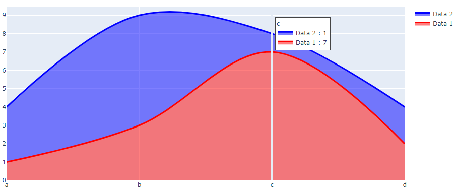
我怎样才能改变它在悬停中所显示的--不是图形中的数据,而是来自y3和y4的数据?
在本例中,我希望显示数据2: 0.125%和数据1: 0.875%。
回答 1
Stack Overflow用户
发布于 2022-11-05 11:16:36
如果要在悬停文本中显示不同的数据,可以使用自定义数据功能将其添加到显示中。我只是通过打开一个空白来添加额外的数据,因为没有提到如何显示它。
import plotly.graph_objects as go

x=["a","b","c","d"]
y1=[1,3,7,2]
y2=[3,6,1,2]
y3=[0.25, 0.33, 0.875, 0.5]
y4=[0.75, 0.66, 0.125, 0.5]

fig = go.Figure()
fig.add_trace(go.Scatter(
    name='Data 1',
    x=x,
    y=y1,
    customdata=y3,
    marker=dict(color="red"),
    line=dict(width=3),
    mode='lines',
    line_shape='spline',
    stackgroup='one',
    hovertemplate='%{y} %{customdata}'
   )
)
fig.add_trace(go.Scatter(
    name='Data 2',
    x=x,
    y=y2,
    customdata=y4,
    marker=dict(color="blue"),
    line=dict(width=3),
    mode='lines',
    line_shape='spline',
    stackgroup='one',
    hovertemplate='%{y} %{customdata}'
   )
)

fig.update_layout(
    hovermode="x unified",
)

fig.show()
页面原文内容由Stack Overflow提供。腾讯云小微IT领域专用引擎提供翻译支持
原文链接:
https://stackoverflow.com/questions/74326688
复制相关文章
相似问题
腾讯云开发者

Copyright © 2013 - 2026 Tencent Cloud. All Rights Reserved. 腾讯云 版权所有
深圳市腾讯计算机系统有限公司 ICP备案/许可证号:粤B2-20090059 ![]() 粤公网安备44030502008569号
粤公网安备44030502008569号
腾讯云计算(北京)有限责任公司 京ICP证150476号 | 京ICP备11018762号