
HTML和CSS,flexbox多行
HTML和CSS,flexbox多行
提问于 2022-10-31 04:13:10
.ent__food__image {
  display: flex;
  justify-content: end;
}

.bev__food__image {
  display: flex;
  justify-content: end;
}

.kids__food__image {
  display: flex;
  justify-content: end;
}<main class="flex-container">
<!-- Entrees -->
<div class="ent ent--container">
<div class="ent__food__image">
<img src="/food images/nutburger.jpeg" alt="nutburger" />
</div>
<h3>Entrees</h3>
<div class="ent__item__1">
<h4>Millet Burger</h4>
<p>
Millet patty served on whole wheat bun, with sauce, onions, pickles, tomatoes, romaine and sprouts. <span>7.59</span>
</p>
</div>
<div class="ent__item__2">
<h4>Nutburger</h4>
<p>
Nutmeat patty served on a whole wheat bun with sauce, onions, pickles, tomatoes, romaine, and sprouts.
<span>7.59</span>
</p>
</div>
<div class="ent__item__3">
<h4>Vegan Burrito</h4>
<p>
Whole wheat tortilla with basmati rice, black or pinto beans, onions, tomatoes, hot sauce, sour cream, romaine and sprouts.
<span>6.99</span>
</p>
</div>
</div>
<!-- Beverages -->
<div class="bev bev--container">
<div class="bev__food__image">
<img src="/food images/strawberry-smoothie.jpg" alt="Strawberry Smoothie" />
</div>
<h3>Beverages</h3>
<div class="bev__item__1">
<h4>Lemonade</h4>
<p>Small - 3.49 Large - 3.79</p>
</div>
<div class="bev__item__2">
<h4>Pinapple</h4>
<p>Small - 3.49 Large - 3.79</p>
</div>
<div class="bev__item__3">
<h4>Strawberry Smoothie</h4>
<p>Small - 4.89 Large - 6.99</p>
</div>
<div class="bev__item__4">
<h4>Coffee</h4>
<p>1.79</p>
</div>
</div>
<!-- Kids Menu -->
<div class="kids kids--container">
<div class="kids__food__image">
<img src="/food images/grilled-cheese.jpg" alt="Grilled Cheese" />
</div>
<h3>
Kids Menu
<span class="kids__description">Includes mini cookie and juice box</span
>
</h3>
<div class="kids__item__1">
<h4>Grilled Cheese</h4>
<p>5.29</p>
</div>
<div class="kids__item__2">
<h4>Quesadilla</h4>
<p>5.29</p>
</div>
<div class="kids__item__3">
<h4>PGJ</h4>
<p>5.29</p>
</div>
<div class="kids__item__4">
<h4>Shake (Choco, van, straw)</h4>
<p>4.10</p>
</div>
</div>
</main>
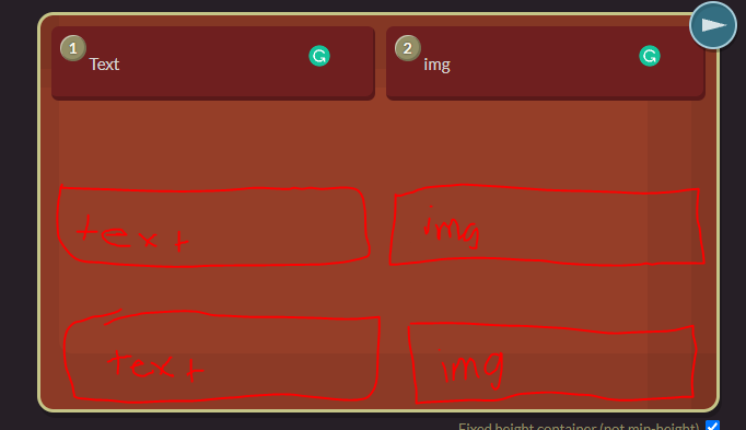
你好,我正在学习柔性盒,我有点困惑它是如何工作的。我怎样才能把我现在拥有的变成下面的图片呢?我希望文本和图像并排,就像下面的图片一样。或者我应该使用网格来解决这个问题?我也不确定我的HTML是否允许这样做。
回答 2
Stack Overflow用户
发布于 2022-10-31 05:27:08
你在手工做css吗?我推荐您使用引导5,因为它支持flex,请参阅此https://getbootstrap.com/docs/5.0/layout/grid/
HTML应该是这样的
<main class="flex-container">
  <div class="container">
   <div class="row">
    <div class="col">
      Column
    </div>
    <div class="col">
      Column
    </div>
    <div class="col">
      Column
    </div>
   </div>
  </div>
它真的会对你有帮助。还有一件事,请不要习惯使用双破折号和下划线,这是有效的,但不是一个好的做法。
Stack Overflow用户
发布于 2022-10-31 05:53:07
你的问题似乎仍然很宽泛,但希望这能有所帮助。
.test_css {
    display: flex;
    flex direction: column; /*columns*/
    flex-wrap: wrap; /*if needed*/
    align-items: flex-end; /*puts the class at the bottom, add only if you want that space between the boxes 1 & 2 and the sketched ones below*/
}
or
.test_css2 {
display: grid;
justify-content: center; /*center*/
align-content: end; /*bottom, adds that gap between the two sets of boxes*/
grid-template-columns: 12px 12px 12px; /*how big & how many columns*/
grid-template-rows: 12px 12px 12px; /*how big & how many rows*/
}
不知道他们在实践中有多好,因为这个问题很广泛,但是它应该给你一个关于你需要什么的想法。
另外,如果您仍然倾向于使用柔性箱,我建议您使用http://flexboxfroggy.com来记住那些命令,如果您还没有记住这些命令,并且不确定它们之间的区别。您还可以在CSS中将网格和柔性盒结合在一起,而不是只有柔性盒。我用来提醒自己关于网格的东西是https://grid.malven.co。祝项目好运!
页面原文内容由Stack Overflow提供。腾讯云小微IT领域专用引擎提供翻译支持
原文链接:
https://stackoverflow.com/questions/74258680
复制相关文章
相似问题
腾讯云开发者

Copyright © 2013 - 2026 Tencent Cloud. All Rights Reserved. 腾讯云 版权所有
深圳市腾讯计算机系统有限公司 ICP备案/许可证号:粤B2-20090059  粤公网安备44030502008569号
腾讯云计算(北京)有限责任公司 京ICP证150476号 | 京ICP备11018762号