
在matplotlib条形图上绘制3个类别,当其中一个类别没有x轴的部分值时
我一直在使用我自己的IMDB数据来练习熊猫和绘图,并创建了一个条形图,用来显示3种收视率之间的等级分布:电视剧、电影和电视剧。
问题是,在我的数据集中,我没有任何电视剧的收视率为1或2。我想在电视连续剧的x轴上显示1和2的0%。
到目前为止,这是我想出的代码:
fig, ax = plt.subplots(figsize=(10,4))
x_axis = np.arange(1,11)
movies_x = movies['your rating'].value_counts(normalize=True).sort_index()*100
tvseries_x = tvseries['your rating'].value_counts(normalize=True).sort_index()*100
tveps_x = tveps['your rating'].value_counts(normalize=True).sort_index()*100

width = 0.3
ax.bar(x_axis-width, movies_x, width, label = 'Movies')
ax.bar(x_axis, tveps_x, width, label = 'Episodes')
ax.bar(x_axis[2:]+width, tvseries_x, width, label = 'Series')
ax.bar_label(ax.containers[0], color='blue', fmt='%.f%%', fontsize=8)
ax.bar_label(ax.containers[1], color='red', fmt='%.f%%', fontsize=8)
ax.bar_label(ax.containers[2], color='green', fmt='%.f%%', fontsize=8)
ax.set_xticks(x_axis)
ax.set_xlabel('Rating')
ax.set_ylabel('Percent')
ax.set_title('Rating Distribution per rating type')
ax.legend(loc=6)
plt.tight_layout()
plt.show()
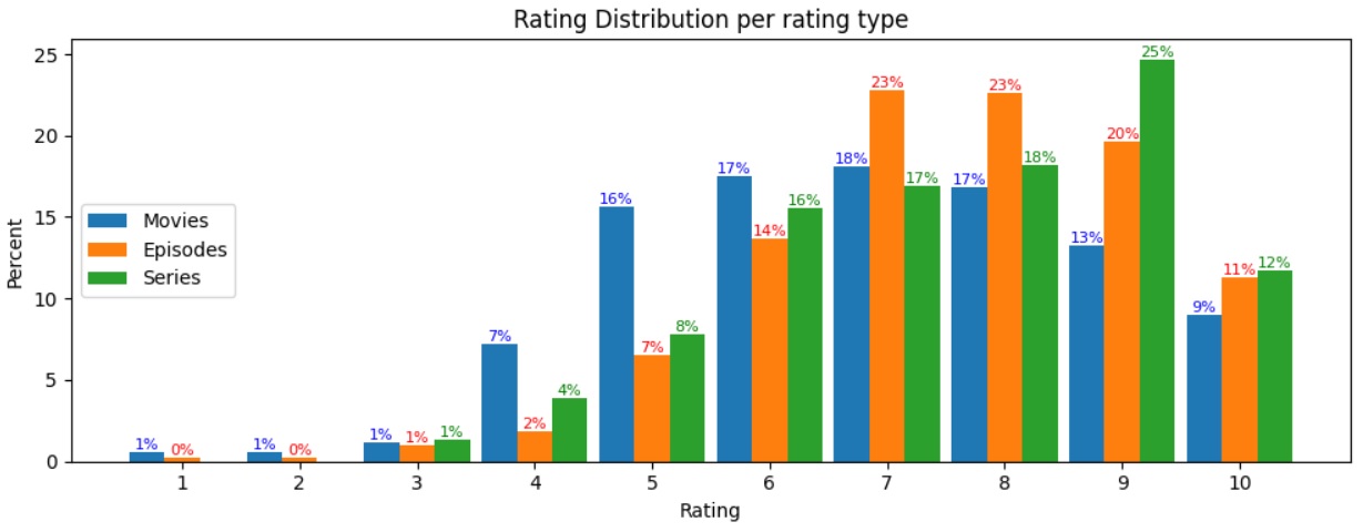
我的解决办法是从3-10开始绘制电视连续剧(x_axis2:),否则我会得到"ValueError: shape失配:对象不能被广播成单个形状。Arg0与shape (10 )和arg 1与shape (8,)之间的不匹配“。
我已经在这里搜索了很多,我所能找到的是问题,哪里的分布是基于X轴(例如,每个评级组的百分比)。手动编辑该系列以添加1,2似乎不是一个理想的解决方案。
如有任何意见或建议,将不胜感激。
谢谢!
回答 1
Stack Overflow用户
发布于 2022-10-22 05:14:40
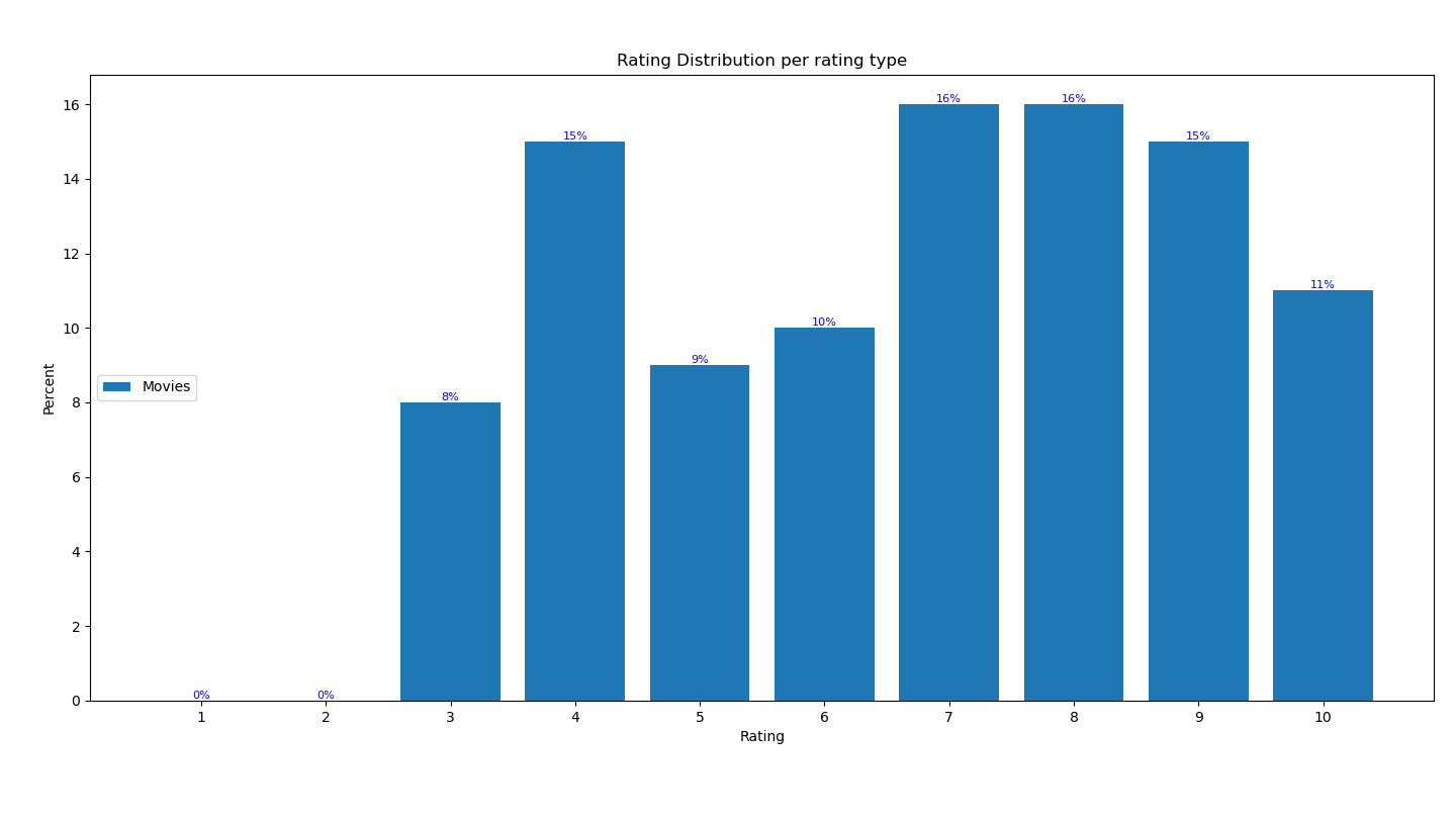
由于没有提供数据,我将通过为电影收视率生成(假)数据集来回答这个问题。
复制错误:
import pandas as pd
import matplotlib.pyplot as plt
import random
import numpy as np

# The dataframe will have one column with movie ratings from 3 to 10.
movies = pd.DataFrame({"your rating" : random.choices(range(3, 11), k = 100)})

fig, ax = plt.subplots(figsize=(10,4))
x_axis = np.arange(1, 11)

# Get percentage of ratings
movies_x = movies['your rating'].value_counts(normalize=True).sort_index()*100

ax.bar(x_axis, movies_x, label = 'Movies')
ax.bar_label(ax.containers[0], color='blue', fmt='%.f%%', fontsize=8)
ax.set_xticks(x_axis)
ax.set_xlabel('Rating')
ax.set_ylabel('Percent')
ax.set_title('Rating Distribution per rating type')
ax.legend(loc=6)
plt.tight_layout()
plt.show()
这就产生了错误:
ValueError: shape mismatch: objects cannot be broadcast to a single shape. Mismatch is between arg 0 with shape (10,) and arg 1 with shape (8,).
解决错误:
您必须确保“系列”以_x结尾(存储不同评级的百分比)的索引从1到10不等。要做到这一点,不需要担心数据集中不存在哪些评级,我们可以尝试:
random.seed(100)

movies = pd.DataFrame({"your rating" : random.choices(range(3, 11), k = 100)})

fig, ax = plt.subplots(figsize=(10,4))
x_axis = np.arange(1, 11)


# Get percentage of ratings
movies_x = movies['your rating'].value_counts(normalize=True).sort_index()*100

# Code of interest
ratings = dict.fromkeys(set(range(1, 10)).difference(movies_x.index), 0)
movies_x = movies_x.combine(pd.Series(ratings), max, 0)
print(movies_x)

ax.bar(x_axis, movies_x, label = 'Movies')
ax.bar_label(ax.containers[0], color='blue', fmt='%.f%%', fontsize=8)
ax.set_xticks(x_axis)
ax.set_xlabel('Rating')
ax.set_ylabel('Percent')
ax.set_title('Rating Distribution per rating type')
ax.legend(loc=6)
plt.tight_layout()
plt.show()这使movies_x成为:
1      0.0
2      0.0
3      8.0
4     15.0
5      9.0
6     10.0
7     16.0
8     16.0
9     15.0
10    11.0
数字输出如下:
https://stackoverflow.com/questions/74151568
复制相似问题
腾讯云开发者

Copyright © 2013 - 2026 Tencent Cloud. All Rights Reserved. 腾讯云 版权所有
深圳市腾讯计算机系统有限公司 ICP备案/许可证号:粤B2-20090059 ![]() 粤公网安备44030502008569号
粤公网安备44030502008569号
腾讯云计算(北京)有限责任公司 京ICP证150476号 | 京ICP备11018762号