
牛市-如何在图表中添加线条
牛市-如何在图表中添加线条
提问于 2022-10-21 01:26:28
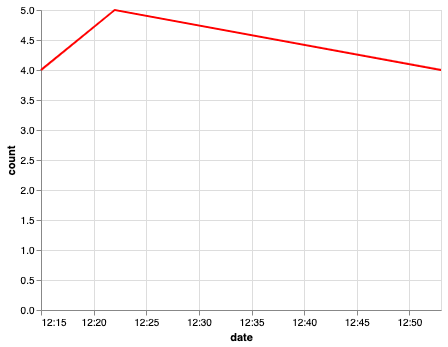
我试图在牛尾图中添加特定的线条,从文字到图表上的某个点。我在这里添加了我的当前输出:
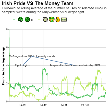
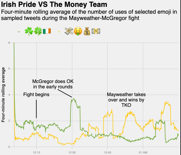
我正试图得到一个像下面这样的图表,但我不知道如何在图表中正确地添加线条。
下面是需要在特定时间添加的文本和位置的df。我的问题是-如何在图表中添加行以显示这些事件发生的特定时间?
    date              count note
0   2017-08-27 00:15:00 4   Fight begins
1   2017-08-27 00:22:00 5   McGregor does OK \nin the early rounds
2 2017-08-27 00:53:00 4 Mayweather takes \nover and wins by \nTKO回答 1
Stack Overflow用户
回答已采纳
发布于 2022-10-21 07:43:46
问题在于你画这条线的方式。
当您仅使用x和y指定行时,它将连接这些行,而不创建单独的行。
s ="""date,count,note
2017-08-27 00:15:00,4,Fight begins
2017-08-27 00:22:00,5,McGregor does OK \\nin the early rounds
2017-08-27 00:53:00,4,Mayweather takes \\nover and wins by \\nTKO"""
a_df = pd.DataFrame([x.split(',') for x in s.split('\n')])
a_df = a_df.rename(columns=a_df.iloc[0]).drop(a_df.index[0]).reset_index(drop=True)
a_df['count'] =a_df['count'].astype(int)
Dataframe:
date    count   note
0   2017-08-27 00:15:00 4   Fight begins
1   2017-08-27 00:22:00 5   McGregor does OK \nin the early rounds
2 2017-08-27 00:53:00 4 Mayweather takes \nover and wins by \nTKO只使用x和y参数
alt.Chart(a_df).mark_line().encode(
    x='date:T',
    y='count:Q',
    color=alt.value('red'),
)
您必须使用x1和y1,或者至少使用其中一种来满足您的需要。例如:
a_df['temp'] = a_df['count'] - 1 # change it according to your use case
alt.Chart(a_df).mark_line().encode(
    x='date:T',
    #x2='date:T',
    y='count:Q',
    y2='temp:Q',
    color=alt.value('red'),
)
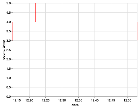
这些行是垂直的,因为x和x2是相同的,因为我们没有为x2指定值。根据你的问题改变它。我希望这能帮到你。
页面原文内容由Stack Overflow提供。腾讯云小微IT领域专用引擎提供翻译支持
原文链接:
https://stackoverflow.com/questions/74147856
复制相关文章
相似问题
腾讯云开发者

Copyright © 2013 - 2026 Tencent Cloud. All Rights Reserved. 腾讯云 版权所有
深圳市腾讯计算机系统有限公司 ICP备案/许可证号:粤B2-20090059 ![]() 粤公网安备44030502008569号
粤公网安备44030502008569号
腾讯云计算(北京)有限责任公司 京ICP证150476号 | 京ICP备11018762号