
空间4 div在div内均匀填充垂直空间。
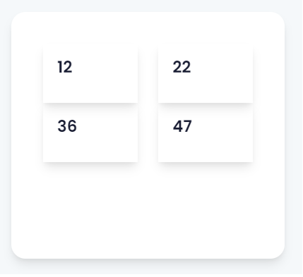
我正在尝试创建一个父Div,其中包含4个子Div,所有这些都是为了填充可用的空间,无论添加多少文本,都会在不同的屏幕大小上自动调整。到目前为止,我已经能够编码的div水平,但不是垂直填充。
到目前为止,我已经尝试了变体的位置,Flex,宽度和高度,但没有效果。任何帮助都将不胜感激。你可以从增加的图片中判断出我想要达到的效果。
这可能看起来相当简单,尽管我主要从事后端开发,并且仍然在学习CCS。
    <div class="d-flex col-lg-4 col-md-4 col-sm-12 col-12">
   <div class="boxshadow" style="background-color: #fff; border-radius: 20px; margin: 10px; width: 100%; height: 350px; padding: 40px;">
                <div class="row">
                <div class="col-sm-12 col-md-6 col-lg-6">
            <div class="boxshadow" style="display: flex; flex-flow: column; height: 100%; padding: 20px; margin: 5px;">
                    <h1>12</h1>
                        </div>
                            </div>

                                                <div class="col-sm-12 col-md-6 col-lg-6">
                                                    <div class="boxshadow" style="display: flex; flex-flow: column; height: 100%; padding: 20px; margin: 5px;">
                                                        <h1>22</h1>
                                                    </div>
                                                </div>

                                                <div class="col-sm-12 col-md-6 col-lg-6">
                                                    <div class="boxshadow" style="display: flex; flex-flow: column; height: 100%; padding: 20px; margin: 5px;">
                                                        <h1>36</h1>
                                                    </div>
                                                </div>

                                                <div class="col-sm-12 col-md-6 col-lg-6">
                                                    <div class="boxshadow" style="display: flex; flex-flow: column; height: 100%; padding: 20px; margin: 5px;">
                                                        <h1>47</h1>
                                                    </div>
                                                </div>
                                            </div>
                                            </div>
                                        </div>
为此目的:
回答 3
Stack Overflow用户
发布于 2022-10-19 02:08:29
我不太清楚您的行和列类是什么,但是在这里可能帮助您的一个属性是flex-wrap。
当您将flex-wrap: wrap添加到父<div>或容器中时,它将定义flex项是强制在一行中还是可以流到多行。然后,当容器中的项导出您设置的width属性时,它们应该包装。因此,使用child div和parent div的宽度进行一次播放。
所以,在这个片段中,使用预定义的类似的东西。
<div class="d-flex col-lg-4 col-md-4 col-sm-12 col-12">
    <div class="boxshadow" style="background-color: #fff; border-radius: 20px; margin: 10px; width: 100%; height: 350px; padding: 40px;">
    <!-- Here is your parent container -->
        <div
          style="box-shadow: rgba(149, 157, 165, 0.2) 0px 8px 24px;
                display:flex;
                width: 120px;
                flex-wrap: wrap;
                padding: 20px;"
         >

          <div style="box-shadow: rgba(149, 157, 165, 0.2) 0px 8px 24px; display: flex; width: 50px; margin: 5px">
            <h1>12</h1>
          </div>

          <div style="box-shadow: rgba(149, 157, 165, 0.2) 0px 8px 24px; display: flex; width: 50px; margin: 5px">
            <h1>22</h1>
          </div>

          <div style="box-shadow: rgba(149, 157, 165, 0.2) 0px 8px 24px; display: flex; width: 50px; margin: 5px">
            <h1>36</h1>
          </div>

          <div style="box-shadow: rgba(149, 157, 165, 0.2) 0px 8px 24px; display: flex; width: 50px; margin: 5px">
            <h1>47</h1>
          </div>
        </div>


    </div>
  </div>
Stack Overflow用户
发布于 2022-10-19 08:13:08
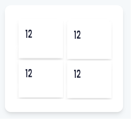
这样能达到预期的效果吗?css中有注释来解释它,但本质上它都是用柔性盒完成的。
body, body *{
  box-sizing:border-box;
}

body{
  margin:0;
  padding:0;
  width:100%;
  height:100vh;
}

.d-flex{
  /*
    assumed to be a flex container
    given existing class name in html.
  */
  display:flex;
  flex-direction:column;
  background:rgb(240, 248, 255);
  /*
    make the parent fill the page
  */
  margin:0;
  padding:2rem 1rem;
  width:100%;
  height:100vh;
}


.d-flex > .boxshadow{
  /*
    set the 1st child to fill parent
  */
  flex:1;
  background:transparent;
  border-radius: 20px;
  box-shadow:0 1rem 1rem rgba(176, 196, 222, 0.75);
}


.d-flex-con{
  /*
    The main container for the 4 divs
  */
  background-color: #fff;
  border-radius: 20px;
  margin: 0;
  padding: 40px;
  width:100%;
  height:100%;
  /*
    Set the container as the flex-container
    that wraps the children.

    Change row to column if the numbers are
    to stack vertically etc
  */
  flex:1;
  display:flex;
  flex-direction:row;
  flex-wrap:wrap;
}


.d-flex-item{
  /*
    An individual div element - also set
    as a flex-container in it's own right
    to aid layout within itself.

    Tried to make it look like the picture.
  */
  box-shadow:0 5px 0.5rem rgba(176, 196, 222, 0.75);
  flex:1 1 45%;
  display:flex;
  margin:0.25rem 0.5rem;
  height:50%;
}


.d-flex-item > .boxshadow{
  /*
    ensure children of the div
    fill the available space
  */
  flex:1;
  margin:1rem;
}


.d-flex-item > .boxshadow > h1{
  font-family:sans-serif;
}<div class="d-flex col-lg-4 col-md-4 col-sm-12 col-12">
<div class="boxshadow">
<div class="row d-flex-con">
<div class="col-sm-12 col-md-6 col-lg-6 d-flex-item">
<div class="boxshadow">
<h1>12</h1>
</div>
</div>
<div class="col-sm-12 col-md-6 col-lg-6 d-flex-item">
<div class="boxshadow">
<h1>22</h1>
</div>
</div>
<div class="col-sm-12 col-md-6 col-lg-6 d-flex-item">
<div class="boxshadow">
<h1>36</h1>
</div>
</div>
<div class="col-sm-12 col-md-6 col-lg-6 d-flex-item">
<div class="boxshadow">
<h1>47</h1>
</div>
</div>
</div>
</div>
</div>
Stack Overflow用户
发布于 2022-10-19 01:57:41
我不知道你到底想要实现什么,所以我的答案是相当基本的,但是CSS网格会帮助你解决这个问题,如果你只想平均地填充4个div之间的空间的话。
将下面的CSS应用到包含4个div的主容器中,它应该均匀地分配空间:
display: grid;
grid-template-columns: repeat(2, 1fr);
同样,取决于您的网站/应用程序试图实现和看起来,这可能不是最理想的解决方案,但我认为它可能会有所帮助。
https://stackoverflow.com/questions/74118828
复制相似问题
腾讯云开发者

Copyright © 2013 - 2026 Tencent Cloud. All Rights Reserved. 腾讯云 版权所有
深圳市腾讯计算机系统有限公司 ICP备案/许可证号:粤B2-20090059  粤公网安备44030502008569号
腾讯云计算(北京)有限责任公司 京ICP证150476号 | 京ICP备11018762号