
为两条具有两个不同y轴比例的曲线插入图例,并具有各自的y标签颜色。
为两条具有两个不同y轴比例的曲线插入图例,并具有各自的y标签颜色。
提问于 2022-10-17 05:03:40
我希望有人能就以下几点给我一些指导:
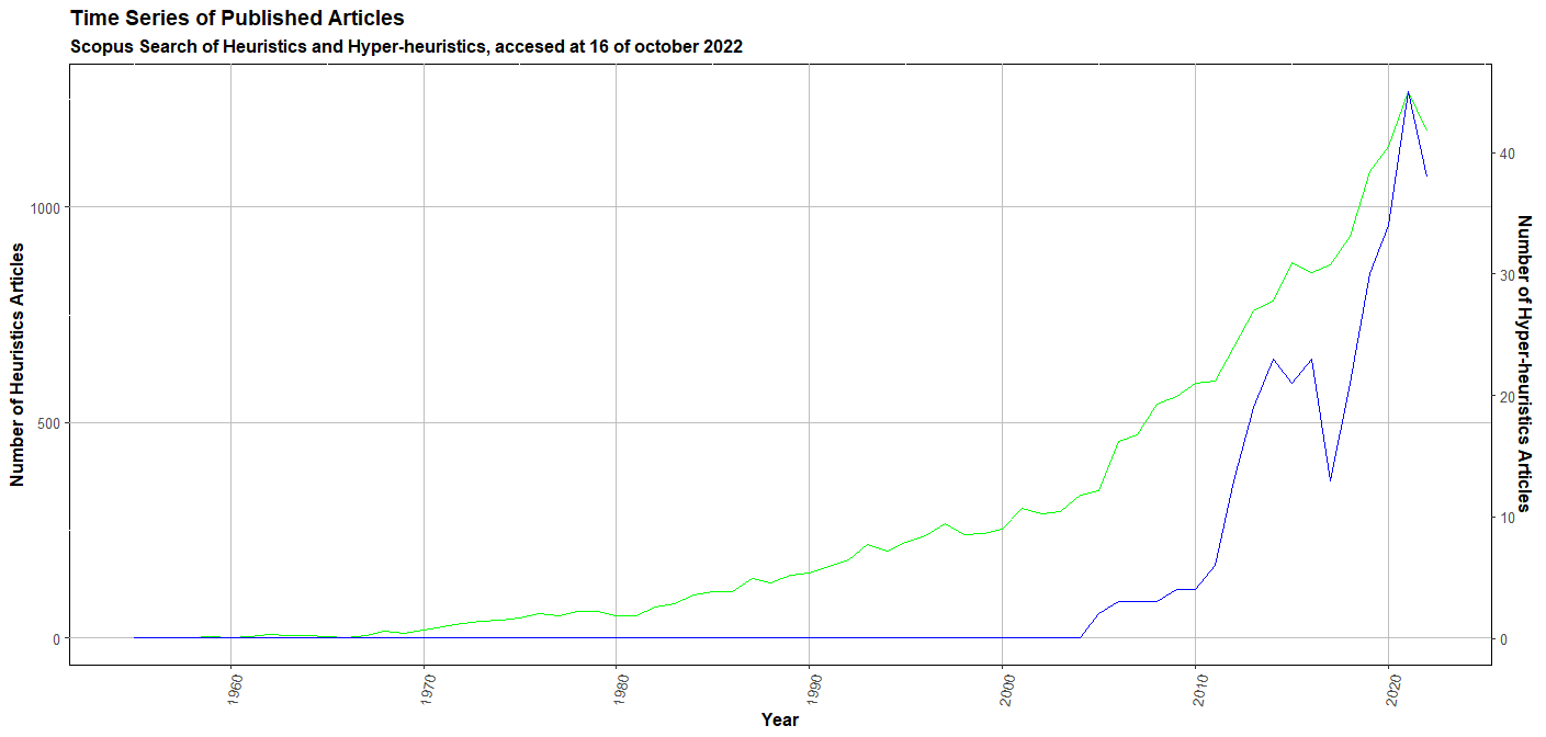
我想要画出两条有自己的y轴(左/右)的曲线,我想要改变y-标签的颜色,使它与曲线的颜色相匹配。我有以下代码:
library(readr)
library(ggplot2)
library(tibble)
library(hrbrthemes)
df <- read_csv("TS-ARTICLES.csv")
df <- as.data.frame(df)
p1 <- ggplot(df, aes(x = YEAR)) +
geom_line(aes(y = HEURISTICS), color = "green") +
geom_line(aes(y = HYPERHEURISTICS * 1267/45), color = "blue") +
labs(title = "Time Series of Published Articles", subtitle = "Scopus Search of Heuristics and Hyper-heuristics, accesed at 16 of october 2022", x ="Year", y ="Number of Heuristics Articles") +
scale_x_continuous(breaks = seq(from = 1950, to = 2022, by = 10)) +
scale_y_continuous(limits = c(0, 1267), sec.axis = sec_axis(~ . *45/1267, name = "Number of Hyper-heuristics Articles")) +
theme(axis.text.x = element_text(angle=80, hjust=1), title = element_text(face = "bold"), panel.background = element_rect(fill = 'White', colour = 'black'), panel.grid.major = element_line(colour = "gray"))
print(p1)
回答 1
Stack Overflow用户
回答已采纳
发布于 2022-10-17 06:09:28
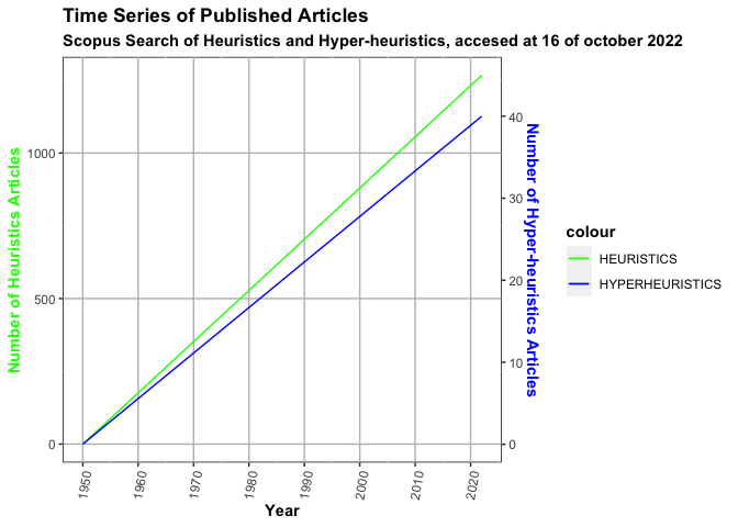
轴标签的颜色可以通过主题选项axis.title.y.left和axis.title.y.right来设置。若要添加附加图例,请将color=...移动到aes()中,然后使用scale_color_manual设置正确的颜色和标签:
使用一些假的示例数据:
library(ggplot2)

df <- data.frame(
  YEAR = 1950:2022,
  HEURISTICS = seq(0, 1267, length.out = 73),
  HYPERHEURISTICS = seq(0, 40, length.out = 73)
)

ggplot(df, aes(x = YEAR)) +
  geom_line(aes(y = HEURISTICS, color = "green")) +
  geom_line(aes(y = HYPERHEURISTICS * 1267 / 45, color = "blue")) +
  scale_color_manual(values = c(green = "green", blue = "blue"),
                     labels = c(green = "HEURISTICS", blue = "HYPERHEURISTICS")) +
  labs(
    title = "Time Series of Published Articles",
    subtitle = "Scopus Search of Heuristics and Hyper-heuristics, accesed at 16 of october 2022",
    x = "Year",
    y = "Number of Heuristics Articles"
  ) +
  scale_x_continuous(breaks = seq(from = 1950, to = 2022, by = 10)) +
  scale_y_continuous(limits = c(0, 1267), sec.axis = sec_axis(~ . * 45 / 1267,
    name = "Number of Hyper-heuristics Articles"
  )) +
  theme(
    axis.text.x = element_text(angle = 80, hjust = 1),
    title = element_text(face = "bold"),
    panel.background = element_rect(fill = "White", colour = "black"),
    panel.grid.major = element_line(colour = "gray")
  ) +
  theme(
    axis.title.y.left = element_text(color = "green"),
    axis.title.y.right = element_text(color = "blue")
  )
页面原文内容由Stack Overflow提供。腾讯云小微IT领域专用引擎提供翻译支持
原文链接:
https://stackoverflow.com/questions/74092768
复制相关文章
相似问题
腾讯云开发者

Copyright © 2013 - 2026 Tencent Cloud. All Rights Reserved. 腾讯云 版权所有
深圳市腾讯计算机系统有限公司 ICP备案/许可证号:粤B2-20090059 ![]() 粤公网安备44030502008569号
粤公网安备44030502008569号
腾讯云计算(北京)有限责任公司 京ICP证150476号 | 京ICP备11018762号