
Python Mathplotlib:基于当天5分钟时间戳的24小时X轴刻度
我有一个P1meter,它从我的电度表/气压计中读取值。因此,我得到一个时间戳和一个正负电值,这取决于我是使用电力,还是我的太阳能电池板产生的电能比我使用的更多。(实际上,我得到了很多价值观,但它们现在并不相关)。所有数据都存储在一个sqlite3 DB中。我使用myquery="select timestamp tmstmp, verbruiknuw from v_p1data where substr(timestamp,1,10) == date()"这样的查询从数据库中收集数据
读取数据,然后将其发送到matplotlib函数。
data = pandas.read_sql(myquery, connection)
mpgraphs.netto_per_dag(data, values)
到目前一切尚好。白天,我每6分钟测量一次,最多得到240分(=每小时10分,每24小时239分,因为午夜(00:00:00)不读,但我不在乎)。
现在我想把它们编出来:
def netto_per_dag(data, all_values):
    #Get current plot/figure and clear it
    fig = plt.gcf()
    plt.clf()
    plt.xlabel('metingen')
    plt.ylabel('Watts')

    if (len(all_values['-CAL-']) == 0):
        plt.suptitle("energie vandaag")
    else:
        plt.suptitle("energie verbruik op " + datetime.strptime(all_values['-CAL-'], '%Y-%m-%d').strftime('%a %d-%m-%Y'))

    plt.title("positief (paars): verbruikt; negatief (groen): door zonnepanelen geleverd")
    plt.grid(axis='y', linestyle='--')

    x = np.arange(len(data.tmstmp))

    plt.bar(x[data.verbruiknuw >0], data.verbruiknuw[data.verbruiknuw >0], color='m')
    plt.bar(x[data.verbruiknuw <0], data.verbruiknuw[data.verbruiknuw <0], color='g')

    plt.show()
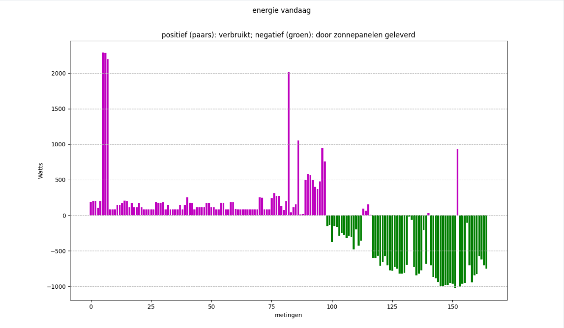
如果我不使用矮胖的长廊,我就不会得到洋红/绿色的地块。我如何摆脱这些数字(对于点数),如下午16:10从0到~160 )。如何获得24小时量表(每3或4小时一次),以便:
- 当一天还没有结束时,不要在右边得到一个完整的图表(在16:40左右)(这是一天的2/3,因此一个2/3填充的x轴)。
- X轴从0到24小时(比如0,03:00,06:00 ....21:00 .)无论有1小时的数据,15小时的数据,或(几乎) 24小时的数据。
日期为"2022-10-11 16:10:00“格式。比如:
0     2022-10-11 00:05:00
1     2022-10-11 00:10:00
2     2022-10-11 00:15:00
3     2022-10-11 00:20:00
4     2022-10-11 00:25:00
              ...
156   2022-10-11 15:40:00
157   2022-10-11 15:45:00
158   2022-10-11 15:50:00
159   2022-10-11 15:55:00
160 2022-10-11 16:05:00我还尝试data.tmstmp = pandas.to_datetime(data.tmstmp, format = "%Y-%m-%d %H:%M:%S")将字符串转换为datetime对象,并以多种方式对它们进行操作。
我也尝试过这样的方法:
    plt.setp(plt.gca().xaxis.get_majorticklabels(),'rotation', 30)
    #plt.gca().xaxis.set_major_locator(md.MinuteLocator(byminute = [0, 15, 30, 45]))
    plt.gca().xaxis.set_major_locator(md.MinuteLocator(byminute=[0,15,30,45], interval = 1))
plt.gca().xaxis.set_major_formatter(md.DateFormatter('%H:%M'))我就是不能让它起作用。我保持上面的函数代码def netto_per_dag(data, all_values)干净,并删除了大量的外部评论尝试。我希望有人能帮我填上工作代码。
谢谢。
@chocoloco's 编辑:提供的答案是,对滴答和标签的数量进行了最少的调整,现在我得到:
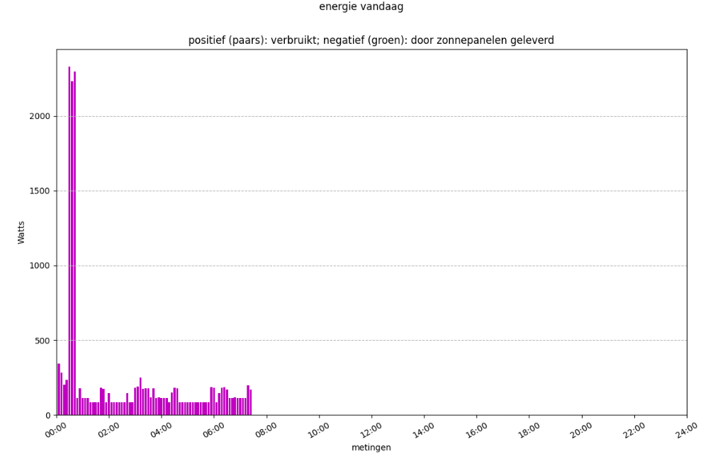
最少改编的代码:
    # Define the location of your ticks relative to the total x-axis length
    time_stamps = np.linspace(0, 240, 13)
    # Define the labels
    time_labels = ["00:00", "02:00", "04:00", "06:00", "08:00", "10:00", "12:00", "14:00", "16:00", "18:00", "20:00", "22:00", "24:00"]
    plt.xlim(0, 240)  # Defines the limit of your x-axis
plt.xticks(time_stamps, labels=time_labels, rotation='30') # Adapts the x-axis scale and labels回答 1
Stack Overflow用户
发布于 2022-10-11 23:05:31
您可能需要使用xlim函数来固定x轴的比例,并使用xticks函数来调整标签。我创建了一个样地,它具有您所描述的特性:
x = np.linspace(0, 150, 151)

# Define the location of your ticks relative to the total x-axis length
time_stamps = np.linspace(0, 240, 9)
# Define the labels
time_labels = ["00:00", "03:00", "06:00", "09:00", "12:00", "15:00", "18:00", "21:00", "24:00"]


plt.figure()
plt.plot(x, x)
plt.xlim(0, 240)  # Defines the limit of your x-axis
plt.xticks(time_stamps, labels=time_labels, rotation='vertical')  # Adapts the x-axis scale and labels
plt.show()
希望这有帮助:^)
https://stackoverflow.com/questions/74030974
复制相似问题
腾讯云开发者

Copyright © 2013 - 2026 Tencent Cloud. All Rights Reserved. 腾讯云 版权所有
深圳市腾讯计算机系统有限公司 ICP备案/许可证号:粤B2-20090059 ![]() 粤公网安备44030502008569号
粤公网安备44030502008569号
腾讯云计算(北京)有限责任公司 京ICP证150476号 | 京ICP备11018762号